Pixels of the Week – June 20, 2021
Every day, I share on Twitter and LinkedIn a list of curated articles I read, resources and tools about UX Design, User Research, UI and mobile design, HTML, CSS, the web industry, some process, some inspiration, etc. This is an archive of everything I shared this week.
#Now – what I’m up to
I had a really nice time at Ladies that UX Paris this week, talking about what I learned during the last 10+ years at my job (and might write something in French about that). There’s a lot of “ladies that” or “women who” events are open to all genders, true, but, if you are a man participating, please I implore you, refrain yourself from monopolizing the conversation in those events. If you speak French, I will talk about designing reusable components at “Sommet Design Systems 2021” (online event) on June 29. Also on a fun + security note, I got my new reflective bag and it’s awesome. So big shoutout to Reflective Berlin, a little company in Berlin that creates awesome reflective gear for your security!
TL;DNR the one you should not miss
#MobileUX
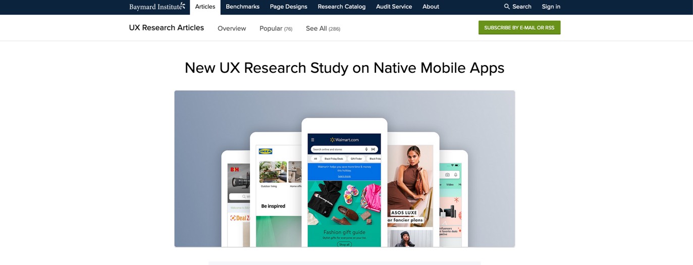
Survey by @Baymard on Native Mobile Apps (US market): 1. unless you’re amazon, users are more likely to use a mobile site than corresponding m app for purchasing, 2. 98% of product-finding guidelines for mobile websites also apply to native m apps
Interesting article
#GameUX #GameDesign
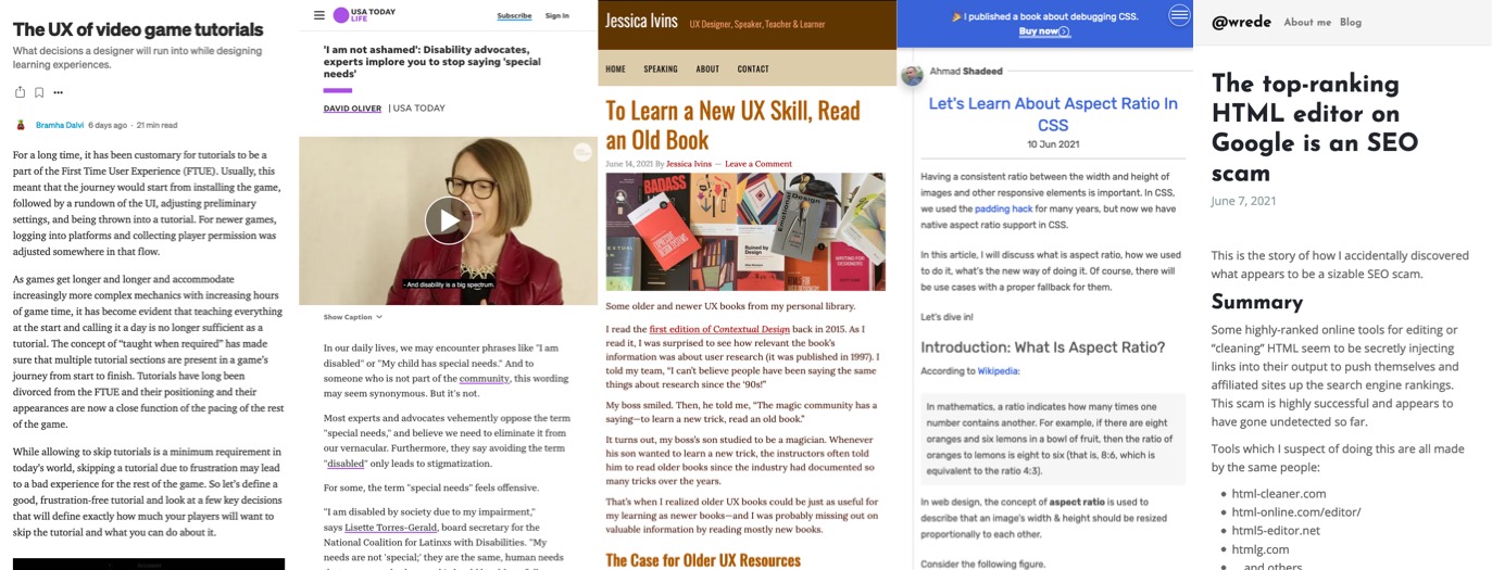
- Super insightful article with a lot of detailed examples by Bramha Dalvi on game UX and learning experiences: “The UX of video game tutorials“
- An interesting thread by Delaney King on why concept art in not the same as illustrations in game design
#Disability
- “disability dongle: a disability aid that is meant to solve a real or perceived problem experienced by disabled people, but which was built without including disabled people in the design process”
- ‘I am not ashamed’: Disability advocates, experts implore you to stop saying ‘special needs’
#UXDesign #UXmethods
- Matter Lerner explains how he wasted $1M on marketing segmentation to build personas and that he would rather use Jobs to be Done instead now.
- As a rule of thumbs, I think you can consider any UX resource or article that uses the “Miller Magical Number Seven” to tell you to have less than 7 items in navigation as outdated at best, poorly documented at worse. Here’s a NNgroup video on that
- “To Learn a New UX Skill, Read an Old Book” really good advice from @jessicaivins, + a list of books to add to my library (my only issue with older books is that some don’t exist as ebooks or ebook layout is bad, but that’s a me problem ^^)
- “UI Copy: Sign In vs Log In” interesting arguments on not using “sign up” but “create account” and “log in” instead of “sign in”. As usually, I would still test this with your own target audience though to make sure it works for them
#CSS
“Let’s Learn About Aspect Ratio In CSS“, great read about the aspect-ratio CSS property and how you can combine it with object-fit to achieve nice responsive thumbnails and more
#VisualPrinciples
Some visual UI principles that help user understand your content. As always, master the rules, and break them if you need to if it makes sense for you audience, and test it.
#Design
“The end of the celebrity designer – A more open approach to design helps build better products and demystifies the process for the rest of the company.” interesting read and ego check 🙂
#Emojis
“What happened when I stopped using Emojis” by @This2ShallGrow, really interesting articles on how emojis are made, how they convey meaning and we need to be careful about it, limits and how to make the best out of them
#Licenses
This is a super important topic (that goes beyond fonts and applies to icons, images or anything published you re-use really) sadly many people still don’t get it: “Font licensing: Personal use vs. commercial use”
#SEO
“The top-ranking HTML editor on Google is an SEO scam“, okay the title is clickbait, but trust me, it’s a really interesting article on links injection and how people are gaming the system (by @wrede)
Inspiration, fun experiments and great ideas
#SVG
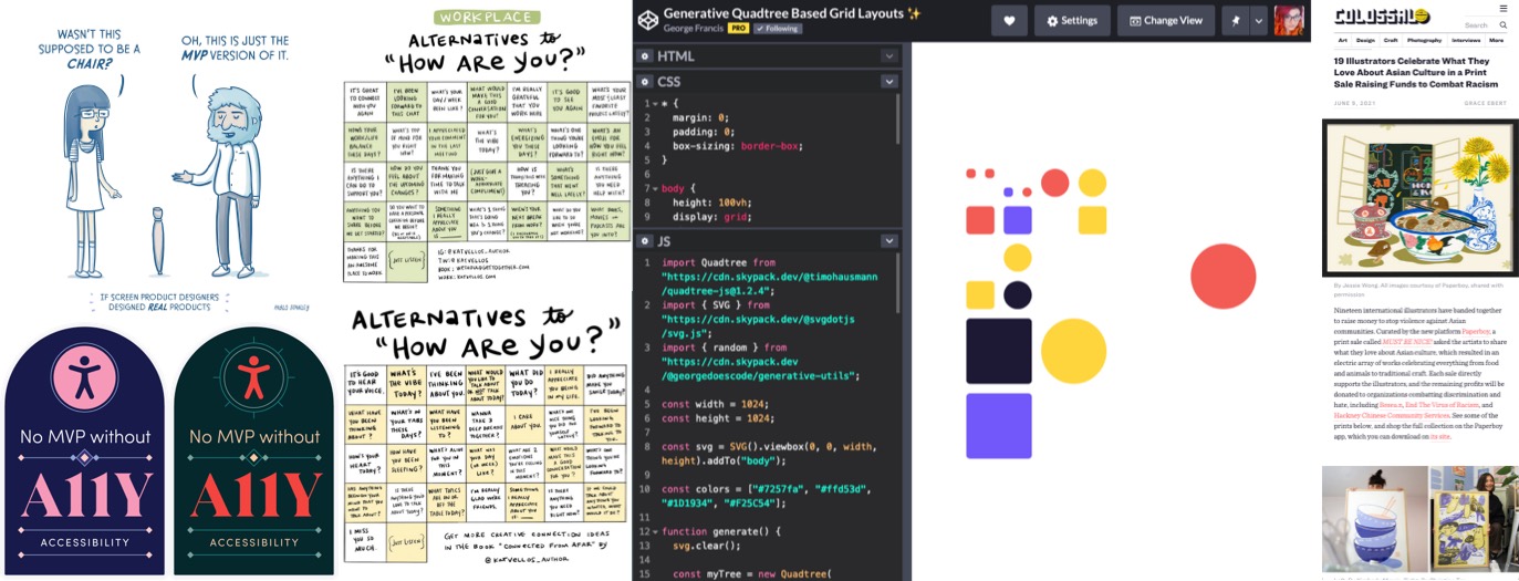
George Francis is experimenting with some generative grid layouts
#SayingHello
A list of alternatives to “how are you” and “how are you” in the workplace by Kat Vellos
#Accessibility #Stickers
Anna E.Cook created awesome accessibility stickers
#Inspiration
#ProductDesign
Old but still good: “If Screen Product Designers Designed Physical Products” , some fun comics by @pablostanley
Podcast
#Neurodiversity
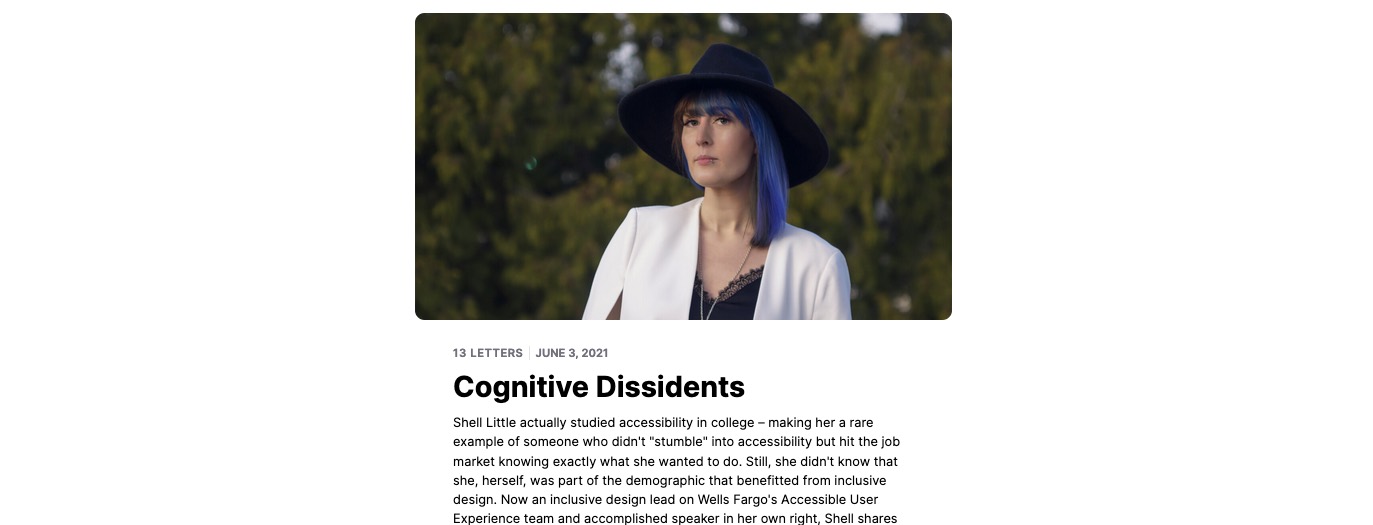
Cognitive Dissidents: “The internet can be downright hostile for people with cognitive disabilities.” and awesome podcast episode by Shell Little
News in the industry
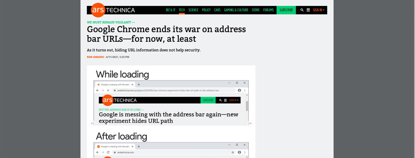
#Browser
#Research
The 2021 UX Research Tools Map, a tool inspired by metro maps, that shows the landscape of user research tools
Tutorials
#CSS
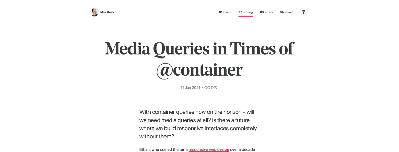
Media Queries in Times of @container by @mxbck, aka “can we do responsive web design only using container queries”. TLDNR you could but there’s still a lot of @media that can help with layout, toekns, user preferences for example for the big picture
Useful tools and resources that will make your life easy
#Typography #Scifi
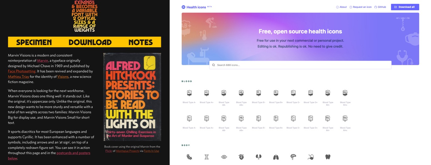
If you are looking for a good typeface that screams “sci -fi”, Marvin Visions is a modern and consistent reinterpretation of Marvin, a typeface originally designed by Michael Chave in 1969 and published by Face Photosetting.
#Icons
If you are working in the health sector, this is nice: a collection of free open source (MIT license) health icons
