Pixels of the Week – March 12 , 2023
Beautiful accessible color palette, alerts & notifications & the wonderful world of slime mold
On Twitter, LinkedIn and Mastodon, I share curated articles I read, resources and tools about UX Design, User Research, UI and mobile design, HTML, CSS, the web industry, some process, some inspiration, etc. This is an archive of everything I shared this week. And some extra links that I decided to only share for the blog readers. Also, subscribe to the newsletter to get notified when those are published!
Now: what I’m currently up to
First, I wanted to thank everyone who answered the preference test. You gave me super interesting insights on how to improve this newsletter (and the blog version) every more. So, thank you thank you!! I’m reworking a little bit the sections titles, and I’m adding a new “Curiosity cabinet” section for the cool rabbit holes that are not design or tech oriented.
I’ve seen accessibility listed as UX trends for the last 4 years, yet, most sites are not, most people don’t care. It’s about time we turn the trend into something else than inspirational articles, and start, doing the work? Yes, I’m a little bit tired of all talk zero action. So, I put together a list of resources to help you get started on Twitter and LinkedIn and Mastodon. This is just the tip of the iceberg, I’m preparing a much bigger list of resources to help designers (but also developers) get started with building more accessible products.
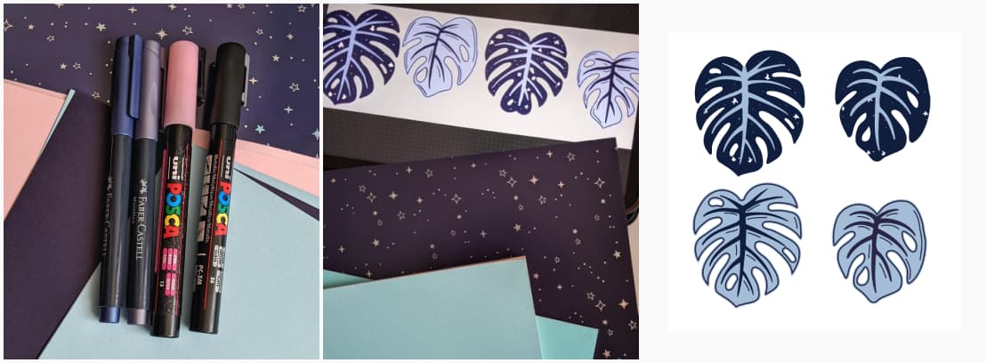
On the craft side: I’m starting a new craft project: space monstera paper plants. You can follow the process in Twitter and Mastodon.
TL;DNR: the one you should not miss
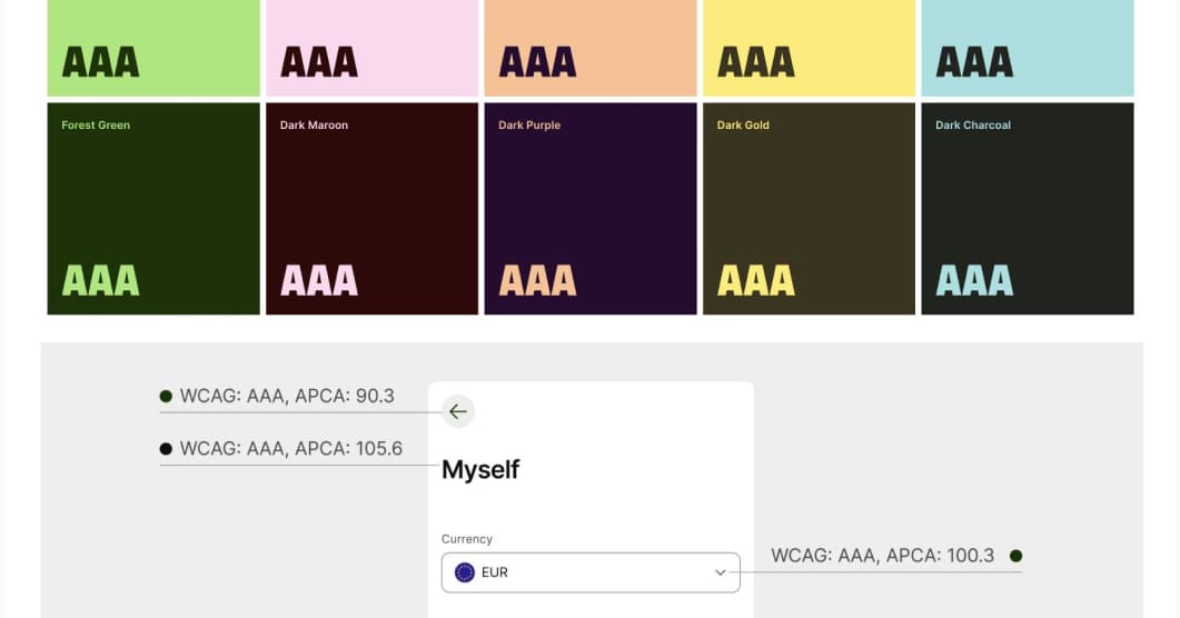
Accessible But Never Boring: Wise rebranding is not only beautiful, but those vibrant color combinations also follow WCAG and APCA color guidelines
Interesting articles that caught my attention this
UX research, design, job interviews, documentation and more:
- UX Research with Children great tips if you need to work with children in your user research studies, and how to deal with their parents as well so that they don’t mess up your research
- 10 Tips to Help you Excel in Your UXR Interview Challenges: nice read if you need help with you job search
- 12 tips that can actually explain how to network when seeking a job. I’m an introvert, so more of an inbound network type, what’s your favorite method?
- A taxonomy for alerts and notifications: is it an Alert, Toast, Callout, Popup, Snackbar, or Notification? Tips on how to design those UI elements that will pop on the screen and give users some information.
- The difference between iteration and prototyping: Prototype to discover. Iterate to release. Roughly, all of this is presented in a nice hill graph.
- How Good Documentation Can Improve Productivity: it helps onboard new colleagues, makes the environment more inclusive for non native speakers, encourages collaboration and enables asynchronous communication
- Have Research Insights Collecting Dust? Here’s How to Activate Them: 8 ideas to activate insights and make real impact with your research + a gdoc ideation workshop template to help you get started (you need to give them your email address in exchange)
- 10 Tips to Help you Excel in Your UXR Interview Challenges: very helpful tips to make sure you excel at your ux researcher job interviews, and, get that job!
A little bit of accessibility:
- How-to: Are you making these five mistakes when writing alt text? all images need an alt attribute, but not all images need alt text.
- Understanding the cost of not being accessible: some math formulas to help you calculate the actual costs of having a non accessible site you need to fix!
Some AI content, because it’s hard not to read anything about it those days:
- What Greek myths can teach us about the dangers of AI – I’m a ancient mythology geek, so this speaks to me a lot
Curiosity cabinet: non design/tech rabbit holes I enjoyed
- Creatures That Don’t Conform, an awesome read on slime mold, how they don’t fit in any categories and what they can teach us about the world
Inspiration: fun experiments, beautiful art and great ideas
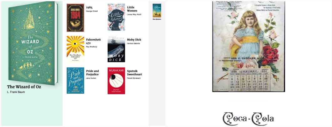
- Demo – Max built a fun demo for container queries, where you can drag and drop the same books in 3 different areas, and they will automagically adapt
- The Coca-Cola logo, the history of the Coca Cola logo, and wow, I love the 1892 one, can we go back to that one?
Useful tools & resources that will save you time
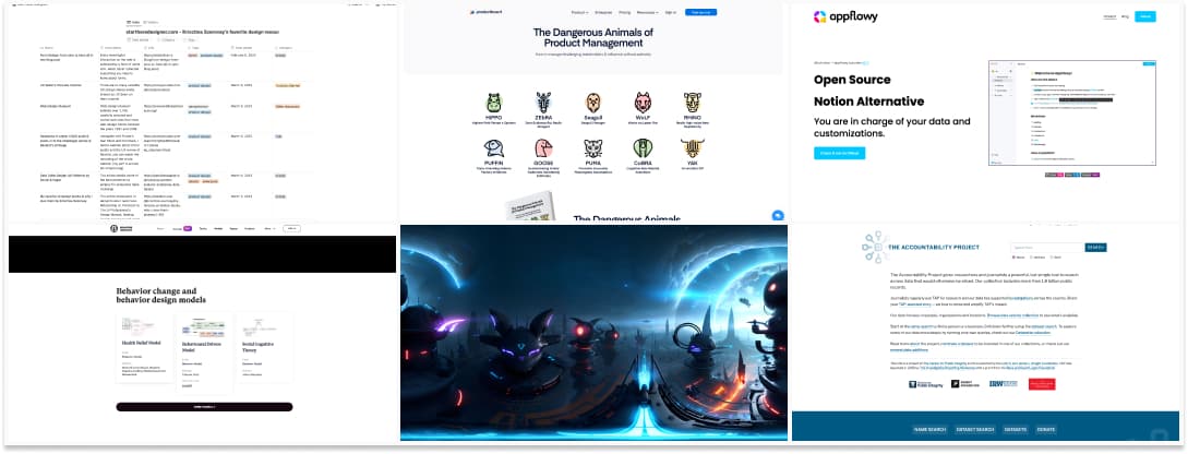
- Startheredesigner.com: Krisztina Szerovay maintain a notion of tools and articles to help you start and grow as a designer
- Behavior Institute: a nice place to learn about behavioral science, tactics and models for behavioral change.
- The Dangerous Animals of Product Management: You know about HiPPO, but what about WoLF, RHiNO, ZerBRA? Product management is a jungle, full of dangerous animals that might put your project at risk. They also have a couple of those on their Youtube Channel.
- Blockade Labs is a 360° image generator, which will, in the not too distant future, be instantly useful in the creation of artwork, games, VR experiences and more, and, I love my sci-fi cats and dragons universe
- appflowy.io: a good tool if you are looking for an open source alternative to notion
- The Accountability Project gives researchers and journalists a powerful, but simple tool to search across data that would otherwise be siloed. Our collection includes more than 1.8 billion public records.
Videos
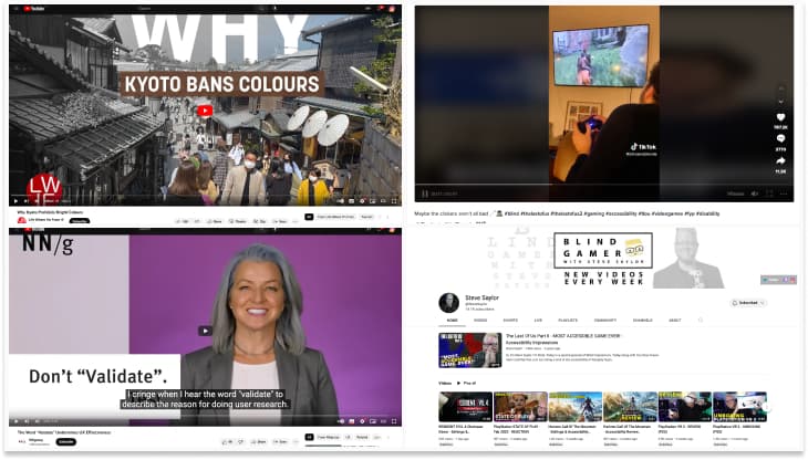
- Why Kyoto Prohibits Bright Colours: a deep dive into the architecture regulation of the city on building heights, outdoor advertisement on buildings, allowed colors, etc. to preserve the historical heritage and consistency
- The Word “Validate” Undermines UX Effectiveness: “research is a catalyst for design iterations, and not just a checklist item to be tolerated “
- Playing the Last of Us 2, as a blind person: yes, please, let’s get rid of the “but blind people don’t play video games” cliché once and for all: if you build an accessible game, they will.
- On the same topic, check Steve Saylor’s youtube channel, another blind person playing video games.
Tutorials
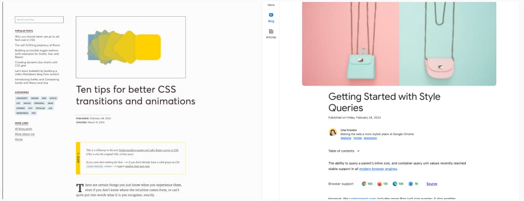
- Ten tips for better CSS transitions and animations: make them shorter, avoid default and use cubic-beziers instead, beware of your easings, don’t forget about delays, etc.
- Getting Started with Style Queries: we can style components based on parent size, but also based on any parent custom property. You can see this as a sort of conditional CSS.
Latest news in the industry
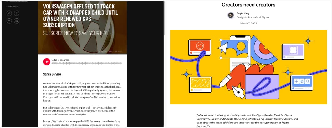
- Volkswagen Refused to Track Car with Kidnapped Child Until Owner Renewed GPS Subscription: what happens when corporate greed trumps user needs in emergency situation? I know it’s hard to predict such situations, but, seriously, at some point, maybe your customer support needs a “in case of emergency” branch in their script?
- Figma is creating a marketplace, to allow creators to sell their templates, plugins, etc. And, they also are building a “creator fund” so that people can keep creating free resources, while still making some money. I love this idea!
