Pixels of the Week – March 23, 2025
UX methods resources, design & office politics and some nice Figma plugins
My curated weekly-ish online newsletter, where I share interesting articles, tools, and resources I found during the week. You can expect content about UX, design, user research, accessibility & tech, but also some processes, some inspiration, sometimes books, and a couple of videos and podcasts. Also, don’t forget to, subscribe to the newsletter to get notified, you will get the weekly links directly in your mailbox, and be notified when I publish other articles.
Now: what I’m currently up to
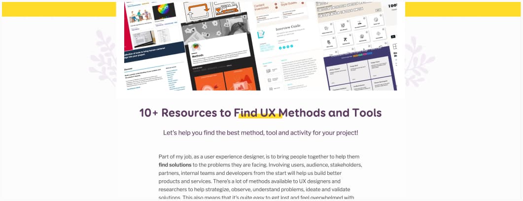
If you are looking for some help, to find the perfect UX method or tool for your project, I got you: 10+ Resources to Find UX Methods and Tools. The article has been updated, with new tools, and backup URLs for the 18F project (that is getting destroyed by Orange guy and Space Karen).
Most popular content this week
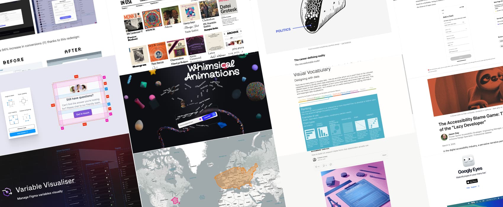
True Size Of… One of the most common criticisms of the Mercator map is that it exaggerates the size of countries nearer the poles (US, Russia, Europe), while downplaying the size of those near the equator (the African Continent). With this tool, you can play around and compare the actual size of countries.
Interesting articles that caught my attention
- The must-have questions for a UX research intake form a little bit of research ops: UX research intake forms, are here to help you gather request for new research for your team. What do you need in them? Context for the request, project name, research goals, background, important dates, name and contact. You could also consider adding extra useful information (such as user details, a place for stakeholder to upload files, success criteria, etc.) and some context-dependent extra information (like research methods, assumptions, desired deliverables, etc.). By Thomas Stokes
- When Technology Becomes the Problem what happens when businesses push tech without understanding people’s needs? Dr Maria Panagiotidi shares her experience with a desert place, that forced customers through a horrible journey, involving a QR code, downloading an app, just to order, without the option to even pay in the app in the end. This raises a couple issues, from ageing population who struggled with the lack of alternative option, accessibility problems, and the lost of human connection, something people expect in small cafés.
- My weirdest A/B test blew everyone’s mind (8min) People are curious, which would explain why, having a blurred background with a sneak peek of the future app behind the sign-up form has increased sign up rate. Critical thinking time: while sign up rate is a nice metric, I would also be super interested in retention rate with those, and also churn rate, and, an in case of freemium products, actual conversion rates (aka how many people converted from a free signed up account to a paying one). Taking only one metric in a vacuum doesn’t really tell us a full story. By Tom Orbach
- Office politics: the skill they never taught us (5min) Good design is not enough. If you want your work to ship, you need to understand how decisions are made, who has influence, and how to navigate workplace dynamics. Escaping politics isn’t an option. Yet, office politics is a skill that is rarely taught to design students. So, here are a couple of pointers: build relationships, communicate with clarity, and align your work with business goals. This is what separates good designers from those who make an impact. by Pascal Potvin
- Less Effort, More Completion: The EAS Framework for Simplifying Forms (11min) EAS stands for Eliminate, Automate, Simplify. To make forms easier to fill, and have users do less, you must eliminate first: remove non-essential, non-urgent or irrelevant questions use conditional logic to avoid asking useless tings, etc. Then Automate where possible to minimize manual input by re-using existing data, infer data instead of asking, etc.. And, Simplify what is remaining, with helpful defaults, alternatives, help for formatting, using mobile input types, etc. By Huei-Hsin Wang
- The Accessibility Blame Game: The Fallacy of the “Lazy Developer” (10min) it’s easy to blame the person at the end of the agile process chain (aka the developer), but, inaccessibility is a systemic problem, and everyone is responsible. Product managers should provide explicit accessible requirements. Designers should provide comprehensive design documentation. Accessibility testing should be part of the definition of done. Everyone should be trained, and leadership needs to emphasize the importance of accessibility. It’s a team effort! By Jason Day
Inspiration: fun experiments, beautiful art, and great ideas
- Fonts In Use some inspiration to discover usage of different fonts, in context, for print, digital, posters and more
- Whimsycal Animations some fun procrastination with Josh W. Comeau’s new animation course landing page. You can move things around, remove content, destroy layout with the bomb, and a couple of other fun Easter eggs I’ll let you discover. And, he respects the reduced motion preference, in case you just want to subscribe, without all the animations distracting you. Love it!
Useful tools & resources
- Googly Eyes Mac app: do we need googly eyes following our mouse in our macbook menu bar? Nope. Do we want it? Maybe…
- HMRC’s Virtual Empathy Hub: a set of accessibility personas, to help build empathy. Each has an introduction of the persona, and a training task simulation. While a simulation is never a true representation of an impairment, it’s an interesting tool to demonstrate issues people might face when using a website. For more persona, you can also check the GDS Understanding disabilities and impairments: user profiles. I really like the “making things work for” part, that helps you understand better how to improve websites and digital products.
- DesignDoc [Spectral] a Figma that helps to visualize the spacing, margins, padding, and measurements of components. This can be nice if your developers don’t have a dev account.
- Visual Vocabulary a visual tool, to help you pick the right data visualisation for your dataset, depending on what you want to do / show: deviation, correlation, change over time, ranking, etc.
- Variable Visualizer if your variables get hard to manage, that Figma plugin might be helpful. It lets you visualise your variables relationships into a map, on an infinite canvas. You can filter them, but also group, create collections and more.
- TypeBalance a Figma plugin that uses machine learning to help you find the perfect ltter-spacing and line-height
Tutorials
Cool native HTML elements you should already be using: dialog, details, summary, native range inputs, progress, datalist, kbd and figcaption. For optgroup I would be careful because I remember there are still accessibility issues, with many screen readers not supporting it properly (check the support for optgroup on accessibility support from 2 years ago and more tests from Adrian Roselli in 2024)