Pixels of the Week – March 26, 2023
Space Monstera, user interview workshop, iOS navigation pattern and UX strategy
On Twitter, LinkedIn, and Mastodon, I share curated articles I read, resources and tools about UX Design, User Research, UI and mobile design, HTML, CSS, the web industry, some processes, some inspiration, etc. This is an archive of everything I shared this week. And some extra links that I decided to only share for the blog readers. Also, subscribe to the newsletter to get notified when those are published!
Now: what I’m currently up to
User Interviews: a workshop and a small tip
 I’ve partnered up with Condens to bring you a “Introduction to User Interviews” workshop, on April 17th 6:30 pm CET OR on April 21st 2 pm CET. During the workshop, we will use my interview cards to build better interview guides. It’s a 2,5 hours workshop, with 2 hours of learning and practice and 30min of Q and A at the end. The number of spots is limited so you need to contact Condens directly. All the information is in the meetup description.
Fun interview tip today: silence is powerful, it gives the participant time to think. But, silence is hard. Humans do not like silence. If you struggle with this, my fun advice: count in your head, the same way you count when lightening strikes: 1 Mississippi, 2 Mississippis… up to 5 Mississippis. Eventually, you will get more comfortable with silence. I made a small visual to illustrate that. For more interview tips, check My expert guide to user interviews.
The space monstera paper plants!

I finished the space monstera paper plant project. You might remember I already had a prototype. This weekend I finished cutting the papers (check the Instagram video). The space paper is from HEMA. I had big plants, but I also decided to cut smaller ones and turned them into earrings. And since I love a good challenge, well, I decided to add iridescent PVC in the middle. I found some 0.7mm sheets and some very slim 0.2mm (the ones used to embellish flower bouquets. Cutting the 0.7m was not easy. I got a 2mm manual blade and found a tutorial where the Alexis explains how to cut shrink plastic with multiple passes at different bland depths.
I ended up with bigger bland depth than her (like 8, 12, 15 and even 18) on the manual blade, but managed to cut the PVC. And, I made earrings with this technique (check the video on Instagram and Twitter). The actual big paper plants use the 0.1mm plastic so it was easier to cut. You can find the final results on Twitter and Instagram.
Interesting frameworks and concepts
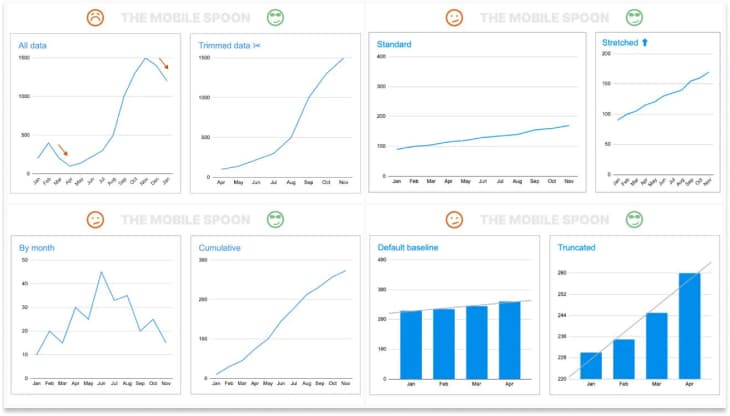
Same data, different stories: How to manipulate the graphs to support your narrative: think critically when you see graphs, don’t just check the conclusion, think critically when you see graphs, don’t just check the conclusion, ask questions about cohorts, dates, if it was filtered, etc.
TL; DNR: the one you should not miss
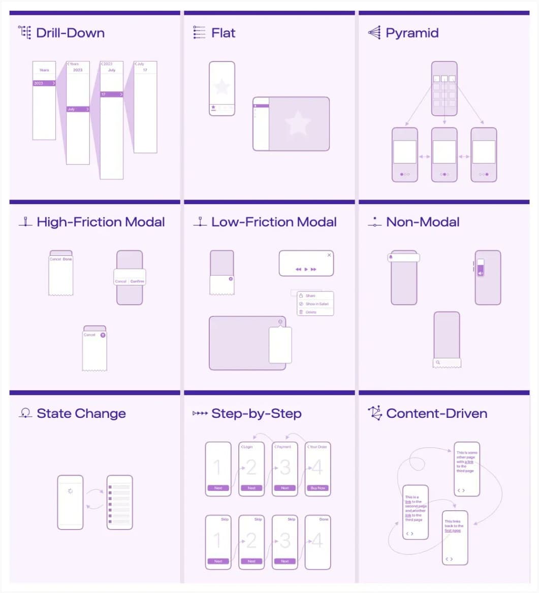
Modern iOS Navigation Patterns: a nice overview of the different way you can structure navigation on iOS, using drill-downs, modals, sequences and more.
Interesting articles that caught my attention
Some UX design and research, information architecture articles:
- How to Present Research Insights to Executives with Ease: some tips to help you present your user research for maximum impact with your stakeholders
- How (and Why) to Conduct a Heuristic Evaluation: a quick guide on heuristic evaluations for when you can’t talk to users directly
- UX office politics explained: example of why your designs can’t get validation, especially when you work on enterprise systems, and how to navigate the sometimes complex politics around it. This sums up, a lot of things I wish I knew when I started working in enterprise UX. By Bas Wallet.
- Mistakes organizations make in regards to UX Research, according to David Hamill: some “democratizing UX” truth bombs, and why you can’t just let any untrained person do user research.
- The UX Strategy: a collection of links to our articles and videos about UX visioning and strategy.
- What is the return on investing in information architecture? a longer article by Abby Covert to help you understand how information architecture can help build better products
A little bit of critical thinking
- Time to Get rid of the Imposter Syndrome concept? Critics, and even the idea’s originators, question its value. It focussed on things such as family dynamics and gender socialization rather than on systemic racism and other legacies of inequality.
- The problem with Don Norman’s new book; it’s time we start getting critical about our design heroes, especially when they are privileged people. On related topics, you might also want to check That unpleasant job posting from Nielsen Norman Group and Wilkinson | The “Tender Technicians” of Nielsen Norman Group Videos. While we can still acknowledge that NNGroup has some great resources, we also we need to be aware of some of the issues described on those articles.
Some front-end articles:
- 6 CSS snippets every front-end developer should know in 2023: container queries, CSS scroll snap, grid pile, CSS circles, @layer variants, logical properties.
- The End of Front-End Development: Will AI tools replace Front-End Developers? No, they will evolve and use those tools as part of the job. And I think it will be the same in UX.
A little bit of accessibility and inclusive design:
- Foundations: pointer gestures: an introduction to the different forms of pointer gestures (single-pointer, multi-point, path based, dragging), how and when to provide alternatives for people who can’t perform them.
- It’s about time CAPTCHAS become accessible: how annoying and frustrating it can be for users to fill captchas and different solutions tested
- How to support your disabled colleagues some interesting advice to help us make more accessible workplaces by supporting our disabled colleagues
- What it’s really like to be openly disabled in an interview process: Mal needed accommodations for her job interview due to autism and ended up being asked to prove her disabilities by getting a doctor to fill a $100 form. Very not inclusive recruitment process!
Curiosity cabinet: non-design/tech rabbit holes I enjoyed
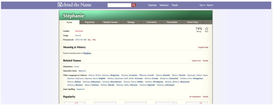
Behind the Name, the etymology, and the history of first names. Apparently, mine is considered refined but also strange and nerdy. I’m okay with that.
Inspiration: fun experiments, beautiful art, and great ideas
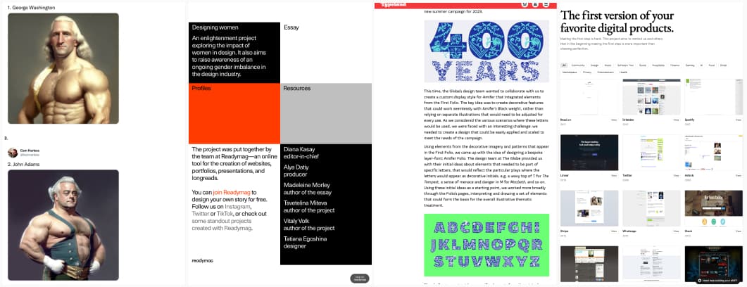
- Using AI, Artist Creates Portraits Of U.S. Presidents As Professional Wrestlers (46 Pics), because, well, why not?
- Designing women: an enlightenment project exploring the impact of women in design. It also aims to raise awareness of an ongoing gender imbalance in the design industry.
- Amifer Folio: bespoke font for Shakespeare’s Globe is simply gorgeous!
- The first version of your favorite digital products: it’s nice and humbling to see the first steps of projects who became successful today, and see how they evolved since.
Useful tools & resources that will save you time
- UX Research Templates: an awesome resource compiled by Odette Jansen that you can use for your workshops, setting up research plans, methods, and outcomes.
- macOS Cursors: a place to get all the mac cursors you need for your designs, with their CSS code (if available) and the option to download them as SVG and PNGs
- Edit Photo: a free online photo editor in the browser, you can crop, add filters, change frames, resize, etc.
- Shapes: a collection of 120+ basic SVG shapes you can copy and paste. I think some would make cute stamps for my Procreate kawaii drawings.
- Modern Font Stacks: a list of system fonts you can use for the web, as in “fonts available on most people’s devices”. This brings me back to the “websafe font” area before we had font-face. Cufon anyone?
- Not By AI: some badges to show the world that your content was not generated by AI. I strangely understand the need for those, in the AI soup, finding genuine content will get harder and harder
- Mobile Journalism Manual: Storytelling, Data Journalism & Online Investigation – learn the basics of modern journalistic work with this new, immersive manual.
- MadNotes App: a light minimalistic markdown notepad and I really like the neon blue design of its site
Videos
Tutorials
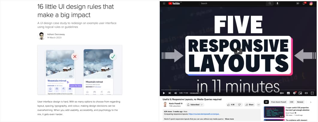
- 16 little UI design rules that make a big impact: some rules on spacing (gestalt), consistency, visual hierarchy, accessibility, typography, text alignment to bring your UI to the next level!
- Useful & Responsive Layouts, no Media Queries required: Kevin explains how to use intrinsic design, aka using the browser behavior to build responsive layouts without media queries
Latest news in the industry
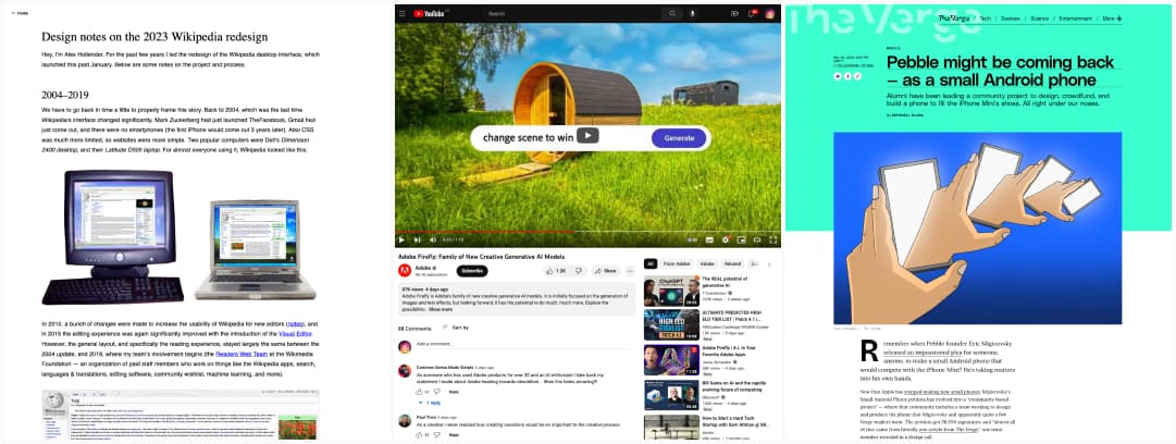
- Design notes on the 2023 Wikipedia redesign: I like the new design because it has a fixed with on the content now, it’s easier to read on a big screen. I know some developers who used Wikipedia as an example of “but look, the content takes the whole browser it’s awesome” will be sad though.
- Adobe Firefly: Family of New Creative Generative AI Models: Adobe’s new toy is indeed very impressive. I’m curious about real usage outside of the perfect demo videos though
- Pebble might be coming back — as a small Android phone I need to change my Pixel3 (still working but it doesn’t get updates). I’m desperate for a “small” affordable phone. I have “no pocket” problem + small hands. I hate how big the phones became. This is an good news, maybe I will wait for this one.
