Pixels of the Week – March 3, 2024
Figma keyboard shortcut game, Barbaras Rhabarberbar & WTF is going on with UX job market
My curated weekly-ish online newsletter, where I share interesting articles, tools, and resources I found during the week. You can expect content about UX, design, user research, accessibility & tech, but also some processes, some inspiration, sometimes books, and a couple of videos and podcasts. Also, don’t forget to, subscribe to the newsletter to get notified, you will get the weekly links directly in your mailbox, and be notified when I publish other articles.
Now: what I’m currently up to
I’ve asked chatGPT to evangelize UX with the vice and tone of RuPaul and honey this is fabulous. There are also a lot of things going on behind the scene at the moment. I’m basically preparing a very busy month of April, with workshops, meetups and all the fun. I’ve been recording teasers for some of them this week. It’s honestly been a challenge, since my neighbor is renovating, and the drilling noise is starting to get the best of my mental health and patience. I’m also teaching mobile UX again in March for Master Caweb, which means, a new cohort of students. Looking forward to this!
Most popular content this week
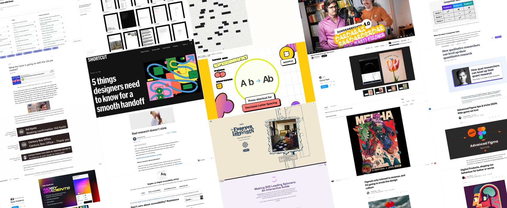
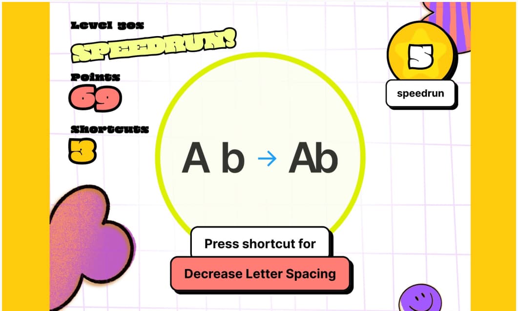
Figma Master Test your Figma keyboard shortcut knowledge with this fun Figma prototype game. Honestly, I’m bad at this. But, I discovered quite a few shortcuts while playing.
Interesting articles that caught my attention
UX Research
- Bad research doesn’t stink (8min) Carl Pearson, PhD explains that the problem with democratization is that bad research can be hard to detect, because outputs can look good on the surface. This leads to poor product decisions. To address this, he proposes we focus on measuring impact more effectively, aka the outcome of research. This will help teams assess if democratization is working for them or not.
- How qualitative researchers can level up their quantitative research (10min) Brad Orego explains why caring about quantitative research makes you a better researcher and teammate, and where you can start learning the basics (data type, measure of central tendency, graph types, etc.) and dig further into product analytics, multivariate testing and more.
Product design
- Figma’s only interest is revenue, and it’s going to erode the design culture (3min) I get Roman Roan’s feeling here, but, to be fair, capitalism, so, is it that surprising? My frustration is prototyping. As a UX researcher, I would love for them to focus on having a solid prototyping feature instead of adding some AI tools in the mix. I’m amazed that a design tool, that is in the browser, doesn’t have real HTML form elements (yeah, like Axure) for example. Just, give me an input type text so I don’t have to create a giant complex component to simulate a keyboard on mobile? That would make prototyping so powerful. But, I guess UX researchers who need advanced prototypes are not the core audience? You can continue the discussion on LinkedIn and Mastodon
- Comparison Tables for Products, Services, and Features (15min) if you ever need to design a comparison table, Kate Moran and Taylor Dykes from NN/group wrote a giant study on comparison tables and how to design them, what to compare, etc.
- 5 Things Designers Need to Know for a Smooth Handoff (9min) Lauren Andres shares her tips to help with design hand off. Things like what to annotate, how to adopt a shared language, how to organize your files, and more.
- Names are complex: Displaying initials for an avatar component in a design system (22min) you know how, as a designer, you just put 2 letters in a circle when there’s no avatar and you are done? Well, there’s a lot going on into coding this. I love how geeky this article becomes and all the questions developers have to answer to make this work, including assumptions about what even are initials and what is a name in the first place. Like: what happens if the name has more than 2 words, or if users use non-Latin characters? What about hyphens in names? By Georgie Celestine Cooke
- The Ethical Designer’s Handbook On Dark Patterns (note: those were renamed deceptive patterns by their author) Are you familiar with misdirection, forced continuity, a roach motel, or a confirmshaming? Those are deceptive patterns used by some websites to trick people into doing something. They impact users on a psychological level, on top of being often very unethical practices. Jan Nikka A. Estefani helps you navigate what they are, how they impact user trust, and our responsibility as designers around such topics. They might work as a short term quick wins, but they can impact loyalty and user trust in the long run.
- Digital Products, shaping our behaviour for better or worse (18min) from positive impacts fostering healthier habits to negative consequences inducing addictive behaviors, examples of how products (like Strava, Duolingo Noom, etc.) try to change our behaviors
Accessibility
Don’t care about accessibility? Resistance is futile! Bogdan Cerovac reflects on his own journey into accessibility, from ignorance to advocacy (to be fair, mine was similar). He argues that ignoring accessibility is pointless, as it will become increasingly important and integrated into various sectors, especially with new laws in Europe. I hope he’s right.
Curiosity cabinet: non-design/tech rabbit holes I enjoyed
Inspiration: fun experiments, beautiful art, and great ideas
- ❌❤️ Cross My Heart a fun browser game where your heart needs to cross to the top (using keyboard navigation)
- The Forever Labyrinth: a art-filled question through time and space, with an amazing art direction. The game might take many hours but you can save your progress. Also, it plays sound.
- The Superb Dystopian Illustrations by Mad Kobra » I love those, the colors are amazing, the composition, everything.
- Dive Below the Surface with the Stunning Images of the 2024 Underwater Photographer of the Year
Useful tools & resources
- Dead Simple Sites: a curated collection of minimalist websites on the web for your inspiration. No overly animated content. No scroll jacking. No excessive storytelling. I really like that idea, I’m getting tired of overstimulating sites and portfolios that use all the technologies in the book.
- Navbar Gallery: a place to find navigation inspiration from static ones all the way to dropdowns, mega menus, progress bars, sidebars and more.
- Noisy Gradients: a Figma plugin to create gradient colorful backgrounds. You can also add some noise to it, and export it to SVG and PNG.
- Made with Sora a gallery of videos created with Sora,OpenAI’s text to video new tool. Some are okay-ish, so are honestly quite uncanny, and trigger motion sickness for me.
- Psychology for UX: Study Guide NN/group put a giant list of all their content about psychology in one article, a great place to start learning about some principles of human psychology and how they relate to UX design.
- CMDExplorer a small command line cheatsheet with a search function
- Curve Text: a Figma plugin to write text along a custom curve (like in Illustrator)
Interesting Videos and Podcast
- What the heck is going on with the UX job market? Let’s face it: the (US) UX job market has been quite depressing. I know lots of people are, currently, seeking a job right now, and I think you could benefit from this podcast. Amy has done an interesting analysis and came to the conclusion that landing a job is taking way longer than it used to. So, no, it’s not just you. You might be doing everything right, and yet, be struggling. She also gives some advice to help you navigate the whole, let’s face it, giant mess. Also available in an article version.
- Peter merholz state of the design nation: It’s been fun and very enlightening to listen to Peter Merholz and Andy Polaine talk about enterprise UX a couple of years ago. I think it’s the first time I hear someone talk about business analysts, I feel less alone, yeah! Also, yes, design being “good enough”, about how easy it is to make mediocre things. I’m also super happy to be able to change things, a bit, within different companies. But, for sure, it takes time. They also touch an interesting point: schools teach designers how to work in agencies. Which can be a problem on its own. Since they are not equipped for the reality of some places, they might work later. Anyway, I’m not going to summarize the whole thing, go listen to it, especially if you work in enterprise UX and want to feel, a little less alone.
Tutorials
- Making SVG Loading Spinners: An Interactive Guide a very comprehensive and interactive tutorial that teaches you how to build a cute little SVG spinner.
- Advanced Figma tips & tricks 2024: little gems we love: Christine Vallaure put together 22 tips and tricks to take your Figma technical skills to the next level and save tones of time while designing. There’s also a 8min YouTube video.
Latest news in the industry
- Apple has a warning: Don’t put your iPhone in rice if it gets wet: snap I wasn’t aware, was I living under a rock? Also, this is why I chose mostly waterproof electronics. You have no idea how often my earplugs ended up in some puddle in the street, and, in my coffee 🤦
- Laid Off Guy Hides Undetected in Company Slack my kind of chaos!!
