Pixels of the Week – March 31, 2024
A designer’s role is NOT at the table, domino game & UX research calendar
My curated weekly-ish online newsletter, where I share interesting articles, tools, and resources I found during the week. You can expect content about UX, design, user research, accessibility & tech, but also some processes, some inspiration, sometimes books, and a couple of videos and podcasts. Also, don’t forget to, subscribe to the newsletter to get notified, you will get the weekly links directly in your mailbox, and be notified when I publish other articles.
Now: what I’m currently up to
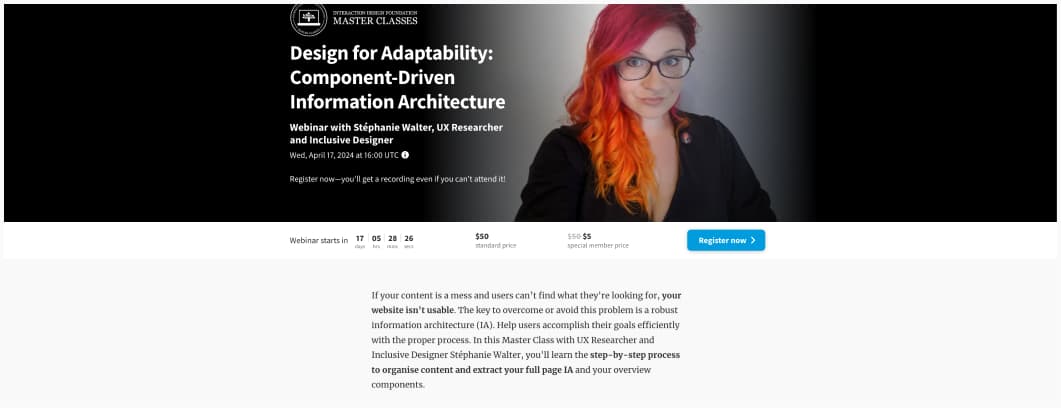
I’m happy to announce I will be running my Design for Adaptability: Component-Driven Information Architecture Masterclass, on Wed, April 17, 2024 at 16:00 UTC with Interaction Design Foundation. We’ll be talking about information architecture, and how to build re-usable components out of a content model. This should help you save precious time, before jumping into any design tool.
Most popular content this week
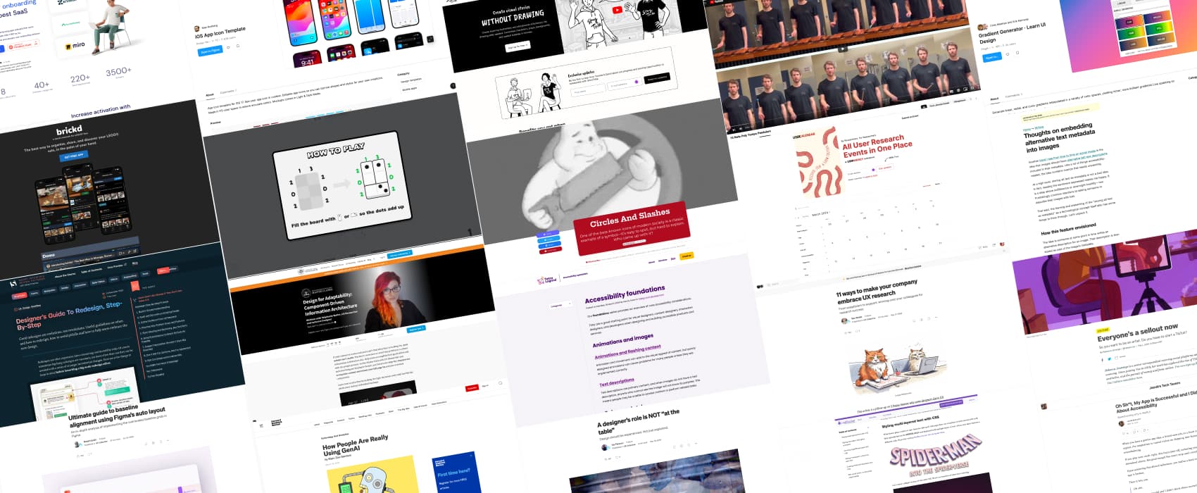
A designer’s role is NOT “at the table” (7min) Designers often struggle to explain their job and role to stakeholders (or their own parents), which leads to business leader failing to understand design leadership. Ida Persson argues that, instead of getting a seat at the table, designers should instead emphasize their role in the field, advocate for users and be actively involved in the creation process. What if, next time someone asks you what you do as a designer, you say “join me and I’ll show you”? I really like this approach. It’s not easy to put in place everywhere. But I’m a big advocate of “designing in the open”, let people see the process, how the “magic” is done.
Interesting articles that caught my attention
UX research and design
- Designer’s Guide To Redesign, Step-By-Step – Smart Interface Design Patterns (7min) Good redesigns are evolutions, not revolutions. Useful guidelines on when and how to redesign, how to avoid pitfalls and how to help users embrace the new design. By Vitaly Friedman
- 11 ways to make your company embrace UX research (10min) a good reminder that UX in not bogus, but, if you want people to care about it, you need to put in some work: show don’t tell, invite colleagues as observers, speak the language of stakeholders, showcase tangible benefits, etc.
- Why Researchers Need to Be Marketers (and Vice Versa) (17min) Researchers do Research (capital R) while marketing like to think they do research (survey, A/B test, etc.). But marketers also learned how to promote their efforts and tie their work to the business, a field where researchers might struggle sometimes. We often expect marketing and researchers to be enemies. But they have more in common than what we think. So, they could learn from each other to get better results and organization buy-ins.
Accessibility
- Accessibility foundations if you are new to accessibility and you don’t know where to start, Tetralogical built this foundation series of articles that provide you overviews on core considerations.
- Thoughts on embedding alternative text metadata into images (16min) Eric Bailey explains why, even if it sounds like a good technical solution, embedding alternative text into meta data images isn’t going to work. Context matters: people whose an image for a specific purpose, and you can’t predict this. It will also get misused, let’s face it: spam, hate, exploits and malware. It won’t work for localization, yes, not everyone speaks English. And, it would be a technical coordination mess. There’s interesting things happening about AI though, but here, again, it’s not perfect, so consider a hybrid approach with a human to double check. So, yeah, time to stop with the technoableism and solutioneering. Alternate text is for people, and people are not a problem to be solved!
- How People Are Really Using GenAI (10min, might have paywall). There are many use cases for generative AI, spanning a vast number of areas of domestic and work life. Looking through thousands of comments on sites such as Reddit and Quora, they author identified 100 categories of AI usage, that can be divided into six top-level themes: Technical Assistance & Troubleshooting (23%), Content Creation & Editing (22%), Personal & Professional Support (17%), Learning & Education (15%), Creativity & Recreation (13%), Research, Analysis & Decision Making (10%)
The other interesting ones
- The No Symbol: The History Of The Red Circle-Slash (22min) I love such deep “geeking out on the history of a symbol” kind of articles. And folks, the history of the circle-slash to say “no something” is not as obvious as you might think. But, it has something to do with road signs and the need to make things easily understandable in Europe, even when people don’t speak the same languages from one country to the other.
- Everyone’s a sellout now (23min) the pressure today’s artists to market themselves is huge. They need to already have a big community, to even hope to sign a book deal or a with a music record company. Having to do personal branding and self-promotion is exhausting, but it also often detracts them from their actual creative work. What a mess of capitalism at its worse.
Curiosity cabinet: non-design/tech rabbit holes I enjoyed
15 Note Poly Tempo Pendulum: a 5min video of 15 different notes played at 0.2 bpm diffrences, I’m still trying to decide if I find this fun or very annoying, but, it’s, at least, quite interesting.
Inspiration: fun experiments, beautiful art, and great ideas
Domino Fit Do you like puzzles and math? You are going to love procrastinating on this little Domino fit game
Useful tools & resources
- The UX Research Calendar a place to find (and submit) UX research events all around the world and remote. It accepts free and public events, and you can submit in guest, no account needed. Created by Jan Ahrend
- brickd a social media network, for LEGO fans, were you can organize, share, and discover LEGO sets
- iOS App Icon Template: a figma App icon template for iOS 17
- StoryTribe a tool to create short visual storyboards with read to use characters
- Gradient Generator a Figma gradient generator that lets you use LCH and OKLCH colors, yielding richer, more brilliant gradients.
- Onboarding Study a place to find inspiration for onboarding process, from 220+ SaaS applications, including 3500+ screenshot examples.
Tutorials
- 5 ways to style text with CSS inspired by the Spider-verse I loved the visuals in that movie, this is soo cool, my favorite is the CSS glitch animation (but it’s a little bit motion triggering)
- Oh Sh*t, My App is Successful and I Didn’t Think About Accessibility (22min) a very detailed tutorial of all the small things you can correct, if you built and app in SwiftUI, didn’t make it accessible when you launched, and want to correct this now (you should)
- Ultimate guide to baseline alignment using Figma’s auto layout (10min) An in-depth analysis of implementing the overlooked baseline grids in Figma
- 23 Prototyping Resources to Bookmark Right Now a list of mostly figma videos tutorials to help you improve your prototyping skills. And a couple of figma files.
