Pixels of the Week – March 8, 2020
Every week I share a list of curated articles, resources and tools about UX, UI and mobile design, HTML, CSS, the web industry, process inspiration and more…
This week’s selection: stop using material design text fields, CSS fixed header and slide out tutorials, deciding between modal vs page, CSS selectors explanation tool, UX workshop activities, more ethical design patterns, 5 visual design principles, testing other people’s sites, designing for edge cases, etc.
#Now – what I’m up to
This Friday I gave a 8 hours introduction to mobile UX to 15 people in Brussels. We went from user interviews to building user journeys, user flows, ideation, paper prototype and user testing. I thought them about mobile usability best practises, information architecture, content strategy. It was a dense but really great day.
TL;DNR the one you should not miss
#Forms
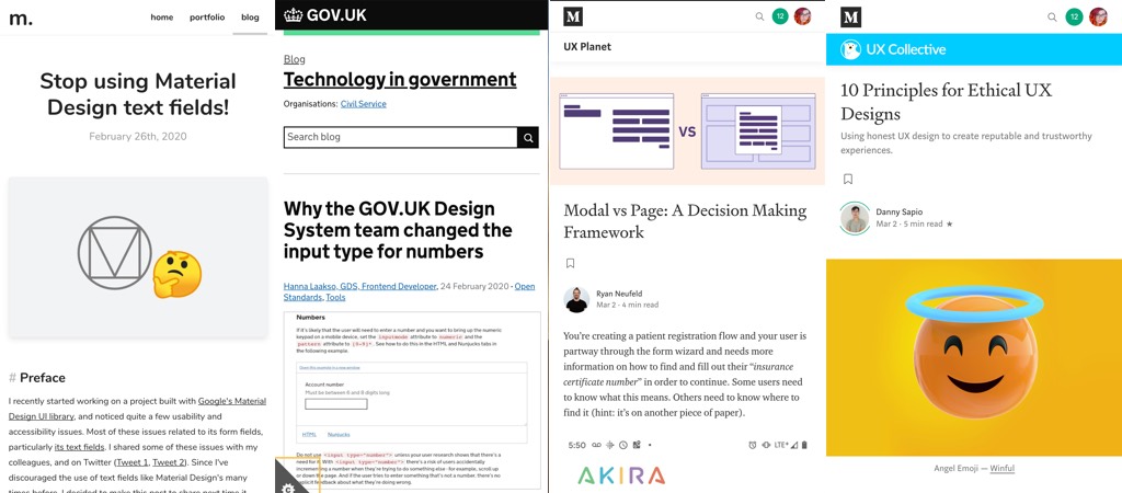
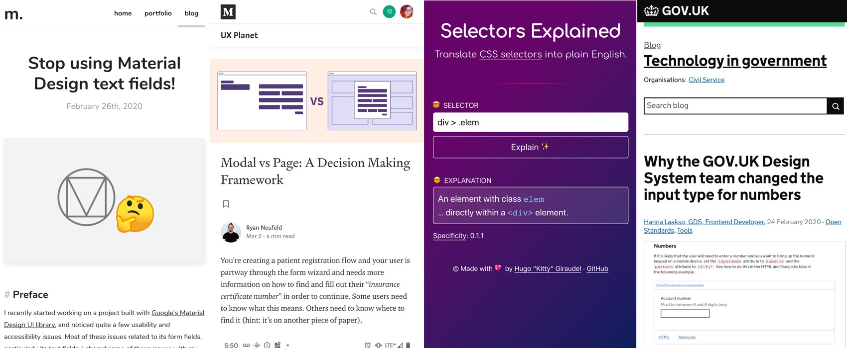
“Stop using Material Design text fields!” By Matsuko Friedland, YES YES and YES.
May I add
- The inconsistency gets worse then you have selects with inputs
- As soon as you want to icons (errors, tooltips) again you are quite limited with floating labels
- They might look nice on mobile with a few fields but try to build a complex dashboard with a lot of data to input and you will quickly see that labels into fields becomes a usability nightmare
For those saying “stop using material design”, I think it’s not that simple. Many projects now start with a Material UI react or angular base. Stop using material design either means create your own components (and hire designers to design them) or switch to another UI framework. Don’t get me wrong, as a design I would LOVE to not have all the contraints of those Framework, but I’m pragmatic and see how much time/money they help gain. Plus not all teams are ready/have the budget to get a designer.
So it’s not that easy to say “don’t use it”.
Interesting article
#UI
- “Modal vs Page: A Decision Making Framework” good summary of the different flavors (modal, lightbox, etc.) and how to decide what you need to avoid putting whole pages into modals
- “Stop Using ‘Drop-down” there’s plenty of other components with names, use the right name, yes yes, please.
#UXDesign
- Let’s put bring goodness and more ethical design patterns back into the interface world: “10 Principles for Ethical UX Designs” (am I too naive to think we can still do it?)
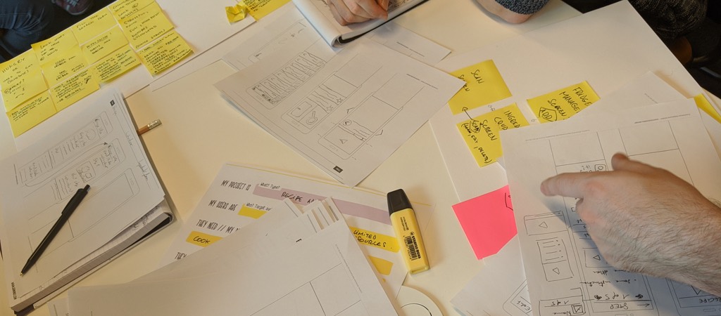
- Foundational UX Workshop Activities: There are 7 activities that act as a foundation for every UX exercise during a workshop or collaborative team meeting. By understanding these, you can create almost any other exercise you need.
- “Livin’ on the edge: how to design for edge cases early in the process” the interesting Temporal and Functional context framework: Temporary → Permanent vs Core Experience → Assistive Experience
- “Why you should test other people’s sites before your own” when you testing an idea but don’t have time to invest in prototype, as an exercice for beginners UX designers, as icebreaker before testing your site, etc .
#Content Hierarchy
5 Principles of Visual-Design in UX: The principles of scale, visual hierarchy, balance, contrast, and Gestalt not only create beautiful designs, but also increase usability when applied correctly
#HTML
“Why the GOV.UK Design System team changed the input type for numbers” what are the problems with input type = number and why they switched to <input type=”text” inputmode=”numeric” pattern=”[0-9]*”>
#CSS
“Why is CSS Frustrating?” One of the main reasons is because CSS forces you to face the webishness of the web, the responsiveness. Great read to start the week
#Sexism
Nevertheless, Ali Coded – Ali Spittel published a few screenshots of all the shitty messages she got this year from the web community. Welcome to women in tech 101s
#Accessibility
“More accessible defaults, please!” Browsers still have a lot to do to make some default HTML elements accessible. It’s a collective effort!
Inspiration, fun experiments and great ideas
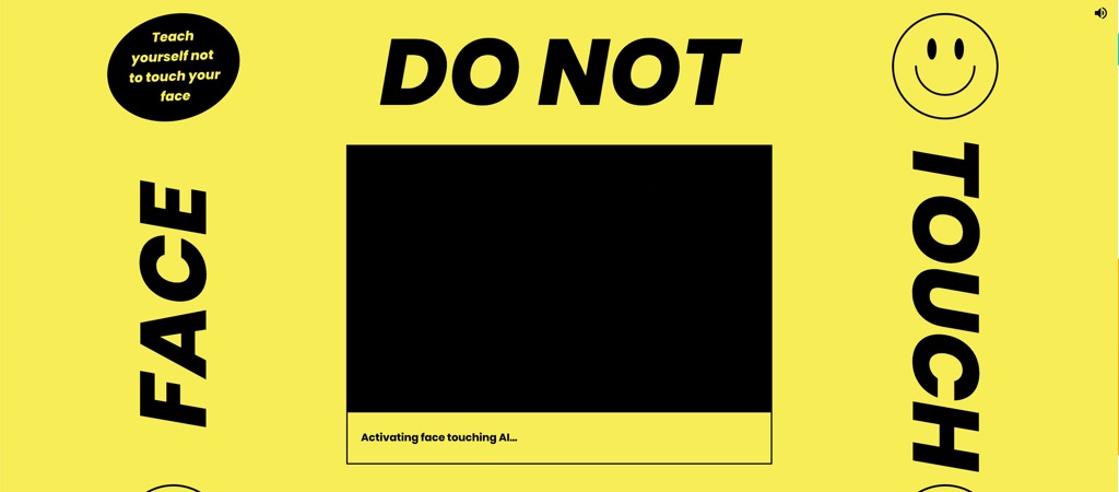
Do Not Touch Your Face, a fun experience with machine learning and camera (not working on mobile)
Tutorials
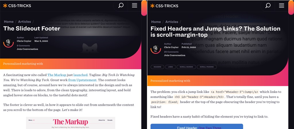
- “The Slideout Footer” this is a cool little trick and the visual effects is quite nice!
- “Fixed Headers and Jump Links? The Solution is scroll-margin-top” oh yes we needed that one for a very long time!!!
Useful tools and plugins that will make your life easy
#CSS
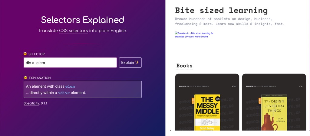
Selectors Explained – a nice cool tool by Hugo “Kitty”Giraudel to translate CSS selectors into plain English.
#Learning
Booklets.io – Bite Sized Learning: you can browse small “booklets” which are like “reading cards” on specific topics, books, etc. I like this small digestable format then if you are interested in one topic you dig more!
#Conferences #Virus
“Is it canceled yet?” A site to let you know if a lot of big conferences are cancelled yet. Hahah the Pacific Rim reference in here
#Design Systems
