Pixels of the Week – May 17, 2020
Every week I share a list of curated articles, resources and tools about UX, UI and mobile design, HTML, CSS, the web industry, process inspiration and more…
This week’s selection: remote usability testing, cognitive biases, UX job title red flags, complex table design, a few things you need to know about Maslow’s pyramid of needs, modern solutions to old CSS problems, Do Norman on 21st century design, a nice “a single div” project, design system sites sections, UX methods map, a cool tool to build custom illustrations, fun and nice conf call backgrounds, etc.
#Now – what I’m up to
Thursday Laurence Vagner and I spoke at our first “online meetup”, UX in Lux virtually went to Zurich. It was a great event, we had about 48 people at some point. We spoke about cognitive biases and presented our deck of 52 UX cognitive biases cards.
The slides are available here:
Also if you speak French
- I will be online next Wednesday to talk about co-creation with my colleague Steven. It’s in French though.
- The video of my talk on mobile capabilities in French is available: Optimiser l’expérience utilisateur grâce aux capacités des navigateurs mobiles
TL;DNR the one you should not miss
#CSS
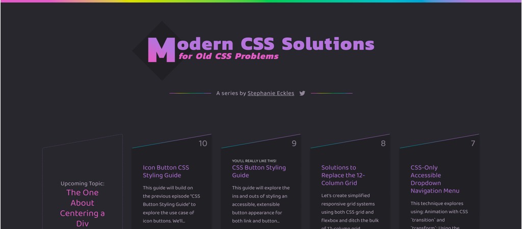
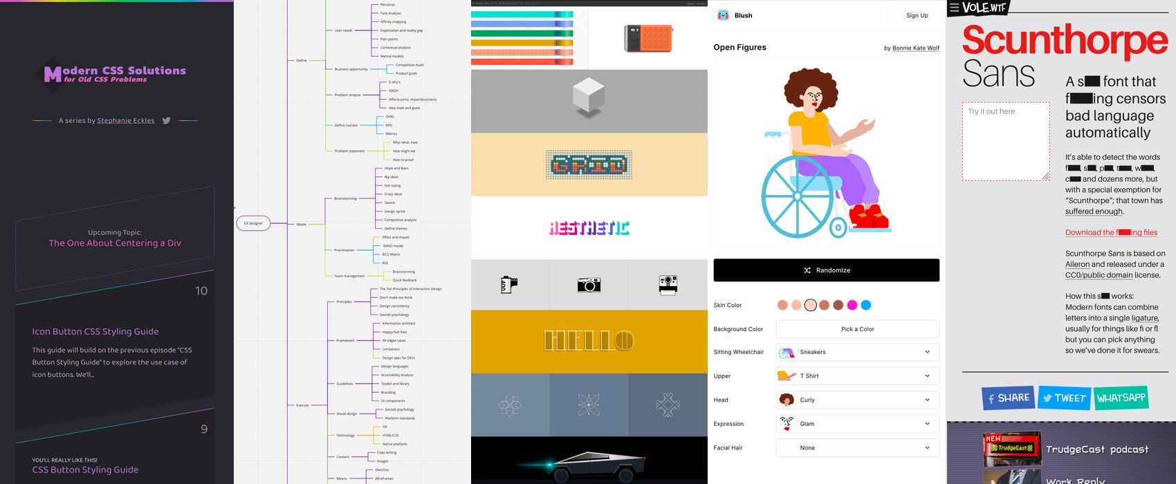
Modern CSS Solutions for Old CSS Problems by Stephanie Eckles
Interesting article
#RemoteTesting #UsabilityTest
- “The Ethnographer’s Spyglass: Insights and Distortions from Remote Usability Testing” a free (but sign in) paper on remote usability, what works, what doesn’t, and why you could do this even after we can all go back to the office
- Run More Effective Remote Usability Tests with These 5 Tips, it’s always a good idea to check the user setup and have a back-up plan in case some tools don’t work. I ended up doing a test with user over the phone because they had no mic Grinning face with smiling eyes
#Datatable
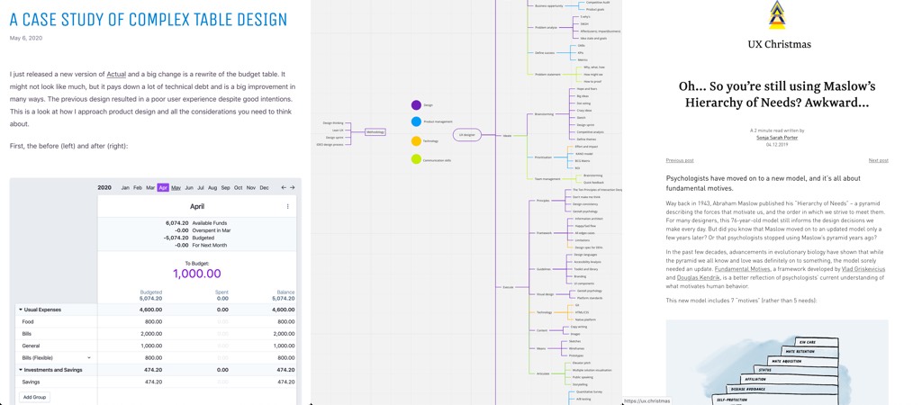
“A case study of complex table design“, I love how small little details like a different font, a small change in architecture or subtle animations can really help make a complex table more usable
#UXDesignMethods
We have a lot of different methods in our UX Designer toolkit but it’s not always easy to chose the right one. Mei Zhang organised them in an interesting mind map based on process phase and other categories. And the article: UX Design Methods In A Mind Map
#Psychology #Maslow
Quick reminder that Maslow’s hierarchy of needs is based on his mid-twentieth century U.S. middle class man values. Here are some articles to get some perspective on the topic:
- Bruce Lawson wrote about how it might not apply to asian, arabic, native american cultures
- Joe Leech also wrote Maslow’s Hierarchy of Need: Psychology Myth Busting #1
#UXDesign
Don Norman has a few things to tell you about 21st Century Design!! (A 6 minutes video)
#Dataviz #Timelines
How does the shape of a timeline affect how well people can read it
#UX
UX Rescue, a nice project that connects UX practitioners to organisations in need across the globe.
#DesignSystems
“Useful Sections for a Design System Reference Site“, what should you put in your design system documentation? The components, obviously. But a design system goes far beyond that, here is a list of things that could help.
#Programmation
““Hello, World!” but in 30 different languages!!! ” I admit I was expecting languages not programming languages but this is even better ^^
Inspiration, fun experiments and great ideas
#HTML#CSS
I love all those A Single Div projects
#Conference Call
This zoom “conference call bingo” background made me laugh
#Fun
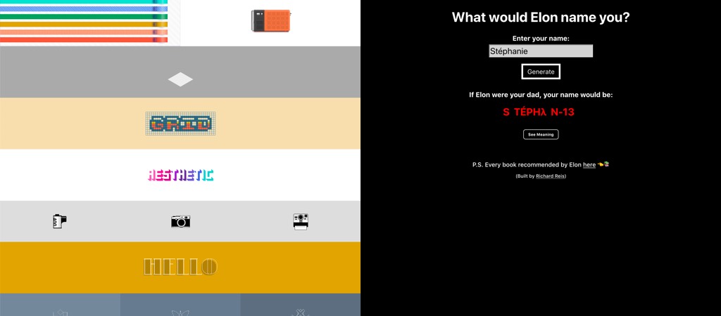
What my name would be if Elon had named me: S TÉPHλ N-13
Honestly I already have enough issues with Stéphanie being transformed to St?phanie, Stêphanie or Stéphanie or St�phanie
#AR
“Copy & Paste Your Surroundings into Photoshop with a Magical AR App” I have no idea who would need that but it is a cool demo
News in the industry
#CSS #Flexbox
This is a good news: Chromium lands Flexbox gap
Podcasts
#UXJobs #Podcast
UX Job Title and Description Red Flags: another great podcast by Delta CX with
Mitchell Wakefield as guest. I like the name “UX theater”: putting post its on the walls, drawing and “thinking like a user” but never talking to them. This resonates on so many levels with me. I feel like I and a lot of people I talk to were in that situation sometimes where clients, stakeholders really just want to have the nice UX deliverable to say “look we are user driven” but will not act on anything that was discovered. Even worse when all of those deliverables are produced without any user data of any kind.
I think this episode really stroke a nerve with me, I spent the whole time nodding with my head.
Tutorials
CSS
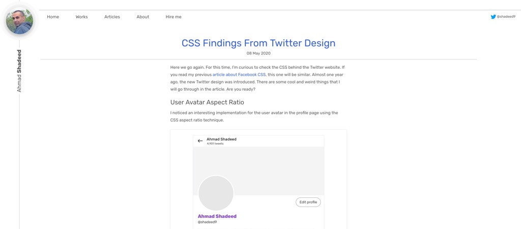
“CSS Findings From Twitter Design“, checking “behind the scene” is a great way to learn, and this is what I love about CSS and HTML 🙂
Useful tools and resources that will make your life easy
#Confcalls
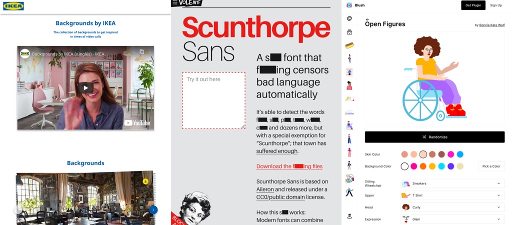
This is a really smart idea, ikea is offering nice clean backgrounds you can download as use as background for your videos calls
#Typography
A s*** font that f***ing censors bad language automatically, using ligatures
#Illustrations
“Blush, Illustrations for Everyone“, a figma plugin that lets create, customize and mix different illustrations so that they fit your specific needs, this is quite awesome
