Pixels of the Week – May 4, 2025
Better color contrast tool, exploring AI's role in accessibility & kawaii linocuts
My curated weekly-ish online newsletter, where I share interesting articles, tools, and resources I found during the week. You can expect content about UX, design, user research, accessibility & tech, but also some processes, some inspiration, sometimes books, and a couple of videos and podcasts. Also, don’t forget to, subscribe to the newsletter to get notified, you will get the weekly links directly in your mailbox, and be notified when I publish other articles
Most popular content this week
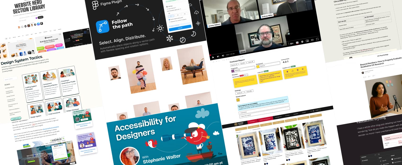
Contrast Report a new online contrast checker I really like, with features like AA and AAA, regular large text and UI elements, an option to “fix”, that will automatically recommend a color combination that is as close as possible to the original, a picture in picture mode (not supported in Firefox) that gives you an eyedropper, in an overlay to select any color on screen and support for PWA, aka, you can “install” it on Chrome/ Edge. Also, for more contrast tools and contrast checking tips, check my full article (I just added it to the list): Color accessibility: tools and resources to help you design inclusive products
Interesting articles that caught my attention
Beyond Numbers: How to Properly Evaluate Qualitative UX Research (9min) Stakeholders often focus on “how many” when presented qualitative research. Which is the wrong question to ask. Qualitative is about understanding the H (human) in HCI. The goal is to understand why they behave like that. When presenting research results: focus on showing clear patterns, supporting findings with evidence like quotes or observations, and connecting everything back to user behaviors and business goals, not sample sizes. Also, combine qualitative with quantitative to explain the what and the why. By Dr Maria Panagiotidi
How to write error messages that actually help users rather than frustrate them (8min) Good error messages help users recover and stay on track, not frustrate them. To write better error messages: consider all types of errors, write like a human and avoid technical jargon, avoid whimsy, use active voice, give a clear way forward, and use consistent patterns. by Amy Hupe
What Does It Really Mean For A Site To Be Keyboard Navigable (8min) an introduction to help you understand what is keyboard navigation, who it’s useful for (people with motor impairments who can’t use a mouse, but also, screen reader users), what you need to make a website keyboard navigable (focus indicators, logical tab order, skip links, keyboard accessible interactive elements) and how to test it. by Eleanor Hecks
Inspiration: fun experiments, beautiful art, and great ideas
Estampes Japonaises : Collection kodomo I continue my linocut journey, and got the cute little Kitsune. If you like Japan, kawaii and linocuts, I highly recommend you take a look at the shop. Their instagram account is also quite nice: here the behind the scene of the Kitsune I bought.
Max Siedentop’s Passport Photos: a fun photo series that challenges the boring, very strict passport photo, by imagining what the rest of the body of the person does, outside the quare little shot.
Useful tools & resources
Redesigning Design Systems Tactics: a collection of tactics designed to help you make progress in creating and maintaining a mature design system. I love how they are presented as small little cards, with some when to use it, and a step by step for each when you expand them.
Follow the Path a Figma plugin that places elements along a path, distributes them, with customizable spacing and orientation option. Very nice for illustration needs. And, if you need to write following a path you can use the Curved Text plugin.
Rehearse A Figma Slides plugin that lets you know exactly how long you spent on each of your slide and the total time for your deck
Supahero: a curated collection of interesting website hero banners, for your inspiration
Cool and Interesting Videos
Exploring AI’s Role in Accessibility We often talk about the bad side of AI (ethics, perpetuating biases, content theft), but AI has a huge potential to also help improve the lives of many people, from generative alternative text for images, voice preservation, voice recognition, and more. (warning: the video extract on voice synthesis is quite emotional)
Tutorials
11 uses for variables beyond light and dark mode (10min) if you’ve only been using Figma modes for dark/light mode, you are missing out on some nice productivity ideas: validation styling, asset availability, breakpoints for responsive, multi branding, special seasonal promotion, contrast level (high, low), and more. By Alice Packard
Latest news in the industry
Like to play alone? Ubisoft is still watching you! yeah, that’s shady, and I’m happy to see some people start complaining. You should ask users for consent when you send information, and not force them to be “online” just so that you can track them, on games without online features.
Penpot Design Tokens: penpot is the first tool to integrate native design tokens