Pixels of the Week – November 10, 2019
Every week I share a list of curated articles, resources and tools about UX, UI and mobile design, HTML, CSS, the web industry, process inspiration and more…
This week’s selection: UX tools and methods, cognitive biases cards, evolution of scrollbar, typography & lettering resources, mobile microsessions, dataviz tips, color accessible design systems, material design form text fields, service design and design systems, designing for people who want to do bad things with your product, new CSS underline properties, Firefox shield users from notification request, CSS variables, and more goodness from Kikk Festival.
#Now – what I’m up to
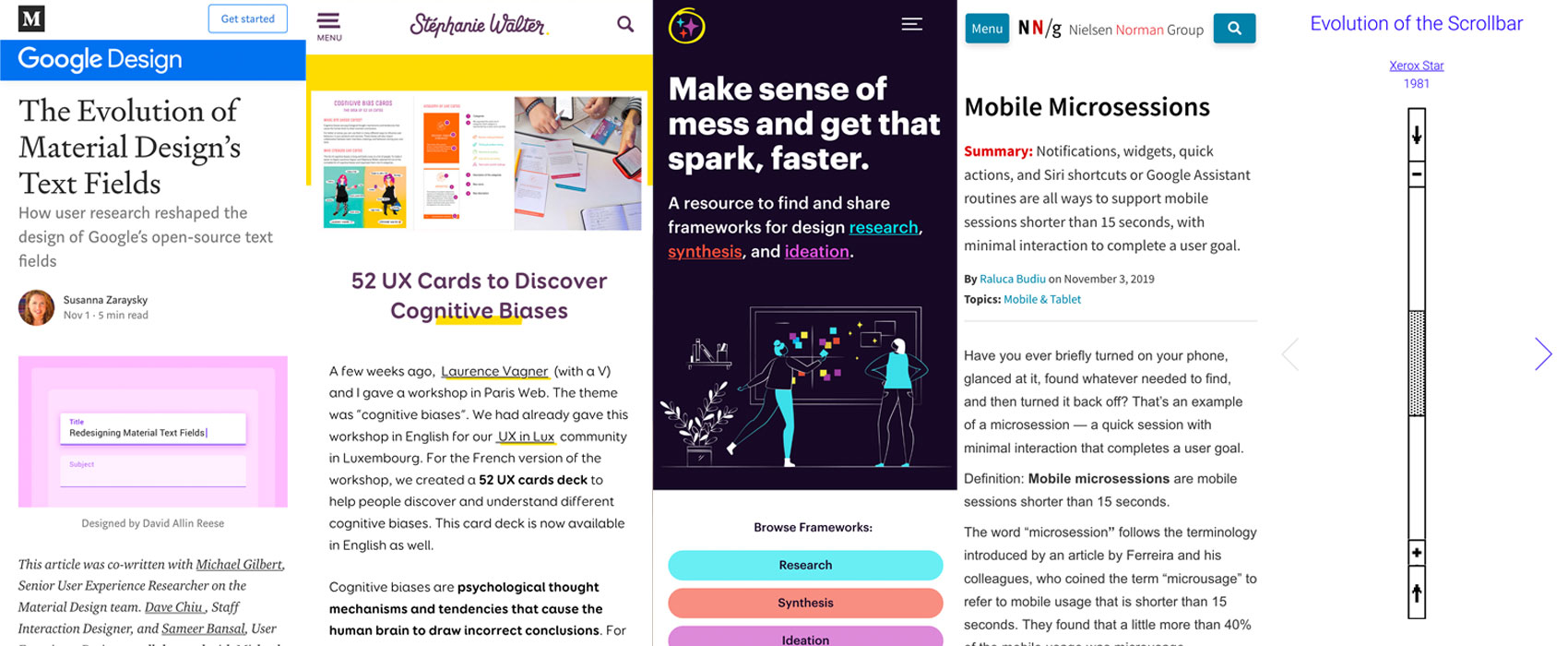
Laurence Vagner and I created a deck of 52 UX Cards to Discover Cognitive Biases. Last weekend I attended the Kikk Festival in Namur and it was really nice, great talks and a lot of interesting ideas and tech experiments in the market.
Next week I will attend Beyond Tellerrand in Berlin, come and say hi if you are around.
TL;DNR the one you should not miss
#UX #Methods #UXframeworks
🔥UX Frameworks – an online ressources that lists UX methods and tools to help you with research, ideation and synthesis
Kikk specials
The Kikk festival was really fun, so here is a selection of resources and experiments I gathered for you.
This machine was hacked to draw the tweets on #kikk19 in real time with 2 pens
#NSFW #Sextoys
There was a talk on APIs and hacking sextoys: Buttplug.io is an open-source standards and software project for controlling intimate hardware, including sex toys, fucking machines, electrostim hardware, and more. It supports #C and JavaScript
#Artificial Intelligence
A people’s guide to AI, cool zine co-created by Mimi Onuoha and Mother Cyborg (Diana Nucera) to explain to people how AIs work.
#Data
“Side-by-side images expose a glitch in Google’s maps“, a great introduction by Mimi Onuoha to understand what happens in the messy spaces between categorisation and collection 💜
#Culture Wars
Online Culture Wars map: an overlay of hundreds of politicised memes. Designed as a discussion starter, it intends to visualize and contextualize the ongoing online culture wars, and some of the main political references, actors, and influencers.
#Paper #Sustainability
The paper program of the Festival was printed on a material that lets you turn it into a wallet, this is an amazing idea!! (Or you can just put it in the box at the end for recycling)
#VR #Experience
Amazing project: NeuroSpeculative AfroFeminism (NSAF) is an award winning three-part digital narrative that sits at the intersection product design, virtual reality, and neuroscience
#Touch #Experiment #Connected objects
Is your touch interface wood ready? Mui is a nicely designed connected wood object with many “smart home” features that can display information, emails, etc.
#Experiment #Fun
8bits and a byte (youtube Channel) created this awesome robot and I need one!! #kikk
Interesting article
#Color #Accessibility
Designing accessible color systems, interesting read on colors, how they “work” on screens and how they build a color palette that works for many scenarios
#Form #Material Design
The Evolution of Material Design’s Text Fields – “Enclosed text fields with a rectangular box shape performed better than those with a line” shocking isn’t it? (No). I still wonder about the gray background being mistaken for disabled field. Also I would love more research on floating labels.
#UX #ethics
How to Design for Assholes – There will always be people who use your product for evil. Here’s what you can do about it. (TW the article contains mentions of rape, death threats and only harassment)
#UX #UserResearch
How might we be wrong? An interesting read on quantitative user research validity and how you need to be aware of researcher bias & participant reactivity
#UX #Psychology
How Netflix uses psychology to perfect their customer experience
#Mobile #UX
Mobile Microsessions – Notifications, widgets, quick actions, and Siri shortcuts or Google Assistant routines are all ways to support mobile sessions shorter than 15 seconds, with minimal interaction to complete a user goal.
#dataviz
How to Master Data Visualization – A few rules of thumb for designing with charts and graphs, when to use a chart pie, an histogram, etc.
#ServiceDesign #DesignSystem
“Why every design system needs a service designer” a design system is not just a bunch of components in Sketch and maybe some HTML/CSS, it’s so much more and having a service designer in the team helps a lot
#PWA
Yes, That Web Project Should Be a PWA (2017 still relevant article)
#Icons
Iconfinder designer report Q4 2019: “arrow”, “phone”, “download”, “search” or “user” rank as the most searched in 2019 so far.
Inspiration, fun experiments and great ideas
#Snek
Now is a good time to remind you about the greatest ad for a flow chart tool ever. And no step on snek!!!
#Dinosaurs #Illustrations
I hope you like dinosaurs because my friend created those amazing rainbow dinos for #dinoctober and now you can purchase them on mugs, shower curtains and other cool swag on
News in the industry
#browser #notifications #UX
This is a good news for users: Firefox is taking steps to stop browser notification spam from next year – Soon you’ll need to interact to see the notification requests
#DesignTools #Collaboration
Figma has real time co-editing design capabilities and now so had AdobeXD (beta)
Tutorials
#CSS #Underlines
New CSS for Styling Underlines on the Web, a video that shows you all the new properties: text-decoration-color YEEEEEEEEEEES PLEAAAAAAAAASE <3
#CSS
“CSS Variables With Inline Styles” interesting techniques but I wonder about responsive, I guess you could override those variables in media queries?
Useful tools and plugins that will make your life easy
#UI
Evolution of the Scrollbar, I love those kind of “preserving the past and showing evolution” small little sites 💜
#Typography #Ressources
Sidebearings is a collection of typography & lettering resources. It’s designed to focus on beginner as well as advanced type designers, graphic designers and enthusiasts.