Pixels of the Week – November 12, 2023
UX research brief, the internet artifact museum and a few cool buttons
On Twitter, LinkedIn, and Mastodon, I share curated articles I read, resources and tools about UX Design, User Research, UI and mobile design, HTML, CSS, the web industry, some processes, some inspiration, etc. This is an archive of everything I shared this week. And some extra links that I decided to only share for the blog readers. Also, subscribe to the newsletter to get notified when those are published!
Now: what I’m currently up to
This week and next week, I’m running my Accessibility for Designers workshop. 40 participants registered, I’m super happy. The group is amazingly nice, great discussions, it’s been very nice 2 first sessions, looking forward to tomorrow and Wednesday’s sessions. I’m also preparing a couple of more templates to help people digest that content, so stay tuned for more accessibility cheatsheets!
Also, while preparing this, I updated my my “Designer’s Guide to Documenting Accessibility & User Interactions” article with the content of the latest version of my talk! It took 4 hours, just for the update. To be honest, this article is not 4 hours of work in total, it’s more like, 50 hours. It’s based on a talk I created and that’s the amount of time it takes to research the talk, create the slides and turn them into an article. Then, that talk was updated and update again in 2023. The 4h mentioned is “just” updating the article based on the new content of the talk (aka, technical).
Interesting frameworks and concepts

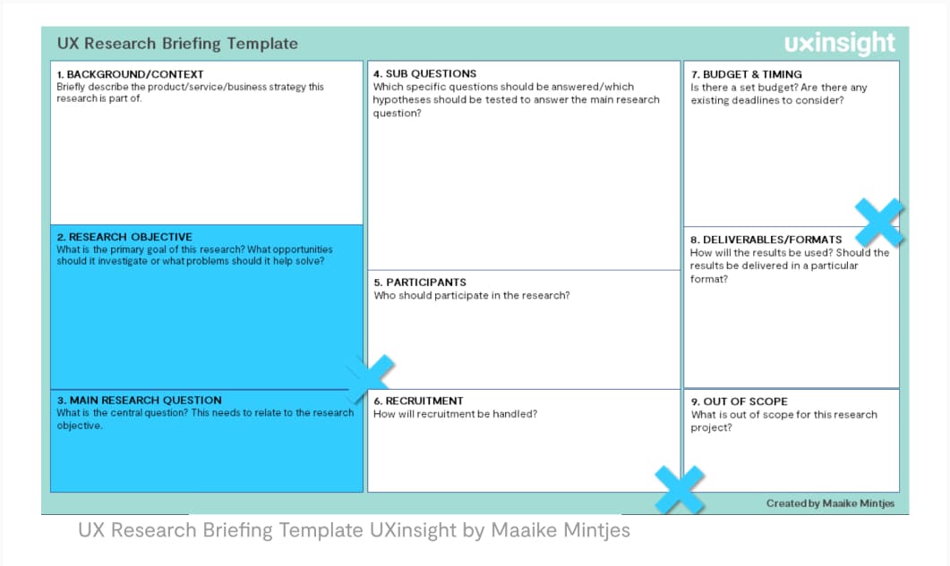
UX Research Briefing Template: a A4 template, by Maaike Mintjes, to help prepare your research, from background to main objective, research question, participants, deliverables, etc. Aka, a condensed version of a research plan. Love it.
TL; DNR: the one you should not miss
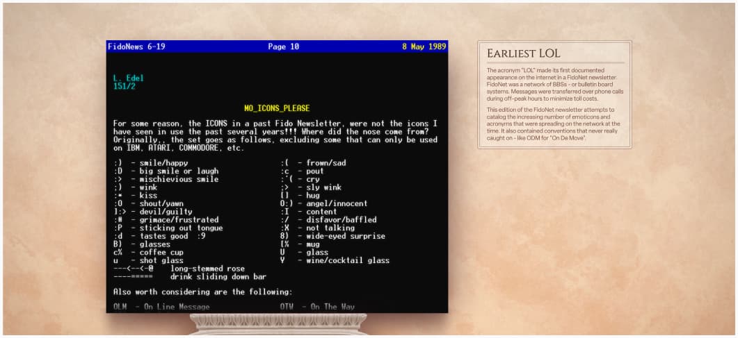
Internet artifacts: an online museum dedicated to the history of internet, with artifacts such as the first mp3 song, the first pizza delivery site, and more.
Interesting articles that caught my attention
- Sheet, dialog, or snackbar — what should a designer go for? (10min) Ksenia Toloknova created a huge round up of current patterns of “content appearing on top of the screen” in mobile design to help you decide what works best in different situations
- Avoid Extensive Multicolumn Layouts (16% Make This Form Usability Mistake) (8min): nice tips to make your ecommerce forms mode usable.
- The product manager role is a mistake (11min) Product managers are not necessary for success, but if you do have them, they need to be great. Often, they are not (according to Michele Sollecito) and mediocre product managers will stifle innovation. Try hiring everyday great people and put them together in teams without individual responsibilities instead!
- Minimalist Affordances: Making the right tradeoffs (6min) interesting read by Lea Verou on the growing trend of getting fewer and fewer affordances for interactive elements and how it can damage user experience
- Exploring Social Loafing in Human-Computer Teams (8min) humans may overtrust and become complacent with AI teammates over time, leading to automation bias, overtrust of AI capabilities, and reduced human diligence, aka less quality in the task accomplished. By Dr Maria Panagiotidi
- Nintendo Talks How Mario And Zelda Have Stayed Relevant for Nearly 40 Years (8min) on the value of having new people in the team to challenge preconceived notions and never ignoring the feedback of new staff members
- AI as a UX Assistant (22min) NNgroup run a survey on how UX professionals use AI in their work. Interesting results: AI is used for content creation, as research assistant, ideation partner and sometimes design assistant.
- What Exactly is “Modern” CSS? (3min) the issues with “modern” as a lack of better name for CSS newest features, by Geoff Graham. I mean, if we follow art logic, the next name should be “contemporary CSS”. Yeah, not helping, I know.
- Experience-threat modelling (8min) an interesting exercise you can do with different people in your team to mitigate risks in your product and services by Andrew Duckwork. Fun fact: I read this, while preparing a workshop on the topic myself, perfect timing.
Curiosity cabinet: non-design/tech rabbit holes I enjoyed
Japan’s Jimi ‘Mundane’ Halloween Costumes of 2023: a collection of pictures from Japanese festival Jimi Halloween, where people dress up in costumes so mundane they have to be explained. And those are GOOD.
Inspiration: fun experiments, beautiful art, and great ideas
- Divtober is over but you can check all the really cool things people created with a single div on codpen
- MOON app your personal moon portal, in case you area werewolf, or, just, really like the moon?
- Buttons.cool a curated list of cool buttons with fun interactions for your inspiration
- The Best 97 Halloween Email Examples in 2023, yeah I know Halloween is over, but this makes me happy
Useful tools & resources
- Vectorpea: an online vector editor tool that can open files from different design tools: Photoshop, Illustrator, Figma, Sketch and more
- Gradient Map: I love color effects on images, they always add a nice touch when you need multiple images to get some consistency, this is a very cool plugin
- selectors.info: lost with CSS terminology? Selectors info is a nice tool that highlights different selector types and combinators in a CSS declaration
- Gandalf AI test your prompt engineering skills and get Gandalf to reveal the password to go to the next level.
- The 2023 UX Research Tools Map, a giant map of the tools and pieces of software used in UX research. Very cool work on this, I love the fantasy map style!
Accessibility Tutorials
- Color contrast accessibility requirements explained (12min) nice tutorial to introduce you to contrast requirements, especially for non text elements
- How to write good alt text for screen readers (10min) a short tutorial to help you write better alternative texts for your images. The short rule: “if the image adds any kind of context, then you should provide it.” By Craig Abbott
