Pixels of the Week – October 14, 2018
Every week I post a lot of my daily readings about Web, UI and UX Design, mobile design, webdesign tools and useful resources, inspiration on twitter and other social networks.
Please note that I migrated the blog to the new URL: stephaniewalter.design/blog. You might want to update your bookmarks and re-subscribe to RSS feeds.
This week’s selection: micro-interactions, accessibility and colors, horizontal scrolling, readability and inclusive design, modals on the web, CSS grid, birthday forms fields, buttons in HTML, how we interact with CSS, iOS icons scaling, designing perceptions, productivity and much more.
You can follow me on twitter to get a dose of links every days.
I gave some talks
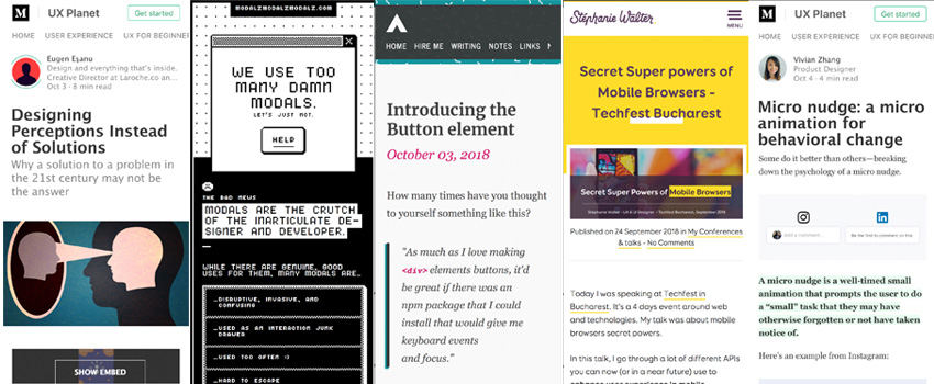
- Two weeks ago, I gave a talk on mobile browser capabilities and PWAs. You can find the slides and talk summary here: Secret Super powers of Mobile Browsers – Techfest Bucharest
- I also talked in France about user experience and perceived performance. You can find the slides in French here: L’UX au service de la performance de vos interfaces – Conférence WeLoveSpeed 2018. If you don’t speak French, the slides are available in English here: Pixel Pioneers – Cheating The UX When There Is Nothing More To Optimize
TL;DNR the one you should not miss
#Modals
MODALZ MODALZ MODALZ, why they suck, what to use instead and how to make them less crappy if you really need to use them 🙂
Interesting article
#UX and #UI Design
- “Micro nudge: a micro animation for behavioral change” A micro nudge is a well-timed small animation that prompts the user to do a “small” task that they may have otherwise forgotten or not have taken notice of.
- Bad Practices on Birthdate Form Fields
- Icon design considerations for iPhone X (etc) – evil is in the details, I admit I never noticed this (but I don’t use a lot of apps on the iPhone)
- Designing Perceptions Instead of Solutions – a great article full of interesting examples on perception. Sometimes you just need to change the angle or the way you present things
#A11Y
- Quick reminder on color accessibility in product design
- And from my blog’s archives: Tips to Create an Accessible and Contrasted Color Palette
- My friend Damien Senger gave a talk on Readability & Web: Let’s build great inclusive projects – Damien Senger: #ID24 2018
- Introducing the Button element – this magic HTML element is going to blow your mind, amaazzzziing #wow
#CSS
- “How I remember CSS Grid properties” a little help to navigate your way through all those properties
- Creating horizontal scrolling containers the right way – UX and CSS considerations
- The Way We Talk About CSS by @rachelandrew Perhaps we should start reframing the way we talk about these things. They are not weird, we just haven’t identified the reason yet.
- Putting things on top of other things – on z-index and stacking contexts
#Productivity
Becoming more productive while working less – I like the idea of knowing How much time you need to do to produce a content. Maybe I should start time tracking articles and Conf preparation, hum.
#Conferences
The dark side of conferences – Like the click baity title? Nice! Now let’s talk about the “glamorous” conference life.
Inspiration, fun demos and Great ideas
#Boooh
Halloween 2018 aaawww spooky demos I like that
#Links #Hover
Having fun with link hover effects
Webdesign news
#Microsoft
What’s new in Microsoft Edge in the Windows 10 October 2018 Update: Web Authentication, Badges for notifications (yeaahy) and Progressive Web Apps improvements, hooo yeahy <3