Pixels of the Week – October 20, 2019
Every week I share a list of curated articles, resources and tools about UX, UI and mobile design, HTML, CSS, the web industry, process inspiration and more…
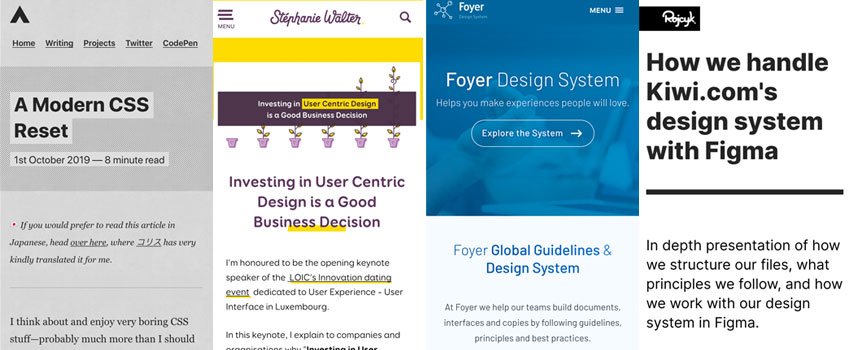
This week’s selection: selling the benefits of UX design, 2 Design System (Foyer and Kiwi.com), making bigger clickable area size, a modern CSS reset, a layout tutorial, flight booking anti-patterns, etc.
#Now – what I’m up to
This Wednesday I gave the opening keynote at LOIC’s innovation dating event. I explained what UX and UI design are, how companies can start doing some user research even with a small budget. I also went through different design maturity models and presented some benefits to “sell” a design and user centric approach to your company. The slides are available here: Investing in User Centric Design is a Good Business Decision.
TL;DNR the one you should not miss
#CSS
A Modern CSS Reset by Andy Bell, with all the explanation for each set of properties. This is a great work!!!
Interesting article
#DesignSystem #Figma
“How we handle Kiwi.com’s design system with Figma” I love this kind of detailed articles about how to organize your design assets to collaborate. We need moooar!! How do you work collaboratively on your design system?
#UI
“The Obvious UI is Often the Best UI” interesting article on bottom navigation and icons with labels.
#UX #AntiPattern
A really nice example of an anti pattern “38 people are looking at this flight“, when you open the code you actually see that 38 is a number randomly generated between 28 and 45.
Tutorials
#Buttons #Form #Accessibility
Enhancing The Clickable Area Size, yes please make that button clickable area bigger, a great HTML and CSS article!
#Layout
“Spacing, Grids and Layouts” nice read. I moved away from “columns latout” and use gutters and space division instead, because Flexbox and GridLayout. For instance, my gutters are 24px, I want 3 blocs, I will do 100%-(4*24)/3. Does it make sense?
Useful tools and plugins that will make your life easy
#UX #UI #DesignSystem
GroupeFoyer ‘s design system is officially public, you can take a look here: design.foyer.lu Big congratulations to all the design team, I think that this is the first public design system in Luxembourg!