Pixels of the Week – October 23, 2022
Every day, I share on Twitter and LinkedIn a list of curated articles I read, resources and tools about UX Design, User Research, UI and mobile design, HTML, CSS, the web industry, some process, some inspiration, etc. This is an archive of everything I shared this week.
#Now – what I’m up to
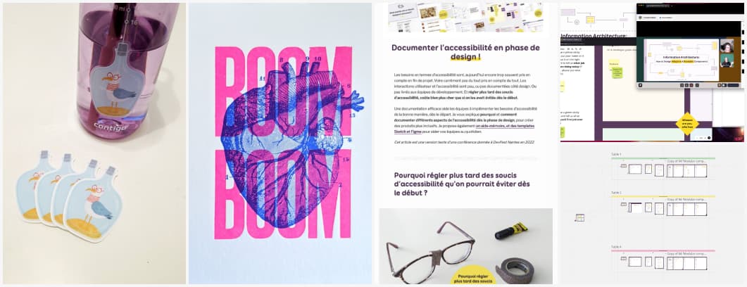
Wednesday, I had an amazing time teaching Information Architecture and how to build re-usable components and responsive pages. Awesome group, awesome feedback. I might offer that workshop again next year, so stay tuned!
Then, I spent the end of the week at DevFest Nantes and I spoke, in French, about how and why designers can document accessibility. French version of the talk here, English here. I took some time to visit and stumbled upon this beautiful letter press post card. When I came back the Steve Seagull stickers were waiting for me. I love them!
TL;DNR the one you should not miss
#Accessibility
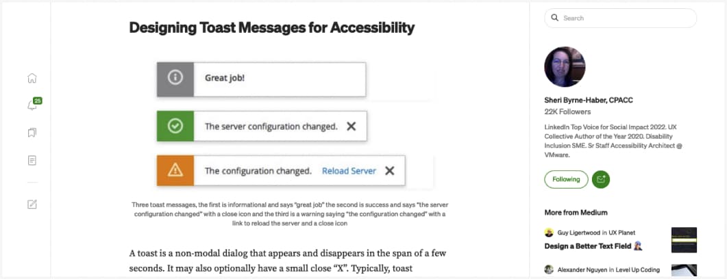
A lot of interesting information to help you design better accessible toast message
Interesting article
#Form UX
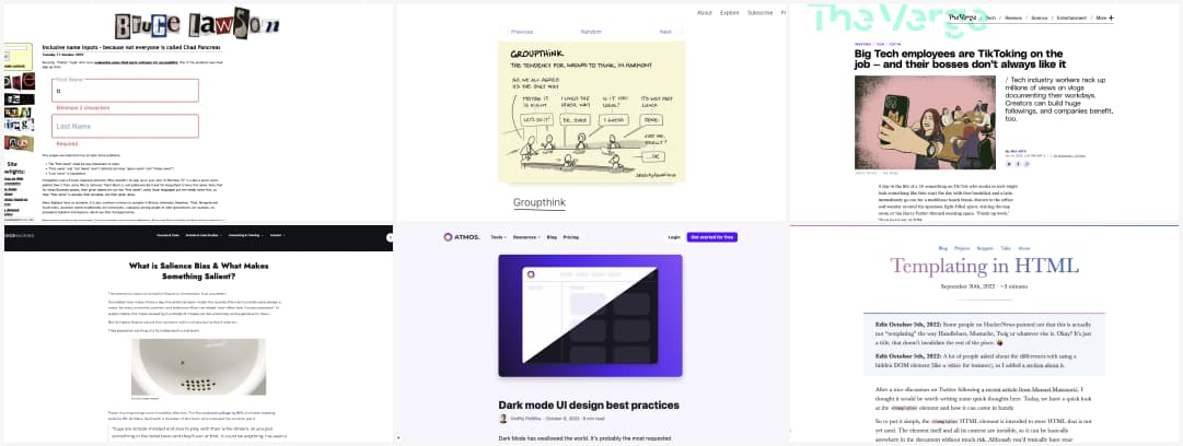
Inclusive name inputs – because not everyone is called Chad Pancreas. Imagine how angry you boss will be when you tell them that Cher or Madonna (or Beyoncé for the é) could not subscribe because you poorly coded your form?
#UX Method
The CUE framework (culture, unspoken, environment) is a method to help researcher gather feedback when doing field studies that often provide a lot of data. It helps account for interactions & inter-dependencies among space, people & artifacts
#Psychology
- A few examples of how the Salience bias (making it simple for people to process information) is used by different products. For more content on cognitive biases, including some bias cards, check my UX Cognitive Bias Cards & Workshop
- I’m a big fan of the “group thinking effect” which is the reason why I try to stay away as much as possible from focus groups when doing research (it’s not even a UX research method, it’s marketing anyway
#Accessibility
- How to write good alt text, in case you wonder the difference between alt, title and figcaption
- Making Events Accessible: checklist for meetings, conferences, training, and presentations that are remote/virtual, in-person, or hybrid
#Dark Mode
Dark mode UI design best practices. All the yes to point 7, finally someone talking about how people with astigmatism could have issues with Dark mode. Best practice: let user chose, do not force dark mode, thanks
#Research Methods
When not to use surveys as a primary research tool: a lot of beginners use surveys because they look easy and are cheap. Be careful about that, often, surveys are not the right research tool. When used poorly, they will bring false data.
#Creation
None of Your Business: “if you did your best when you created a piece of work, but your perfectionism or fear of judgement or lack of confidence makes you not like it, ask yourself: who is this piece for and will it work? ”
#Remote
You’re going back to the office. Your boss isn’t: Bosses are ordering people back to the office from the comfort of their own homes.
#Enterprise UX #Patterns
5 Flexible Enterprise UX Patterns: custom views, adding notes, tagging, custom fields: enterprise software and tools sometimes needs specific UI patterns to help users to their daily job
#Tech #Diversity
Big Tech employees are TikToking on the job — and their bosses don’t always like it. I like how the article highlights how important those TikTok videos can be for marginalized people in tech, to show younger girls that not only white men work in tech, to reach out and build a supportive community that shares advice
#HTML
Did you know you could do that: Templating in HTML
#PWA #Mobile Web
Advanced apps patterns, a collection of common patterns for building advanced apps. (careful some of those APIs only work in Chrome for now, double check support)
Inspiration, fun experiments and great ideas
#Illustration
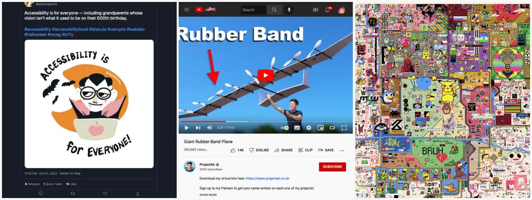
Emily Painter drew some awesome spooky Halloween accessibility illustrations
#Craft #3DPrinted
Hi, it’s Sunday, let’s build a Giant Rubber-Band Plane
#Inspiration
Fun and strange project: everyone can draw on a giant online canvas. Pixel art lovers, it’s your time to shine
Useful tools and resources that will make your life easy
#Typography
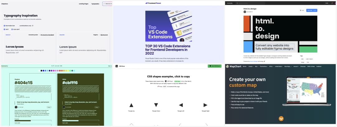
Pairing fonts together can be tricky. In case you need inspiration, here’s a place with examples of font pairing, from different sites all over the internet
#Accessibility
A site that generates examples of accessible color combination for your inspiration. I would be careful though, even if some pass the contrast ratio test, they are still a nightmare if combined (blue/ green on red for example)
#Front End
For my VS code geek friend: TOP 30 VS Code Extensions for Frontend Developers in 2022
#CSS
CSS shapes examples. You do fun things with CSS, including some pretty advances shapes. Here’s a place where you can find and copy paste some.
#Figma
I gave the HTML to design figma plugin a try. I’m honestly impressed, apart from a few issues with CSS backgrounds, the rest is quite accurate. It’s a little bit scary though, making it even easier to steal other people’s designs?
#Maps
A tool to create your very own custom maps from different places of the world (and imaginary worlds like Game of Thrones)
Podcasts
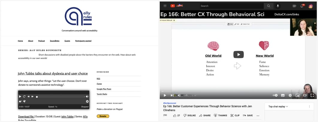
Short discussions with disabled people about the barriers they encounter on the web. Hear about web accessibility in our own words!
#Behavioral Science
“Better Customer Experiences Through Behavior Science with Jen Clinehens“, a really interesting podcast, and I love the cat example
Tutorials
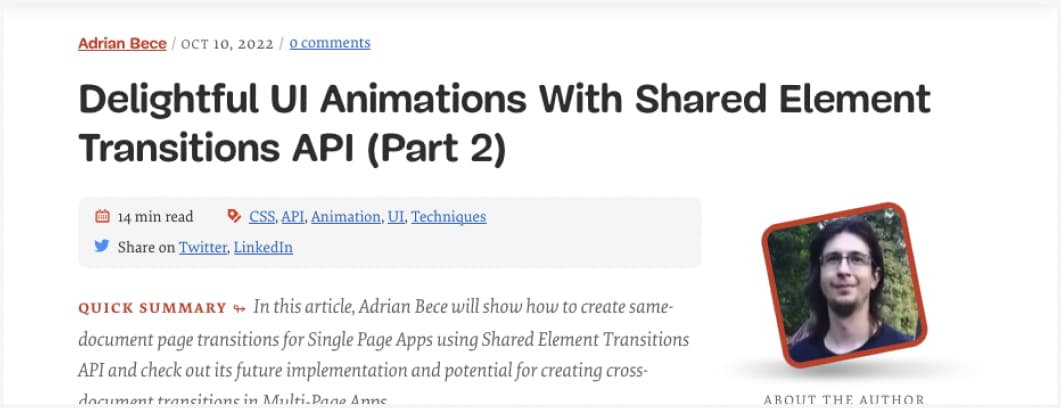
Some really nice things you can do when animating UI using Shared Element Transition API (also kudos for the prefers-reduced-motion example for accessibility)
Conferences & training
#Diversity In Tech
Shout out to DEITECH Conference, 3 days of free online Diversity, Equity, and Inclusion in Tech Conference and Career Fair, focused on increasing Black representation in Tech!
