Pixels of the Week – October 30, 2022
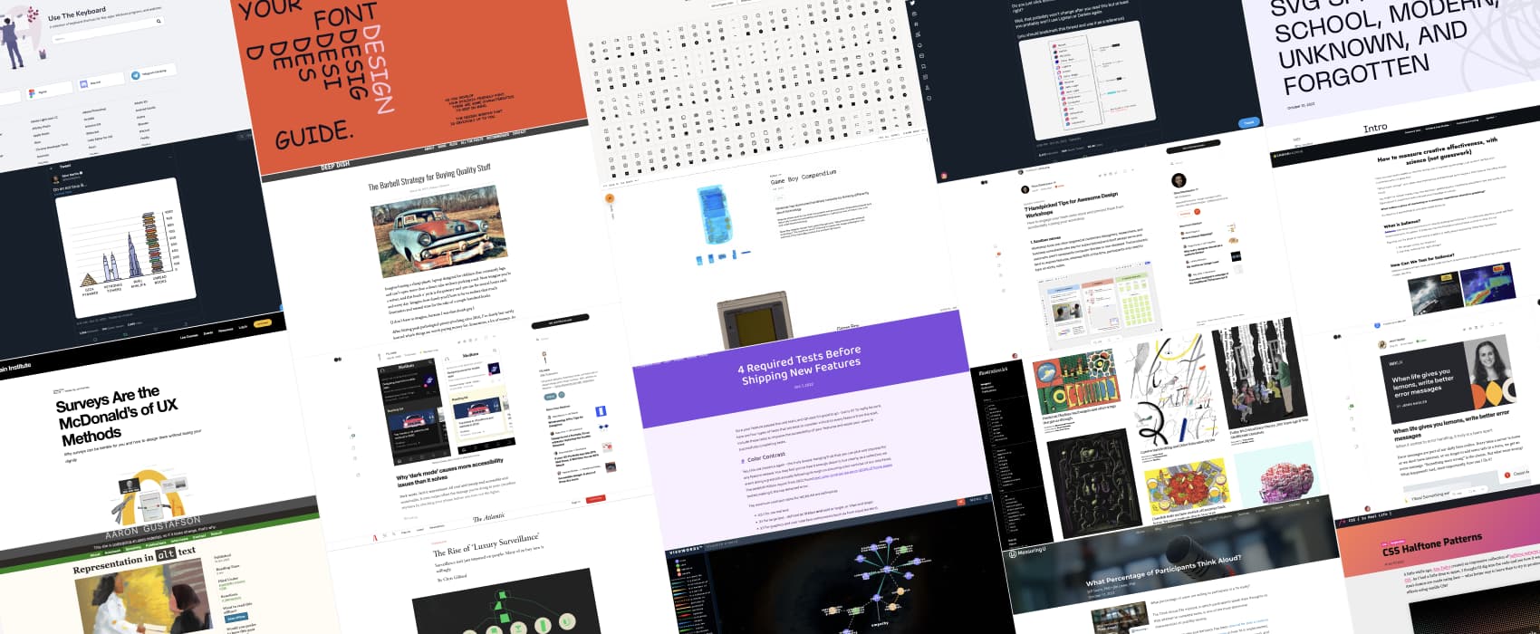
Every day, I share on Twitter and LinkedIn a list of curated articles I read, resources and tools about UX Design, User Research, UI and mobile design, HTML, CSS, the web industry, some process, some inspiration, etc. This is an archive of everything I shared this week. representation in alt text,
#Now – what I’m up to
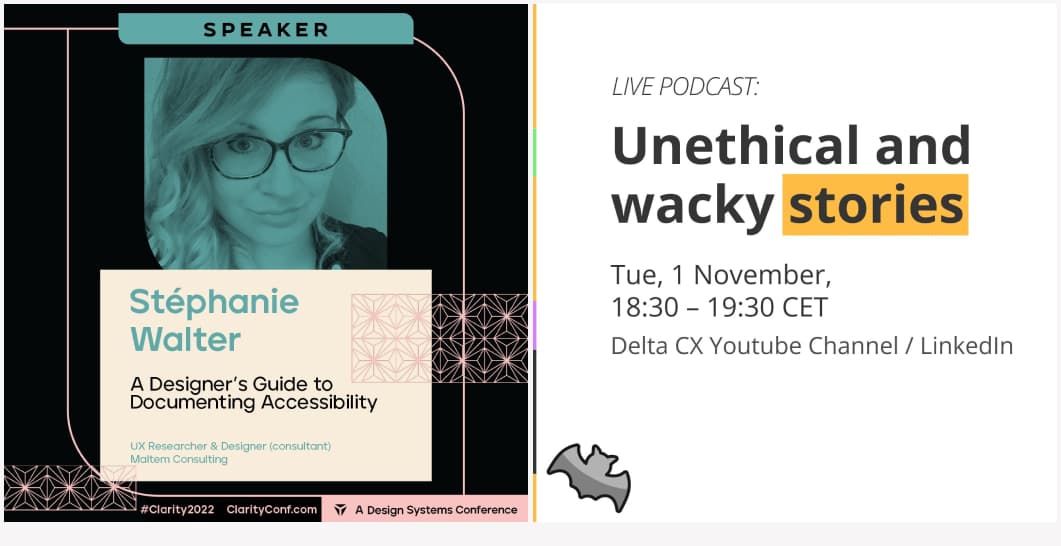 I have very cool things coming up soon. November 1, 6:30PM CET, we will have a fun and scary Halloween podcast with Debbie Levitt and will talk about Unethical and wacky stories. Want to anonymously tell us one? Tell us your story anonymously here.
Then November 9 – 11th, I’ll be talking (remotely) at Clarity 2022 about how and why designers can document accessibility. Grab your ticket.
TL;DNR the one you should not miss
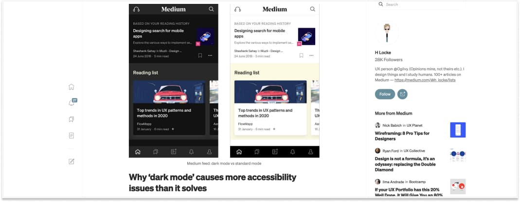
Why ‘dark mode’ causes more accessibility issues than it solves. TLDR — dark mode makes astigmatism worse. Yeah, I’m part of the population with astigmatism where glasses don’t really make that much of a difference apparently, ahhaa, hello halation effect. Let the user control what they prefer!!!
Interesting article
- Why Field-Study Sessions Go Wrong: 5 Common Problems: stay focused, avoid long complaint sessions during a field study by communicating the purpose of the visit early on, maintaining the partnership relationship with participants, and looking for concrete examples over abstract generalizations
- Very interesting study on Think Aloud methods. Interesting findings: people are less willing to participate if asked to share their webcam and participate more if you send the invite immediately after they agreed to participate
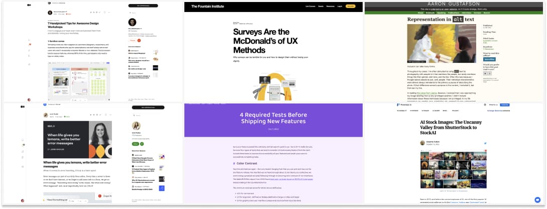
- Great read on surveys: why surveys can be terrible for you and how to design them without losing your dignity
#Accessibility
- 4 things you can and should test before shipping: color contrast, keyboard interactions, visible focus and zoom levels
- Why representation is as important in alt text as it is in the photos you put on your site
#Error Message #UX Writing
When life gives you lemons, write better error messages – very interesting detailed article on how people at Wix tracked 7643 places where the word error appeared and made error messages better
#Workshop Facilitation
7 Handpicked Tips for Awesome Design Workshops – Interesting tips if you need to facilitate a workshop, especially online. I really like the sandbox canvas so that people can get used to the tool and contextual help is always nice when you have people in groups
#Privacy
The scary cringy concept of ‘Luxury Surveillance’, when surveillance isn’t just imposed on people anymore because they bought the surveillance devices themselves and what it means for marginalized people.
#AI Images
AI Stock Images: The Uncanny Valley from ShutterStock to StockAI: I find it quite interesting that you now have some “stock photo” image tools, that simply generate them instead of buying them from photographers
#Marketing
Let’s talk about the usage of eyetracking in marketing and how you can use it to test the salience of your marketing campaigns: How to measure creative effectiveness, with science (not guesswork)
#Linguistics
51 Wonderful Words With No English Equivalent. I love Backpfeifengesicht, Gigil, Iktsuarpok, Pålegg anf Ya’arburnee . Never heard of “L’esprit de l’escalier” or “Seigneur-terraces” in French though?!?
#Economics
Buy the expensive or the cheap stuff? It depends. And interesting diagram to help make purchase decisions
Inspiration, fun experiments and great ideas
#Inspiration
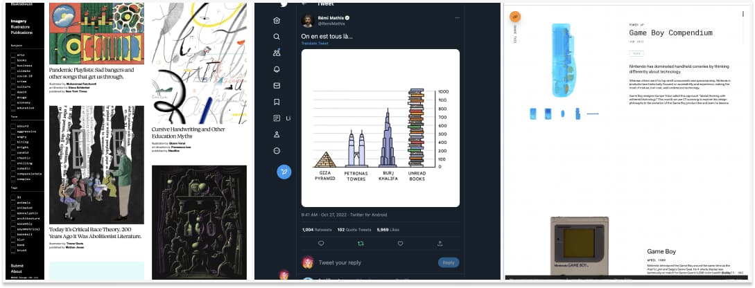
Illustrations for an article or a book don’t have to be boring. Or stock photo. Here’s some editorial illustrations from around the world. I really love all the different styles, colors
#Books
A fun illustration of all the unread books we have, I feel seen.
#Xray
Scan of the Month: my kind of geeky content: a collection of X-ray images of different objects. A new object is added each month. The Game Boy is amazing
Useful tools and resources that will make your life easy
#Semantics
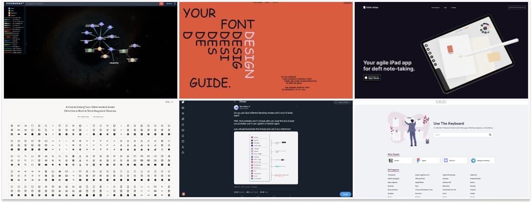
Look up words to find their meanings and associations with other words and concepts, presented in a visual diagram: visuwords
#Icons
A collection of 3 styles elegant free SVG icons
#Dyslexia #Typography
nothingcomicaboutdyslexia.com from what I’ve seen/heard in the dyslexic community, not everyone is okay with the comic sans, and not every dyslexic person finds it readable. But, those are still interesting tips to help you design a more dyslexic friendly font
#Blending Mode
#Note Taking
This deft note taking iPad app looks very nice, anyone tried it?
#Keyboard Shortcut
A collection of keyboard shortcuts for Mac apps, Windows programs, and websites.
Tutorials
#SVG
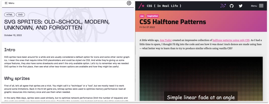
Geek with SVG sprites syntax: old school, modern, unknown and forgotten
#CSS
This is fun and I love that we can do it with CSS: CSS Halftone Patterns
News in the industry
#Figma
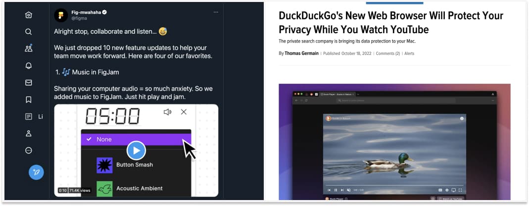
10 new Figma and Figjam features.
#Privacy
Interesting: DuckDuckGo’s New Web Browser Will Protect Your Privacy While You Watch YouTube
