Pixels of the Week – October 31, 2021
Every day, I share on Twitter and LinkedIn a list of curated articles I read, resources and tools about UX Design, User Research, UI and mobile design, HTML, CSS, the web industry, some process, some inspiration, etc. This is an archive of everything I shared this week.
#Now – what I’m up to
I’m happy to announce I’ll be speaking at Axe-con, a conference about accessibility on March 15 2022! I’m also taking a week of holidays, so you might see a few scheduled tweets and posts, but I won’t prepare any weekly links next Sunday.
Also, November 11 is World Usability Day. I’m participating this year and hosting an online participatory webinar on “Testing the “Abusability” of your products & services”. Will you come? >> Registration via eventbrite
TL;DNR the one you should not miss
#Information Architecture
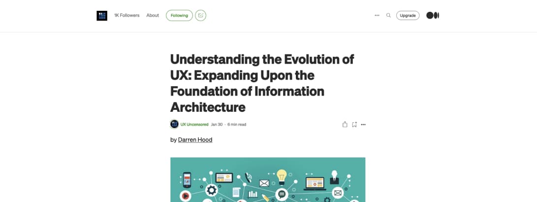
“Understanding the Evolution of UX: Expanding Upon the Foundation of Information Architecture” great read a excellent resources by Darren Hood
Interesting article
#Information Architecture
How to Handle Category Outliers in Your IA. I love detailed articles about specific IA issues, today, how to handle category outliers when building your categories. (this article contains a big Battlestar Galactica spoiler though, you are warned)
#Usability #Ecommerce
Checkout Optimization: 5 Ways to Minimize Form Fields in Checkout “A relatively minor interruption on desktop can swiftly become a more trying ordeal as users struggle with navigating the mobile form and keyboard.” excellent tips to make your checkouts more usable by @Baymard
#UXResearch
We talk to 5 users and report that 3 out of 5 have an unmet need. Why shouldn’t UX Researchers report this and what to do instead? An interesting read on reporting data that will help you understand the importance of samples
#Gender Identity
Understanding the gender spectrum and what to do in forms if you really need to ask for that information (rule number 1 don’t ask, there’s a good chance you don’t need that info)
#Abusability
Spear phishing with Slackbot for fun and profit, an excellent example of how someone might use the new Slackbot feature for fun and profit and how Slack could prevent this by @ericwbailey
#Team Building
The Art of Not Taking things Personally: why other people’s emotions might not be about you — and your emotions might not be about them, and 10 ideas to help you deal with people in the office who might be perceived as negative, overreacting, etc.
#Responsive
The start of a new era for Responsive Web Design, I don’t know if it’s a “new” responsive or just an evolution, but I really like how @fbrill presents the different types of queries we can now use in CSS in his article
#Dark Mode
Dark Mode vs Inverted – one thing we run into a fair amount in our design system work is the need to clarify the difference between “dark mode” and “components rendered on a dark background”.
Inspiration, fun experiments and great ideas
#Inspiration
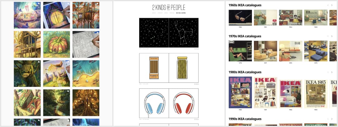
I fell in love with the beautiful bright iPad illustrations of Vika Muse
#FurnitureDesign
Some Friday beautiful print and furniture design eye candy: the IKEA catalogue through the ages
#Illustrations
Tired of the X vs Y design tool debate? Here’s some fun “there are 2 kinds of people in the wold” illustrations that always make me laugh (especially the toilet paper and the cereal ones, big fight with friends on those) by @inoffensive
Useful tools and resources that will make your life easy
#Accessibility
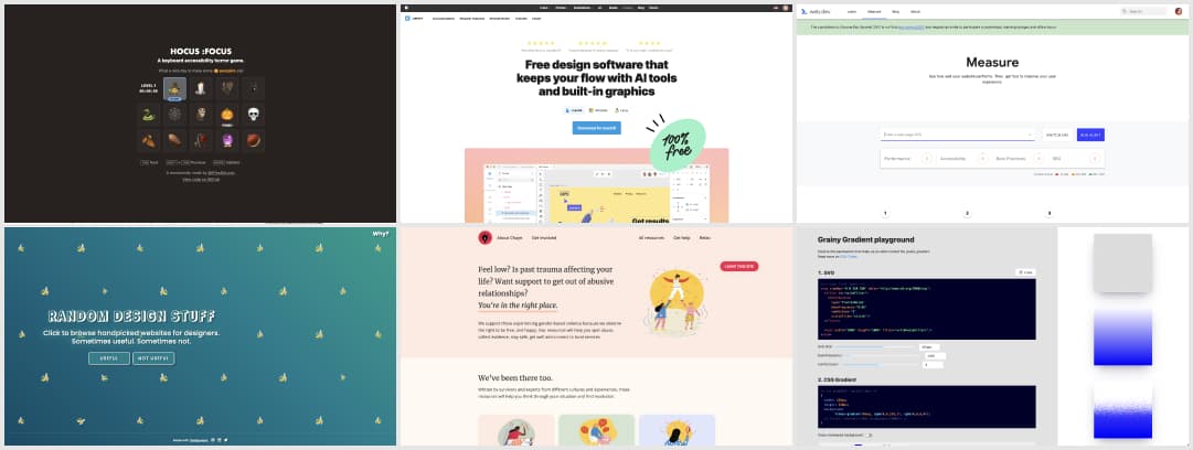
This is a great way to raise help raise awareness around accessibility: A keyboard accessibility horror game. (create by @HTeuMeuLeu)
#Icons
- Icons8 launched Lunacy, a free design software that keeps your flow with AI tools and built-in graphics
- @flatroundicons built those gorgeous illustrations that mix 2D and 3D in an elegant way
#Support
Chayn.co, a website that supports people experiencing gender based violence spot abuse, collect evidence, stay safe, etc. And that little floating “leave this site” button is such a great idea in that particular context.
#CSS Gradient
A cool Grainy Gradient playground by @jimmmy
#Performance
Dev Tools Measure: you can use this tool to measure your lighthouse score online (so that it won’t be measured with the device you are using and bias the measures). Tests are run using a simulated mobile device, throttled to a fast 3G network & 4x CPU slowdown
Video and tutorials
#UX
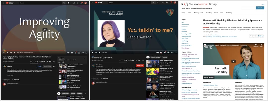
The Aesthetic Usability Effect and Prioritizing Appearance vs. Functionality – Users believe that designs that look good also work well, and UX should take advantage of this. But don’t make aesthetic usability lead you astray as a designer, because the UI must actually work well for long-term success.
#Speech
You talkin’ to me? A 40min talk by @LeonieWatson on Speech Synthesis Markup Language (SSML), the Web Speech API and (maybe one day) the CSS Speech module to make web applications that sound a lot more interesting than you might think!
#AgileUX
Improving Agility By Using Customers’ Definitions of “Quality” and “Done” , a 45 min talk by Debbie Levitt from @Delta_CX
News in the industry
#GDPR
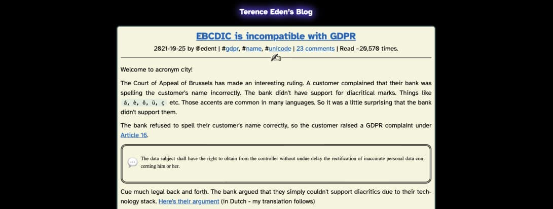
A customer sued a bank (using GDPR) & won, because bank would not display their name properly. The bank claimed that they could not technically display diacritical marks (é, á, ç…) I could sue so many companies for my é, including French ones, I even have a talk on how annoying it can be for users when they can’t input their name properly.

