Pixels of the Week – September 17, 2023
Faking container queries in Figma, CSS loaders and car UI inspiration
On Twitter, LinkedIn, and Mastodon, I share curated articles I read, resources and tools about UX Design, User Research, UI and mobile design, HTML, CSS, the web industry, some processes, some inspiration, etc. This is an archive of everything I shared this week. And some extra links that I decided to only share for the blog readers. Also, subscribe to the newsletter to get notified when those are published!
Now: what I’m currently up to
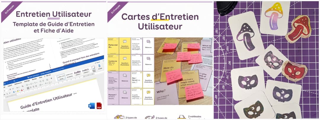
If you speak French and are in Paris, I’ll be doing my “user interview” workshop at ParisWeb on September 1st, with Myriam Jessier. For the occasion, we will be using my 43 printable user interview cards. If you are curious, they exist in English, but also, in French now too. I will be working on adding more French content to the shop soon, including a user interview guide template. Meanwhile, if you need an English one.
On the craft side, I’m playing with foam to make some stamps (Twitter, masto, LinkedIn). It’s a little annoying because it’s not very precise, but still quite fun. I published a reel of the cat skeleton stamp, using heat gun embossing for fun.
Interesting frameworks and concepts
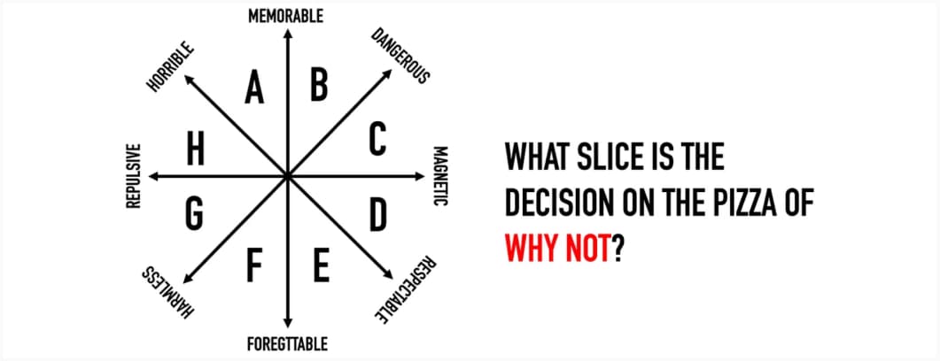
Why not? Whatever your reason, NO is a complete sentence, and should be respected for the honest answer it is. But this is still a fun diagram of “reasons you say no” (I wish I could be that honest sometimes)
TL; DNR: the one you should not miss
Container queries: why it’s time to consider them in Figma and how to implement them (10min) Great tutorial by Christine Vallaure on how to “fake” and document container queries in Figma for your development teams.
At the moment, I’m exploring with Figma, updating my documentation and course on responsive. I was already using and teaching variants, mix/max and auto layout to build “fake” responsive components you can swap. Christine’s article inspired me a new way to document this, I’m trying out the little color blocs to show the different intervals where this layout should be used.
Interesting articles that caught my attention
Accessibility
- Why do so many modern games have tiny text? (8min) that’s an issue that comes again and again in a lot of games, it’s worse on local coop, for example, Tiny Tina Wonderlands makes it next to impossible to read any weapon description, subtitles are minuscule and so on. I’ve never understood why we could not have a setting to make the font bigger when needed
- Web Components Accessibility FAQ: the important questions about accessibility and web components you might ask yourself
- Being “Polite” Does Not Ensure Access (4min) People with disabilities should not have to “politely” request that businesses comply with a law that has been in effect for over three decades. Further, voluntary compliance is a myth.
- First, do no harm: mistakes to avoid in creating accessible user experiences: tokenism, lack of user involvement, ignoring diverse disabilities, lack of holistic approach, insufficient awareness and training, discounting or overwriting lived experiences
Design, AI and UX research
- The Surprising Origins of Our Obsession with Creativity (11min) the concept of creativity emerged in the postwar era as a way to address the alienation and conformity of white-collar work. Creativity was seen as a way to make work more humane and to restore a sense of individual vision and passion. All of this was embraced by businesses and organizations as a way, you guessed it, to boost innovation and productivity. Not what you expected, right?
- Tree Testing: Fast, Iterative Evaluation of Menu Labels and Categories (18min) you should use tree testing (and not card sorting) when you want to improve your navigation and evaluate how people and where people expect to find different items.
- Is AI better at picking and pairing fonts than you? (13min) AI tools can be a good starting point for non-designers and produce okay-ish safe font-pairing results for non-designers (for a blog for instance) but you don’t want to use them to pick fonts for branding decisions.
Curiosity cabinet: non-design/tech rabbit holes I enjoyed
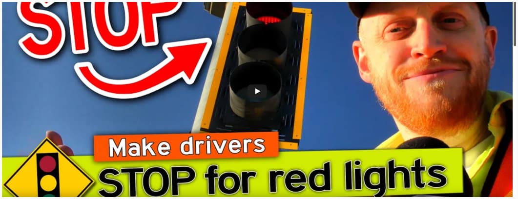
Three ways to FIX a STOP LIGHT: road design is always fascinating to me. Some stop lights are broken. Even if every corner had a red-light camera, many people would still run red lights. It’s interesting to see different tools engineers can use to reduce or eliminate red-light running?
Inspiration: fun experiments, beautiful art, and great ideas
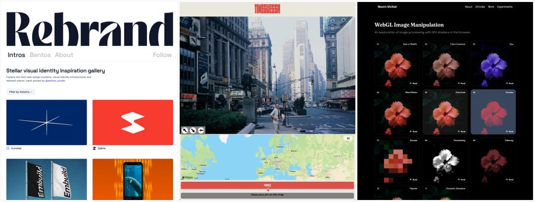
- Rebrand a gallery of visual identity inspiration, filtered by industry
- TimeGuessr: a game where you guess the right time and location of a historical photo.
- WebGL Image Manipulation: a very cool exploration of image processing with GPU shaders in the browser, with details for each on how it works
Useful tools & resources
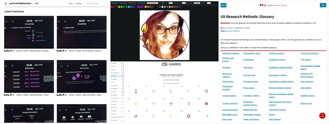
- Auto Interfaces: a gallery of examples of car UIs and dashboards, you can filter by brand and categories.
- UX-Research Methods: Glossary: a big glossary of UX research methods ordered by categories and key concepts, with links to learn more about each
- Tezumie-Image-To-Pixel: why would you need a tool to pixelate images? I’m not sure. But I love the cool visual effects you can get and play around with.
- CSS Loaders: The Biggest Collection of Loading Animations. Over 500+ CSS-only loaders made using a single element
Cool and Interesting Videos & Podcasts
- State of Web accessibility, ARIA in HTML, and missing UI patterns: some of my favorite accessibility people (Bruce Lawson, Vadim Makeev and Léonie Watson) got together and chatted about screen reader and accessibility for an hour.
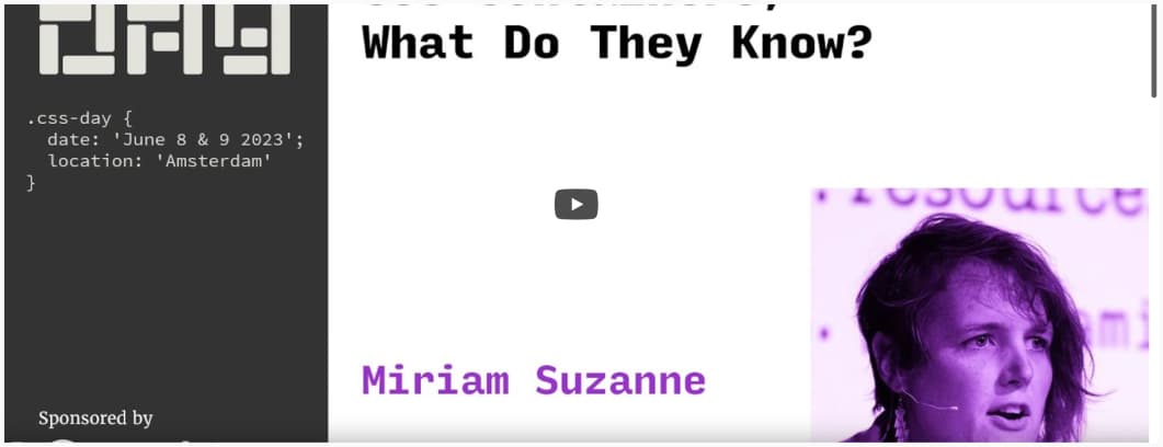
- CSS Containers, What Do They Know? Miriam Suzanne’s awesome talk at CSS Day gave me so many ideas, I now need to put my little hands back into some code to play around
Tutorials
Practical Game Accessibility: ho, Unity has an online course on game accessibility, that’s nice!