Pixels of the Week – September 26, 2021
Every day, I share on Twitter and LinkedIn a list of curated articles I read, resources and tools about UX Design, User Research, UI and mobile design, HTML, CSS, the web industry, some process, some inspiration, etc. This is an archive of everything I shared this week.
#Now – what I’m up to
Hi, I’m back from holidays in Britany (a few pics here) and noticed that “gosh, we are almost end of September I have teaching classes soon”. So I’m currently working on a “what is UX design and how to convince your company/client to hire some” small master class for different developer, HR and tech audience. Also, I’m super happy that none of my plants died during the holidays (trust me it’s a miracle) and the little succulent baby I was able to grow out of a leaf is still fine!
TL;DNR the one you should not miss
#Design #Agile
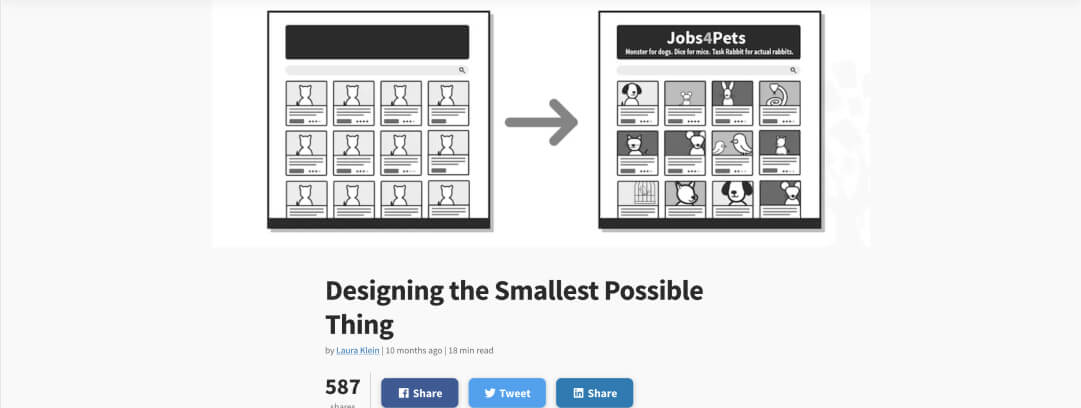
“We need to stop designing faster and learn how to start designing less, by shipping smaller things more frequently we have more chances to get feedback.” an interesting article on agile and design by Laura Klein
Interesting article
#UX Design #UX Research
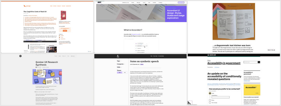
- The Cognitive Costs of Bad UX. It’s not just enterprise software: bad UX is pervasive. It’s caused by 1) lack of care and 2) bad incentives. In the case of online publications, at least we readers have an easy fix.
- 5 tips to help you synthesize your UX research work in a more efficient way by @uxtoolsco
#Design
- There’s a place for “because it looks better” I think that the “it looks better” your professional designer eye trained in patterns and visual principles that is able to take shortcuts. Most of us can “explain” why it looks better: contrast, structure, information architecture, etc.
- I never heard of the “Lego kits Syndrome”, an interesting read on the limits of design systems, the lack of participation and how to balance this by @buditanrim
#UI #Accordion
A quite nice introduction on all the small details you need to be careful about when designing accordions
#Accessibility
- Interesting piece on accessibility considerations for conditionally revealed questions.
- Notes on synthetic speech: the importance of voice quality as a part of user experience and the different types of synthetic speech formats you can find bu @LeonieWatson
#Diagrams
“101 Diagrams: My Test Kitchen Results“, it was super fun to test Abby Covert’s recipes for her new book on diagrams. Really looking forward to see the whole book, it’s going to be super useful especially for students and beginners
#Inclusion
I’ve never heard the words manel (all men panel), manference (conference with only men in the line up) & wanel (panel with only white people) and discovered them in @betterallies awesome newsletter, worth checking out and subscribing
Inspiration, fun experiments and great ideas
#Medieval Illustrations
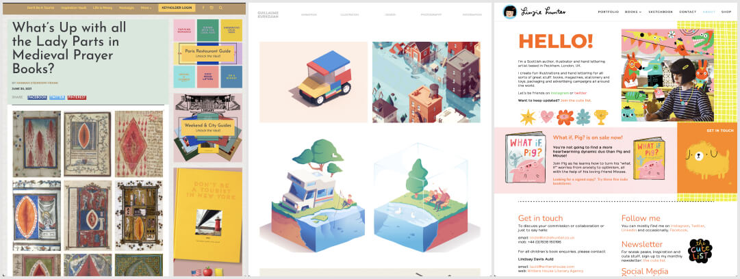
This is fun and quite interesting: What’s Up with all the Lady Parts in Medieval Prayer Books?
#Illustration
Guillaume Kurkdjian is an illustrator and animation in Paris. I love his 3D style gorgeous illustrations. You can find their work on their website and instagram
#Inspiration
Linzie Hunter is an illustrator and hand lettering artist based in Peckham, London. I love her cute little animals illustrations. You can find their work on their website and instagram
News in the industry
#Conference #PWA
Yeah, if you are into PWAs (Progressive Web Apps) or just interested in new features of web browsers, check PWA Summit 2021
Tutorial
#CSS #SVG
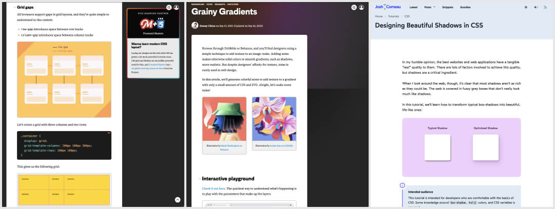
- Minding the “gap”, an interesting article on CSS gaps for columns and flexbox
- Grainy Gradients is one of my favorite “style” of illustrations, I think it’s one of the first things I learned to do in AI, so I’m super excited to see we can do something similar with CSS and SVG noise, thanks @jimmmy!!
- A deep dive into “Designing Beautiful Shadows in CSS” by @joshwcomeau. I really like the bonus drop-shadow that lets you create shadows that follow specific shapes
Videos and Talks
#FontSize
“What’s the best font size? A guide for body text in responsive web design” an nice video by @glyphe. I’m a big fan on “Make it bigger”, but I wonder about complex enterprise UI, most users want it smaller to get more data on the screen
#Bootcamp Review
If you are curious about how to review if a bootcamp program is any good, Debbie Levitt gives you some tips and reviews a few programs in this 1hour podcast: “Assessing Bootcamp, Uni Degree, & Online Course Curricula, Part 2”
#TEDTalk #Motivation
How to stop languishing and start finding flow with the presentation of he Mario Kart theory of Peak Flow
Useful tools and resources that will make your life easy
#Accessibility
The Colorblind Accessibility Manifesto, 10 rules for more inclusive designs when it comes to color blindness, signed by 150+ designers.
#SVG
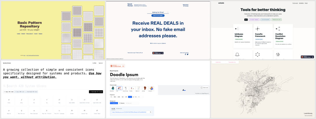
Another nice repository of basic SVG patterns you can use
#Icons
A growing collection of simple and consistent icons specifically designed for systems and products
#UXWriting
Speak Human is a website that generates human centric microcopy, it’s quite interesting if you are looking for some UX writing inspiration
#Placeholder
This is cool: a lorem ipsum for illustrations if you need fake illustrations in different styles for quick mockups or prototypes
#UIDesign
A place to find color palettes, gradients and different font pairing options to help you if you don’t have inspiration for your next design. Just be careful with color pairing, make sure you have sufficient contrast ratio.
#WordPress Theme
Say hi to Tove – a fun and colorful WordPress theme built entirely around the Full Site Editing features coming in WordPress 5.9.
#Jargon
In case you need help navigating the 124 918 (ok, 150…) acronyms of startup metrics jargon
#User Interviews
A fun quick test where you have to tell if a question is a good or bad question (or it depends) to ask in an interview, but the most important part: why is it good, bad, or “it depends”.
#Thinking Tools
Collection of thinking tools and frameworks to help you solve problems, make decisions and understand systems.
#Curation
Apparently my article on resources to design tables was popular on Refind, so I decided to give it a try. It’s a tool to get 5 links/day on topics you chose. So far it’s been nice. In case you want to try, here’s a ref link
#Maps
This really cool project lets you draw all the roads in a specific city.
So I’m curious: what does your city (or a city you love) look like if we only show the roads? Here’s Luxembourg!
