Pixels of the Week – September 27, 2020
Every week I share a list of curated articles, resources and tools about UX, UI and mobile design, HTML, CSS, the web industry, process inspiration and more…
This week’s selection: centering in CSS, evolution of Google’s sign up form, SVG and CSS animation tips, CSS perspective, the story of macOS System Preferences, line breaks with inline CSS, CSS accessible checkboxes, figma wireframing library, designing with reduced motion, designin with Paint, a podcast on the need for UX specialists, a parody of branding, an accessible comic, etc.
#Now – what I’m up to
This week I spoke at my first “Russian” conference and shared on twitter my “cheap” lightening setup for remote online conference talks and workshops. You can see a picture here and I added the links to each element here (maybe I’ll turne this into a short article when I get time).
I also replied to a few students questions in the “digital design talks” interview.
Last but not least, my birthday and Xmas gift from me to myself arrived, I got a new bike to go to work (and have nice bike rides during the weekend). Big kudos to Radpower’s customer service who was really awesome during the whole process, from chosing the bike to getting it to my flat!!
TL;DNR the one you should not miss
#Accessibility #Animations
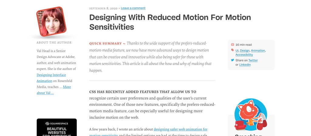
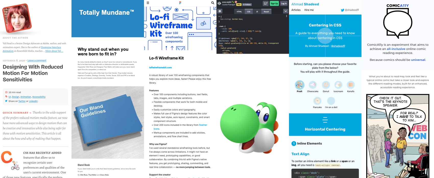
Designing With Reduced Motion For Motion Sensitivities, a great article to help you build more accessible and inclusive animations by Val Head (@vlh)
Interesting article
#UI
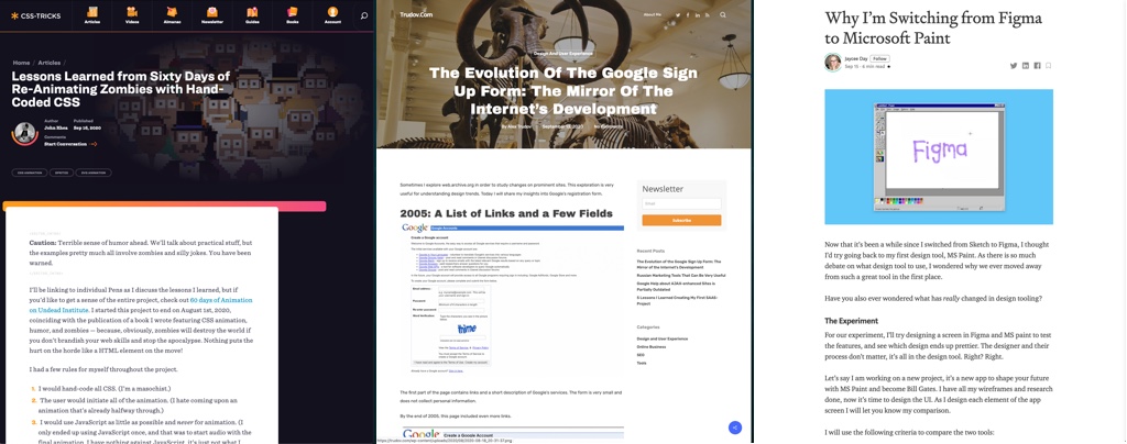
- “The Evolution Of The Google Sign Up Form” it’s always to see how some things change over time based on visual trends, user research, brand awareness and user habits.
- “The untold history of macOS System Preferences” the evolution of the different icons and settings over 17 versions of macOS
#CSS #SVG
“Lessons Learned from Sixty Days of Re-Animating Zombies with Hand-Coded CSS” great lessons if you ever need to combine SVG and CSS, animations, etc.
#Tools
“Why I’m Switching from Figma to Microsoft Paint” brilliant fun article by @tooaverage It’s quite interesting that design tools didn’t change “that” much in 25 years. Also, I’m a total paint fangirl so I’m biased but paint wins in my heart
#WebDev #Stack
“The tangled webs we weave” an interesting reflection on modern web development, how complex our stack became, how supposed 3 technologies exploded into 20 different inter dependent ones
Inspiration, fun experiments and great ideas
#Branding
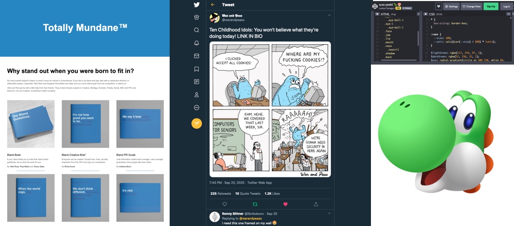
“Totally Mundane™” a set of resources and guidebooks to make sure that your brand or product never stands out and you never take risks. The speaker invite made me cringe ^^ Basically good examples of what you don’t want to do
#Copywritting
A fun exercice of writting “Ransom notes in different styles“: Instagram, Dorothy Parker, in the style of millenial officer worker, James Joyce, etc.
#Comics
The Cookie Montster doesn’t like cookies banners, by War and Peas
#CSS
Hi, here’s a full HTML and CSS Yoshi, because, why not?
#Music #3D
Bongo Cat In Space (3D Animation), a really cute little 3D animation by Alex Pogorelov
Podcast
#UX #Roles
This week, I also participated in Delta_CX’s podcast, we discussed about why you still nex CX/UX specialists even with business analysts documenting exactly how this looks and works, product owners doing wireframes, and engineers asking customers “what they want”
Tutorials
#CSS #Center
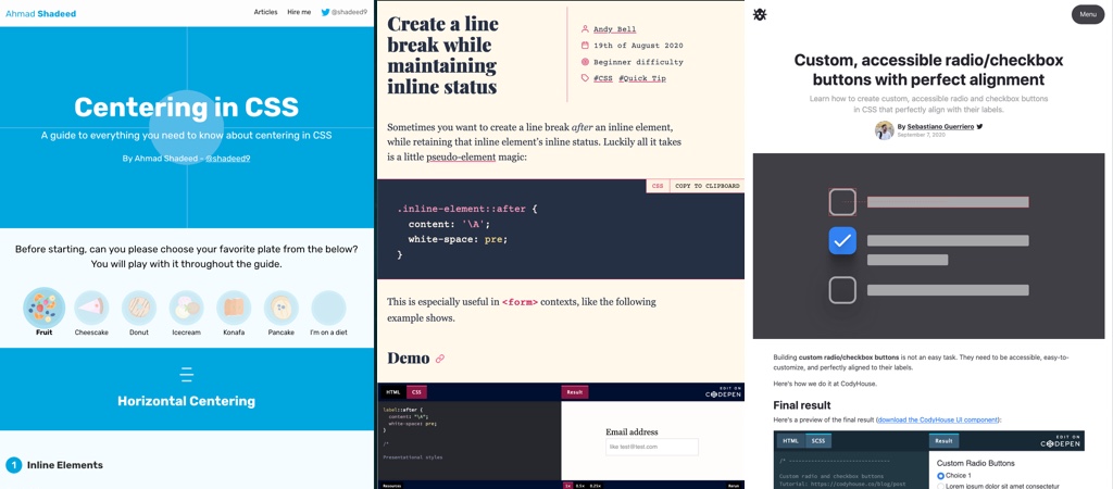
Front-End people you need to bookmark this: “Centering in CSS: A guide to everything you need to know about centering in CSS” by Ahmad Shadeed (@shadeed9)
#CSS #Animation
“How CSS Perspective Works” great article to help you understand in details how those CSS properties work. Nevertheless I don’t think I have seen yet a “good” example of CSS perspective on a website that is not overkill eyecandy, have you?
#CSS
Create a line break while maintaining inline status, a simple 2 lines tricks by @hankchizljaw
#CSS #Accessibility
“Custom, accessible radio/checkbox buttons with perfect alignment“, yes it’s possible!!
Useful tools and resources that will make your life easy
#Figma #Resource #Wireframes
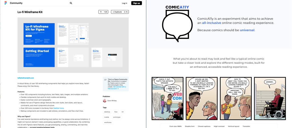
A free figma library for low fidelity wireframes with 100+ desktop and mobile components
#Accessibility #Comics
This is a nice idea: “ComicA11y is an experiment that aims to achieve an all-inclusive online comic reading experience. Because comics should be universal.”
