My 2018 Portfolio redesign: UX, visual design and development process
You might have noticed that there was a little bit of blog redesign going on here. This is because I redesigned my portfolio last week and I’m trying to make the blog match the new portfolio redesign. For the moment it’s a MVP, full static HTML and a little bit of PHP includes. There’s some design and linguistic decisions involved. In this article, I will explain a little bit the redesign process and what’s coming next.
First credits where due. I designed the portfolio and the icons and Geoffrey is the one who coded the whole thing
Why (why and why) redesign the portfolio
Let’s address the elephant in the room folks…No, I’m not looking for a new job. (I’m actually hiring a UX Designer and a Front-End Designer at the time of this article, feel free to reach out if you are interested). Though I can totally understand the question since most of designers redesign their portfolio to find a job.
So why did I redesign? Well, a few reasons.
First, my old portfolio was 6 years old. It was such a pain to update and add new works that I wasn’t updating it since 2014. So, the first goal was to have something I can more easily keep up to date.
Secondly, my old portfolio wasn’t clearly reflecting my skills as a User Experience Designer. There was not much text on the homepage, just a big slider (buuuuuhhh). Most of the text, my skills, process and also my conferences were in the “about me page” (told you, 6 years old). That was not a great information architecture. I wanted the new portfolio to have a better information architecture that will better reflect my skills as a UX and UI designer but also showcase my talks and workshops.
Last but not least, I wanted to go full English as the main language. I don’t live in France anymore and I want to have a more international audience. This meant that I needed to change the domain name, it would feel strange to have a .fr site in English.
Understanding the users and planning the content
I started the project by a really long phase of planning. This almost lasted one year. Yes, it’s super long, but I’m super good at procrastination when it comes to my portfolio, aren’t we all?
Target audience identification
Once I identified those 3 main goals, I had to identify my current audience and some potential new one. I worked with my SEO and content strategist Myriam on that part.
Based on my website data in Google Analytics, SEO insights, some small inquiries on social networks and 6 years of emails from my contact form, the current audience was mostly split between:
- People looking for a UX designer to work with them. This also includes people who see my resume call for tenders and want to check that I’m legit.
- Conferences organizers who want to invite me as a speaker
- People coming from the blog who either
- want some support on something I wrote
- want more information on a topic or more links / books to read
- want me to promote their product / want a backlink
- Recruiters, recruitment agencies
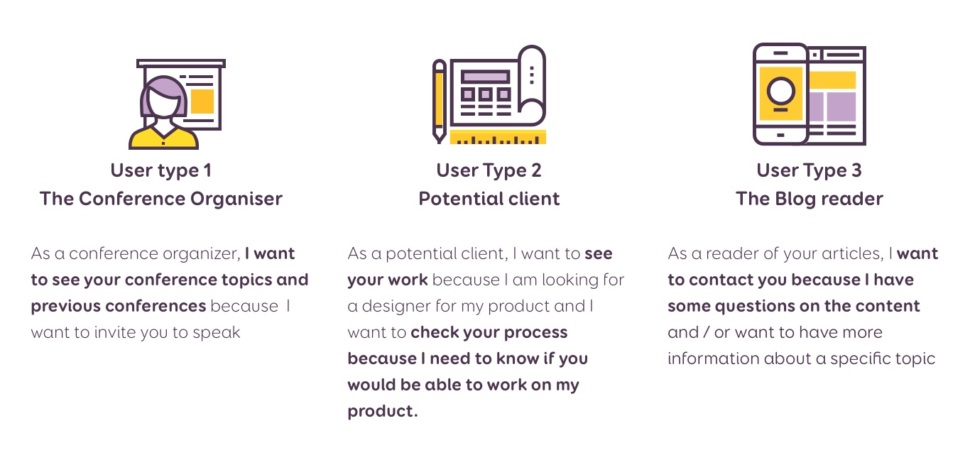
Since I’m not looking for a job and not interested in backlinks and turning my blog into a promoting platform, I mostly concentrated on people looking for a UX designer to work with, conference organizers and blog posts support.
Information Architecture
I started the redesign by a content inventory to identify current pages and their content. I also added to the inventory the new pages I wanted to add, based on the different goals and again, the request I got from users in my mailbox the last 6 years. For example, for the use case 3, I would like to add a page that will reference all the books I read. A lot of people ask me for book recommendation so having them all in one place would be nice.
MVP content decisions
This isn’t a super complex content inventory, just a bullet points list of all the contents I want to have somewhere at some point. But this helped a lot to stay focused and to decide what would be in MVP and in the next versions. I want to have a portfolio MVP that satisfies the main needs of the 3 use cases listed above. Then develop a more complex site. I colour coded my content inventory into 2 sections: “MVP” and “Later”
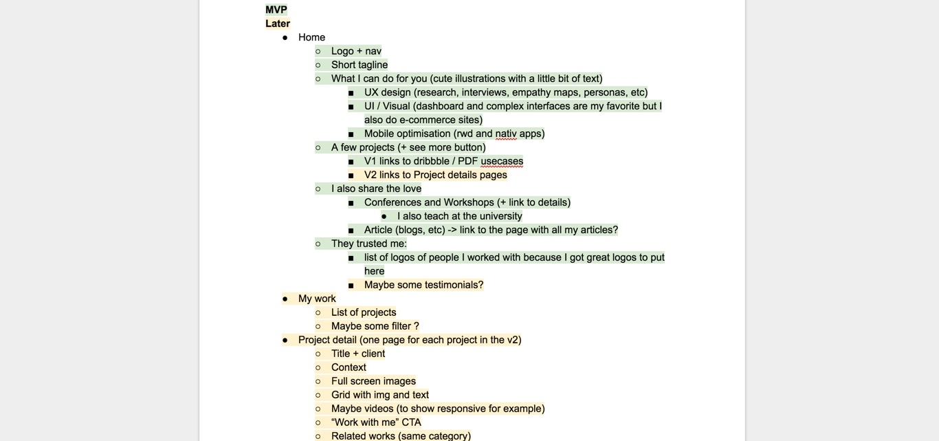
To put it short, MVP version is currently a transition version with a lot of “my work and process” content outsourced to the blog / dribbble / and into PDFs (due again to lack of time for the development). I’m not super happy about Dribbble because you can’t really put a lot of text to explain your process. But it’s simple to publish content there. So, for the MPV, it would have to do. Then V2 will have specific project details pages with all the explanation on the process and more pages.
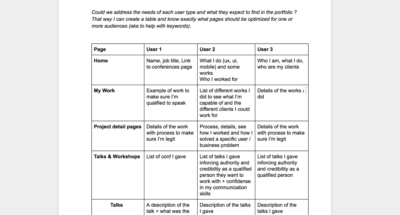
Addressing the needs of each user type
To address the needs for each of those 3 user types, Myriam made me fill a table to help me focus on what each user type needs on each of my current and upcoming pages. This also helped a lot with the design decisions later in the process.
A new visual identity
Once I had the target audience, goals and content, building a visual identity took me less than a month.
Let’s be honest, there’s no real meaning behind the yellow and purple
While I was working on my user needs and the content, I was also working at the same time on a new visual identity.
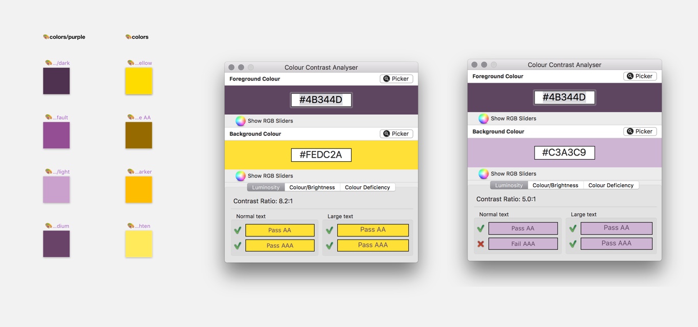
I could write a lot of bullshit to try to explain to you why I chose yellow and purple. I will be honest instead: I’ve no real explanation, there’s no hidden symbolic. I just wanted to use those 2 colours because I like them and feel like they work nicely together. It’s my portfolio. For once in my designer life it’s about ME and what I like, so hello ego, here we go, purple and yellow it would be. I was also kind of tired of the really pastel colours out there, all the white and grey, boooring. I wanted something fun and colourful, while proving to the world that you can have both a yellow and accessible site. I did some visual research on how to combine those.
My first idea was to go for a more red violet kind of purple. But I did some accessibility tests and it was hard to combine. I chose a medium purple to go with the yellow, and some lighter variation that I could use with dark text. As I said, I wanted to be accessible, the goal was a WCAG AA grade for the colors ☺
An idea, on top of another random idea, step by step
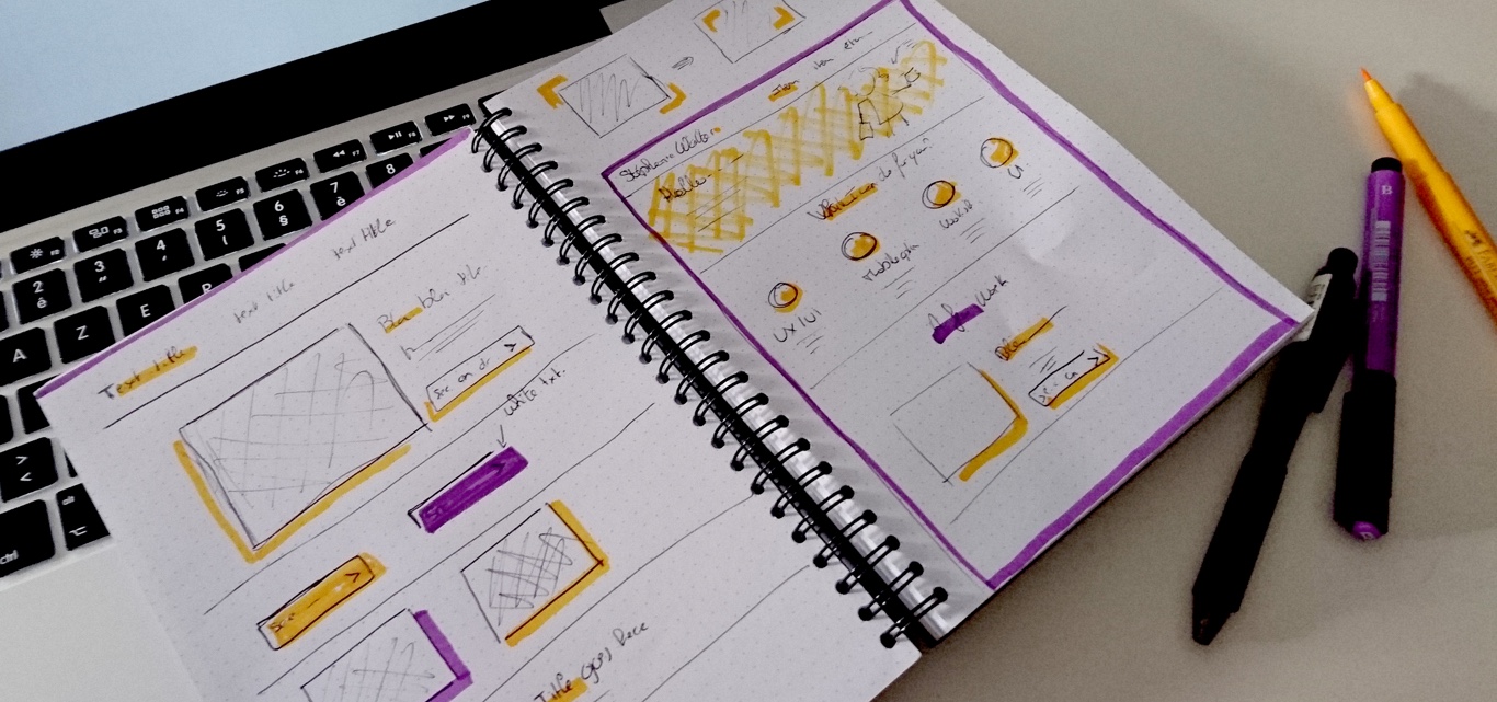
While searching for inspiration and working on those 2 colours, I noticed something: yellow and purple where the colours of the tool I was mostly using at work: Posits and Stabilos pens. Pen and paper are a big part of my process: from user interviews to information architecture on paper, ideation sessions, crazy-8 exercises and sketching interfaces and prototypes.
I decided to try to bring this in the new visual identity as well. It’s kind of funny because I remember talking to a friend a WHILE ago (like 2 or 3 years) about redesigning my portfolio. She told me that she could totally see something sketchier for me. She was right.
I started drawing some ideas, paper and colourful pencils.
A content oriented Moodboard to inspire me
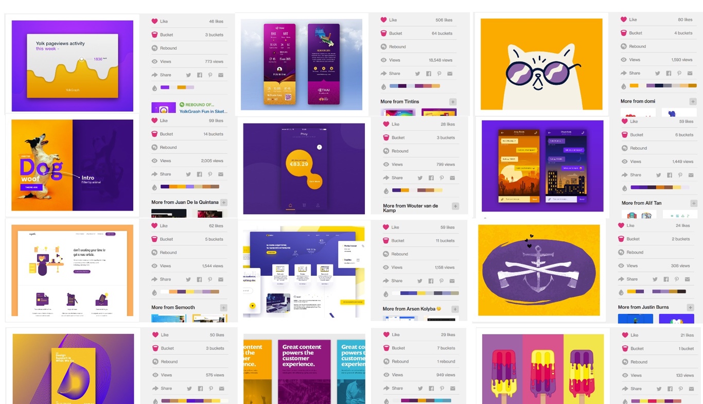
I think I was collecting other designers’ online portfolio as bookmarks for the last 2 years. I took a look at some of them. But I have to admit that I quickly entered into an “inspiration fatigue”. So instead, I decided to look at really specific elements I was interested in, to build a moodboard of different components using realtimeboard.com
I wasn’t super interested in the visual identity, but more in how those people presented their work. What kind of words where they using? Did they use “I” or “she”? What tone? How many projects on the homepage? Where there some specific elements that I liked about them? Etc.
Element collage and visual exploration
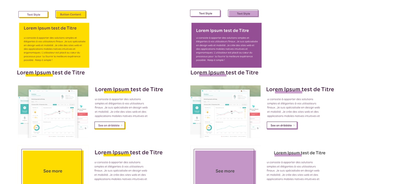
Based on Dan Mall’s Element collages methodology, I started playing around in Sketch to explore some visual ideas. I wanted to test if what I drew was working on a screens. I came up with 2 sets of coloured components. I decided to keep them both. Yellow will be the “main” colour and purple the “secondary” one. I created some “filled” call to actions for important actions and “ghost” ones for secondary actions. I had to tone down the purple a little bit to make it more readable on call to actions though.
I admit that I’m still not 100% comfortable with going full yellow. Since I will have lists of works, conferences, I decided to use the yellow and purple on odd and even items to alternate.
Some Sketchy Illustrations
This content moodboard helped me build my homepage illustrations. In the search and planning phase, I had identified 3 different “topics” I wanted to put on the homepage. I’m currently a big fan of nice illustrations. I didn’t want some stock icons for my portfolio, so I started brainstorming about how I could visually represent “UX design and user research”, “UI and interaction design” and “mobile inspiration”.
I drew all the icons and pictograms that could represent those topics.
Then I decided that I wanted to build an illustration for each topic that would be composed of 3 of those symbols. Then I sketched a few combinations.
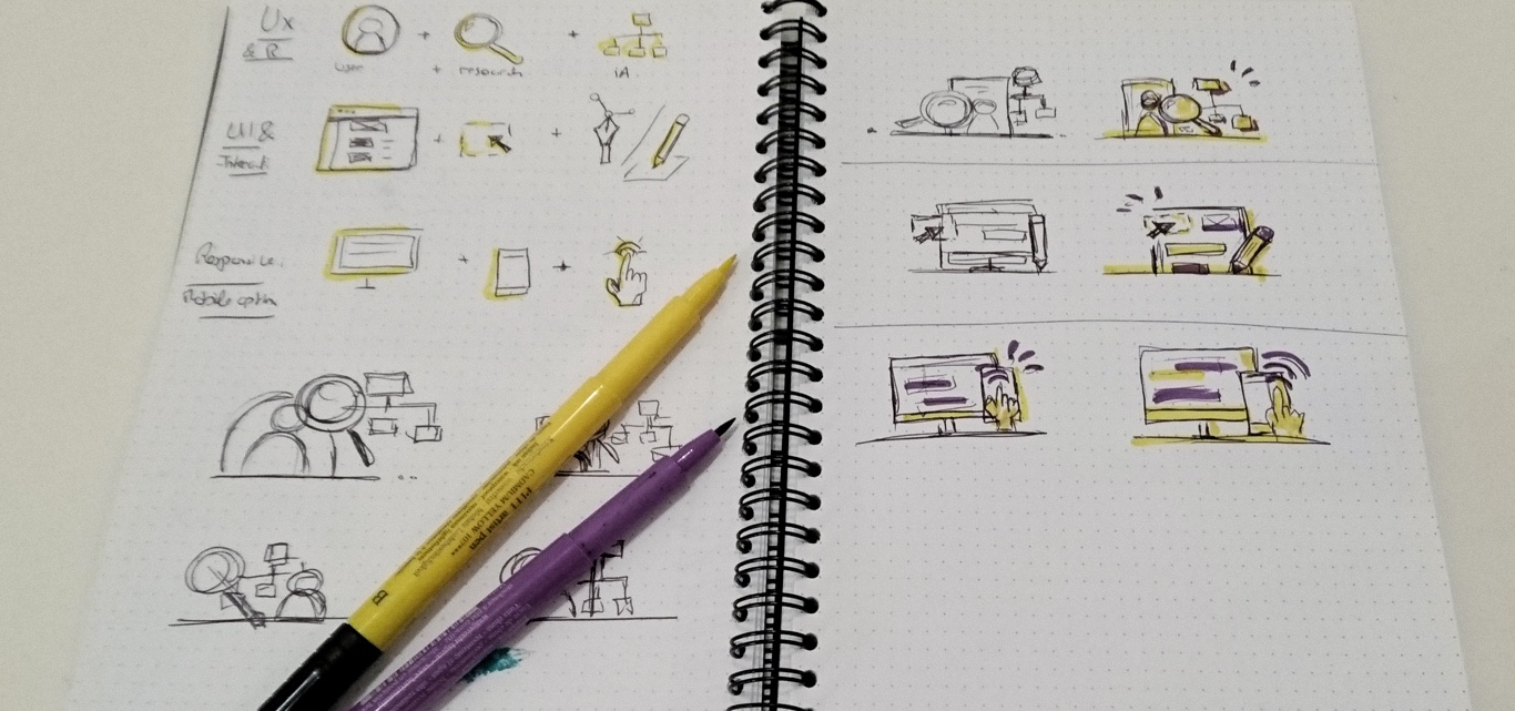
The style of the icons was defined a long time ago (maybe even before I decided the colours of the new identity. I opened Illustrator and worked on those, playing around again with the 2 colours of my new visual identity.
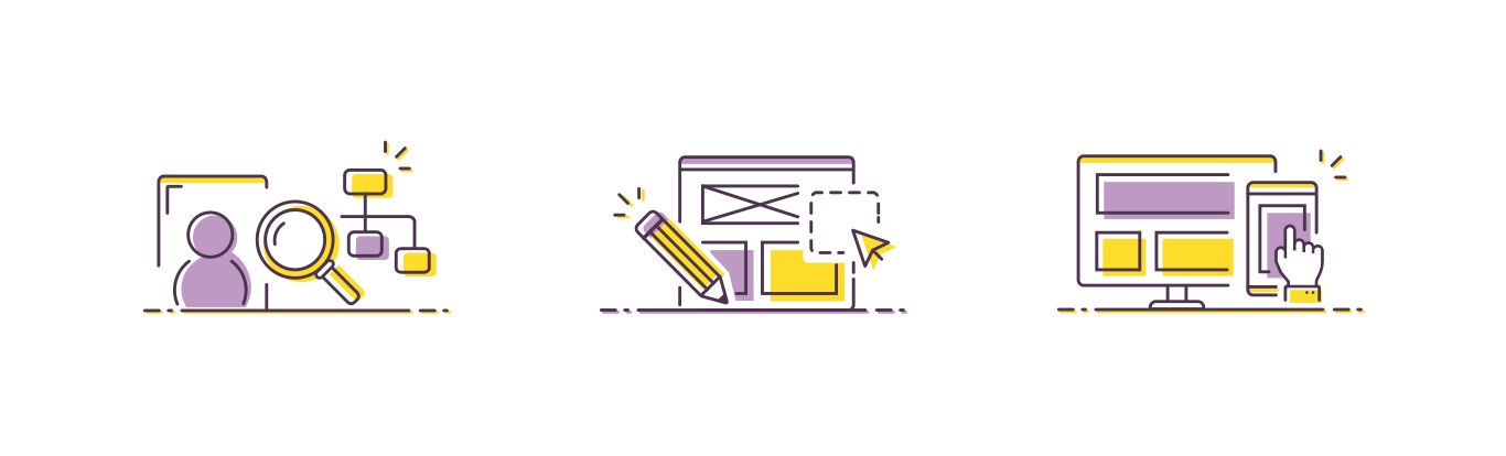
The whole process took me a whole afternoon of work, here is the final result:
Putting it all together – the homepage design
So, at that point I had:
- A solid content structures
- A visual identity. Kind of.
- Some illustrations.
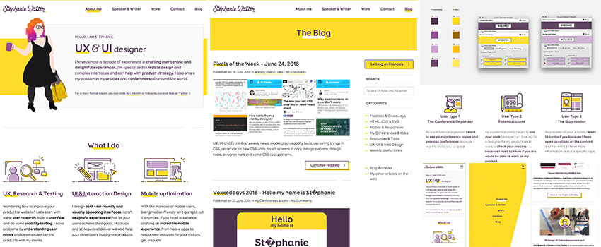
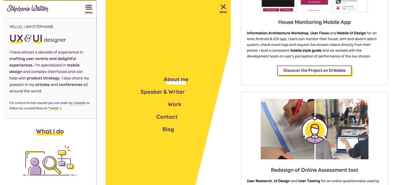
It was about time I stopped procrastinating. I opened Sketch and designed the homepage directly using the content inventory and some paper wireframes.
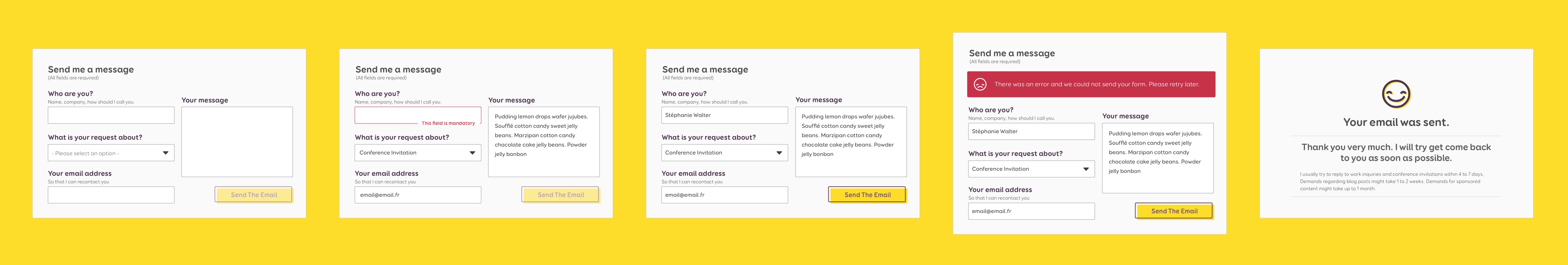
I also designed the different states of the form so that Geoffrey my developer would have error and success messages. This again took me another afternoon.
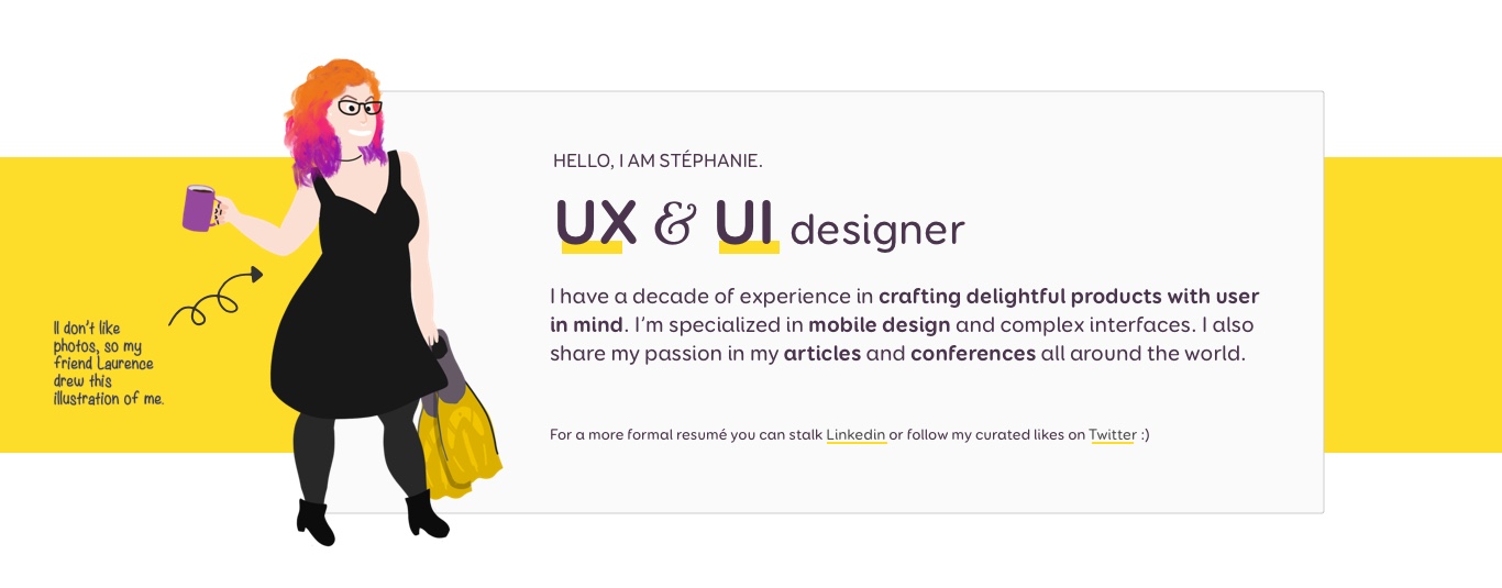
The Character illustration on the homepage
At that point, I still needed an illustration to make the top of the page more welcoming. Since this page is about me, I was wondering about doing another illustration that would mix different things I like.
Then I remembered that my friend Laurence Vagner with a V. drew this amazing illustration to help people differentiate us. I asked her if I could use my character on the site. The illustration has this little hand drawn touch I love. Also, I hate photos so this perfectly reflects me and my personality, my hair colour (current one anyway). I love it. She authorised me to change a few things so the current illustration is a little bit different from the original one though.
Code, content and building the other pages directly in the browser
In my developer, I trust
Once I finished designing the homepage, Geoffrey started coding it. I totally trust him with interaction design so I let him build all the animations and transitions. He showed me what he was building, we discussed animation delays and behaviour directly based on what he built into the browser. He’s the one you need to congratulate for my super cool responsive mobile menu <3
I told you before, this is a static site. Geoffrey built me some PHP include files so that I could add more content. The code is on a bitbucket repository so we were able to collaborate quite easily. I added the content and changed the HTML while he was building the HTML and CSS of the other pages. The first commit was May 18, but most of the coding took place between May 25 and June 4. Also the bug tracker is public, in case you see some strange things feel free to report those ☺
Finishing the MVP pages
Once I had the homepage, I thought I could build the “conference” page directly. But I ended up opening Sketch for that as well. I also decided to design a quick version of the homepage of the blog and of the conference list page to see where this was going.
For the moment, the blog is a mess, I admit. We applied the CSS of the new portfolio on the top of the CSS of the old blog, removed a few things and basically designed directly in the browser using HTML and CSS.
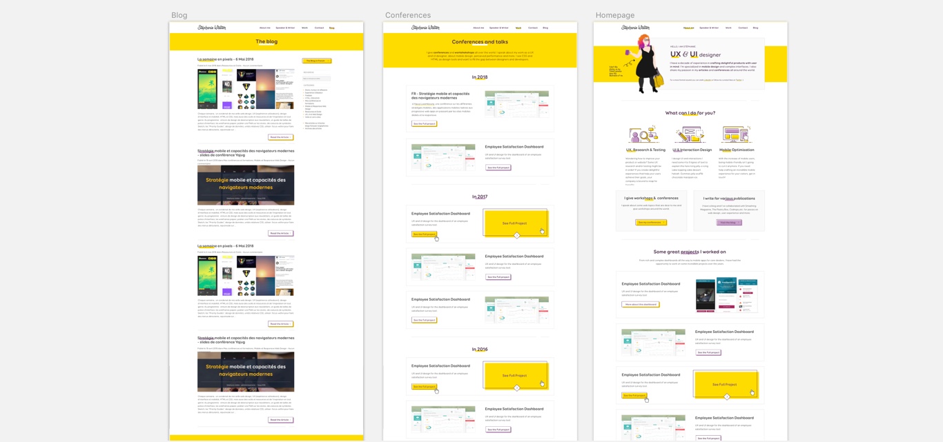
For the moment, the site has 2 real pages: homepage and conferences. The navigation is a mix between anchor inside the page and links. I’m not super happy about that, but this is supposed to be temporary.
Preparing the content – from text to dribbble and PDFs . MVPs again
While Geoffrey was coding the pages, I was preparing the content. First, I had to choose which projects I wanted to put on the site. Then do a little bit of clean up in my dribbble projects to match my portfolio structure. I also wanted to add a more detailed use case but dribbble isn’t really the place for that, so I ended up publishing it as a PDF file. It’s not the most perfect solution, but again, it does the job (for now).
I wrote descriptions for the projects and the conferences, prepare images for those as well. This took me about one day and a half. Yes, I spent more time writing texts and preparing assets than designing the homepage.
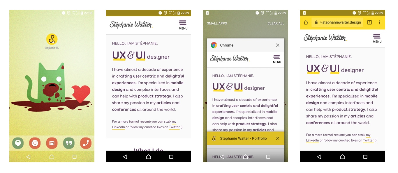
Going responsive and mobile (in the browser)
We designed the responsive directly in the browser. Geoffrey built the site on a system of content first breakpoints so I just changed a few breakpoints to adapt the responsive typography to more content than what I designed in the mockups.
Favicons and social images, the final touch before the big launch
While Geoffrey was fixing the last bugs, I added some favicons to the site and all the cool metas so that you will be able to have a really nice launch icon if you decide to add the site on the homescreen of your device. I also added the metas to have a yellow colour in the android top bar and more Android mobile niceties (I will do a specific article one day about that, meanwhile you can check this part of my Smashing article on the topic)
If you want to add all the favicon without going through the pain of generating all the images, you might want to try realfavicongenerator.net
I also prepared the images and the open graph, twitter and google plus cards code. Nevertheless, I’m still trying to figure out why the hell Google mobile is using this image (if you have any idea)
The big launch and what’s next to come
Changing the portfolio domain – an SEO mess.
Launching the site was easy, changing the domain (and making Google understand this) was not. I redesigned the site, changed the language and removed a lot of pages in the process. So, we had to do some nginx URL rewriting. I exported my Google analytics data and created a spreadsheet to decide what should be redirected where.
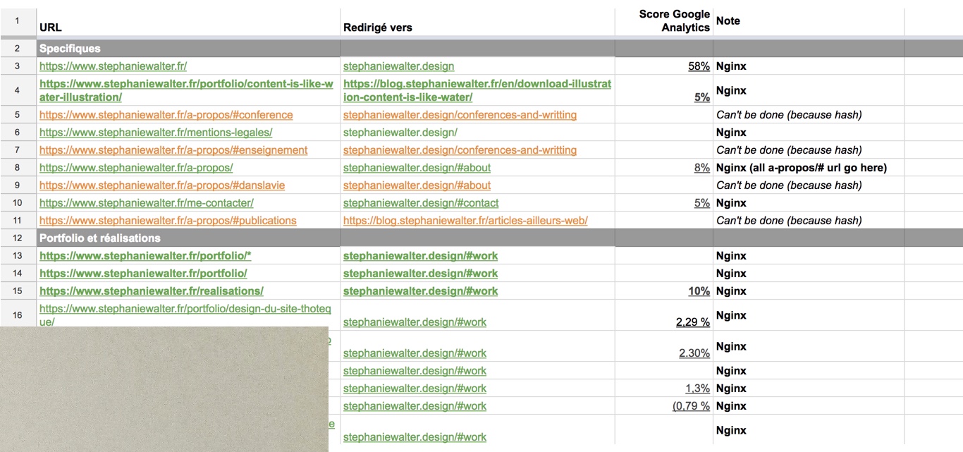
After a week of 301 in place, Google would still not understand that stephaniewalter.fr was redirected to the new domain and was still displaying both stephaniewalter.fr and stephaniewalter.design.
I tried a site:www.stephaniewalter.fr to understand what URLS I missed from, the index. Then I understood that Yoast SEO plugin had also fucked up portfolio’s SEO. If you are not familiar with what happened: V7 of the plugin had an issue and WordPress media pages where indexed. All of a sudden, WordPress had a LOT of new content indexed for my site. No wonder Google didn’t want to remove it, 90 pages of crappy image pages vs 2 new pages, aoutch. In the end, I had to copy those images on the new domain and redirect them as well. Super glad we have regexes for that, but still, quite messy.
What’s coming next for the portfolio
I told you before, this is a MVP. For the moment, I have a static site and a WordPress multisite to handle the multilingual part of the blog. Frankly it’s a mess to maintain. The portfolio used to have its own WordPress as well and I had 2 themes.
The idea in the future is to merge all of that, have only one WordPress with one theme for the portfolio and the blog. And this is going to get challenging.
The next version of the portfolio will be on WordPress, will have dedicated pages to build real case studies. It will also have some pages to explain my process and a page to showcase books I read that might interest you.
What’s coming next for the blog
For the moment, the blog’s URL is still blog.stephaniewalter.fr, French as a main language. In the future, I will change this to stephaniewalter.design/blog so that it be a ‘blog’ subfolder of my new domain. English will become the main language. I will also switch from a WordPress Multisite to a single site with a Polylang plugin. That might take some time, so please be patient.
I will still write things in French, but it will be mostly translations of my English articles.
I might also launch a little form soon to ask you a few questions about how you use my blog, features and try to understand your needs a little bit better, so stay tuned ☺
That’s it for the process. Geoffrey might write a more technical guest blog on the coding part if you are interested. And again, if you see any strange things, use the bug tracker to report them. Thanks a lot.