Portfolio Rework: Animation, Micro interaction & SVG
I’m pretty sure you didn’t miss Stéphanie’s Portfolio and blog redesign. If you missed it, no worries, she explained a big part of the process of redesigning a UX portfolio on her blog.
I personally worked on the coding part, but also on the animation and micro-interaction part. And that’s what I want to write about today.
Animation can be considered as part of a visual identity, I was really glad when Stéphanie told to “do whatever you want, you know the style, I trust you”. First because I like when people trust me (they are crazy to do so, but… anyway) and second because I love working on animation and micro-interaction.
Read the Portfolio Redesign Article
Let’s go through the different little animations and their specificities. I want to share with you some tips, things I learnt before and practiced while creating those interactions, to inspire you.
Before we start, keep in mind that the following portions of code are just snippets taken out of the whole context. Also, you can totally use other units than px in your code, I even recommend relative font units like em or rem.
If you have any question, feel free to ask in the comments and share your animation tips and ideas as well.
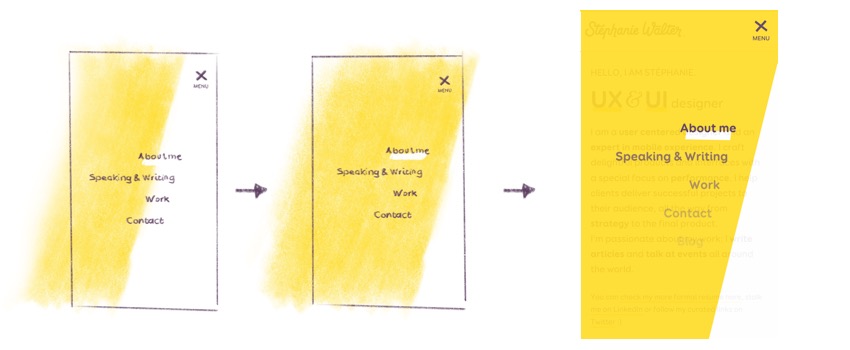
Small screens’ main navigation animation
When you visit the website on small screen devices, you might notice the cute little burger menu and the whole animation behind this component.
Animating a burger shaped icon
When it is time to create a mobile menu on a website, I’m always wondering –and not only for this website– if a burger icon button is a right solution. Should we hide and show the menu? I usually prefer things that are not hidden to use, but this is a portfolio menu for a onepage layout.
And for the arguments against burger-icon, I let you read about it here and there if you are curious.
Shape of the burger icon
That burger will be a button with a span element and a text saying something like “Menu”. I guess it’s pretty easy to identify 😀
As you can see, the icon can be destructured into bevels and a little skew. A visual effect on purpose to keep the identity near the original idea: sketchnote/draft style. But the entire button remains visually organized and balanced.
To do so, I used pseudo-elements and CSS transformations on this span elements.
The skew transformation on .burger allows me to skew (obvious, I know) the 3 lines at the same time.
Then each line has its own little skew effect and a small offset on the :after to balance the global shape.
The text is an uppercase medium font. I let you deal with the code, but I suggest you to always couple an icon with a text for accessibility purpose.
Animating the burger icon
The animation idea: remove the central line and cross the top and bottom line to build a cross. To do so, I used CSS Transformations and opacity properties.
Yep. That’s all, you’ve got your burger animation with less than 10 lines of CSS.
This creates the first part of the cross: the entire icon skews and rotates at 45 deg.
Meanwhile, I create the second part of the cross by rotating the :before pseudo-element to cross the first part.
Then I needed the :after pseudo-element to be hidden. It’s like a tomato slice running away from the bread on the top-right side, a little bit like it was ejected by the rotation.
Destructured Burger Icon Animation
Let’s see now how the animation of the main menu works.
Animating the main menu
Whether you are on big screen or on small screen, the same HTML markup is used for the main menu. Yep, I need to say it because I still see a lot of duplicated code for building small-screen navigation and big-screen navigation, and sometimes even 3 different structures in the worth scenario.a
Main menu positioning
The “desktop” version is built with flexbox positioning for the header and inline-block links for the navigation. We switch to mobile version when there’s not more space on the screen and links start colliding with each other. I use something like a content flow method I called Natural Flow First I detailed on my blog, so the menu has its own specific breakpoint.
The only request from Stephanie was “I want a beautiful full screen menu”. The first idea that pops in my mind was a centered list of links in full screen with a beautiful illustration in watermark like I did with Myriam’s portfolio’s menu. Lazy solution, I did it 2 weeks before.
I started with this idea and asked myself: why not keep the bevel effect you already have everywhere?
I designed directly in the browser using the Responsive Design Mode of Firefox Web Developer Tool. I started with the final state of all the components of the menu, then though about the animation between the two states.
To start with the position of the menu, here is the code applied when the main navigation component needs to become a “mobile” nav. (when the links collide)
The container covers the entire viewport thanks to a fixed position. I applied a transition on all the properties, but in fact the only properties that matters is opacity for the visual effect, and z-index to avoid a sudden disappearance.
Visibility property is changed for accessibility reason: it hides the content also for screen readers.
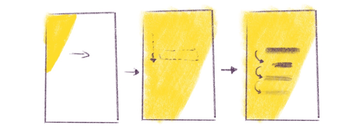
Then I worked on the yellow diagonal effect on the background.
The trick here is to declare the transform origin at 0 0 so the skew doesn’t “push” the yellow band too far to the right.
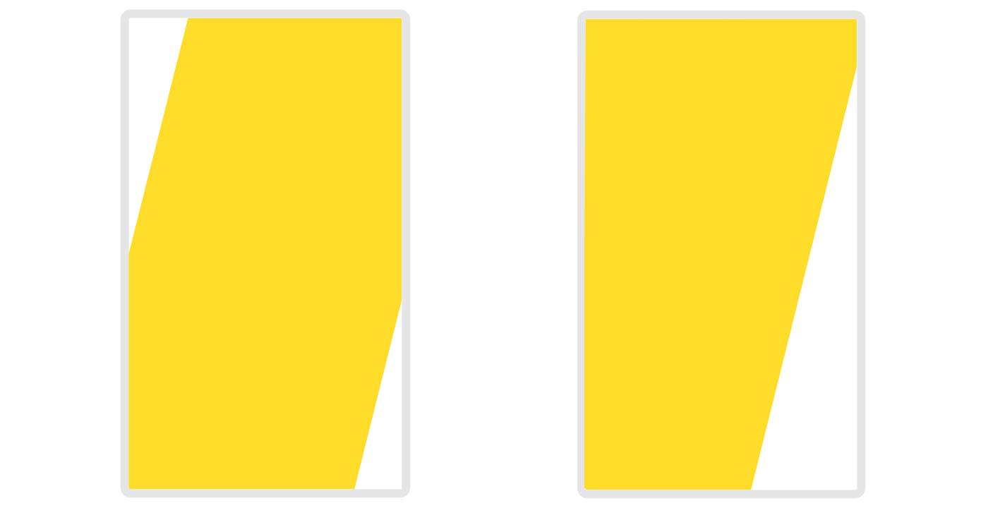
Transform origin settings: ‘auto’ (left) and ‘0 0’ (right)
Now that I get the background I was looking for, I need to position and skew my main menu.
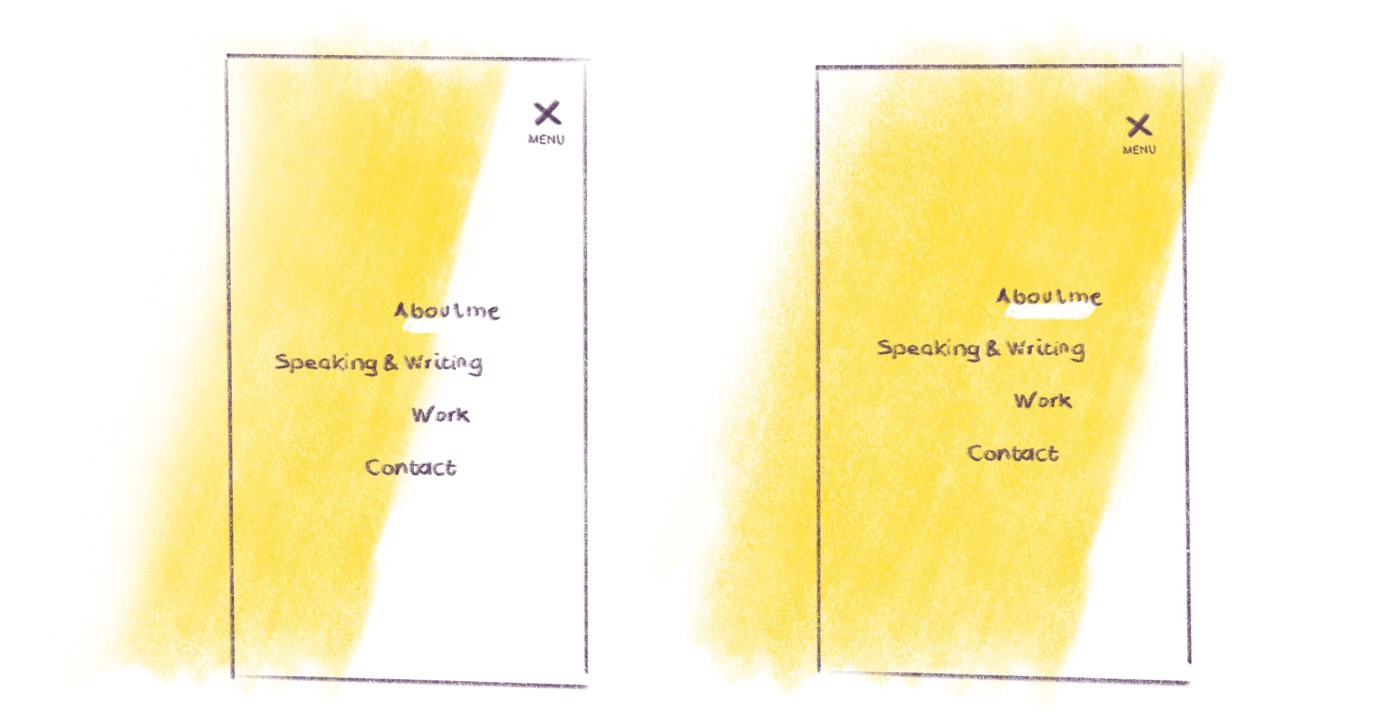
Have a look at the skew value. It’s a bit more than the yellow band because of the visual alignment of the text.
At this point, you are totally right to think the readability of the menu is not the best 😀
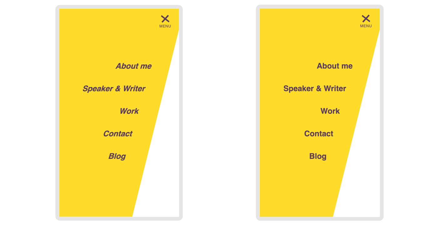
Left with skew on the list. Right with skew on the list and its items.
We have to skew each nav item in the other direction to get the right alignment. Let’s do that.
You saw during the animation that each link appears with a little delay one after another. To do so we need to hide temporarily the links and move them a little bit to the top, then make them appear one by one. To quickly build the code I used Sass and a small loop from 1 to 5 (my 5 links)
Which computes something like that in clear CSS. Here, the last value of the transition’s property represents the delay: the time to wait before animation occurs will be 175ms for the first item, 225ms for the second, 275ms for the third, etc.
As you can see, the delay between each item is really small. It’s on purpose: we want a smart and light animation to avoid motion sickness. I let you check all of that in detail on the CodePen below.
Main navigation: a smooth and sticky story
Now let’s have a look at the big screen navigation. I won’t go deep in the process of creating it but more in where I “failed”.
What I worked on, and reworked along the way
The sticky effect
I was planning to play with scroll-behavior property and sticky position.
I would love to use them because I’m kind of lazy when I need to build smoothscroll and sticky scripts in JS. I am happy if the browser can handle those things. For me, this is styling so it should belong to CSS.
I started by testing the sticky position (I already wrote about it in 2015). After code-designing the first version of the sticky menu, Stéphanie and I wanted a menu that appears only when the user start scrolling back up on the page.
I combined position sticky with an animation only when I decide to apply the .he-can-fly class. When that class is applied, the header becomes sticky, a smooth shadow is applied and the slideDown animation is triggered. I also keep the last state (100%) inside the @keyframers declaration (forwards value).
Now I need to define when I will apply this class. As I told you I decided to apply it only when user scrolls up.
This little menuIsStuck() function checks if the last scroll position is higher than the previous. If it is I add the .he-can-fly class on the body.
It’s a lot of variables just to check the scrolling direction, I agree, but my variables make the whole thing more readable.
Then, I trigger a function on scroll event. The function is called only when the JS engine is not already busy with working on the execution. It’s not really useful in my case, but it can become a real performance saver when you introduce several functions working at the same time on scroll or resize events. Go deeper with requestAnimationFrame() thanks to “Leaner, Meaner, Faster Animations with requestAnimationFrame”.
Instead of using this little trick, you could give a try to Lodash.js and its _.throttle() function. And if you want to go further have a look at this blog post about debouncing javascript event.
I still needed JavaScript to do the job, but if you plan on having a persistant sticky header, or on coding a little prototype, this code I was planning to use at the beginning will save you time.
The spy-scrolling
The idea was ideal here: sticky menu and in-page anchors, let’s spy the position in the page to mark the current section!
But when we decided to get the sticky header only on scroll up, I was wondering if the spy-scroll feature was still a good idea. We finally keep the feature for people who scrolls up.
I’m pretty sure the code might be modern as f*ck if I would use IntersectionObserver (I like this little post with a mobile demo). I’m not really confident yet with that, so I decided to go with measuring the scroll position and the top offset of each section of the page.
So here I save an object in a variable containing the top offset of all my sections.
Then I added the next portion of JS inside my previous “onscroll” listener. See the previous part of code marked line 17. ([spyscroll part])
The value of 140 is a magical number. Kind of a threshold to make the whole thing smoother… at least to me 😀
What I worked on, but finally didn’t keep
In an ideal world, I wish I could use a sticky position and a scroll-behavior set to smooth to deal with all the stuff I spoke before.
The fact is that scroll-behavior is not really well supported by the browsers. When I start thinking about that, even Chrome didn’t support scrollIntoView(). Yeah the support of behavior-scroll in CSS and the support of scrollIntoView() in JS is the same. You can actually do something like that in JS.
Or do the same with CSS by targeting body element if you want to apply the smooth-scrolling to the entire page.
I finally went with a solution that allows me to use scroll-behavior in JS with a polyfill by Dustan Kasten. The polyfill gives me access to the scroll() function I used like that.
For each link targeting an internal anchor, I get the href attribute which is also the ID of the aimed section in the page. I catch the offset top of the target and ask to scroll to the top of that target. I kept a lot of variables in my code to make the whole thing more understandable. I hope it is 😀
Animations on project component
Going back to an animation story. Did I already mention that I like animate things?
When you go to the home page of Stéphanie’s portfolio, you’ve got a list of projects with an illustration next to the description.
Animation details
I won’t go deep in the code, not this time. You just need to know that the animation is sliced in several items. The image, a purple frame, a yellow background made by 3 pieces.
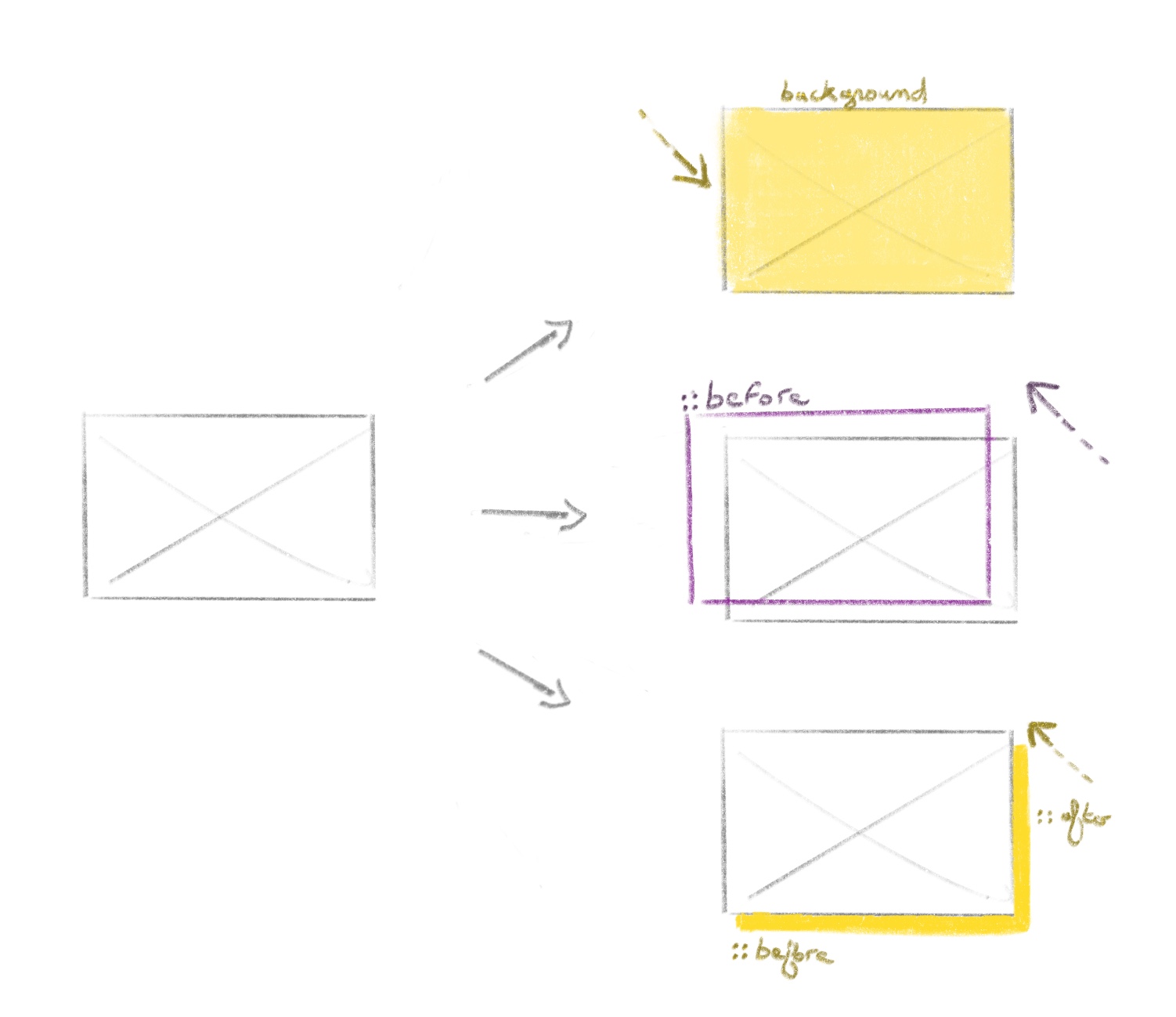
I used a lot of pseudo-elements to build this. Once all this visual part is set, I make the text and the little arrow appears with a bit of delay.
I don’t want to bother you with code detail, I’ll let you check the source for that. Ask me question in the comment area if you need help 🙂
I would like to focus on the little arrow that appears in that animation.
Reusable SVG
As soon as I need to duplicate SVG, I like the idea of going with the reusable SVG method. This method is quite simple: define the SVG to reuse, pick the ones you need here and there in your document.
Let’s see the code together. I define the beautiful diamond arrow made by Stéphanie as reusable SVG.
Then, to use this defined SVG later in the document, you need to target the ID of the group (<g>).
One of the numerous advantages of that method is that the SVG code to use a previously declared path is really short. The other one main advantage is that your original SVG code is not duplicated: easier to maintain, less noise in your code when you reuse a SVG.
When you take a look at the Chrome Dev tool, you will see that a shadow-root is created to help you see what SVG is added to the DOM when using a <use> element.
Good to know: the namespace xlink to use href is deprecated but yet supported.
The fact is the namespace xlink will still be supported for a long time, like the syntax of pseudo-elements with “:” which became “::” (like ::before), but the old way is still supported.
currentColor trick
Take a look at the projects list: one in two is yellow, the alternate color is purple. To do so with my reused xlink SVG method becomes kind of tricky. You can’t really directly manipulate the fill value of your SVG based on the parent container 😀
The currentColor way works
I wanted to do this with CSS Custom Property to take advantage of the CSS heritage of the property though document. I supposed that, if I can do it through document, I should be able to do it with reused SVG. Then I remembered the “CSS Variable”: currentColor. I was not really sure it’ll work, but it finally did the job perfectly.
The CSS Custom Properties doesn’t work
My first idea was wrong on using CSS Custom Properties doesn’t* work, you can not do the same thing with “CSS Variables”. It doesn’t work even if I put styles in a style block declaration inside the SVG declaration. So go for the currentColor trick.
Edit March 2019: Thanks to the comment of Dannie I understood my error on willing to use the style attribute. Sarah Dayan wrote an excellent article on Multicolored SVG Symbols. The rest of the CSS code reminds correct.
What about the part 2?
Yeah you’re guessing it well, I’ve got a part 1 in the title, the part 2 will be about accessibility, color profile (some fun facts on Chrome, Firefox and Sketch and how we dealt with) and how we collaborated with Stéphanie on this rework.
I cant’ give you a precise date for this second part, so let’s keep in touch via Twitter, I’ll give you the update.
And remember, comments are very welcome!