The Pragmatic Designer: Local and Self Hosted Design Tools
Design tools have changed a lot in the past years. We used to work with tools like Photoshop a few years ago where you had to design your website page by page. Now we can design with tools like Figma, Adobe XD, Sketch and combine them with tools like Invision and Zeplin. Those tools not only help us design interfaces, they also help us collaborate with teams, leave comments, build prototypes for usability testing and more. What a great time to be a designer! At least, for some of us.
There’s unfortunately still a lot of environments where designers can’t use those kinds of tools: banks, insurances, institutions, etc. For security reasons, a lot of companies don’t allow tools that host the content online on cloud servers. We don’t all get to play with the new shiny tools in the design box.x
In this article, I list the cloud/online tools related to user research, design and designer/developer relationship I like to use (when I can). I give some local/self-hosted/open source alternatives for: user flows, card sorting, surveys and polls, interactive prototyping, feedback sessions on mockups and documentation, collaboration with developers and handoffs, design system documentation and user data analytics. I also give some tips and tricks on how to “hack” the tools you usually have in those companies (like the Microsoft Office ones) to still be able to do your job as a designer.
Welcome to the Pragmatic Designer Guide. Also known as: “how to still do efficient user research, UI design and collaborate when you can’t use Figma, Invision and all the fancy new cloud design tools because you are working for banks, insurance and other institutions”.
Building User flows, Diagrams and Mind Maps
I usually like Miro or Draw.io (free) to build user flows, diagrams, flow charts and mind maps. It’s not just about creating the boxes, it’s about keeping the connections between them. I like the ability to link elements together and then to keep the links when you move them around. Because usually my user flows grow, change, it’s an iterative process.
Xmind and Powerpoint as local alternatives to user flow tools
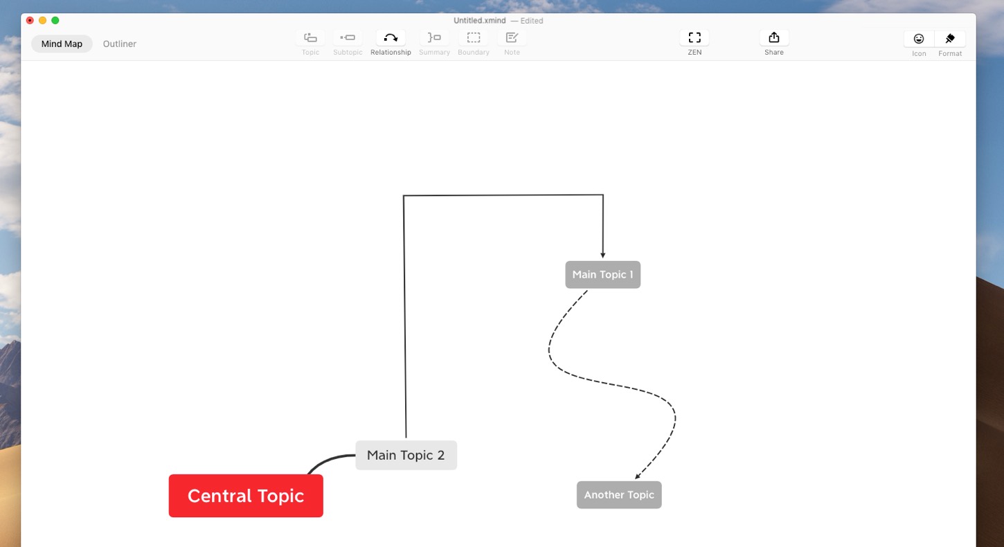
If you are on a Windows or Mac and can install apps on your machine, you can give Xmind a try. The tool helps build mind maps, users flows and other kinds of diagrams. It has a lot of different export options to share your work afterwards.
But what can you do when you don’t have access to such tools and can’t install anything? Most of the time, even the most security centric company has at least PowerPoint installed in people’s computers. Because, who doesn’t like a good PowerPoint presentation, right? So, PowerPoint became my “last resort” tools to build user flows and site maps. It’s not perfect, but it does the job. Did you know that you can build boxes and attach arrows to them like you can do in Miro?
Note that I also use excel a lot for everything related to content architecture, structure, hierarchy, site maps, etc.
Card Sorting Tools
Card sorting is a method that involves asking users to organize data into logical groups. It helps evaluate the information architecture of a product or service. It lets you build , label and categorize navigation items and more. If you want to know more about Card Sorting you can check our UX in Lux workshop slides on that particular topic.
Card sorting can be done with no tool at all. You put the name of the things you want to organize on paper cards, and voilà.
The complex part, when you have a lot of data, comes with the analysis. Online tools like UX Tweak and Optimal Sort help you analyse your results. They offer filter functions and can build dendrograms out of the data. My tip: even when I do paper card sorting with users, I usually enter the data in a tool like that after the sorting to help me with the data analysis.
The Xsort card sorting Mac alternative
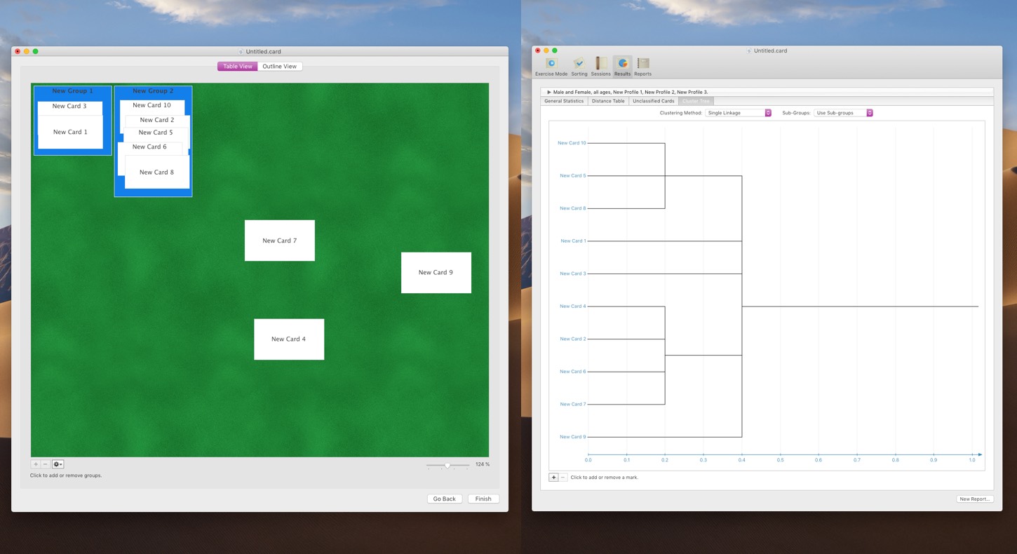
The only solution I found that offers local self-hosted card sorting is a mac app called Xsort App. I admit it is not the most beautiful tool, but it is free and works offline. It will help you build open, semi-open and closed card sortings. It has a few options to help with the analysis of the results, including cluster tree and distance table. Of course, since it’s a tool you install on your mac, there’s no remote card sorting possible.
Note that I didn’t find any Windows local tool but if you know some, please leave a comment!
Some Surveys and Polls Tools
Another tool in UX designer (and marketing people’s) toolbox is the Survey. I have a mixed feeling about Surveys and I share Erika Hall’s opinion on why surveys are a dangerous research method. When building simple online surveys, I usually default to Google Forms. It’s free but some of you or your company might not want your data to go to Google. For the non-free versions, I go with Survey Monkey. I find it quite powerful and it offers a huge variety of types of questions. Typeform is also a nice online alternative but has less options than Survey Monkey. I’m not only interested in building and having people reply to the survey; I also like options to help me with analysis of the data, like graphs.
Some self hosted survey solutions
Lime Survey is a robust and professional online Survey Tool. It is used a lot in academic research. Lime Survey is Open Source and has a self-hosted version. It is free and you can download and install on your own servers. It requires Apache (or Nginx) and PHP >= 4, plus MySQL. We used it when I was working for the University of Luxembourg. I can assure you that it’s quite a powerful solution.
Interactive PDFs forms with Acrobat
Another way to do surveys is to create an interactive PDFs form with Acrobat. You send this PDF form to people by email. Or you can share it using local servers like SharePoint. Collecting the data is still a little bit tricky. Please note that you are still limited in the form options to simple ones like text fields, radio buttons and checkboxes. But it might do the job for simple forms.
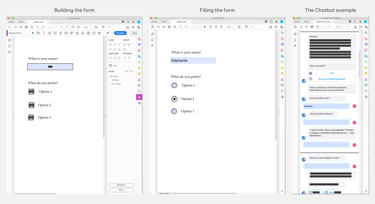
Building PDF forms with Acrobat and an example of the chatbot PDF form on the right.
I used this technique to remotely test the script of a chatbot we built for a client. I designed the whole script of the bot and designed a fake “Facebook Chatbot” interface. Then I exported this into a PDF and added some form logic on top of it. The last questions in the PDF were not the chatbot but questions about the experience of the bot. We asked about the length, the voice and tone and the vocabulary used.
Just send an email
Last but not least, if you don’t need anonymised replies, you can be creative and ask questions by emails. Just ask people not to “reply to all”. Or do paper surveys. My business analyst did that to gather quantitative data on some interface. He recorded small videos of different interactions. He then sent an email poll to ask users to vote for the version they preferred.
Prototyping Tools for Usability Testing and Developer Specifications
I will not cover wireframe tools in this article in detail. Most modern design tools like Adobe XD, Figma or Sketch can be used to build wireframes. Yeahy, I even used to build wireframes with Illustrator and a custom UI elements library. It was nice because I could then export them into PSDs and already have all the content in Photoshop. You can use almost any modern design tool for wireframing. If you are looking for a free wireframe tool you can install on your computer, take a look at Pencil Project. It’s not maintained anymore but it still works, at least on Mac.
I often need to turn wireframes and/or detailed mockups into interactive prototypes for usability testing. An interactive prototype tool lets you link different pages of your interface together. Users can then click and navigate through the prototype during the test. This kind of prototype is also super useful to show developers how the different pages, modals and components work together.
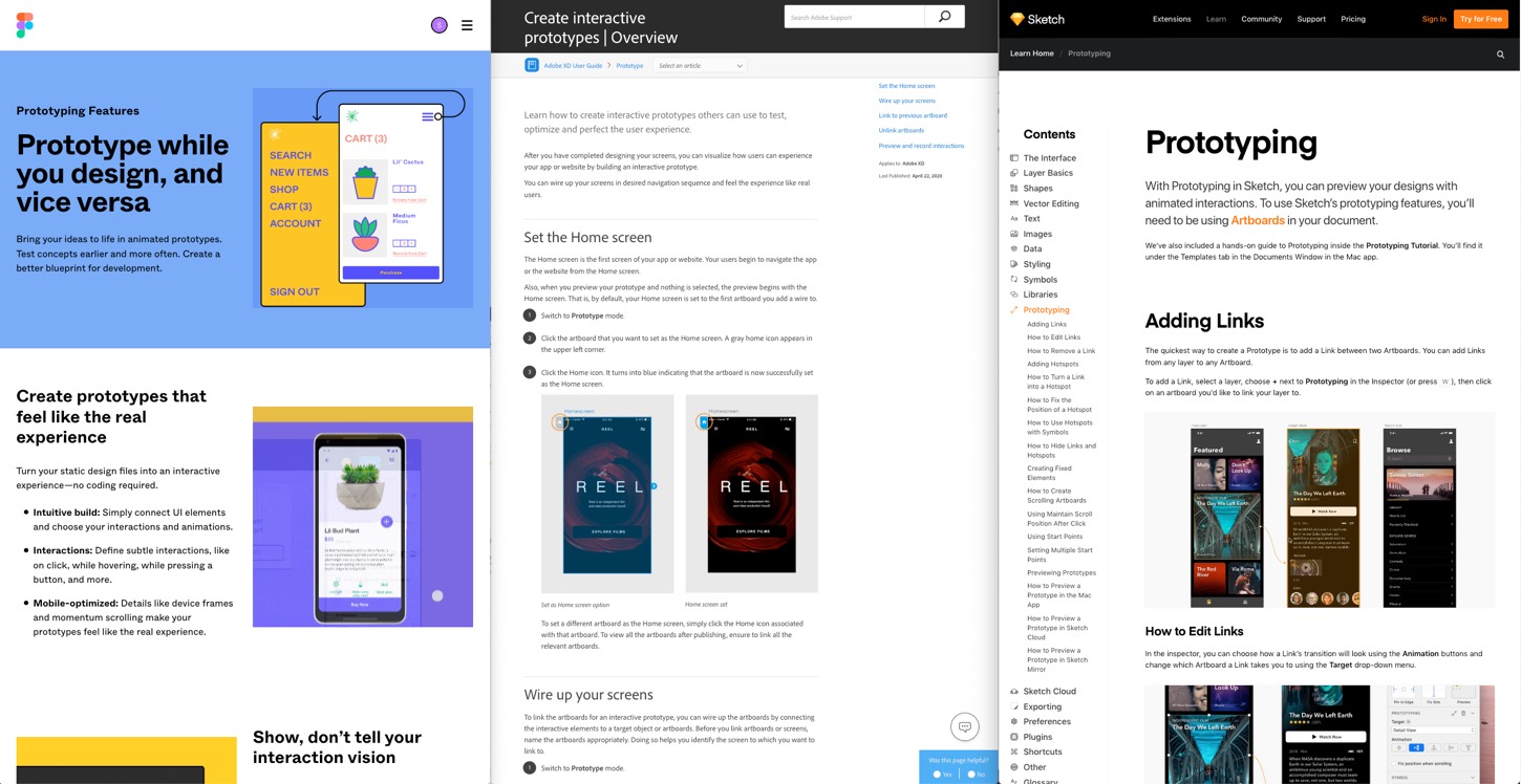
Depending on the tool you are using, you can go to different levels of fidelity. Figma’s prototyping tool for example goes really high level with animations on different triggers, transitions, etc. Adobe XD offers some interesting interactions, including voice triggers to prototype voice interfaces. Sketch now also offers a built-in prototyping feature. In Adobe XD and Sketch, you can preview the prototype on your computer. But Figma is in the cloud by default. If your company/client doesn’t allow cloud tools, goodbye Figma. But also goodbye Sketch Cloud and Adobe XD Cloud share which means you can only show the prototypes on a computer with the tool installed.
Another option is to export your wireframes/mockups and build the prototype with Invision or Marvel App. But here again, those are cloud based tools so if your company blocks cloud tools, you will not be able to use them. Sidenote: a friend of mine works for a big bank. It took them more than a year and a lot of negotiations with both the security team and the Invision team to be able to use it, behind a few layers of firewalls and other fun security options.
Design tools local preview usability testing issues
Adobe XD and Sketch open the prototype on my MacBook in a custom preview tool and not a browser. This can become a problem. Most of my users are on Windows on Internet explorer, soon Edge (I wasn’t kidding when I said I work in very specific environments). They are not used to my Macbook with my specific settings and trackpad. I prefer to have users open the prototype on their computer, with their browser, their resolution and mouse.
Not only does this put them at ease, it’s also closer to the “real” conditions where they would use this interface. I want my usability testing to be as close as possible to the real final product. I want to avoid biases due to a different artificial testing environment they are not used to (my MacBook). I sometimes ask them to show me “how you are doing this with your current tool” or things like that. It’s easier for me for those tests to have the users use their own computer.
Last but not least, if I want to do some mobile usability testing, most of those tools require me to use the cloud version. And remember: no online apps and cloud tools for some of my clients.
This is why I was looking for tools that let me export an HTML local version of the interactive prototype. And let me store it on my client’s server.
Sketch Puzzle Publisher: export and share HTML interactive prototypes
I mostly work with Sketch for wireframes and mockups those days. So far, for most of my clients I was lucky enough to be allowed to work on my consulting company’s MacBook.
Sketch does not offer a native way to export the prototype you create. It’s either preview on your Mac or Sketch Cloud. Needless to say, that sketch.cloud is blocked by the proxy for some of my clients. I was looking for a way to export the Sketch prototypes in HTML and found this amazing plugin: Puzzle Publisher
As you can see on the video, the plugin uses the built in “Sketch prototype feature” and creates a folder with a HTML interactive prototype. You can then open this prototype in a browser.
I then put the HTML prototype folder on a shared drive. Remember those Q, P and T:// drive? Yep, that one. Everyone at the bank has access to those T drives, so I can share it with users for usability testing. I also put the link to the T drive fold for the prototype in the Jira tickets for the developers. (More on that in the designer/developer relationship part of the article).
If we meet IRL one day and want a good laugh, ask me about the “CD drive” story!
If you are using Adobe XD (or still using Photoshop) I’m sorry but I haven’t found any tool yet to export to HTML interactive prototypes yet. As mentioned above, if you are using Adobe XD you can still use the prototype viewer in the tool on your local computer.
Some local HTML and PDF exports for Axure and Balsamiq
If you are using Axure to build your prototypes, not only can you preview it, you can also use the option Publish → Generate HTML Files to generate a local folder with your prototype. This means that you can host this prototype on a local server like I do for my Sketch prototypes.
Another tool you could use for low fidelity wireframe prototypes is Balsamiq. Again, you can use the preview options to locally run usability testing on interactive prototypes. You can also export the prototypes in interactive PDFs with links. Not that Balsamiq offers no HTML option.
Keynote and PowerPoint can become your best prototyping friends
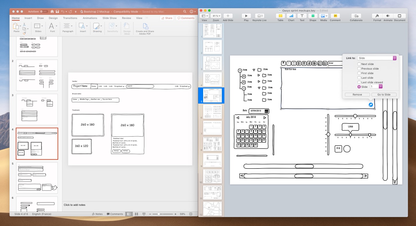
Last but not least, you can use Keynote or PowerPoint to create interactive PDF prototypes. Yes, you read that last sentence correctly. In both tools, you can create elements and then create links on those elements. You can choose “Link to Slide” for Keynote or “Insert Link > This Document” to create links to other slides in the document. Then you can export the whole prototype in PDF. Note that you can’t change the canvas size though. So you are limited to one single page size. You can even find some (non free) kits to wireframe with PowerPoint or Keynote.
Almost everyone knows how to use PowerPoint. This is interesting if you do some prototyping workshops with different people who are not familiar with design tools and want more than paper prototyping. We chose this solution when we hosted a 4 days design Sprint while I was working for the University of Luxembourg. On the 3rd day, we asked the teams to prototype part of the interface. We gave the teams some Keynote and PowerPoint UI kit templates. They were able to create prototypes that we tested in our lab with users on the 4th day.
Feedback Session and Mockups Documentation.
I quite enjoy the comments feature in Figma, Invision, Marvel app and all the AdobeXD and Sketch Cloud tools. I have used it for a few things.
- Q & A with developers and comments about technical specifications for some components.
- Details about how we expect animations and transitions to work.
- Design review with my team. As a lead designer, I used the feature to put small comments about alignment problems, colors, typos and small problems that need some “quick design fixes”
- I used the comments to take notes on mockups after a feedback session with clients/ colleagues. This helped remember what we needed to change.
- I also used them after usability testing sessions to keep track of the main pain points and issues raised by the users
Face to face (or remote) feedback session
I am not a big fan of letting a lot of people comment on mockups without presenting them the design first. Sending mockups to clients and waiting for them to comment without context tends to lead to a lot of misunderstanding and comments loops. This also steers the design towards a “design by committee” dangerous path. This is why I almost never let clients comment on the mockups.
Instead I organize short sessions where I present the mockups to them. I do the same when working internally but present them to the team instead of clients. I show the different design decisions and how they align with business and user needs, how they solve user pain points and problems. I usually have already discussed technical feasibility with developers before for the wireframes. But those sessions also become an opportunity to double check on that. We also use those sessions to clarify expected component behavior with the developers.
I organise those sessions face to face or remotely with a screen sharing of my prototype. Often, I don’t even need comments for feedback sessions, since I gather those directly during the live sessions.
The Jira comments to keep track of design discussions and decisions
I mentioned above that I also used those kinds of comments for Q & As with developers. And for keeping track of details about animations or some specifications. In my current setup, we can’t use cloud tools, but we have a Jira self-hosted installation. So, I usually use Jira for that.
I upload the mockups / prototypes on the shares drive and put the link in the Jira ticket. I also add some of the specifications for complex components that the developer team needs to be aware of in those tickets. We use Jira comments for Q & As sessions with the business analyst, the developers and the tester. Once the questions are answered, we put the final decision into the ticket as well (but keep the comments for future reference). It is not perfect and Jira tickets are lacking the ability to stack replies in a thread, but it’s better than nothing. Also there’s a Jira extension for threaded tickets so I might ask them to install it.
If you are lucky to have confluence, it’s also a nice place to store technical specificities for UI components. I happen to not have access to it for most projects I work on. So, Jira it is 🙂
The old school PDF / Word / PowerPoint comments alternative
Last but not least you can use the built in comment features of Word, PowerPoint or PDFs for asynchronous feedback sessions. I prefer PowerPoint because it is more flexible with layout than Word but it’s up to you.
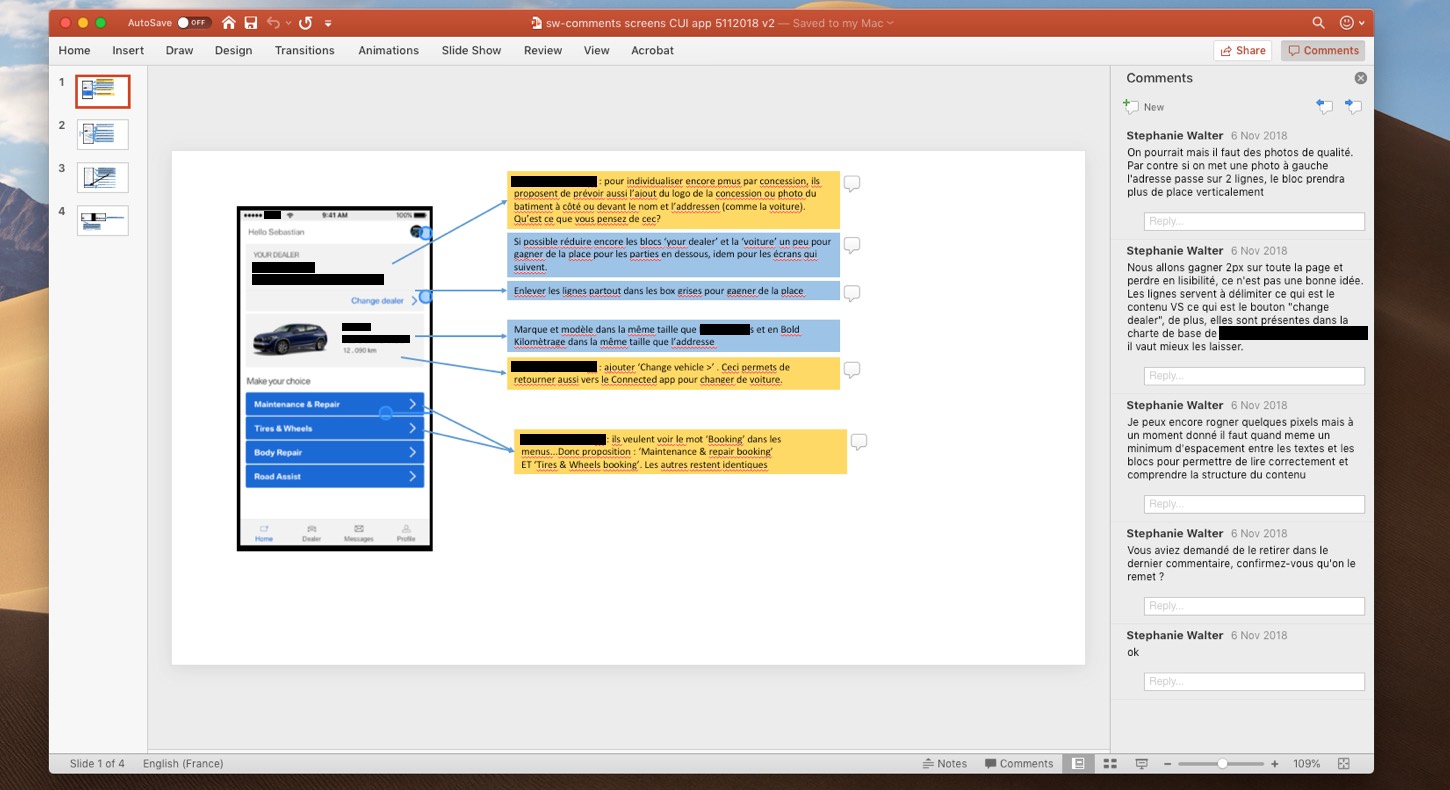
An example of PowerPoint comments for design feedback
You can also use this to document user feedback during and after usability testing sessions. It really helps to keep track of what happened during the test in context. When preparing the test, you put all of the screens in a PowerPoint / Keynote document. During (or after) the test, use the comments (or some blue boxes) to take notes of pain points, aha moments and comments in context. When I am able to use Invision, I do that with comments directly on the mockups. Just make sure to disable comments for your interactive prototype so that other users won’t see them.
Some “self-hosted” design feedback tools
I checked if there were some self-hosted design collaboration tools with comments. I found a few.
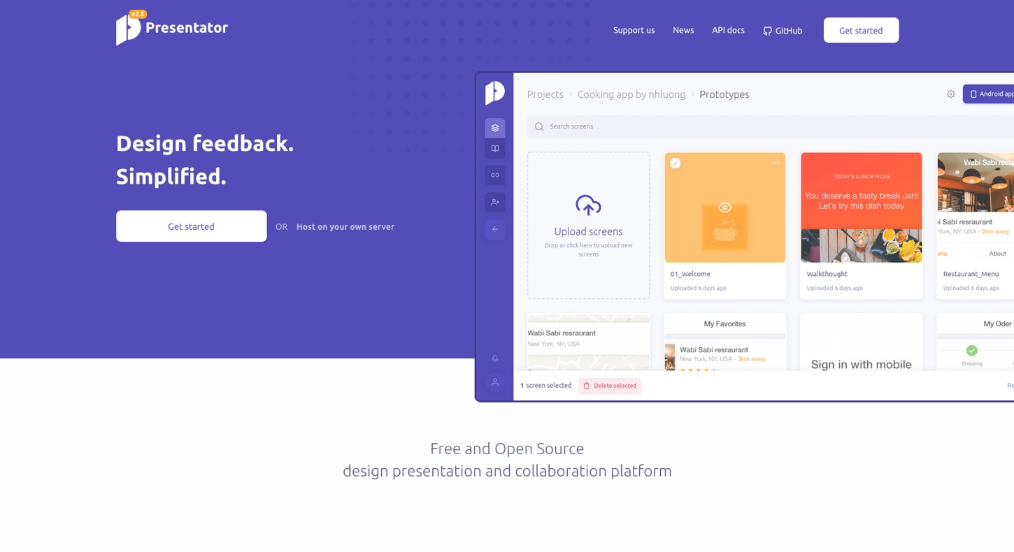
Presentator.io is a free and open source design presentation and collaboration platform. It is self-hosted but the whole “docker container” brought fear to my heart. I tried to install it on my Mac with a local server, but I gave up trying to make this work after 1 hour of googling my docker errors. I tried the online demo. It looks nice, and it should be awesome if you manage to make it work in your environment. I’m not a fullstack developer, following the documentation is as far as I can go. Some days I wish design tools would not need you to also be an expert in the whole full stack to be able to install them. But maybe you will have better luck than I had (or even better, ask your developers to install it).
Geoffrey has a more detailed presentation about Presentator.io in his article.
If you are using WordPress there’s projecthuddle.com/ ($100+ a year) and wpfeedback.co. I will have a hard time convincing my clients to host a whole WordPress just to have some design feedback tools. So, for me this is a no go, but maybe it is not for you.
Collaboration with Developers and Handoff
Figma, Sketch Cloud, Adobe XD inspect but also Invision, Marvel and Zeplin have some interesting features to help your collaboration and handoff with development and product teams. I particularly like the “inspect” feature. This lets your dev team directly “inspect” the elements of the mockups to see the different specifications. Depending on the elements it shows colors, typography, size, and more. The ability to inspect mockups without having to install anything on the developer’s computer is a game changer for me. And my developers also usually love this kind of feature.
If you are unfortunately not allowed to use cloud tools, you can’t use Sketch Cloud, Figma, Adobe XD inspect, Invision or Marvel. Zeplin has some local Mac and Windows apps. But the files are still hosted in the cloud, so it is usually a big No Go. Plus, most companies who refuse cloud tools usually also block any installation on the company computers. So, this might not help.
Sketch measure with local HTML inspect feature
As mentioned above, I am using Sketch for my mockups. When cloud tools are allowed, I upload my mockups on Invision so that the developers can inspect them.
When I am not allowed to use cloud tools, I use the Sketch Measure plugin.
** UPDATE November 2020: the Sketch Measure plugin doesn’t work on the version of Sketch above 68. I am now using Sketch Meaxure which is a fork. It also offers the export of the Sketch Prototypes. **
The plugin offers two interesting options:
- A measure tool that helps you add specifications directly on your mockups files. (like font-size, color but also margins and paddings between elements, etc.)
- A “specs export” feature that builds an HTML page with inspect option for the mockups.
- Sketch Meaxure update: you can also export prototypes.
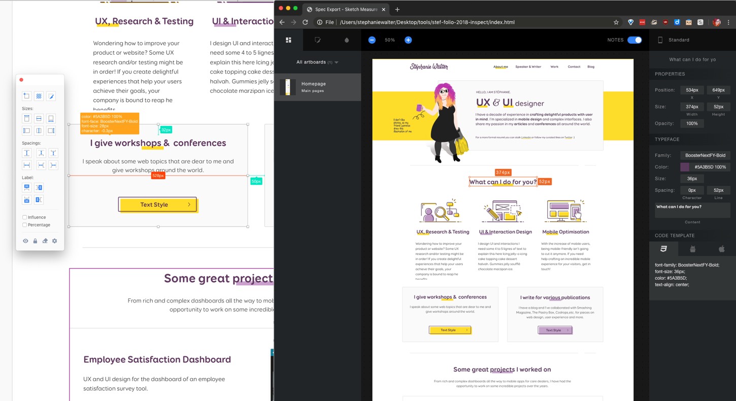
An example of the Sketch Measure plugin with annotations on the mockups and the exported HTML for inspect mode
I use this plugin to generate those inspect HTML pages for my mockups. Like for the prototypes, I store them on a shared drive where everyone has access. Then I link the shared drive URL on Jira for my developers. Even if I work in Sketch on my MacBook and they work on a Windows computer, developers can open those URLs with their browser and inspect my mockups. They don’t need to install anything on their computer for that.
I wasn’t able to find any tool to have some local inspect in Adobe XD (or Photoshop), if you have some, please share in the comments.
Jira, SharePoint and shared drives to share the design specifications
Depending on the client and the team process, I found a few different ways to “share” those design documentation and specifications.
If the client has Jira tickets, I attach the PNG mockups with the specifications created to those Jira tickets. I also add the most important part of the specifications directly in the ticket. We usually use the Jira comments if there’s still some things to clarify with the team as mentioned above.
If the client has Confluence, it’s even better. I build “pages” with all the design documentation and specification needed for all the mockups and components of the project and keep track of it.
For clients who don’t have Jira, if they have some sort of SharePoint, I sometimes store the design specifications there. Depending on the way the SharePoint is organized, I either share folders with PNGs, or export all the mockups and design specifications in a PDF. I then use the PDF comments if needed for clarification.
Last but not least, some clients only have shared drives. So, I end up uploading those specifications, mockups and the HTML inspect generated on those drives.
Building and Documenting Design Systems
Airdrop, shared folders and git repositories to synchronise Design System Libraries
The ultimate goal of documenting all the components is of course not to produce nice and shiny handoff documents. It is to eventually build a library of those components that will be used in a Design System. Tools like Figma offer a LOT of options when it comes to libraries and team collaboration. Adobe XD is also starting to build features to re-use and share libraries and components across projects. If you are working with Invision, you can also take a look at their DSM (design system manager) solution.
With Sketch, you can define one or many Sketch files as libraries. You can then re-use that library’s symbols, text styles and layer styles in any other Sketch files. This is great to build Design Systems. But it means that at some point, you need to “share” that main Sketch library file. On my current project, it’s not an issue since I am in the “UX team of one” position, so I’m the only one who needs those files. I still prefer to work with a team.
Here are a few ideas to share and synchronise some Sketch libraries when you can’t store them on cloud shared tools:
- Put the files on a physical hard drive and share the drive with the people in the office. Not, I am not kidding we did that for some clients. Obviously this is not possible if people are working remotely.
- Use airdrop if the whole team is on Mac to send the library’s updated version to everyone in the team. Again, not remote friendly
- Upload the modified version of the library on SharePoint (meh) or a share drive that everyone can access.
All those solutions are quite annoying, I know, but sometimes you dolly have a choice. A last solution is to host the Sketch file on some git design repository (smartgit, self-hosted GitHub, etc.). It is possible if the Sketch library is not too big. I particularly like this solution for different reasons:
- It is possible to work remotely with that solution.
- You get to use the git history and version control to revert back to previous versions when needed. And dear folks, this SAVE me a couple of times on some projects.
- It’s easy for everyone in the team to get the last version of the file with a simple “comit, push, pull”.
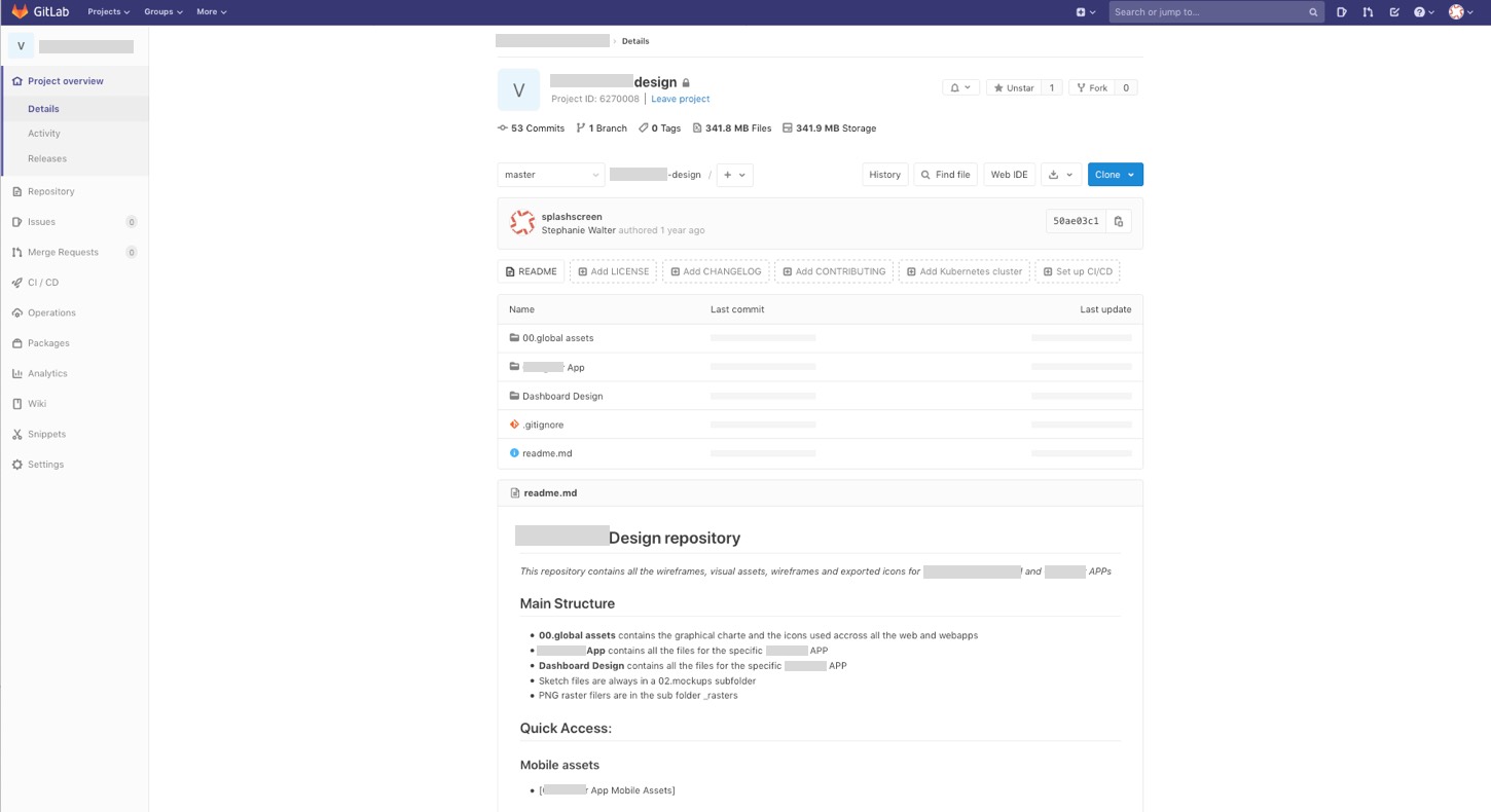
An example of a smartgit repository with the Sketch files versioned
I know, git might be scary for some designers. You can use some visual tools like Source Tree or the GitHub desktop app if your designers are not at ease with CLI. And at least, it’s less tedious than manually putting files on a physical or shared drive!
Storybook and Docz to document components and design systems
A Design System is so much more than some Sketch (or Figma, XD) libraries. It’s a living project with components, organisms, pages, and more. And we want to keep track and document those components. There are a few online cloud solutions like Zero Height.
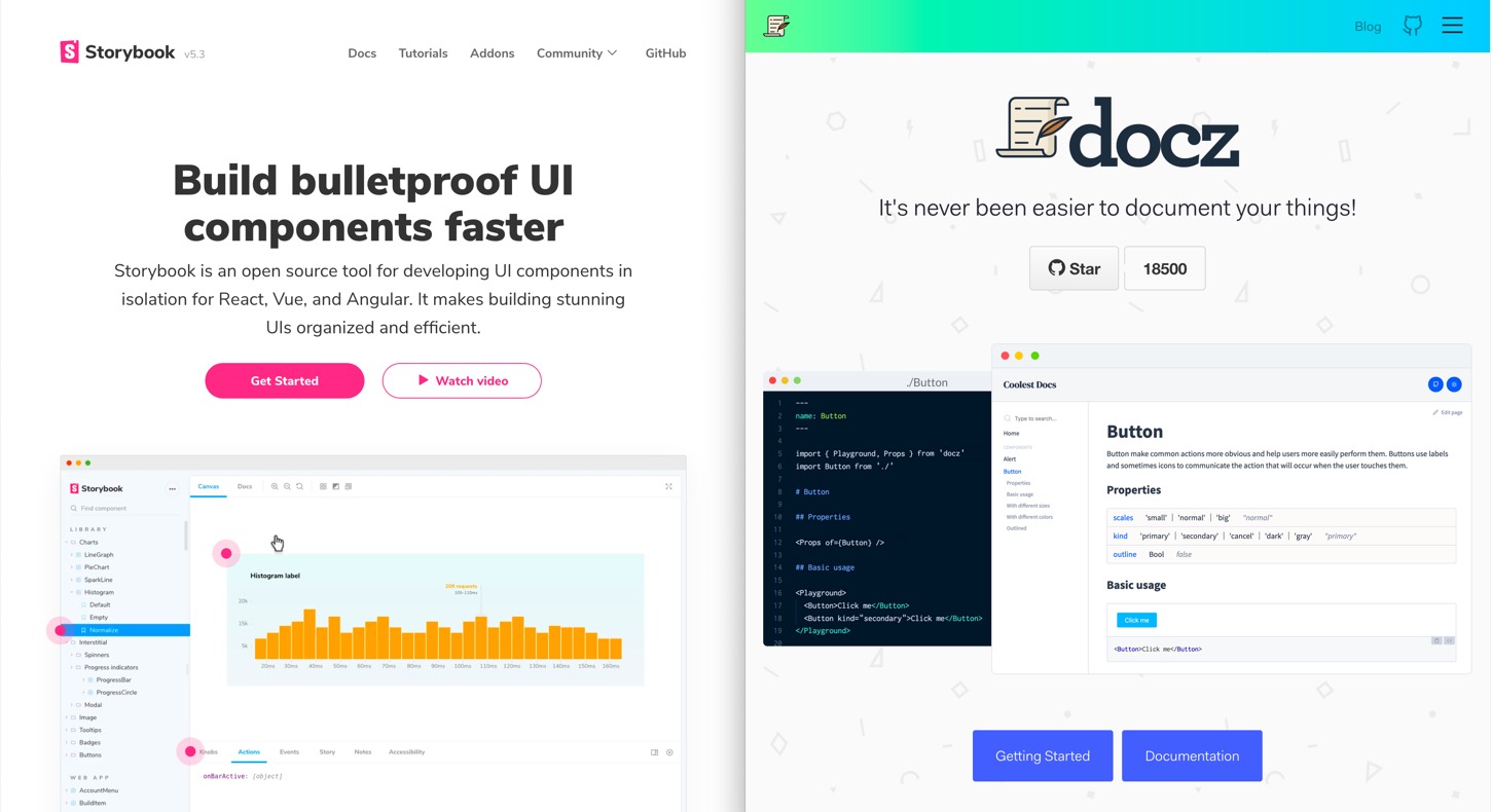
If you are looking for a self-hosted open source solution to document your Design System, take a look at Storybook. It is a playground that allows teams to document but also to organize UI components. You can even build some demo sandbox pages to test the components in different contexts. Take a look at a live example here.
If you need a simple documentation without all the cool sandbox options around, take a closer look at docz.
Both of those tools are self-hosted and open source.
User Data Analytics Tools
Part of my job as a UX designer is also to measure the success of the design and get insight on how the product or service is used. For that I need to define some KPIs, and I need some tools to measure those. I also need generic analytics information about the site usage to help me detect potential issues to correct them. The easy obvious solution is to use Google Analytics. Unfortunately, they do not provide a self-hosted solution
Matomo – Self Hosted open source web analytics
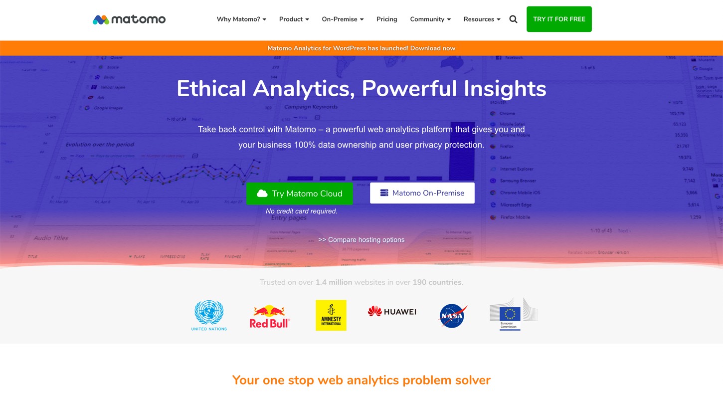
If you are looking for a self-hosted web analytics solution, I recommend Matomo. I used it when working for the University when it was still called Piwik so you might have heard of it under this name. The basic solution is free, open source and GDPR compliant. I still advise you to run it on a separate server because it needs a lot of resources. Check the minimum requirements for more information.
The solution comes with interesting (non free) plugins to replace tools like hotjar. You can have some heat maps and session recordings, some A/B Testing tools.
It is a centralised solution. Which means that you can install it once on a server and monitor different websites and products with it. Big institutions can have a team install it once and then give access to different projects within the company. Ask your company. Maybe they already have this solution available for other projects and are willing to open it for your project as well.
Other self-hosted analytics solutions
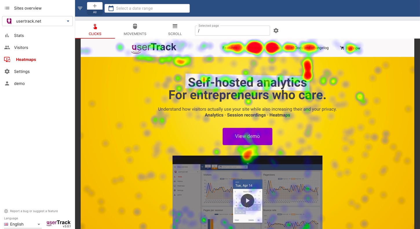
User Track is another self-hosted analytics solution. It is not open source nor free though (monthly or one-time fee licence). It comes with some built in features: analytics, heatmaps, segments and some session recordings. It’s kind of a “one single platform” to do it all. Check the documentation to see minimum requirements and usage.
If you are looking for only the session replay (like Hotjar or Fullstory), you can take a look at RRweb. It’s an open source JavaScript library that lets you record what users are doing on your site and replay it. This is quite useful if you are trying to understand what is going on with baskets or sign up abandonment for example.
For more tools you can look at Geoffrey’s article: “Self-hosted Design and Project Management Solutions”. He is also talking about a tool called “UX Lens” that should also help you with analytics and tracking.
Such quantitative analytics solutions show you the “what” users are doing. But you don’t get the “why” they are doing it. You still need to do more quantitative research, like some user interviews to understand why people are doing certain things.
If you have any tools that are useful to work locally in environments that do not support cloud tools, please share them in the comments 🙂
