5 illustrated metaphors to explain and advocate for accessibility.
I spend 2 days with Marie Guillaumet , perfecting my knowledge around “Designing Accessible interfaces” (training in French). Marie is a very inspiring person and several of the metaphors she used to explain different aspects of accessibility and designing for disabled people stood out. I decided illustrated them for educational purposes and share them with you.
** Si vous souhaitez une version française des illustrations elle sont disponible ici **
Accessibility for Designers – Practical Workshop (remote, June 2025) 
Design mockups that work for everyone, and meet the new European Accessibility Act. In this hands-on workshop, you’ll learn to spot and fix accessibility issues early in your design process. We’ll cover visual design, interactions, navigation, and content, with exercises and real examples.
Includes checklists, annotation kits, and practical tools you can use right away.
- When: June 16, 17, 23, 24 – 4 sessions (2h + Q&A)
- Time: 9:30–12:00 PT / 18:30–21:00 CET
- Price: $300, $255 with 15% off with my coupon link
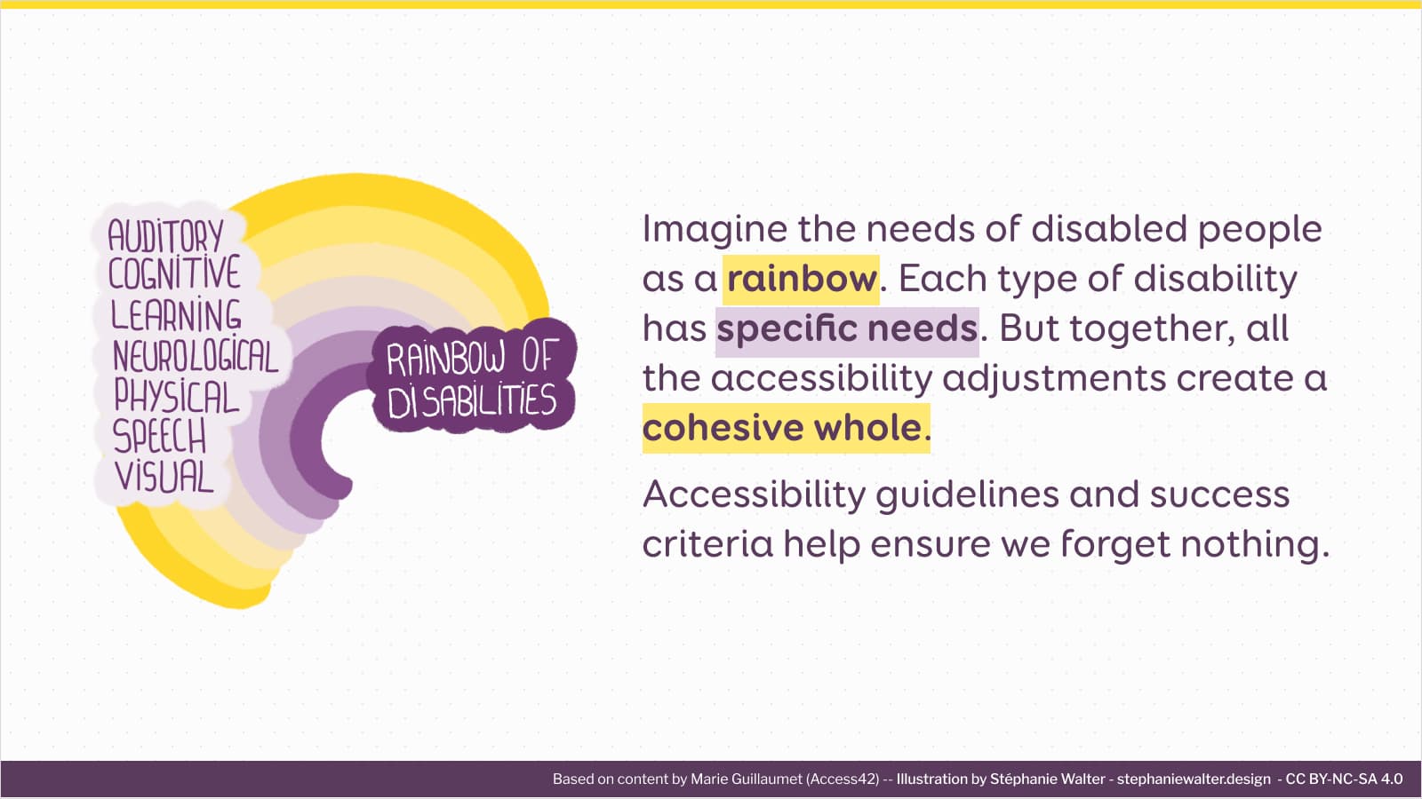
The rainbow of disabled people’s needs
It is sometimes complicated to explain the wide range of accessibility guidelines. Some guidelines help people with specific disabilities or assistive technologies. And someone are more generic. In the end, they are all part of a cohesive whole. And we need to follow them all to create websites accessible to many different people.
I really like Marie’s rainbow metaphor to explain this:
The A, AA and AAA mountain peaks to reach
A (single A), AA (double A) and AAA (triple A). Those are the 3 levels of WCAG compliance. And it is sometimes a bit tricky to explain to people, clients, which one they need to reach. How high should we aim, they ask. I love the metaphor of mountains and peaks that Marie uses.
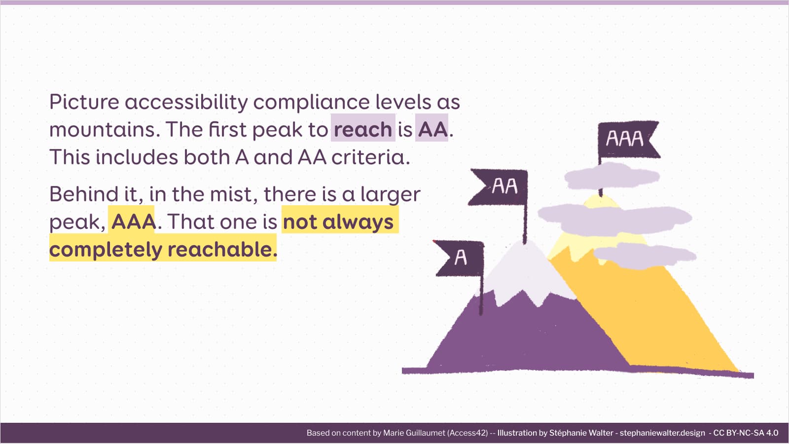
WCAG states that AAA (triple A) is not always achievable. Seeking that level of compliance at all costs is not mandatory. Or even recommended. But if you can, it’s awesome.
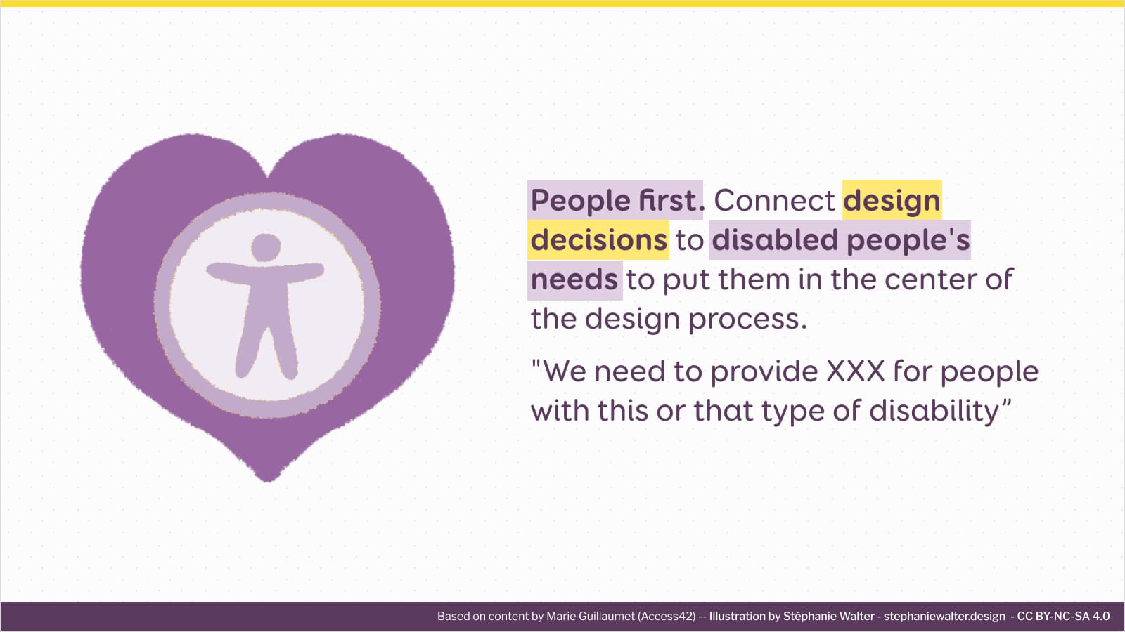
People first. Connect design decisions to disabled people’s needs
I am used to a “people first” approach in UX (user experience) design. We take design decisions, based on the needs of your users. For accessibility, its the same. Each criterion and guidelines aims to help a specific type of disability and group of people. While explaining the criteria, Marie made the connections with who those aim to help.
When promoting accessibility, framing design decisions around disabled people’s needs is very important . This helps explain the design choices. Helps make them more tangible. And I hope, that is also help stop seeing accessibility as a constraint. But rather a major important part of the designer’s work.
Forms: give the rules of the game at the beginning
Forms are often a very frustrating part of websites for many users. This is where we often see a lot of usability problems during testing. Unfortunately, it is also often even worse for disabled people.
Follow Marie’s tip for forms:
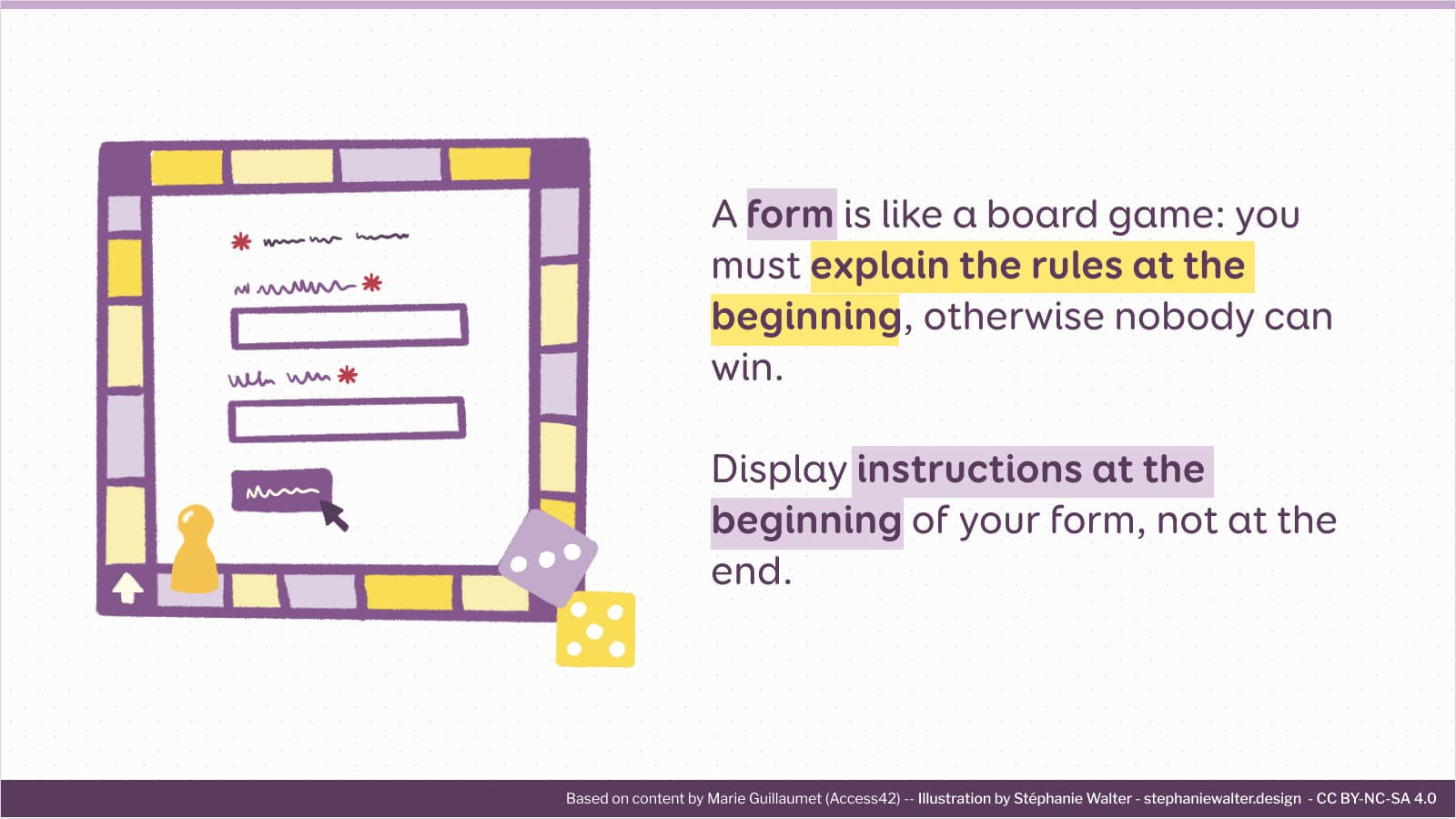
Here is an example. If you use an asterisk to mark mandatory fields, add a caption that explains this symbol. display that explanation before the first field. This helps visually impaired people who use a screen magnifier. They can understand what the symbol means, before they come across it.
Also, did you see what I just did? I explained to you the guideline, and the context of “who does this help”.
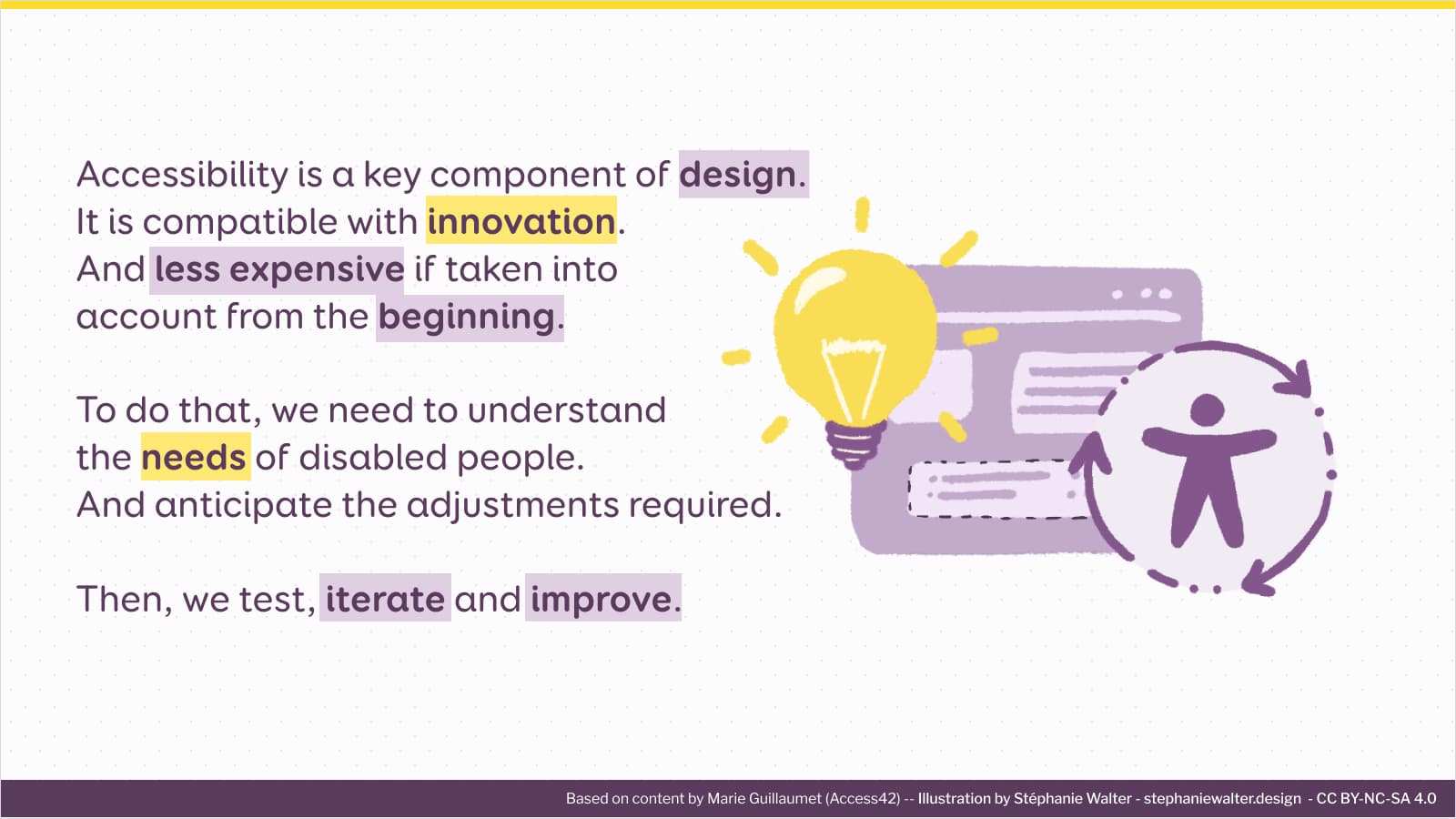
Accessibility, design and innovation: yes, it’s all compatible!
Unfortunately, accessibility is still often seen as a constraint for design teams. And an obstacle to creativity and even innovation. But, this is not at all the case! Let’s debunk a few myths.
Conclusion
If you speak French, I highly recommend the Access42 training!
Marie connected the needs of disabled people with the accessibility guidelines. Each accessibility recommendation was contextualized. This helps a lot understand, but also remember the criteria. I will definitely use that to promote accessibility where I work. And push more recommendations. Finally, UX and accessibility have a lot in common in terms of practice. It all starts with understanding needs and uses.
During the training, we also prepared a “Design and accessibility” checklist. I will publish it soon (either here or in a dedicated article).
Illustrations usage
The illustrations are available under CC BY-NC-SA 4.0 license: Attribution-Non Commercial-ShareAlike 4.0 International. When you use them, you have to give attribution right as follows: “created by Stéphanie Walter, based on content by Marie Guillaumet (Access42)”. If possible put a link to this article.
You can share them on your site as long as it is not a commercial site (aka you don’t make any money of it, this includes advertisement). You can use them in presentations, as long as you follow the same license and don’t make money from the presentation. You can print them to put them in your office if you want. You are NOT allowed to print them to sell them, nor are you allowed to sell the file.
Please also remember to share them in an accessible way (direct text next to the image, alt attribute).
** Due to technical issues on my server at the moment I had to remove the files.**
If you want to use them in commercial presentations or for commercial purposes, please contact me first.
