A Designer’s Guide to Documenting Accessibility & User Interactions
Accessibility is unfortunately still an afterthought on many projects. User interaction and accessibility requirements are poorly documented, at best. Or forgotten, when handing over designs to developer teams. And fixing it later costs a LOT more than building it right to begin with. Great documentation helps teams implement accessibility requirements the right way. This is the text version of a talk, where I explain why, what and how designers can document different aspects of accessibility and user interactions requirements, to build better more inclusive products from the start.
You can also check the video replay of the talk in different places and the sketchnotes. I also prepared a Accessibility & Interactions Documentation Kit to help you get started.
Last update Feb 2025
** Une version français de l’article et la conférence sont disponibles ici **
Why fix it later, when you could do it right to start with?
 A lot of sites were not designed and developed with accessibility needs in mind. As designers, a lot of us think that “accessibility is the job of the developer team”. Accessibility becomes an afterthought for a lot of projects. Companies launch inaccessible tools, sites, services.
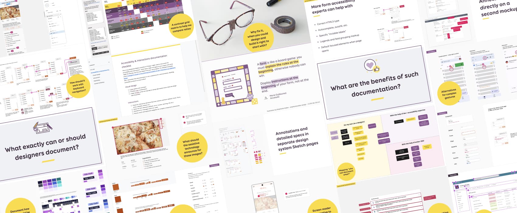
Eventually, someone will complain about this. Maybe the site even gets sued. It circles back to the team. And now they have “fix” the accessibility issues. But, it’s often too late. When the site was not designed, developed with accessibility in mind, it’s harder to correct. And way more expensive as well. A little bit like in this picture: they end up putting duct tape on broken glasses.
My question is: why fix it, when you could design and build it right to start with?
This is why we need to bring accessibility awareness earlier on in the project. Good guidelines and documentation can help us achieve that. They can help identify and fix accessibility issues, earlier in the project. Accessibility becomes part of the “project normal design and development phases“. It’s not an afterthought anymore.
Accessibility is a designer’s job too!
A lot of accessibility issues can be already foreseen and prevented during the design phase. As designers, we hold the power to shape product roadmaps by including accessibility best practices in our designs and advocating for accessibility features.
Designer can use design documentation to include and push accessibility earlier in projects.
Where and how can designers impact accessibility?
First a small disclaimer: this is the transcript of 1h talk. It’s already very long, but, I can’t be exhaustive in 1h. I have a full 8 hours training on the topic. So, keep in mind that, this is the short version. Also, this is targeted towards designers. I cherry picked on which WCAG criteria designers can have the most impact, earlier in the project (mostly A and AA criteria). I won’t go through the full WCAG 2.2 criteria. You will need to go beyond this article to make your website fully compliant.
So, let’s get started. To help you process what designers can do, I’ve split those into 4 different categories: Visual design, Interaction, Wayfinding and Alternative Content and Markup.
Documenting Visual Design for accessibility
Visual design, especially colors is often the first thing that comes to mind when we think about design documentation.
Don’t rely only on colors to convey information
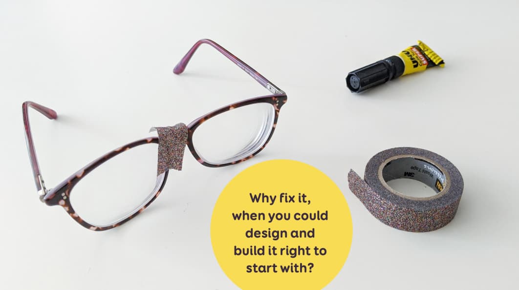
The first thing designers do: ensure color is not the only visual way to convey information.
In my example here, I have the navigation for a cooking site. In the first example, I indicate the “current page” (categories) only with a color change, from black to orange. This is an issue: users who are not able to distinguish color well might not understand the current indicator.
Those people include:
- Colorblind people.
- Users with partial sight often experience limited color vision.
- Some older users may not be able to see color well.
- People using limited color monochrome displays may be unable to access color-dependent information.
- Some people with cognitive disabilities, issues to read
The solution: don’t rely only on color to convey an information. In my second example here, I kept the color, but I double downed with a big border. This way, users who don’t perceive the color have a secondary way to get the information.
What can we do? Designers can check the mockups, identify information conveyed only by color, and provide secondary ways to convey the information that doesn’t rely only on that color. This is usually the case for form validation (error, success), any type of status notification, but also for charts, graphs etc.
Ensure sufficient color contrast ratios
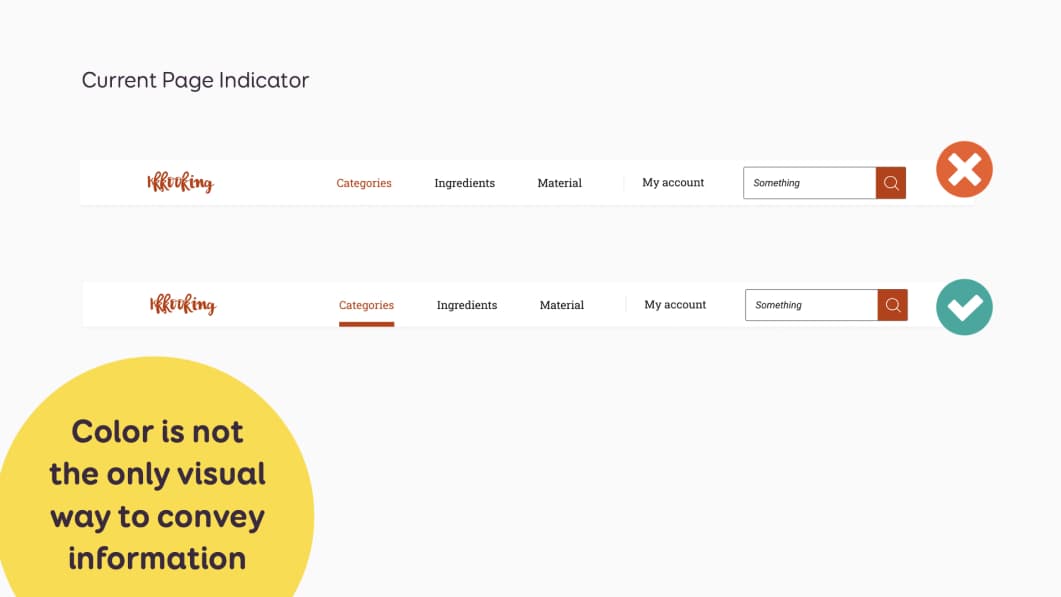
On existing mockups, before sending them to developers, designers need to check that texts have a sufficient contrast ratio with their backgrounds:
- 4.5:1 between text and background for text smaller than 24px, or 19px bold
- 3:1 between text and background for text larger than 24px, or 19px bold
Check my article Color accessibility: tools and resources to help you design inclusive products for a nice choice of different tools. You should find one that suits your needs.
It doesn’t stop at text. Designers also need to take check color contrast for non-text elements (UI components, graphic objects, etc). Those need a 3:1 contrast ratio against adjacent colors
Non-text elements include:
- Visual information to identify user interface components. For example border of a text field, checkboxes, radio buttons (if you don’t use browser native elements).
- Visual information to identify focus indicators
- Graphic objects required to understand the content (for example if you have some icons that convey information without text next to them)
This rule doesn’t apply to native HTML components, and inactive components. But it applies to focus appearance: an area of the focus indication area (a subset of the focus indication area) must have a 3:1 contrast ratio between the unfocused and focused states. For more on that topic, check Sara’s article A guide to designing accessible, WCAG-conformant focus indicators
Finally, note this criteria doesn’t require background or boundaries for default buttons states to pass the 3:1 ratio, if the text (or icon) on the button is enough to identify it as a button (and passes 1.4.3 text/background). Which means, that, even if the background of your button doesn’t have a 3:1 ratio with the background they are displayed on, it’s not an accessibility failure. That being said, more contrast is always nice, so, if you can get that ratio, by all means, go for it.
Ensure links in paragraphs are easily identifiable
Links need to be easily identifiable, especially when surrounded by non link text (in a paragraph for example). Which means people need to be able to identify them from the rest of the text, that is, not a link. How do we do that?
- Check that color is not the only way to identify a link in a block of text from its surrounding. The easiest way is to underline links in text.
- If the color is the only way to identify it, it must have a 3:1 contrast ratio with adjacent non link text and provide additional visual cues on hover
You can us The contrast triangle to help check this. But, seriously, just, underline the links and call it a day!
Building an accessible color palette from the start
At some point, I’ll write a detailed article on this, I promise. Meanwhile, here is the short version: if we work on a new project, we can build and document accessible color palettes from the start.
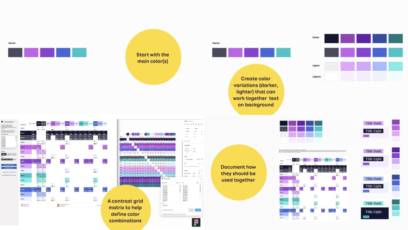
My step-by-step process is something like that:
- I usually start with the “main” colors. In the example above, my “mermaid palette” main colors created for Myriam.
- I create color variations (darker, lighter) that can work together, text on background. I build it so that all my “darker” can be used with “lightest” as text (and the other way around) with 4.5 contrast ratio. I also make sure that my darker text can be used on any of the “lighter” colors
- To help remember that, I document it using a color matrix (figma plugin or online tool)
- Last but not least, I document component examples, in my styleguide, of how the colors should be used together. Here I have a theme with my 4 variations of color (pink, purple, blue, aquamarine) used as title with the darker gray text. And I have examples of call to actions for each version.
If you need help creating palettes, check Color accessibility: tools and resources to help you design inclusive products and Tips to Create an Accessible and Contrasted Color Palette.
Documenting colors combinations in the styleguide
As mentioned above, I like color matrix tools, because they help me document color combinations with their contrast ratios. I use a color matrix tool like this one. (there is also a figma plugin)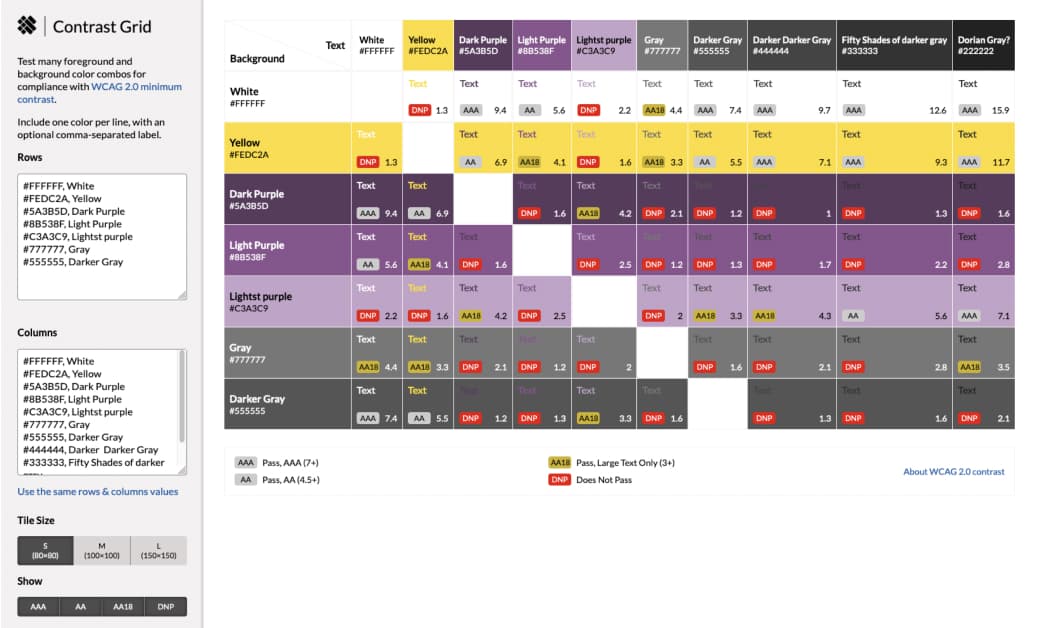 Here we have the same colors on the horizontal and vertical axis. The intersection of both shows their color ratio when paired together. This helps me know if I can pair those 2 colors together for different ratios: 3:1 4:5,… For example I should not use that yellow as text on which background, but I can pair it as a text for a darker grey. I can then put this matrix in the project, to let other designers know the color combinations they can and should not use.
It might be interesting to share this matrix with the whole design team (or development team) somewhere in the system design to help them understand the possible associations.
Documenting specific color combinations in the styleguide
In the design system, I also try to document the use of certain color combinations: what is allowed and not allowed.
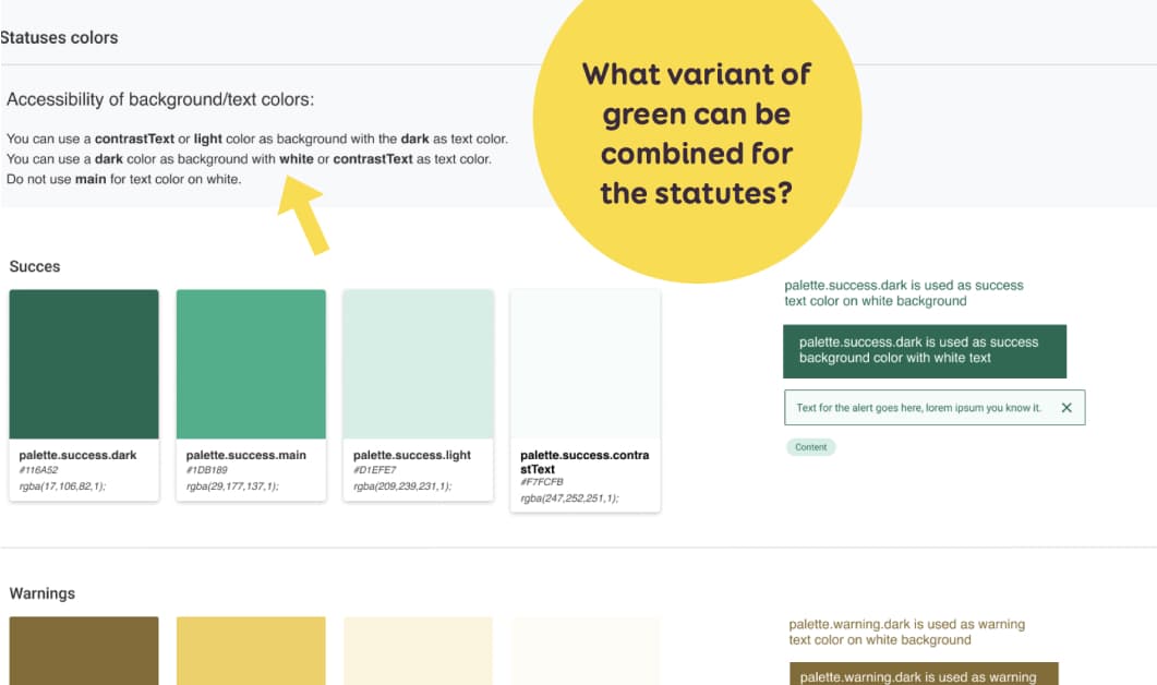
I have an example with statuses in my design system. Each status has 4 variant.
For success, I have 4 shades of greens: dark, main, light et contrastText. (Names come from material UI, don’t ask) I documented how colors can be combined (and can’t) be combined for our statuses all across the interface. For example: I can use contrastText (or white) as text color on top of the dark variant for success status.
Educate design teams on AA, AAA, and contrast ratios.
Not all designers might be familiar with the ratios, AA / AAA meaning and small vs big text concepts. You still need to explain this somewhere. Or put some links to external sources. You could use Geri’s WCAG for Designers documentation or the accessguide page on contrasts. For more tools check “Color accessibility: tools and resources to help you design inclusive products“.
Text: 200% resizing and typography tips
The text content can be enlarged to 200% without hiding elements and missing functionality of the site (no hidden text, images, etc.).
I’ll be honest with you: I tend to document this less on websites, since we mostly build for responsive. But, I will check with developers to make sure they don’t block the zoom. And ask QA to test that zooming to 200% won’t hide elements. The other part here is a technical part: developers need to build the site with fluid units (ems, rems) to insure that, if the user changes the default font in their browser, this will adapt accordingly. Again, very little to do as designers in the mockups. But, if while testing something breaks, you might need to take design decisions as to how this needs to be adapted.
But I think this can be really useful for native apps.This is an example for Goulven Baron at Maif. He documented how the mobile view behaves at 100% on the left and at 200% zoom.
So, here’s some text resizing and typography designer guidelines:
- Avoid fixed height buttons
- Avoid fixed height text boxes with overflow: hidden
- Adapt layout at larger font size if necessary (multiple columns might become one, secondary text on the right might go to the next line, etc.)
- Maintain hierarchy even with bigger fonts (H1 titles should be bigger than H2, etc.)
- Test your font for legibility with “iIlL10oO“. How easy is it to distinguish between each character?
When it comes to typography best practises, most of the WCAG criteria are technical ones. For example: Let user adjust text spacing to make it easier to read: line-height, letter spacing, word spacing (WCAG 1.4.12 , technical)
Still, here’s some practical tips, to go beyond WCAG to help with readability:
- Avoid ultra-light and thin fonts
- Avoid justified, centered and right align text that is hard to read (LtR language)
- Avoid underlining text that isn’t a link.
- Avoid italic and all caps for long passages of text
- Don’t prevent people from selecting plain text (for translations, for example)
- For body copy, the maximum number of characters per line should be around 80, spaces included.
Last but not least when it comes to text: don’t use that fancy special characters they are annoying and not “real” text. Alexa Heinrich has a great article on this: why using fancy fonts on social media is a bad idea
Communicating Accessible Interactions & Interactivity
The next category is the documentation of interactions: how is a user going to interact with those components and pages?
Designing better links and buttons
Links and buttons purpose need to be consistent and easy to understand:
- “Does the user understand what will happen if they click/tap/interact with it?”
- Avoid “click here”
- Use direct action verbs (open, cancel, close)
Links and button size
WCAG 2.2 introduced a minimum size target for pointer inputs that is at least 24 by 24 CSS pixels. I honestly won’t go into the details here, it should be an article on its own again. But, basically:
- Controls must have a minimum size or spacing around them, to provide a target area of 24×24 CSS pixels for AA ( 44px for AAA)
- IF you can’t get the 24px, there’s a spacing exception. When you draw a 24px diameter circle around the target (starting in the center of the element), it doesn’t’ intersect
- The 24px doesn’t apply to links inline in a block of text (paragraphs), if the function can be achieved via another accessible control, for browser elements, when the size is essential (a pin on a map for example) and for legal requirements.
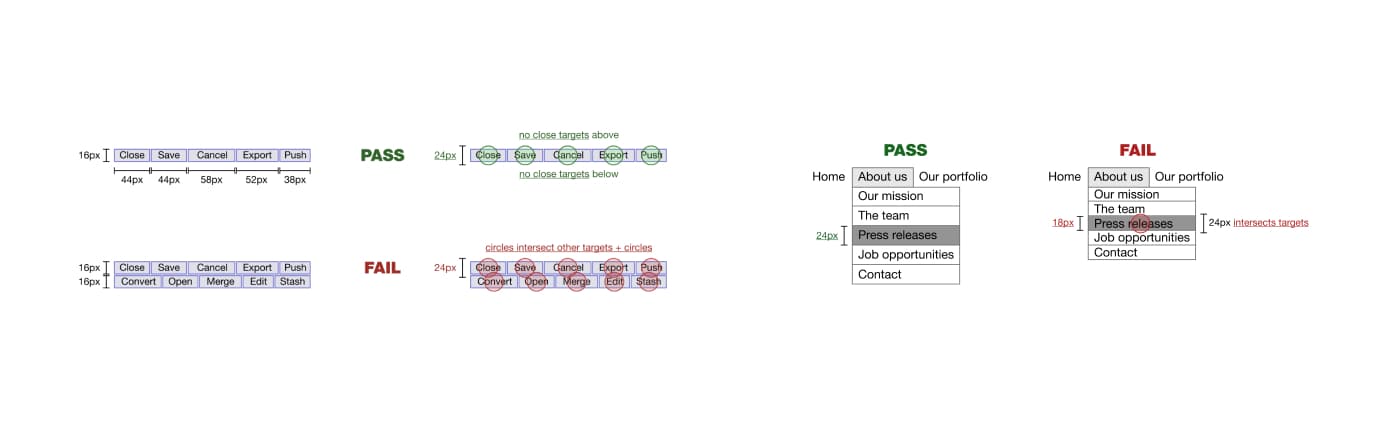
As designers, you can ensure the links and buttons pass the 24px minimum target size criteria in the mockup. Be careful with responsive thought, regarding the spacing exception. Sometimes the interface might pass on large screens because the buttons are on one line, but they might not have enough spacing one they are on a smaller screen and wrap. Check with your developers then to increase spacing.
Documenting link and buttons states
When designing links and documents, designer can document them to make developer’s lives easier. But, also, so that, again, we don’t forget about important states for accessibility, like, focus.
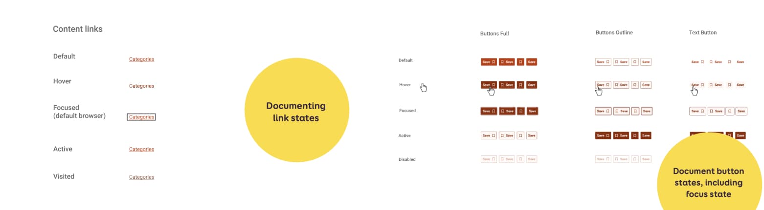 Link states:
- Default
- Hover (:hover)
- Focus (:focus / :focus-visible)
- Active (:active)
- Visited (:visited)
Buttons states
- Default
- Hover (:hover)
- Focus (:focus / :focus-visible)
- Active / Pressed (:active)
- Disabled
- Loading//progress
Ambiguous Links
Sometimes the “clickable” part of an element might not be obvious. Especially when they wrap a whole component.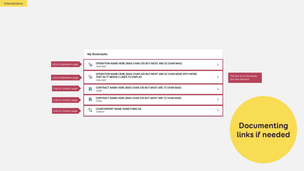 In this example, we have a tile with 5 list items. Each has an icon, a title, a number and an arrow. Dev teams might ask “where should I put the link, is it on the title or the whole element???” I can document this directly with annotations as well. Or I can put that info in a Jira ticket.
Also, when working with links, make sure that the text of the link, aka the anchor is explicit. You want to avoid “click here” links and have more explicit links to help people understand what will happen when they click.
Forms and inputs
Making forms easier to fill
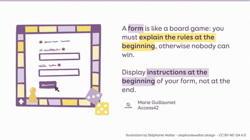
For forms, the main idea is to help the users fill them. Like a game, give the rules / instructions at the beginning
There are a couple of guidelines you can follow to design more accessible forms:
- Each field has a label
- The label is clear and helps understand how to fill the field
Then, you also want to make your forms easy to fill and help users:
- Help users prevent errors (expected format, instructions, mandatory fields, etc.)
- Help to recover from errors (errors are marked, clear messages, etc.)
- Avoid redundant entries: don’t make users input the same information twice (except security reason)
This is where documenting form states can help.
Form states & error documentation
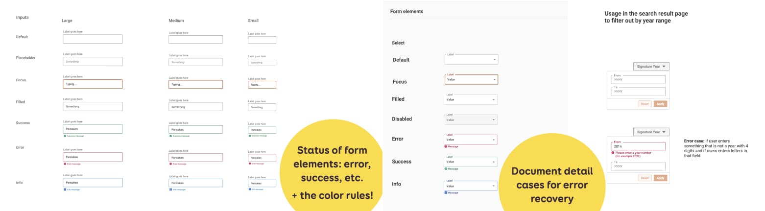
The focus state is very important for accessibility. It helps keyboard users know where they are when navigating on the page. For form inputs, at the component level, I have some generic classics: default, focused, filled, read only (or disabled).
But I could have some extra statuses, for example: Error, Success and Information. For those, I don’t just use color, but also some text and icons (so that the color is not the only way to convey information)
The component is then used in a specific page or content, in a form. In that form, I want to help user avoid or recover from errors. For this, I document at page level:
- What triggers the error (= error case)
- What the exact message (copy) should be. (all of those “help people avoid / recover” elements)
More documentation example
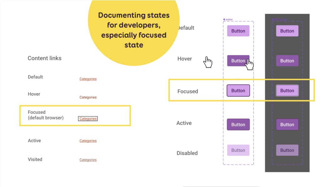
Example of state documentation for links and buttons, with a highlight on the focused state.
For checkboxes, I also have a little bit more documentation to help the developers build those:
- default,
- focus,
- checked,
- disabled,
- disabled checked,
- indeterminate,
- disabled indeterminate.
The last two are not in the HTML specification. But we sometimes need them on tables where the user can check several rows. Same for radio buttons, except they are not indeterminate. When designing custom checkboxes, don’t forget to check they contrast ratio!
More form accessibility documentation that experts can help with
There are more things you can document for form accessibility. But this might require a little bit more help from experts / devs. But, for many of the examples, you could collaborate with developers and accessibility experts to add even extra information to that documentation such as:
- Correct HTML semantic elements (are we using buttons or href links)
- ARIA Roles
- ARIA states and properties
 For forms for example, we could add:
 - What is the Correct HTML5 type? In my example here, this is documented with a little pink annotation next to the right field: option,
type=date,type=search. - Is this field supposed to have
autocomplete,autofill, etc. (attributes) Legendsand field grouping markup- Default focused elements when page opens (if needed, often it is NOT needed
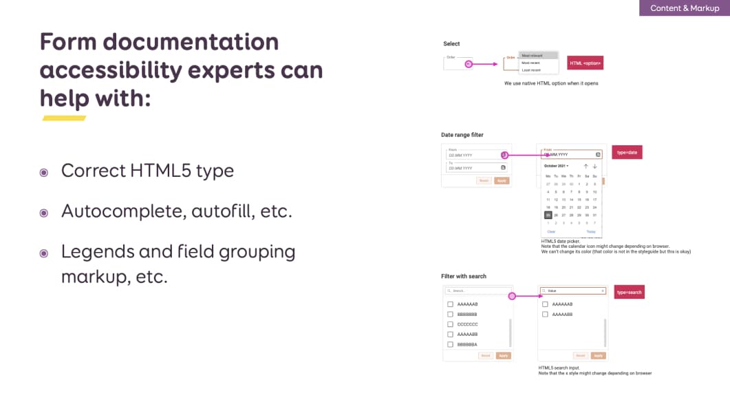 For forms for example, we could add:
Focus on keyboard support
Keyboard accessibility will help keyboard users but also screen reader users. It’s one very important part that gets often forgotten! In short: users need to be able to navigate and interact with elements on the page, using only a keyboard. There are a couple of things designers can build and document to help here.
Skip Links
Skip Links let users bypass blocks of repeating content (navigation) and get direct access to the main content. Those are links that let screenreader users skip directly to the main content of the page. And sometimes to the search. They are often “invisible” by default but are visible on focus (and announced by screen readers). You can also keep them visible all the time in the header. Up to you. Designers can also document the Skip Links.
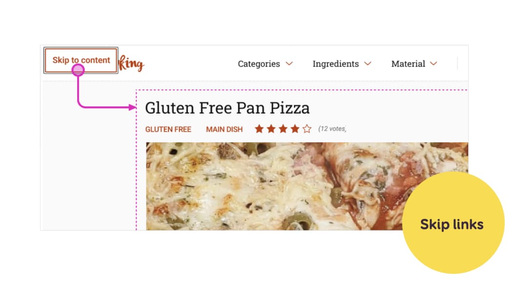 You can document
- Where the link is
- What is looks like when focused (if invisible by default)
- Where it will send users.
Focus order at page level
Some people will navigate a site without a mouse, using the tabulation key. The focus order should follow the logic of the flow of the page.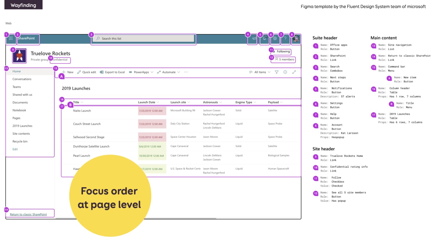 This example is from a Figma template by the Fluent Design System team of Microsoft. They provide a Figma kit to help you with such annotations.
Focus order is also something you can document at page level. The mockup is in the background. On top of it, you have small annotations. With the corresponding documentation of their focus order on the right. In this case, after the user navigates through the top navigation and first “site header”, they enter the main content. They start with the left sidebar, then a “return” link; and finally to the right part of the content.
This type of documentation might be overkill for simple pages. But if you start working in complex B2B apps (like Sharepoint, haha), with a lot of interactions, it can become quite handy.
Focus order at component level
Sometimes, you might document the focus order at the component level. This often happens if the components are in a multi-columns layout.
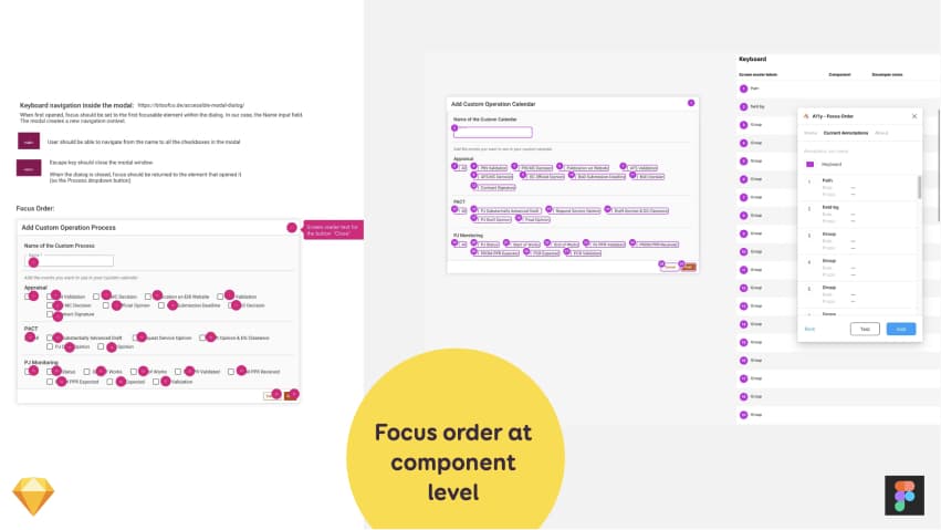
Here is another example of such documentation at the component level for a complex modal with many checkboxes. I document the tabbing (focus) order throughout the modal content with numeric annotations:
- The closing of the modal.
- The text field
- The checkboxes in a certain order
- The cancel button, then confirmation
I also specify that the modal must be closeable using the escape key.
I can document this with little annotation numbers on the form fields and arrows to show the order (which is my example on the left). If you are using Figma, the team at Microsoft created a plugin (A11y Focus order) that will help you with that (this is the example on the right). You can select the elements and then give them a number in the plugin. And you can re-order them as well.
Complex component interactions
Users need to be able navigate and interact with all components using different pointing and interaction devices (mouse, keyboard, etc.).
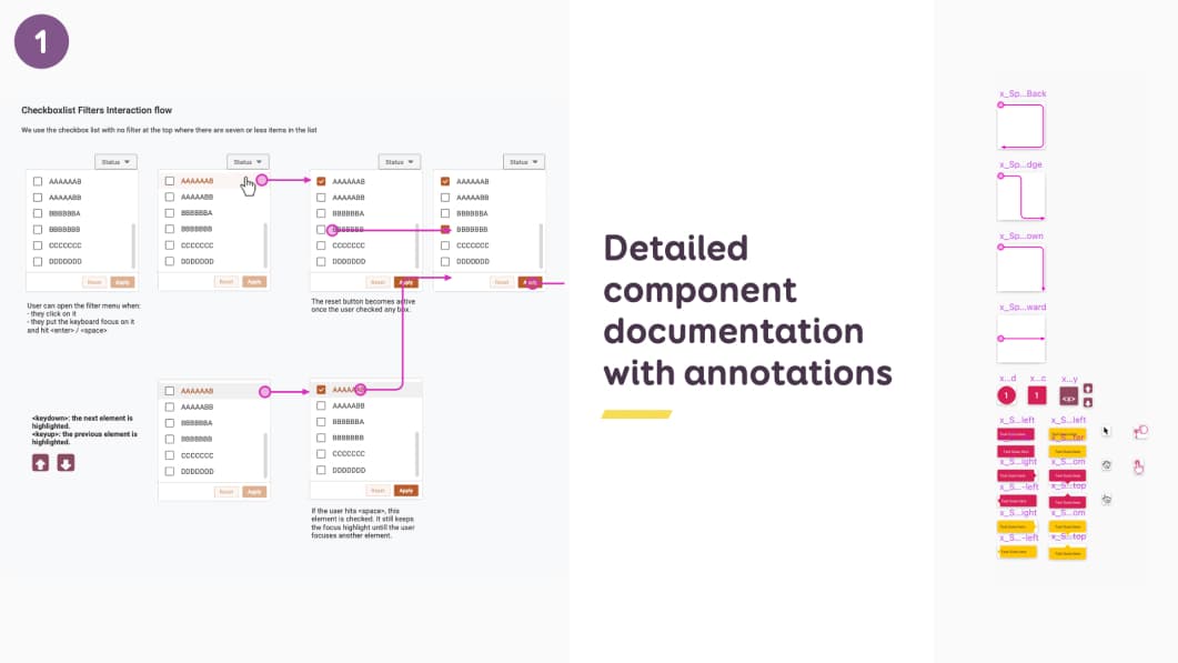
For complex components with many interactions, I build “interaction flows”. This documents how these components should work, when there are different interactions. Let’s start with mouse interaction.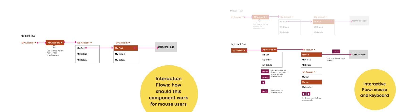 In this example, I have a filter with checkboxes. I documented step by step what happens when a user:
- Hover of the button
- Dropdown open
- Hover on element inside
- What happens when user clicks
On top of mouse interaction, I also document keyboard interaction. So I end up with a similar flow, that will also show keyboard navigation in this component:
- How to open the component (enter/space), close it (esc)
- How to navigate across the elements (up/down key)
- How to activate a link (enter)
If the component has some keyboard shortcuts (mine don’t), this would be a nice place to document that as well.
Here are a few resources to help you get started with keyboard interactions
- Designing for Keyboard Accessibility
- The difference between keyboard and screen reader navigation
- browsing with a keyboard
- A table to help you with keyboard testing (but also shows you the main expect implementations)
A little reminder to help you document keyboard navigation:
- Tab lets people jump between sections
- Arrow key helps navigate inside the component
- Space / enter activates the element
Alternatives for complex gestures
Providing alternatives for complex gestures is an accessibility and usability best practice. An example of this is the “swipe right” to archive feature in gmail.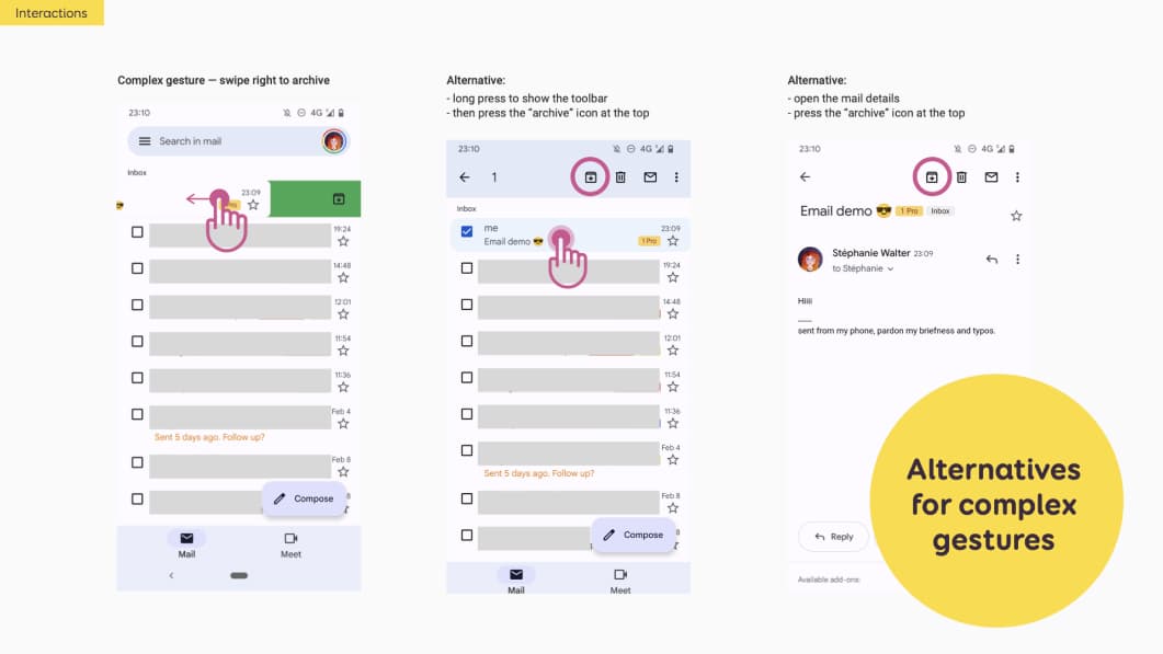 If I were to document alternatives for gmail, I could do something like this. I would document the complex gesture with a mockup that shows the swipe right to archive.
Then I would document alternatives:
- A long press on the mail to show the toolbar, then press the archive icon
- Open the mail, then press the icon at the top
I suggest “Foundations: pointer gestures” for more details as to what is a complex gesture or not and how to deal with those.
Single pointer alternative for drag and drop movements
This is a new WCAG2.2 criteria: for any action that involves dragging, we also need to provide a single pointer movement alternative. Note that this doesn’t just apply to gesture, but also mouse drag and drop.
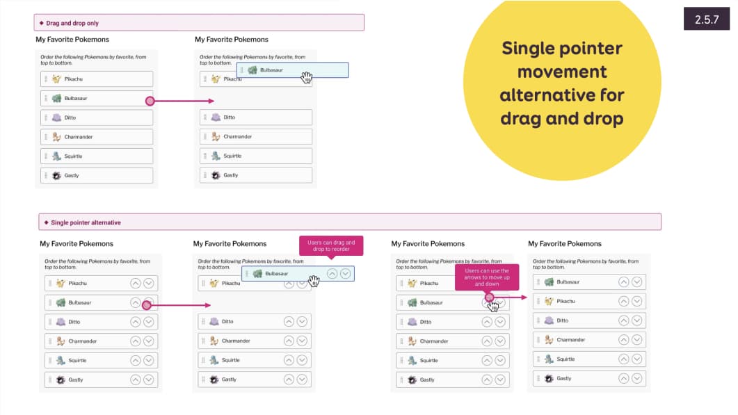
Top and bottom arrows, as alternatives for dragging movements for a re-order type of interaction
In my example here, I have a way to sort pokemons by using drag and drop. This can’t be achieve for some people with motor impairment. A solution here would be to double the action:
- User can drag the cards to re-order
- User can also use some top / down arrows to re-order.
I’ve documented both interactions to help my developers build this. People interact with click with the arrows. We would need of course, to also document and implement a way to use keyboard navigation here.
For more information on this criteria you can check Tetralogical 2.5.7 Dragging Movements (AA)
Navigation & Way Findings
Wayfinding is the documentation of things that will help people find their ways on the page (navigation and more). Good information architecture follows accessibility best practises and makes content easily navigable.
Semantic reading order
Semantic order refers to the order in which content is interpreted by screen readers and keyboards. By default, the screen reader will follow the order of your HTML. The semantic order should follow the logic of the flow of the screen!
Most of the time, it’s straight forward and designers don’t need to do anything. But, in case of complex layouts (multi-columns for example), designers might need to convey the reading order to the developer teams. So that the developers can implement the proper HTML (or native code) to convey that order.
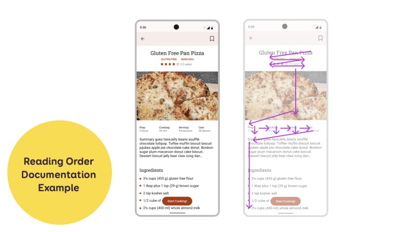
My cooking app is not that complex, so, documenting it might be overkill. Still, there’s one tricky part, with the 4 columns meta-datas. Those meta data are key-values layout out in a 4 columns grid. I honestly really hope you work with developers who understand the reading order here. But, for very complex pages with complex layout, this can become useful.
There’s usually 2 ways you can document this.
- You can use little arrows to show the developers the order. In my example here I was using the arrows from the Include Figma plugin.
- You could use numbers, like when you document the focus order. Be careful though, focus order is only for interactive elements, while reading order is for ALL elements. So, this could get confusing if you use numbers for both.
Here’s an example using numbers
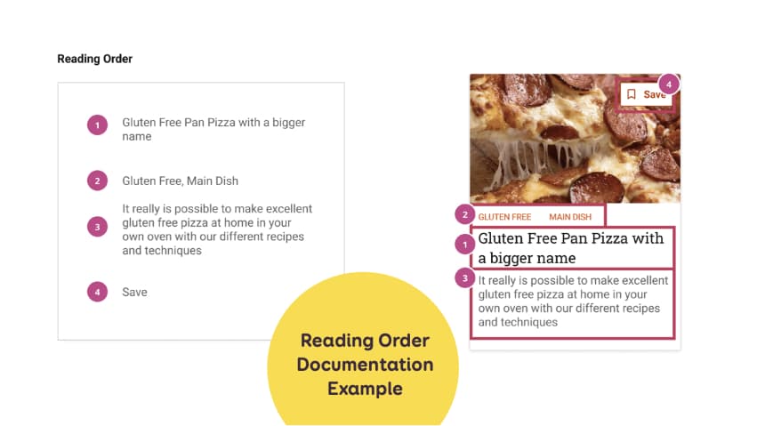
An example of vertical thumbnail of a cooking recipe with annotations on the right to show announced content order
In this example, I have a small version of a cooking recipe “thumbnail” component. This component will be used in a grid page (aka there will be a lot of those on the same page). It has a vertical layout, image at the top with a save button on top of it. Then categories, recipe title and summary.
- I don’t want the image to be announced, because there will be a lot of those and it might get annoying.
- The H1 title should be announced 1st. This is why it’s in a big bold font in my design. It conveys visually the hierarchy. So this gets number 1.
- For the save button, even if visually at the top (mostly to gain space), should be at the bottom of the HTML and announced last.
How would you implement this then? Marie Guillaumet, accessibility expert at Access42, explained to me:
“Even if the title visually appears after the categories, in the HTML code, you need to put it before. This way the screen reader will read the title, then the categories. Then you use CSS to invert the order visually in the component”.
If you want to dig further in the topic of screen reader I recommend:
Information Architecture for Everyone
HTML title of the page
The examples until now were mostly documentation at component level. There are more things you can document at page level.
Starting with the HTML title of the page for example. Each page should have a unique <title> that describes the content of that page. It is displayed in browser tabs. It is also announced by screen readers. This helps users know where there are and what they can expect to find on that page. Designers can document titles for each page. SEO, UX writer or content people can also help writing the page title (and descriptions). What makes a good page title? Well it:
- Is unique for each page
- Is short and descriptive
- Helps users know where there are and what they can expect to find on that page
- Is NOT SEO keyword stuffing
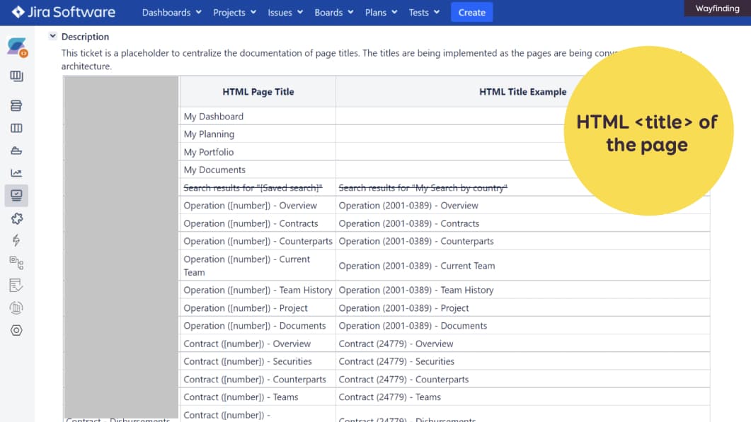 For those, we use a Jira ticket (because we don’t have confluence ^^). You could also document this in mockups .
HTML headings in the page
Once a user is “inside” a page, proper HTML headings is another important aspect of accessibility: H1, H2, etc. I can do 2 things:
- First, I usually directly name my styles with the proper heading level so that others designers can re-use them (and devs see the name when inspecting)
- I can use heading level as annotations on the mockups
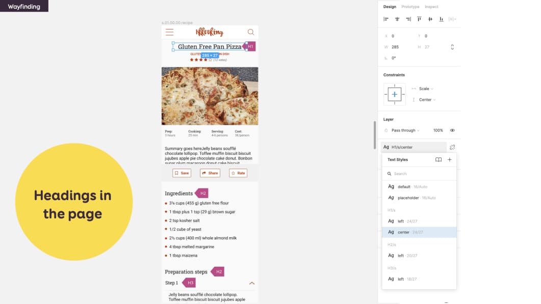
In this example I documented a H1 for the title of the recipe, then H2 for Ingredients and Preparation Steps, etc.
A few rules about accessible headings:
- The label of the heading is descriptive, clear and accurately describes the content that follows
- Don’t have illogical order (a h2 after a h4 in the same section)
- Don’t use paragraphs with bigger font, use Hns instead.
My advice here is: don’t start thinking bout your page structure when you are in Figma/Penpot, whatever tool, it’s too late. Plan your page content and structure ahead! I’m using content modelling for this, in sticky notes, but you can also do it in a document
And work with UX writers, SEO people on those! This is the sort of thing that you could also document with content people. Sometimes you need a heading level but this would mess up SEO. For those cases, you can use the aria-levels (and a p tag). Check with your devs. If you want an example, check the code of my “let’s get in touch” footer. The title is visually the same as H2, but this makes no sense for SEO. So it got a role=”heading” and “aria-level=2” instead.
Identify HTML5 sectioning elements and ARIA landmarks
The skip to content was sending the user to an area of my document that is called “main”. But there are more areas that help screen reader users orientation on the page: the Aria Landmarks. This is really useful for screen reader users, because it lets them get a sense of how the page is structured.
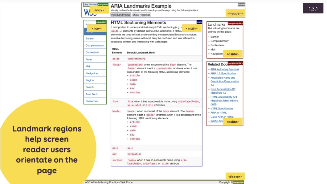
Please note that several HTML sectioning elements automatically create ARIA landmark regions. So, if you use HTML5 elements like main, header, nav, etc, you don’t need to double down with an ARIA role. More information on the ARIA Ladmark Regions page.
 I debated a lot about adding this part. Is it the job of the designer or the developer to document something that starts to be technical? Honnestly: it depends on your teams (more information on the last section on this). For me, designers should at least document the main areas, so that developers understand what belongs together. This can be a collaboration between designers and desvelopers as well. This is why I added a “zone” component to my Figma/Sketch/Penpot annotation templates.
User flow to document interaction between pages
One last level of documentation is “interactions across pages”.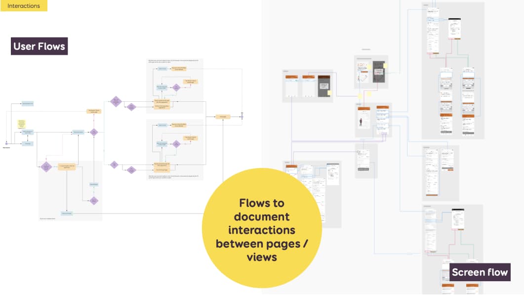 User flows (on the left) are kind of “step by step” boxes and arrow graphs that document how someone accomplishes a task. They list pages, views, branchings, … They are usually built at the beginning of the project to help plan those pages and flows.
Screen flows (on the right) are kind of the same. But instead of boxes for pages, I put the real interface mockups. I build those at the end, once we went through usability testing, refinement and have mockups. Both help the dev team understand how the user will navigate across the whole interface.
Such documentation can help with accessibility to plan:
- Transitions between pages. Especially in single page applications or mobile apps.
- Alerts or messages that might appear and stay on top of the page even if users got to another one.
- Multiple steps flow where you might have session lengths. But avoid limiting form sessions length if you can.
Content Access
Let’s start with some general content rules:
- Use easy to understand language
- Make sure information is structured and convey that structure through presentation (design) but also programmatically (proper semantic)
- Make sure screen reader can access every content
- Ensures all elements in paragraphs and lists are navigable and announced by screen reader (Aka: avoid text in images! )
- Ensure elements in a list are navigable one by one
- Text is used rather than images of text
Image, icons, screen reader content
Image alternatives and screen reader announcements
If there are images or icons in the mockups, designers can document what the screen reader should announce, if those need to be announced.
In my example on the left, I have a cooking recipe site with an image of a slice of pizza at the top
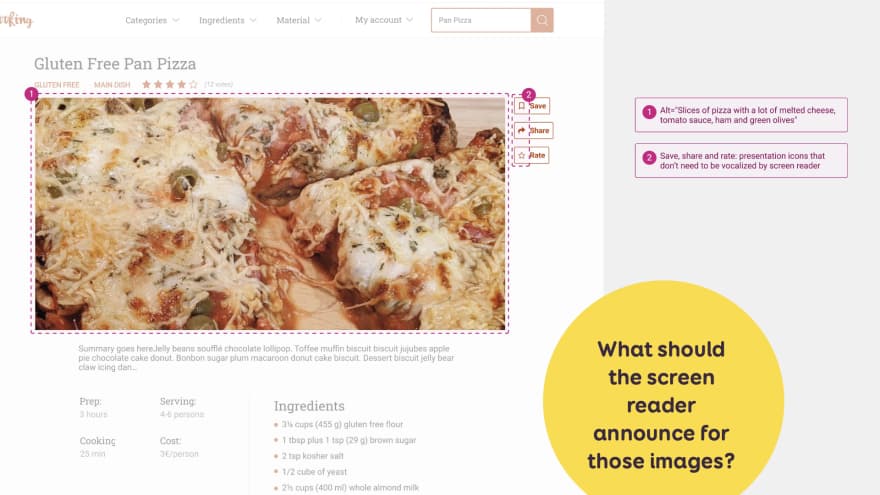
Examples of documentation for a pizza header page. The pizza has a alt text while the icons don’t because they already have text labels
I use the annotation technique to document the alternative text for this image:
- A number on the image
- The alternative detailed documentation on the right
I also have 3 buttons: save, share, rate. Each has an icon and a label. In my annotations, I explain that the screen reader should NOT announce anything for the icons. Since we have the text next to it, those become decorative images. Otherwise it would be annoying to have twice the same information.
I am not sure here how the developers will implement the icons. So I prefer not to document exactly if this should be an empty alt, a role=presentation, … I could also discuss with them. Then update the documentation to reflect how this would be implemented.
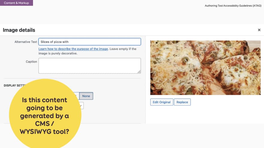
An example of the image details for alternative text and captions in WordPress
One small detail: here I assumed I am the one coding the pages. But this is a cooking recipe page. There is a good chance this content is going to be generated by a user, using some sort of CMS (or WYSIWYG)
Which means: you need to develop the alt text field as well. If you are interested in the topic, take a look at the ATAG: Authoring Tool Accessibility Guidelines
The case of “icon only” buttons
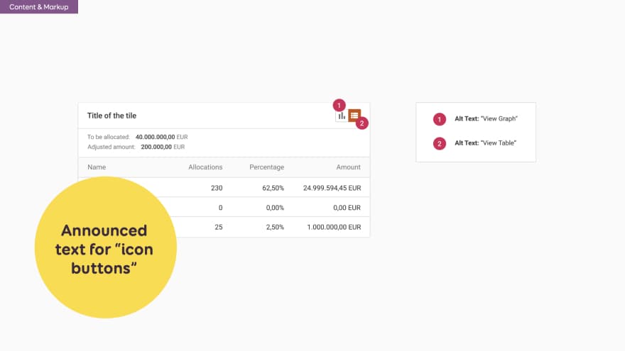 In this second example on the right, my icon buttons do not have visible labels. So I need a screen reader to announce those.
I again use the annotation to document that:
- the first is “view graph”
- and the second “view table”
With the help of my dev team I could bring this one step further. They can add documentation for some ARIA states (selected, etc).
The tricky concept of “decorative” images.
The w3org has a nice decision tree to help you decide if an image is decorative or not. That being said, Léonie Watson (accessbility expert and blind person) had an interesting discussion on the f-word podcast. She explains:
” The idea that decorative images are anything that we just put up there to add a bit of atmosphere or whatever to a page should not be described has driven me to distraction for the longest amount of time because I used to be sighted. So even if I see some dreadful stock photography of a couple eating pizza on the sofa because it’s a mortgage website or something, it evokes exactly the same reaction in me as someone looking at the image.
And I suspect that As a blind person, I’m actually missing out on a lot of peculiar emo-on-a-cheerful-site imagery points to be made, and other such things. And I keep coming back to the thing you just said, Bruce. Not everybody wants to listen to that detail, but you don’t have to listen to it. If it’s there, you can skip past it, or you can stop and listen to it. If somebody decides not to put it there, that choice has gone right out of my hands.”
So, yeah, this is the hardest part, I think, about accessibility and images. Experts and users don’t agree on this. But I like the idea of giving more information, and people can skip if needed. To be clear: here, I’m talking about actual images in articles. This doesn’t apply for images in buttons for example.
Screen reader access to content
Sometimes, screen reader users need some extra information.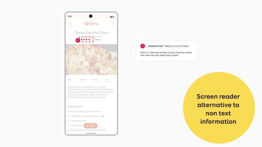
In my case here, I have some ratings for my cooking recipe. I use a stars system. This is very visual. And, I don’t want the screen reader to announce 4 times “filled star” and one time “empty star”. I want the screen reader to convey the same information as the visual one. So I documented this to explain the screen reader should read “Rating 4 out of 5 stars” here.
Another solution would be to follow my advice at the begining of this chapter: don’t use image only to convey information. I could for example, put the rating, in plain text, next to those stars. Something like “4/5 stars, 12 votes”. In this case, the stars would become decoration, since we already have the information in text. And screenreader would not need to announce anything.
I like this example, because it show how our design decisions can impact users, and, that there’s always multiple ways to tackle some accessibility challenges.
Alternatives for Audio and Video content
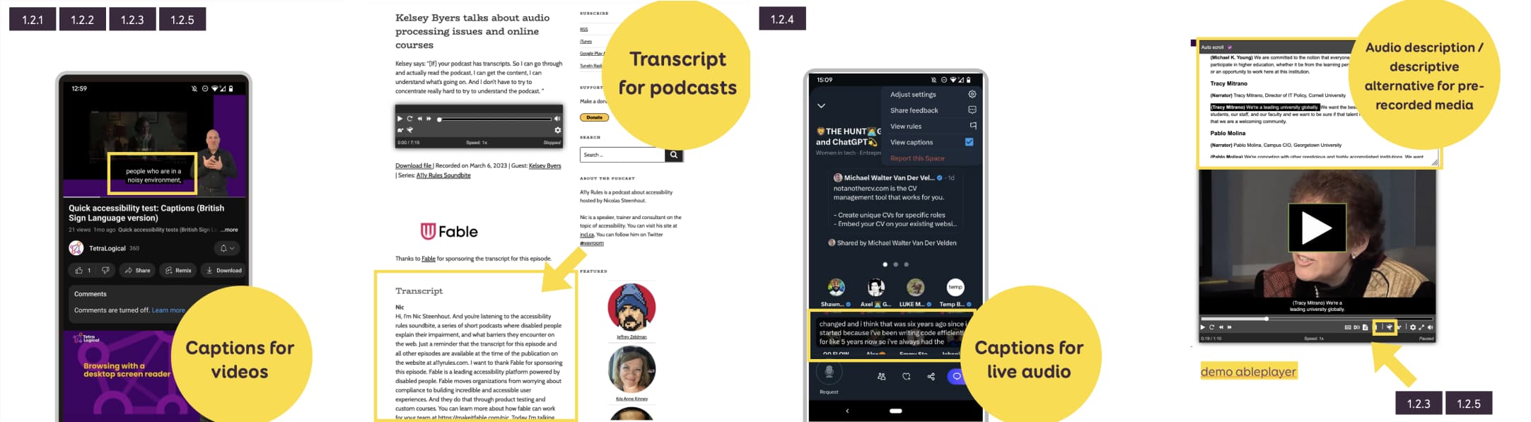
If you have pre-recorded audio only and video contents, you need to provide alternatives.
For examples:
- Captions for videos, and / or transcript, and audio description / descriptive alternative
- Transcripts for audio podcast
For live audio content, we also need to provide text alternatives, like captions. This is a little rarer on web content that tends to be pre-recorded. But think about XTwitter for example: they have space feature that is audio only, and they provide auto-generated you can activate. For now at least.
So you might say “yes, but the designer isn’t going to write all the transcripts and create all the captions”. True. But, as designers, you need to design ways to access and display all the alternatives.
And, just like images, if you are a designer, working on a platform that offers the ability to have pre-recorded audio, videos or live audio, it’s your job to make sure captions and / or transcripts are supported. Which means: design a place for them. Design a whole UI for people to upload their captions, to synchronize them even maybe, if you have a video platform. And, it’s your job also to push this, as a product feature in the roadmap, so that, it’s not accessibility is not an afterthought anymore!
Control for autoplaying audio
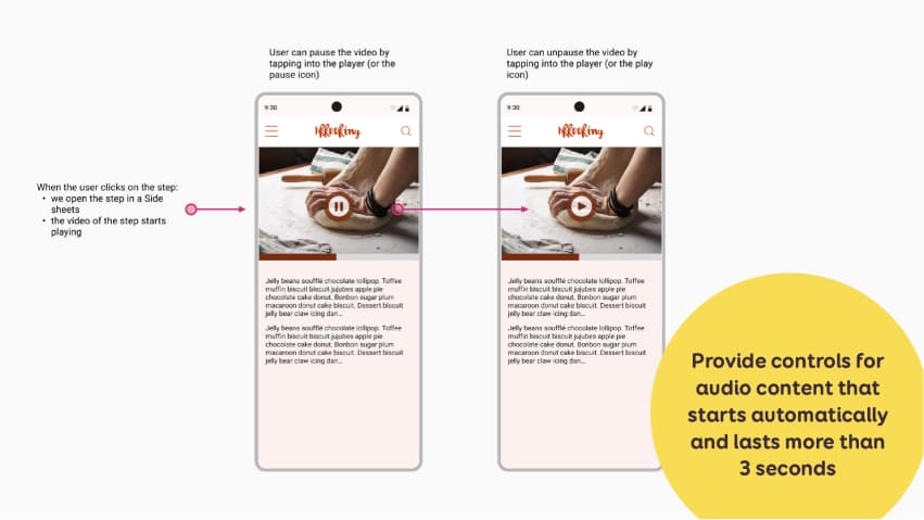
Provide controls for audio content that starts automatically and lasts more than 3 seconds
We also need to provide a way for users to control moving, scrolling blinking or auto-updating content that starts automatically and lasts more than 3 seconds:
- A mechanism to pause / stop the audio
- A mechanism to control the audio volume independently of the system
I have yet another example of my cooking app. When you click on a recipe, the video at the top autoplays. So, I need to provide a way for the user to stop the auto play. They get a pause button.
Don’t block orientation
That’s it, as simple as that. Some people will fix their device and can’t change orientation. So, don’t block orientation change support (and document if necessary) both portrait and landscape mode. Document if necessary the way of page transition between portrait and landscape mode.
Reduced motion and play/pause buttons
One aspect of design that is quite tricky to document is animations and transitions. There are accessibility best practices for those as well. Some animations and transitions can trigger motion sickness to some users. I’m one of those by the way.
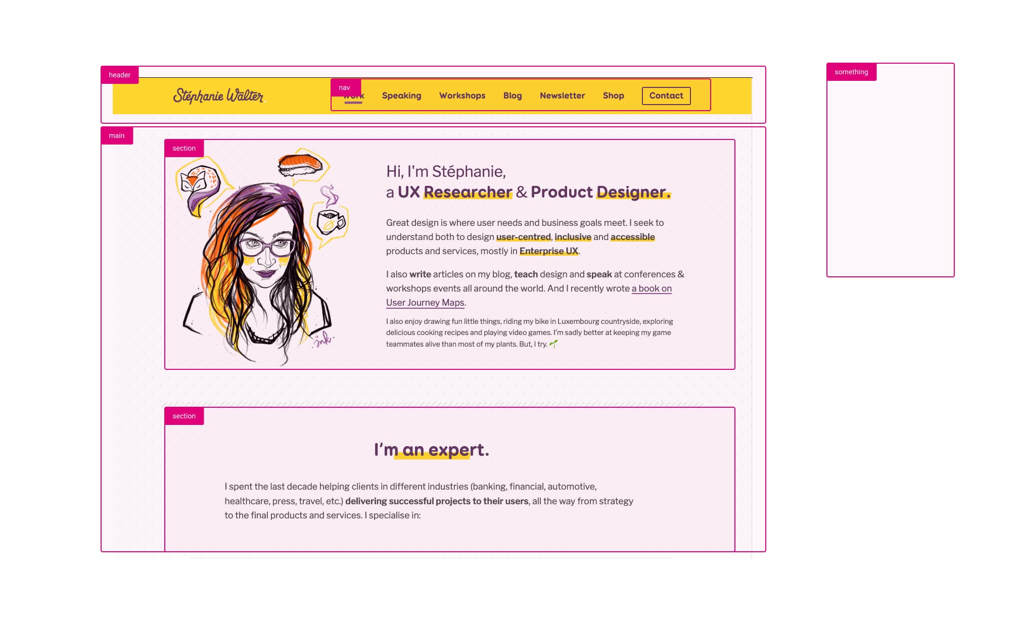
You can use the prefers-reduced-motion media query to provide an alternative version for people who prefer less motion. If you want to learn more about the topic, check the section “Building Accessible and Inclusive Animations” of my talk on CSS animations and UX.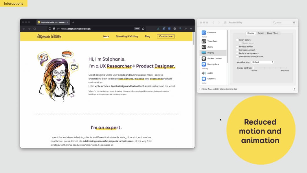 On my homepage for example I have 2 animations. The fox, sushi and coffee float around my head. And if you scroll down, I have a growing plant when you reach the “I help people grow” part. If the user chooses the reduce motion option in the operating system, I stop the animation around my head. And the plant growth becomes a smooth less triggering fade in.
How do you document this? Well…Animations are often something that is built in direct collaboration and fine tuned in the browser. For those sorts of things, I think you need to have a discussion with the dev team directly.
Also, for animations that starts automatically and lasts more than 5 seconds must have a way to get paused. So, don’t forget to have some play/pause buttons in your interface, if you have videos and sliders. Let the users control those!
How do we make it happen at project level?
Include people with disabilities in user research!
This topic on its own should be a talk. So, I’m going to give you only a couple of pointers, aka, the minimum you need to know.
For any research (discovery like interview, but also usability test):
- Find participants with various disabilities to get enough representation
- Choose accessible research locations (ramps, wide doorways, and accessible toilets, etc.)
- Offer transportation assistance, guidance and fair compensation for participants’ time and travel expenses.
And here are 3 tips targeted for usability testing with disabled users:
- Ensure your website meets basic accessibility standards (WCAG 2.2) before testing. You wouldn’t do usability testing before you corrected major usasiliby issues you can catch with an audit / heuristics? Well, same for usability testing with disabled people.
- Let participants use their own devices with assistive technology for familiarity.
- Allow additional time for setup and testing sessions to accommodate participants’ needs.
A couple of resources to learn more:
- Conducting usability testing with people with disabilities
- User Research with People with Disabilities – Sheri Byrne-Haber’s Blog
- Things to consider when doing usability testing with disabled people:
Communicating accessibility requirements is a big part of the design process
Let’s talk about my project. After all, the goal of this article (and talk) is to share what I do. So that you can get inspired and find your own way. We use Sketch and my developers have access to the Sketch mockups. I have 2 different Sketch files:
- A “component documentation” which is our design system where each component is described. This one is used as a Sketch library
- A “page documentation” : the components are put together on pages
In both those files, I document using a lot of annotations. I document using annotations on both component and page documentation.
Documentation at component level
Here is an example of a detailed documentation for a search filter at different states.
On the left: an example of a component with different states. On the right: my component symbols.
I put design annotations directly on the component mockup to help developers understand how this works for interactions, but also accessibility. Those are the little arrows in pink and the keyboard annotations.
I do that mostly because people don’t like to read specs and backlogs. But they might (yes might) look at my design files. I created some Sketch symbols for such annotations. Those are the right part of the example. I have arrows, numbers, boxes, keystrokes and some mouse/touch interactions.
Documentation at page level
I then re-use my components to build different pages. Sometimes, I also have annotations directly on a second mockup at page level as well.
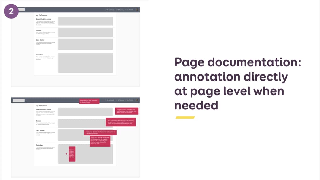
In this example I have the regular page mockup, and the same one with hot pink comments for my developer team
Hot tip: make sure the annotation style is different from the page style. This is why mine are magenta. I want to avoid developers implementing the annotations as part of the product by mistake. And, yes, I saw this happen before.
Documentation using numbers and margin comments
While researching for this talk, I stumbled upon Karen Hawkins “Accessibility Annotation Examples“.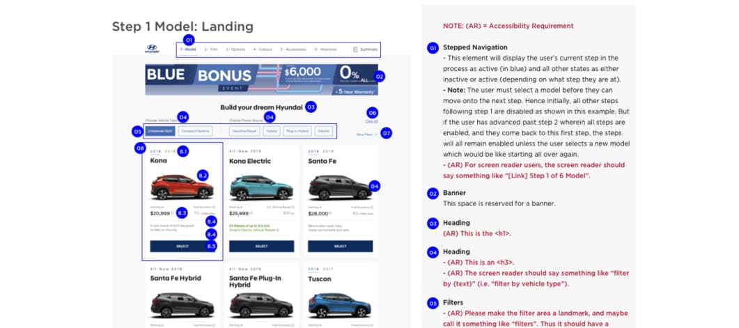 I find this format interesting as well. She puts the mockup on the left of the page, with little numbers on certain areas. On the right, she has detailed documentation for each number. The design annotations are in dark. And the accessibility requirements are in red, with a little (AR) prefix.
Determine the best format with the team
My number one advice: if you want documentation to be useful and used, ask the team about what would work for them. There are many different formats that you could use to document. Here are a few idea:
- Jira tickets used as documentation / research repository
- Confluence pages (or whatever knowledge base tool you use)
- Separate documentation in a word doc, excel sheet
- Miro board (mockups + docs)
- Figma comments
For me, it’s all about the best format for YOUR team. This has to be an open discussion.
Documentation is no substitute for communication
There are different styles and ways to document. Come up with your own and test what works for YOUR team. But remember one thing: Documentation is NOT a substitute for talking to people!!!!
It’s still important to present the documentation in person if you can. In our team, we have weekly meetings. Developers show demos. I show and discuss such documentation and specifications.
It is usually a discussion then, with the team, on what is possible, what is not, how we might implement those, etc.
When do you document accessibility?
One question I get a lot is “when do I document all of this” I document final & tested components / pages, after discussion with devs about technical feasibility.
Which means I might rework some mockups based on technical feasibility. And then create the final documentation. It takes a little bit of time to document. But it also helps have a good base for communication with the dev team. So, on the scale of the project, it actually helps gain time.
Accessibility is a team effort
Who should be responsible of accessibility?
I presented how and what to document. The last question to answer then is: who should document and be responsible for all of this? I have two answers for you:
- It’s a team effort!
- It depends…
It’s a team effort
 Accessibility documentation is a team effort. A lot of people can participate in such documentation:
- Product and Project Managers can define and document accessibility requirements at project level. Do we target AA or AAA for example? Also, they can make accessibility part of the Definition of Done if you work in an agile environment.
- Designers design and also document how it works and what it looks like. They also document navigation, the “hidden” interactions and what screen readers should announce.
- Developers & Accessibility experts document the technical implementation. Things like correct markup, ARIA roles, landmarks, …
- Content people, UX writers and SEOs can help document alternative texts, call to actions and link anchors that make sense for users, and more generally everything content related.
- Testers and QA (quality assurance) teams define and document accessibility test cases: how are we going to test this?
It depends (on what people are comfortable with)
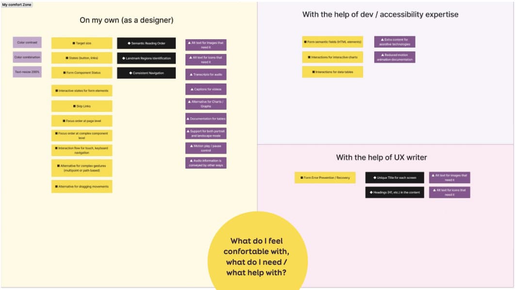 When it comes to who should document, my advice is: Start with what you, your team are comfortable with. Then build upon this base!
While preparing this talk, I tried to organise what I can document on my own, what I need the help of devs / accessibility experts with. And what I would like the help of writers and SEO with. I put all the types of documentation I just showed you in this 3 section matrix.
This is a very “personal” way of ordering things. It is based on my own areas of expertise.
I advise you to do something similar with your team. Of course, your mapping will be different. It depends on a lot of factors, including level of accessibility expertise for designers and dev team. The type of project might also change this. A single page app will not have the same needs and levels of page/component as a blog for example.
It is an interesting exercise to do with the team to see how confident and comfortable people are documenting things.
What are the benefits of such documentation?
I gave you plenty of examples of what to document. The final question now is: what are the benefits of such documentation?
Why should we do it and how do I convince my team to invest time in design documentation for accessibility? Well, a few reasons…
It benefits myself, as designer
The first benefit of documenting accessibility is for myself, as a designer. It helps me learn more about accessibility. To document such things, I had to learn about it.. So documenting helps me keep up to date and understand more accessibility needs and requirements.
It forces me to think about different interactions, beyond the “static” pixels I am working on. Documenting is a nice mental effort that forces me to take a step back and ask myself:
- How will someone interact with this with a mouse?
- A keyboard?
- How will it work on touch?
- What will a screen reader announce for that? Etc.
Sometimes, I am too deep into the pixel details of something. I don’t notice that this will not work, once people interact with it.
This helps me see that, and rethink a whole new solution if needed.
It benefits the designer- developer relationship
Design documentation helps avoid some misinterpretations. Of course this doesn’t mean that you don’t need to talk to your devs, or don’t need to present your mockups. Sometimes there are months between the moment I designed and presented something to the dev team and the moment that Jira ticket arrives in their backlog. Having a solid base of documentation helps remember and restart the conversation.
It also helps bring consistency to future pages and interactions. If interactions and accessibility are documented for one component, then similar components should work the same way. And trust me, my developers hold me accountable. Sometimes they will come and ask me “Stef, this is almost the same thing, why is this working differently?” And they are right to ask.
Companies, stakeholders, PMs might think such documentation is a waste of time. But, what happens if the designer doesn’t document how it works, states and all? Well, the developers will have to come up with that. Which means, you don’t gain time or money at the end of the day by not documenting. You just shift the costs from design to development. And I think you might even lose money then. Developers will often need more time than designers figure the missing peaces out.
It benefits current and future fellow designers
It’s a good onboarding tool for new members, especially if they don’t know about accessibility. They get examples of what is expected from them. Often, they will ask a lot of questions. And will learn about accessibility from that kind of documentation as well.
Prior documentation also helps set standards as to what is expected for the next designs. This again helps bring consistency when the design team grows.
It benefits everyone else in the team
Such documentation helps start conversations about accessibility within the company. It encourages them to dig further and learn about that topic as well. And helps make sure accessibility is NOT an afterthought anymore!
In conclusion…
I share with you a lot of things you can document as a designer to help push accessibility forward.
The goal was to give you some examples. But I will be honest, I don’t always have the time to document all of that in design mockups. I would say: pick your battles. If time is limited, document the things where there might be the biggest issues and misunderstandings
The important thing is teamwork. Even if you don’t document everything, communication is the most important aspect here. With the other designers, with the dev team, with the testers. So that we can push accessibility forward together for everyone. And make it part of the projects from the start.
And yes, it is a BIG, long, demanding job.
Accessibility checklists & Interactions Documentation Kit
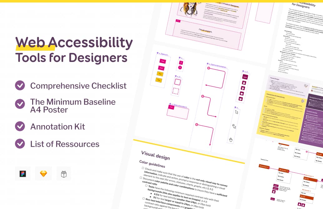
Wow. That was a lot. But don’t worry, if you don’t remember everything that you could document, I prepared a checklist for you. And some Sketch and Figma Annotation kit, to streamline your design process and save you time. You can now get it on my brand new shop.
Get the Checklist and Annotation kit
Videos of the talk
This talk was presented on March 16 at axe-con. (watch the replay of my talk page). It was updated in September 2022 , for Web Accessibility in Mind conference and Inclusive Design 24 to reflect the structure and content of a new version of the talk. And presented at Clarity 2022. It was also updated in 2023 for Penpot and FrontZurich.
I collaborated with Penpot to bring you a 1h introduction on how and where designers can have the biggest impact on Accessibility within a product.
I also created a template that you can find in the library, to help you document accessibility, with ready to use documentation components.
The talk was live on YouTube as part of the Inclusive Design 24 conference. You can also get the Webaim replay.
Sketchnotes
At Clarity 2022, two awesome people drew some Sketchnotes of my talk
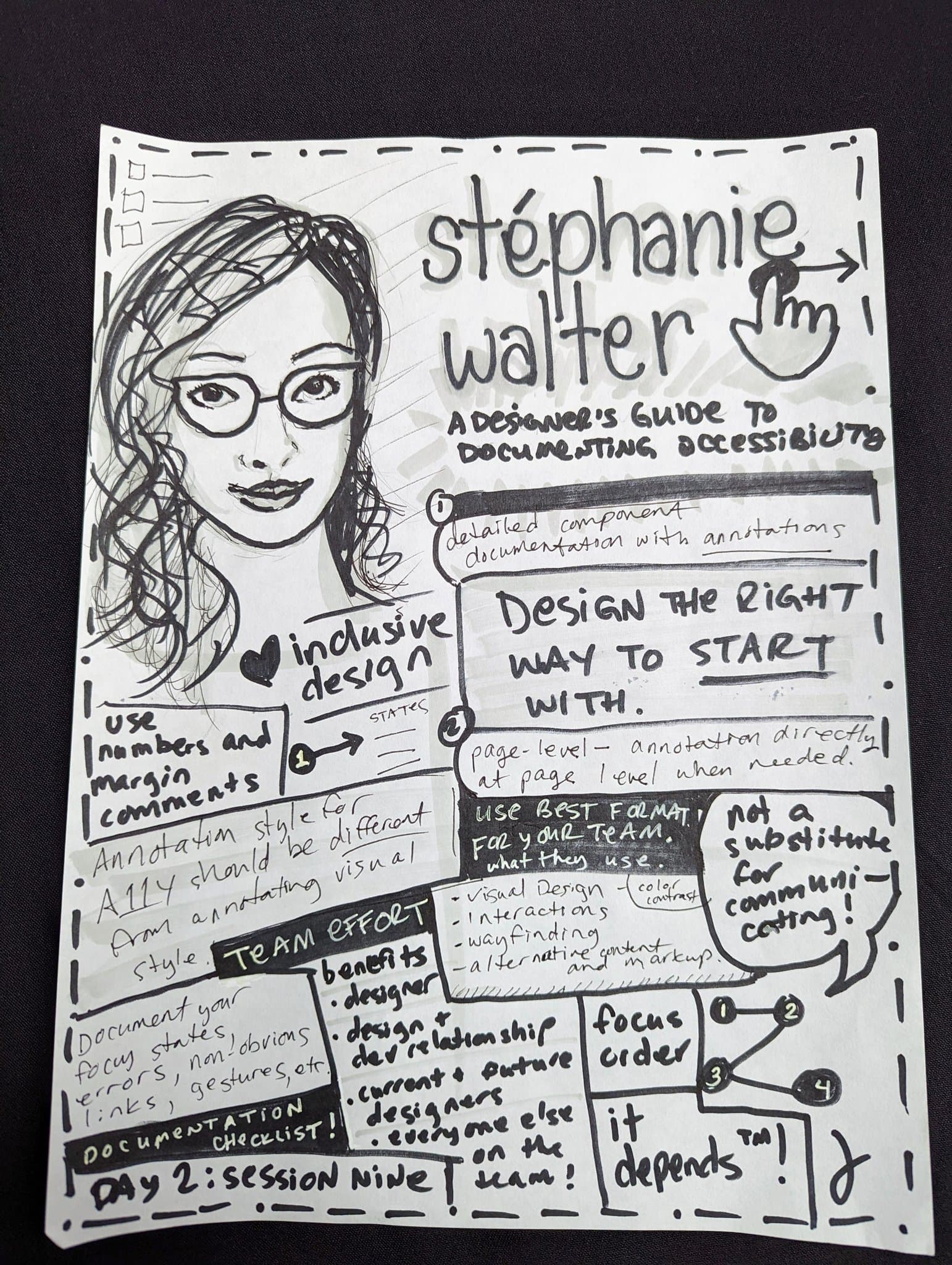
Sketchnote drawn by Jina Anne
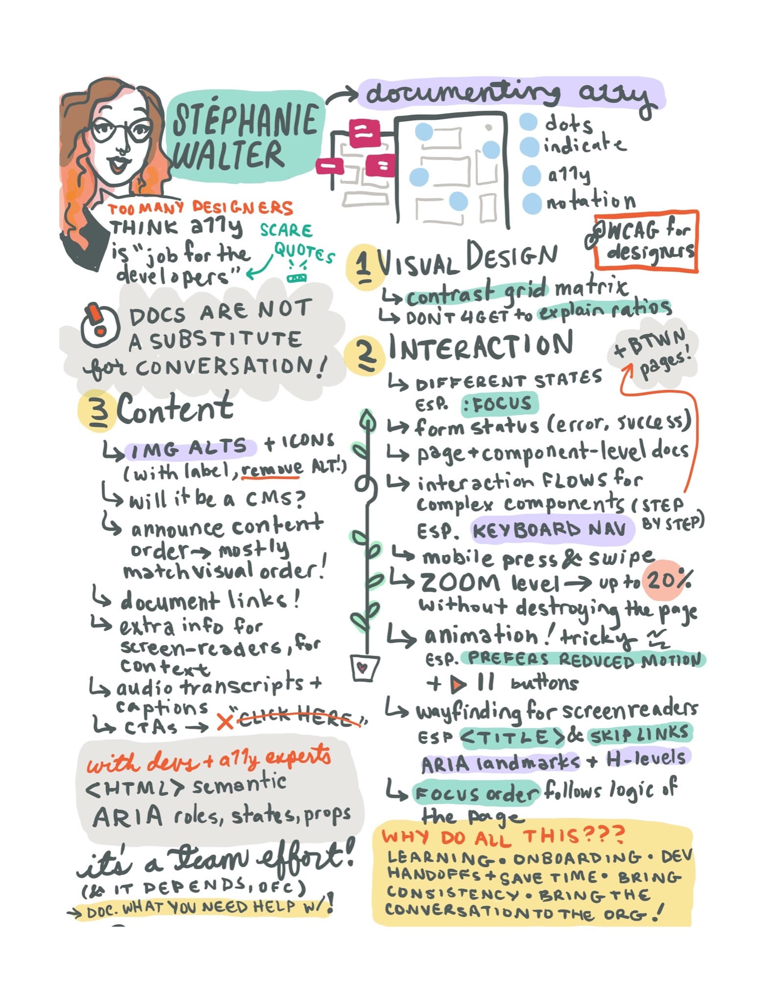
Sketchnote by Raquel Breternitz
Thanks, resources and links
First, many thanks to Alain Vagner, Marie Guillaumet, Geoffrey Crofte and Myriam Jessier for the help and feedback with that talk, Goulven Baron and Karen Hawkins for letting me user their work.
Links in the slides
- Accessibility Annotation Examples from Karen Hawkins
- Color ratio Matrix tool
- WCAG for designers
- A11y – Focus Orderer — Plugin for Figma
- Fluent Accessibility Notation — Figma
- ARIA Example: One Main Landmark
- Reduced motion example on stephaniewalter.design
- A11y Annotation Kit — Figma
- Accessibility bluelines — Figma
- Accessibility Bluelines (Sketch, Adobe XD, Invision Studio)
- Icons in the presentation by Streamline
- Authoring Tool Accessibility Guidelines (ATAG)
More links to help you build and document better accessible designs:
- Include – Accessibility Annotations: a useful Figma plugin to help you annotate landmarks, focus groups (native), headings, reading order, alternative text (for images, it’s missing icons for now), check touch target, color contrast, create de 200% version of your page, document complex gestures (native) and more.
- Color accessibility: tools and resources to help you design inclusive products
- Accessibility annotation Figma template (by twitter)
- Inclusive Components
- browsing with a desktop screen reader
- browsing with a mobile screen reader
- browsing with a keyboard
- browsing with speech recognition
- How to document the screen reader user experience
- Designing for Web Accessibility in 60 Seconds
- Text Resizer – Accessibility Checker
- Firefox Accessibility Inspector
- IDF has a course on accessibility, with an interesting introduction on accessibility vs usability (hint: we need both, but, accessibility doesn’t automagically mean usable)