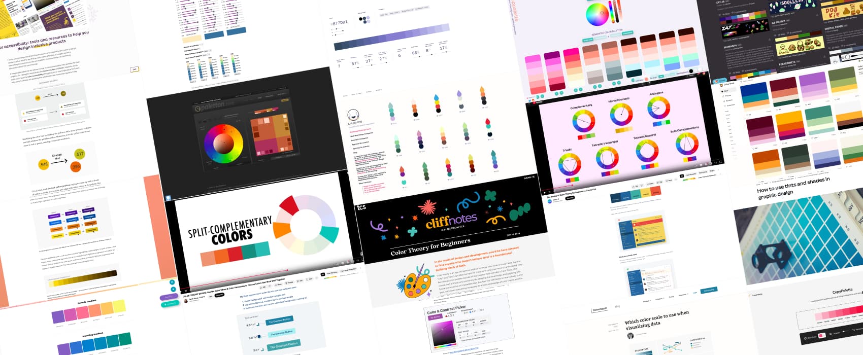
Color Theory & Palette – Resources and Tools
A Designer’s Toolbox for Learning About Colors and Color Accessibility
Last week, my student asked me for resources to help them understand the basics of color theory and build better palettes. Color is a big aspect of design that influences brand perception, but also usability, and accessibility, so, that’s quite an important topic for any designer beginner. I’ve shared with them, a collection of resources and tools on colors, I’ve curated over the years. I decided to share this list here as well, because every beginner—whether they’re my student or not—deserves guidance. I hope it will help you too.
Quick links: Understanding Color Theory, Building Color Palettes for Websites and UI Design, Accessibility and colors, Color Palette Resources, Enhancing Data Visualization with Effective Color Choices
Understanding Color Theory
Before selecting colors, it’s helpful to understand the basics. These resources cover fundamental color principles, from color harmony (also sometimes called color scheme by some authors), to contrast, concepts of hue, saturation, tint, etc., Those will give designers a strong foundation for making intentional and effective color choices.
- COLOR THEORY BASICS (video) A clear introduction to the color wheel, harmonies, and how to create balanced palettes (by Sarah Renae Clark)
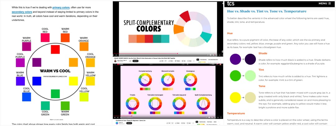
- The Basics of Color Theory for Beginners (video) a short video explaining the concepts of color schemes (complementary, monochromatic, analogous, triadic, tetradic, and split complementary colors), of contrast, the concepts of hue, saturation and value, the importance of neutral colors, and the 60-30-10 color design rule (by Canva)
- Marc Boulton has many chapters dedicated to color theory in his book Designing for the Web : Chapter 16 – The Color Wheel, Chapter 17 – Hue, Saturation and Brightness, Chapter 18 – Color combinations and mood, Chapter 19 – Designing without color, Chapter 20 – Color and Brand
- Color Theory for Beginners an introduction that covers the basics of color theory: hue, shade, tint, tone, temperature, and the six main color harmonies (by Maddie Reber)
- Warm and Cool Colors: What They Are and How To Use Them: an explanation of warm and cool colors, their role in color theory, how they influence perception and emotions, and practical ways to use them in design (by Bruna)
- How to use tints and shades in graphic design a practical guide to using variations of a single color to create depth and consistency in a design (by Canva)
- Color Palette Glossary: in case you are wondering what hue is, what a color space is and what tone means, this is a nice glossary to bookmark
Building Color Palettes for Websites and UI Design
Choosing the right colors for a website involves more than aesthetics. A well-structured palette brings consistency, while making sure the site is easy to use, and accessible. These resources include people, sharing their experience, and building color palettes for different websites. What better way to learn then from someone facing the same problem as you do?
- Building Your Color Palette if you only read ONE article in this list, this is the one. This is a structured approach on what you actually need for a color palette: grays, primary, accent (or secondary), and then utilities (warning, error, success, etc.) by refactoringui.com
- Reinventing Adobe Spectrum’s colors how Adobe created the spectrum color system, to be flexible, accessible, improving contrasts, with a dark theme and to be used by 100+ applications.
- My struggle with colors. Demystifying colors for accessible Part I + My struggle with colors, part II a deep dive by Zain Adeel into building accessible color palettes for design systems, where he goes through contrast ratios and building scales
- “Thinking about color” how cloudflare brought color consistency across all their sites. I’m amazed by the amount of work here, really well documented, big attention to details, something as “simple” as color can become quite complex when product grow (by Sam Mason de Caires and Adam Morse)
- The “dark yellow problem” in design system color palettes an interesting take on what to do with the yellow to get an accessible color palette ( by Lodestar Design)
Accessibility and colors
Great design is inclusive. Which means: colors should be chosen with accessibility best practices in mind. These resources will help you make informed color choices that work for all users, including those with visual impairments.
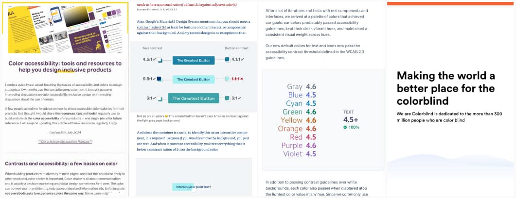
- Color accessibility: tools and resources to help you design inclusive products: a collection of tools for checking contrast and improving accessibility (by me)
- Tips to Create an Accessible and Contrasted Color Palette: a step-by-step guide to building accessible color schemes (by me)
- Fix Color Contrast – Web Accessibility for Text & UI Design (video) a video that introduces you to color contrast and WCAG rules on those (by Oliver Schöndorfer)
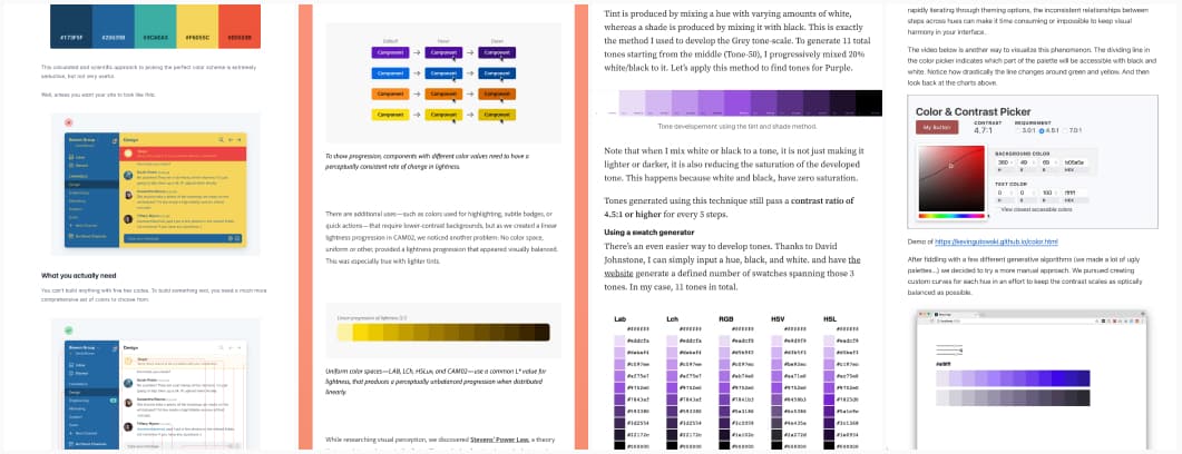
- How to create a color ramp used in design systems how to create color scales for design systems by adjusting lightness and saturation while ensuring accessibility (by Katie Cooper)
- Color Contrast for Better Readability: some small tips on how to check your contrast colors in your mockups (by Tom Osborne)
- Designing accessible color systems how Stripe redesigned its color system using perceptually uniform color models to ensure accessibility, vibrant hues, and consistent contrast across its products.
- We are Colorblind a website dedicated to improving design for users with color blindness.
- Color Contrast Cheat Sheet PDF more color contrast resources and a cheat sheet (by mart-interface-design-patterns.com)
Beyond colors: Accessibility for Designers – Practical Workshop
Design mockups that work for everyone and meet the new European Accessibility Act. In this hands-on workshop, you’ll learn to spot and fix accessibility issues early in your design process. We’ll cover visual design, interactions, navigation, and content, with exercises and real examples.
Color Palette Resources
Sometimes, you just need inspiration or a quick way to generate a palette. These tools will help you find or create beautiful color combinations.
Curated Ready-to-Use Palettes
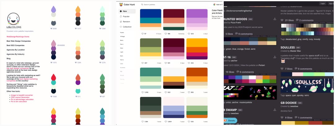
If you’re feeling stuck or simply want to explore beautiful combinations, these curated palettes are a great starting point for your next project.
- Lolcolors.com a collection of hand-picked color palettes, ready to use
- Palette List a database of palettes designed for pixel art and digital design.
- Color Hunt a playful and interactive platform to explore color combinations.
Color Palette Generators
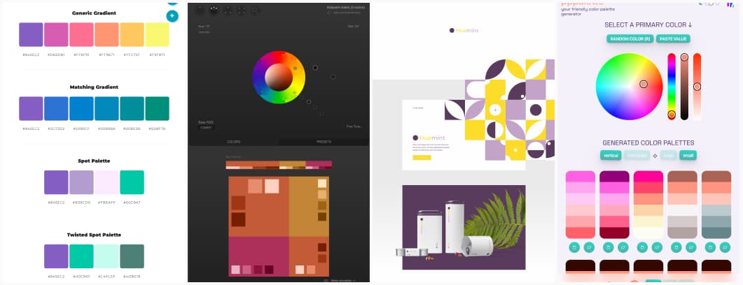
Some generators that will do the work for you: copy and paste your main color, and let them build different variations of palettes you can choose from.
- Color Space an online tool that generates multiple color palettes based on one single input
- Paletton a generator that lets you start with a base color and build different palettes using a color wheel
- Huemint – Generate a unique 3-color palette for your logo or brand: I like that it lets you preview that palette on different visual assets
- Pppalette: a friendly color palette generator where you input one color, and get multiple variations of different color schemes.
Dark and Light Color Ramp / Scale Generators
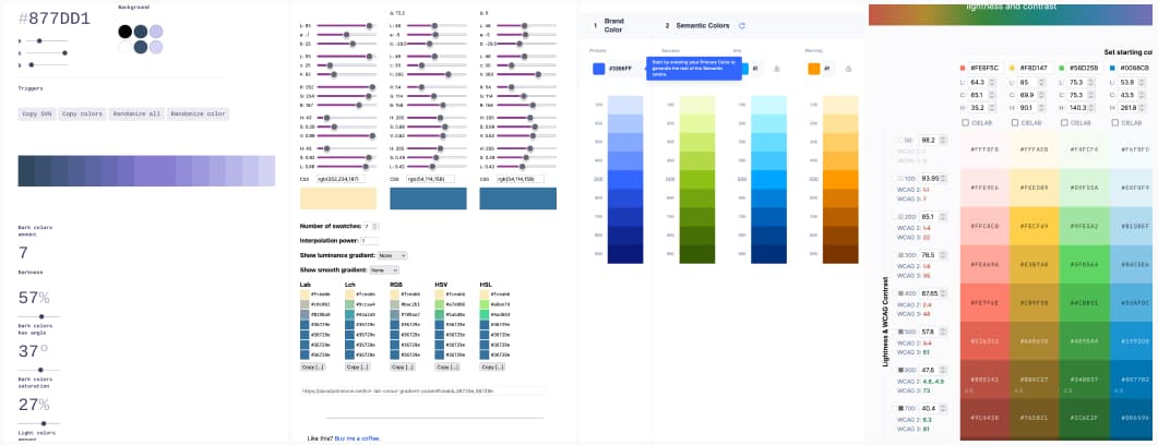
Many of the articles mentioned above go beyond simply selecting two or three colors for a palette. Instead, they develop complete color scales—gradients ranging from light to dark variations of a single color, and sometimes transitioning across multiple colors. If manually crafting these scales sounds overwhelming, here are some excellent tools to help automate the process:
- Color Ramp: create accessible color ramps, with light and dark mode, you can import easily into Figma
- Color scale generator: creates light and dark variations of a base color.
- CopyPalette another tool for building lighter and darker color scales.
- Lch and Lab color and gradient picker this one is niche, but my favorite scale generator because it lets you generate scales between 2 or more colors, in different color spaces (yeah, I know, very color geek)
- Eva Design System: generates UI-focused palettes for various states like success, warning, and error.
- Accessible Palette another tool to create color systems that automatically calculates different shades of the same color and lets you check contrast ratios when used together . Don’t trust the WCAG3 ratios though
Enhancing Data Visualization with Effective Color Choices
Choosing colors specifically for data visualization is a whole adventure. These tools and resources will help you create palettes that enhance readability for data visualizations
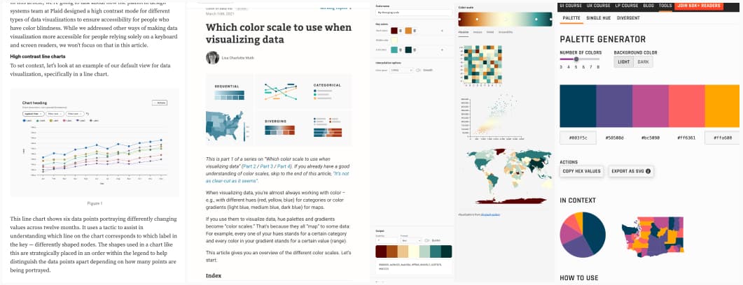
- Visually Accessible Data Visualization a couple of examples on how to make charts more accessible (by Derek Torsani)
- Which color scale to use when visualizing data very detailed article by Lisa Charlotte Muth to geek around sequential, categorical and diverging color scales when working with data viz
- How to pick more beautiful colors for your data visualizations a great introduction to color selection in data visualization (by Lisa Charlotte Muth).
- What to consider when choosing colors for data visualization more tips on dataviz and colors (by Lisa Charlotte Muth)
- Your Friendly Guide to Colors in Data Visualisation even more help with colors and dataviz, (still by Lisa Charlotte Muth )
- Data Viz Color Palette Generator (for Charts & Dashboards) if you need colors for dataviz, this generator helps you build different types of scales (by Kennedy Design)
- Leonardo – color scales another generator to help you generate sequential, diverging and qualitative
So, here we are, if you have more beginner-friendly resources on the topic, just let me know!