Pixels of the Week – April 2, 2023
UX research guides, challenging users, focus-visible tips and your rock training guide
On Twitter, LinkedIn, and Mastodon, I share curated articles I read, resources and tools about UX Design, User Research, UI and mobile design, HTML, CSS, the web industry, some processes, some inspiration, etc. This is an archive of everything I shared this week. And some extra links that I decided to only share for the blog readers. Also, subscribe to the newsletter to get notified when those are published!
Now: what I’m currently up to
 Accessibility and Design Systems: The Deep-Dive Q&A: Geri Reid, Lauren Beatty and I answered some deep-dive questions about accessibility after our panel!
TL; DNR: the one you should not miss
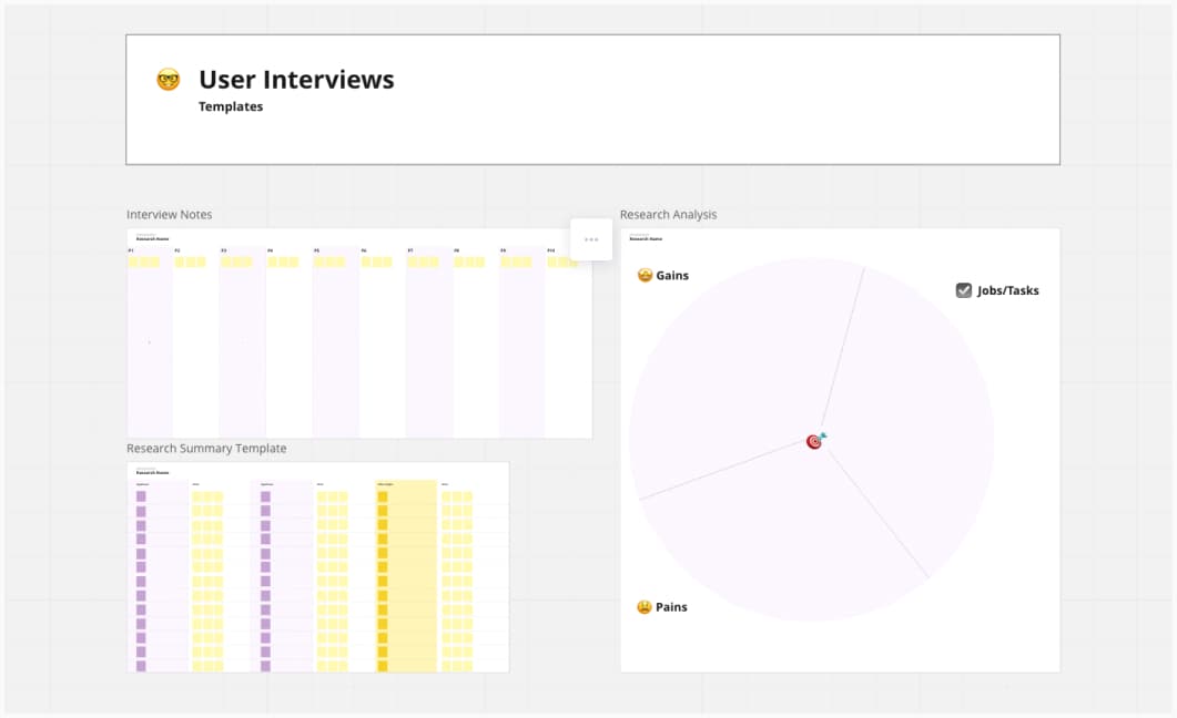
The Complete Guide to User Interviews: I really like that Anna Savranska goes into a lot of details on how to analyze the data using some Miro boards (you can grab her templates for free). If you want more content on the same topic, also check my expert guide to user interviews.
Interesting articles that caught my attention
Lots of guides this week:
- The Ultimate Guide to Mixed Methods User Research: how to use multiple methods to add richness to your findings, gain some time when needed and how to analyze data from mixed method studies
- A Pragmatist’s Guide To Lean User Research: some practical approaches to user research that we might be able to fit into our existing projects without being left disillusioned because we don’t always have all the time and budget we wish we had. I’m not a big fan of surveys though. Also, try to at least run them with your real target audience.
- A comprehensive guide on creating UI designs for iOS apps: a focus on layout and grid, colors, typography, iconography, components and transition, but also details about accessibility (contrast, icons with labels, etc.)
Other UX research and design articles
- UXR across cultures: What can we learn? Michele Ronsen ran some UX workshops in Japan and shared some interesting takeaways, cultural differences, and technical difficulties she had
- 9 Challenging Participant Types (and How to Reset with Them): the venter, the blank start, the distracted, the unopinionated, the perfectionist, the solutionist, the best friend, the self-blamer, the rambler. Which one did you encounter in your research?
- Brainstorm Questions Not Ideas: time stop wasting people’s time with group brainstorming sessions and the infamous “there are no bad ideas”, because there are. Brainstorm questions instead and prioritize them!
On accessibility
- The power of community: “We learn from each other”. Roll Mobility is a new free app that’s a Yelp for accessible spaces, where people can rate places and tell how accessible and inaccessible those are.
- Accessible but never boring – Part 2: type, icons, input and focus states rebrand in the new beautiful wise design system
Curiosity cabinet: non-design/tech rabbit holes I enjoyed
A History Of The World According To Getty Images: a documentary on human history, created with images from Getty Images catalog. Getty Images owns the rights of a lot of images, including historic ones. These images live in our heads and form a part of our collective memory. But in most cases, we cannot access them, as they are held captive behind Getty’s (as well as many other archives’) paywalls. The film explores how image banks including Getty gain control over, and then restrict access to, archive images – even when these images are legally in the public domain.
Inspiration: fun experiments, beautiful art, and great ideas
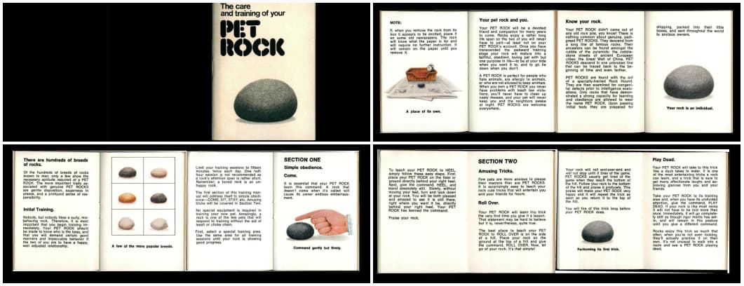
The care and training of your pet rock: so, in 1975, Gary Dahl created “Pet Rock” as a collectible toy, and you can find the care guide on the internet archive. I love that someone took the time to create this.
Useful tools & resources that will save you time
- The UX Cookbook: detailed guides for different user research methods (card sorting, diary studies, surveys, tree testing, user interviews, etc.). Each comes with time, how to prepare, ingredients, and directions to help you use that method.
- photorestore.io: an AI tool that helps you restore photos that are blurry
- Monkeytype is a minimalistic and customizable typing test. It’s quite fun if you want to know how fast and accurately you can type in different languages.
- Gradient Playgound: sometimes, all you need is a nice fun SVG gradient
- AI Colors: a fun tool to generate color palettes from text prompts
- Supatabs: a tab management extension for Chrome, for my tab-hoarding friends, a little bit like OneTab except it has a search feature
- Landing Gallery: a place to discover beautiful hand-picked landing pages for your inspiration, from homepage to pricing page, about, sign up, 404, etc.
- Contrast Grids is a Figma plugin that checks contrast for foreground and background color combinations of your palette. It’s based on Eightshapes’s online contrast grid tool. For more accessibility color tools you can check Color accessibility: tools and resources to help you design inclusive products
Videos
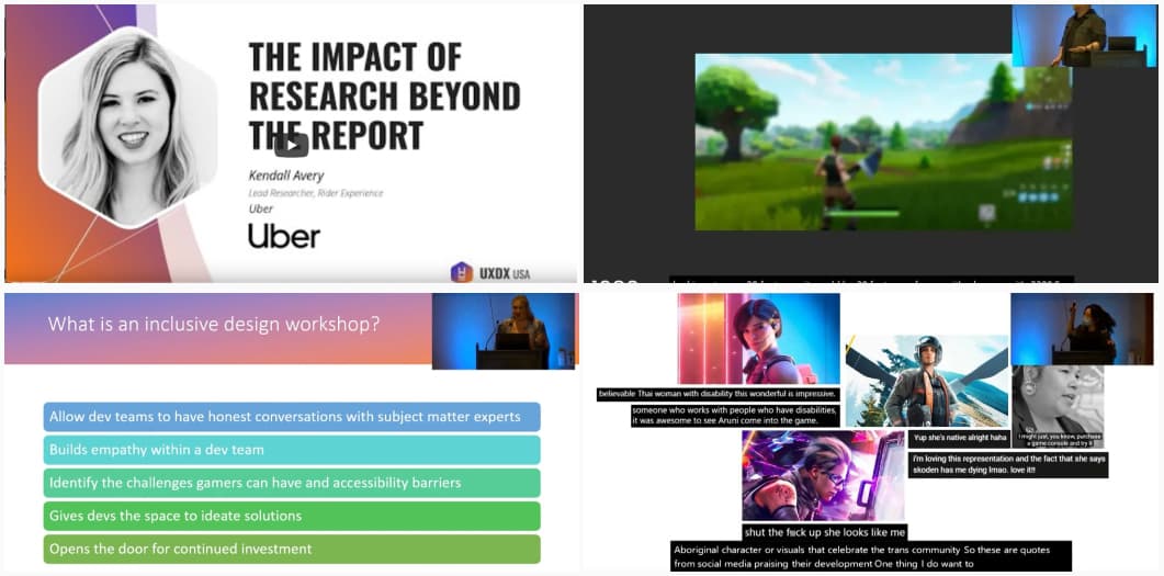
The Impact of Research Beyond the Report: Kendall Aver, a great 30min talk on how to have an impact with research, how to become a research partner to different teams instead of a resource
A few videos I loved from Game UX Summit
- UX Research Methods in the Development of Marginalized Characters: by Tina Chan authenticity is key when you want to create characters, this means, involve people from those marginalized groups through the whole research process and design of those characters
- I thought I sucked at games, but games sucked for me, super enlightening talk by Steve Saylor on the lack of accessibility in most video games. The key message: make games accessible, by design!
- Accessibility Lessons Learned during Forza Horizon 5: a great talk by Tara Voelker that emphasizes that, it’s never too late to improve the accessibility of a game, even, post launch. Also, validate with the real users!
Tutorials
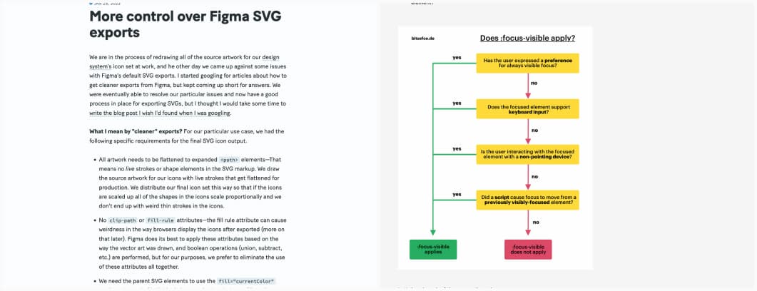
- More control over Figma SVG exports, very niche need, but, yep, this is something I needed too, clean SVG export, especially to get currentColor instead of hexa one to be able to modify it in CSS
- When is :focus-visible visible? a graph and article to understand when focus:visible get applied in the browser, by Ire Aderinokun
Latest news in the industry
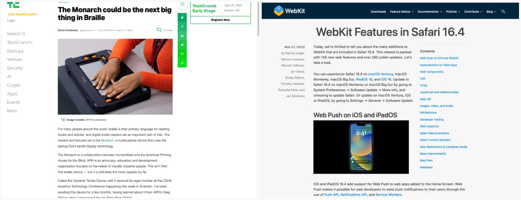
- The Monarch could be the next big thing in Braille
- WebKit Features in Safari 16.4: we are getting push notifications and badges in web apps, yeahy, and some other cool CSS updates in Safari 16.4
