Pixels of the Week – August 13 , 2023
Teaching Information Architecture, usability testing checklist & a fun movie tool
On Twitter, LinkedIn, and Mastodon, I share curated articles I read, resources and tools about UX Design, User Research, UI and mobile design, HTML, CSS, the web industry, some processes, some inspiration, etc. This is an archive of everything I shared this week. And some extra links that I decided to only share for the blog readers. Also, subscribe to the newsletter to get notified when those are published.
Now: what I’m currently up to
On August 31, I’ll be talking in Zurich at Front Conference about accessibility and how documenting accessibility can help push it forward in projects and build more inclusive products.
On September 14, I’ll be remotely talking at the Smashing Meets Magical UX meetup. It’s free and online.
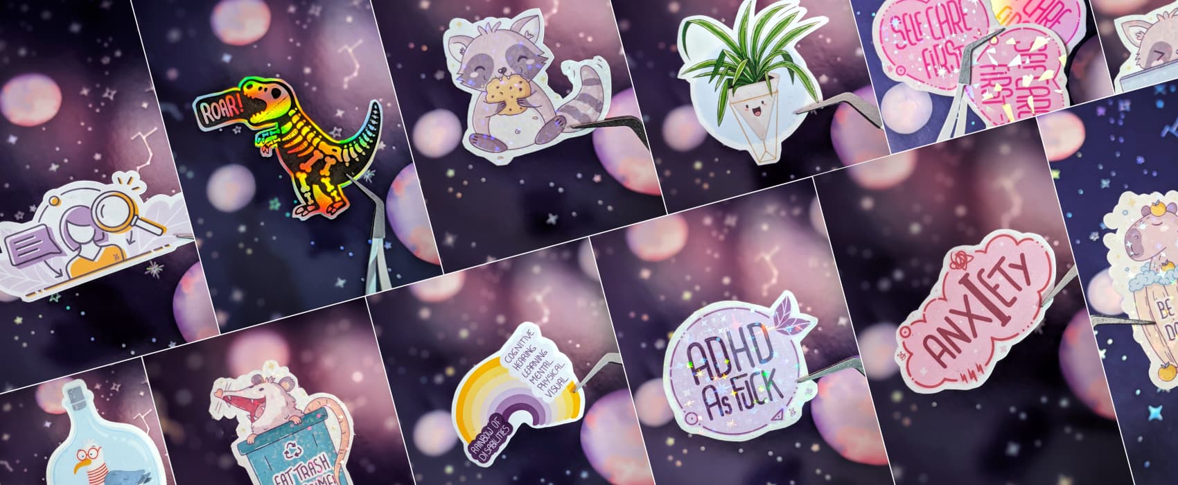
A couple of people asked how to get some stickers from me. I don’t have an official shop, but I put together a list of what I have in stock. If you are interested in one of those cuties, check this page, and let me know (DM or contact form). If you are curious about the behind the scenes and how I sometimes mess up stickers too, I posted a couple of the last epic fails on Twitter and Mastodon.
A great book (and a discount code)
The Teacher’s Guide to How to Make Sense of Any Mess: Abby Cover wrote a must-have manual to help you teach information architecture. It comes with slides and suggested assignments, you can re-use, to teach information architecture. Worth every dollar! Also, Abby was nice enough to give my readers a coupon code. So, add the code “PIXELS” at checkout, for a 15% discount on her book (and Etsy shop).
(this is not sponsored, I’m not making any money from the sales, I’m just happy to help promote awesome people’s work and get you a discount along the way)
Interesting articles that caught my attention
User research and UX design
- How to uncover deep insights into unmoderated studies (10min) great tips by Michele Ronsen, including how to collect qualitative data, think aloud protocols, mixing quant and qual, comparing segments, using session recording, etc.
- Why We Need 11 Usability Heuristics (9min) the 10 Usability Heuristics by Jakob Nielsen have limitations today. We need an “Accessibility and Inclusion” new one, to bridge the gap and emphasize the need for designers to prioritize equal access and consider social identities and biases.
- Make B2B Research Easier with These Tips (12min) great advice on how to conduct user research in a B2B or enterprise environment, from recruitment to analysis
- Striking the Right Balance: Anthropomorphism in AI Assistants (7min): a couple of interesting research studies on attributing human traits and behaviors to non-human entities, and how they influence user experience
- The Emotional Toll of Working in UX (10min): something we don’t talk enough about, the mental and emotional tolls that we might face in our profession (and a self care assessment PDF to help you), by Vivianne Castillo
- UX research tools on a budget. A comprehensive list (5min) from OBS to webcam advice and software, a nice list for recording research on a budget. I really like the “get a second” mouse tip, I’ll definitely keep this in mind next time I do in person testing.
- Your Never-Fail Usability Testing Checklist (16min) a detailed checklist to ensure you’re prepared for everything prior, during, and after the test. Available as a Google Sheet file too. (by Nikki Anderson-Stanier)
Accessibility
- What you need to know about ARIA and how to avoid common mistakes (15min) the number one rule of ARIA is to not use ARIA, if used incorrectly, it can damage the experience of users navigating with screen readers or keyboards.
If you prefer a video format, you can check What ARIA is and its impact on accessibility (on YouTube) - CSS And Accessibility: Inclusion Through User Choice (15min): a nice summary of all the cool new CSS media queries and how you can use them to improve user’s lives and build more inclusive products. By Carrie Fisher
- Just normal web things: yes, yes and yes, let the user do “normal” things on the web, like: copy / paste text from the site (also, copy past in password fields!!), do link things to links (keyboard shortcuts, open context menu, etc.), zoom in the browser, do responsive things, get hover and focus styles, see scroll bars, etc.
Curiosity cabinet: non-design/tech rabbit holes I enjoyed
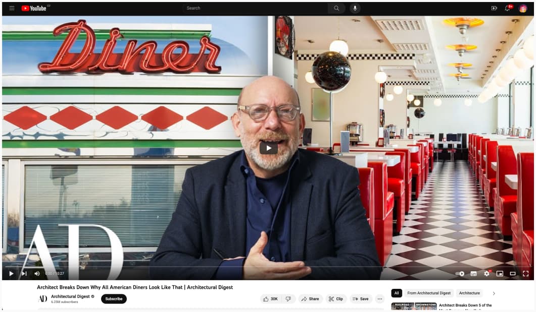
Architect Breaks Down Why All American Diners Look Like That: did you know that the design of American dinners are based on the necessity to eat in a train? The counter, the seats, the open kitchen, etc.
Inspiration: fun experiments, beautiful art, and great ideas
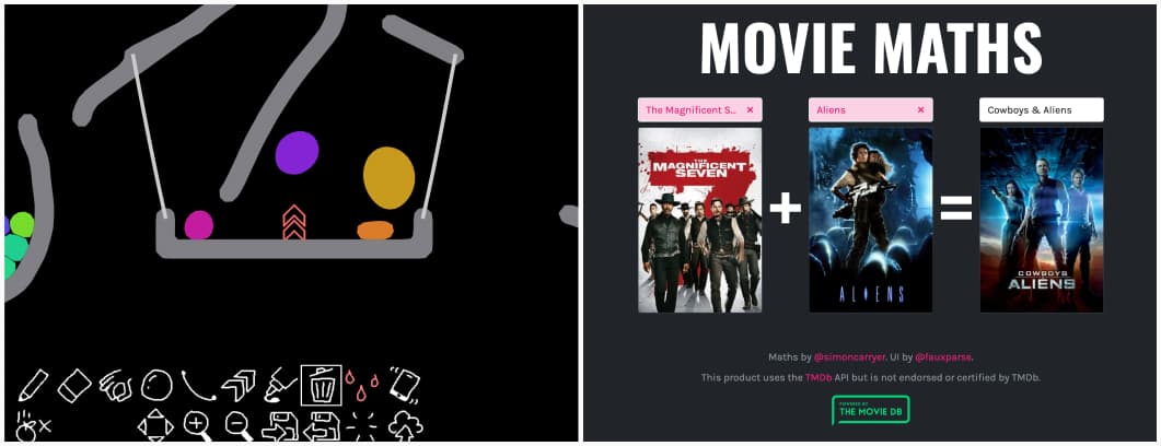
- moviemaths.com what would be a mix of Mad Max Fury Road plus Frozen? Apparently: Underworld Blood Wars. I love this tool. What’s the strangest combination you can come up with?
- The Blob Toy What you do you mean, you have work to do today, and you can’t play with this very fun wobbly blob tool?
Useful tools & resources
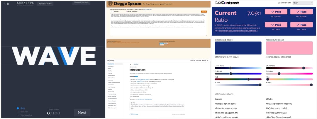
- a11y-dialog: a lightweight yet flexible script to create accessible dialog windows that works with ARIA and keyboard navigation among other things
- Kern Type: so, you think you are a typography master? Try your skills with this fun letter spacing game
- OddContrast: an online color contrast checker tool, with the modern CSS colors formats (like oklch, etc.)
- Doggo Ipsum: for my doggo lovers friends
Cool and Interesting Videos & Podcasts
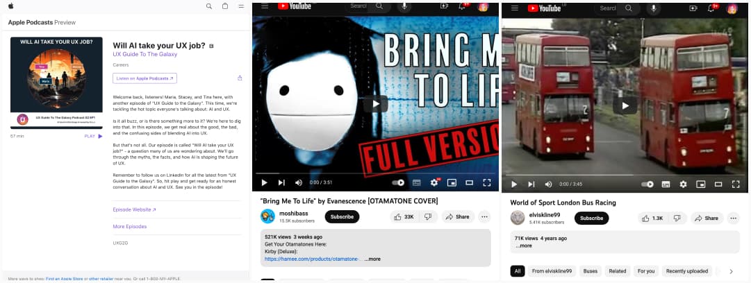
- Will AI take your UX job? another great episode of UX Guide To The Galaxy where Maria, Stacey and Tina talk about AI and UX (spoiler: no)
- “Bring Me To Life” by Evanescence, played with otamatones because, why not?
- World of Sport London Bus Racing: yes, you read that right, archive images from a race with double-deck London buses.
Tutorials
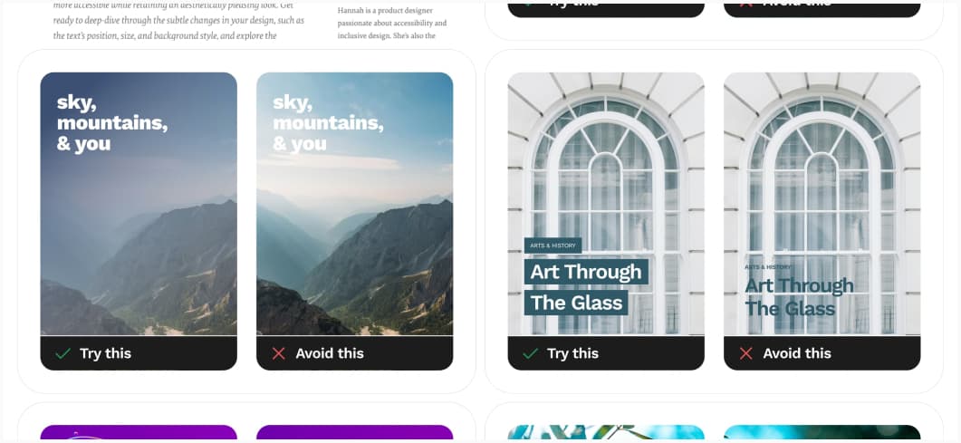
Designing Accessible Text Over Images: 5 techniques when you want to have text over images: shadow overlay, scrim overlay (semi transparent), colored background, find a space with sufficient contrast ratio, blurred background. (I’m not sure all the examples in the wild have sufficient ratio, though)
