Pixels of the Week – August 18, 2024
Responsive tables, the poor design of herbs packaging, best Figma plugins and shortcuts.
My curated weekly-ish online newsletter, where I share interesting articles, tools, and resources I found during the week. You can expect content about UX, design, user research, accessibility & tech, but also some processes, some inspiration, sometimes books, and a couple of videos and podcasts. Also, don’t forget to, subscribe to the newsletter to get notified, you will get the weekly links directly in your mailbox, and be notified when I publish other articles.
Now: what I’m currently up to
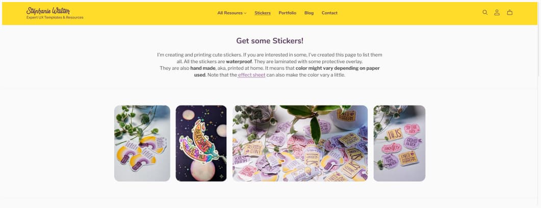
The magic of scheduling posts and things: I’m currently in Berlin, enjoying a couple of days with my business partner from Neurospicy. We are working on some really cool things and I can’t wait to show you. New templates are coming, new workshops, yeaaah. In the meantime you might be interested in some nice Neurospicy stickers. I also got a couple of other cool stickers, in case.
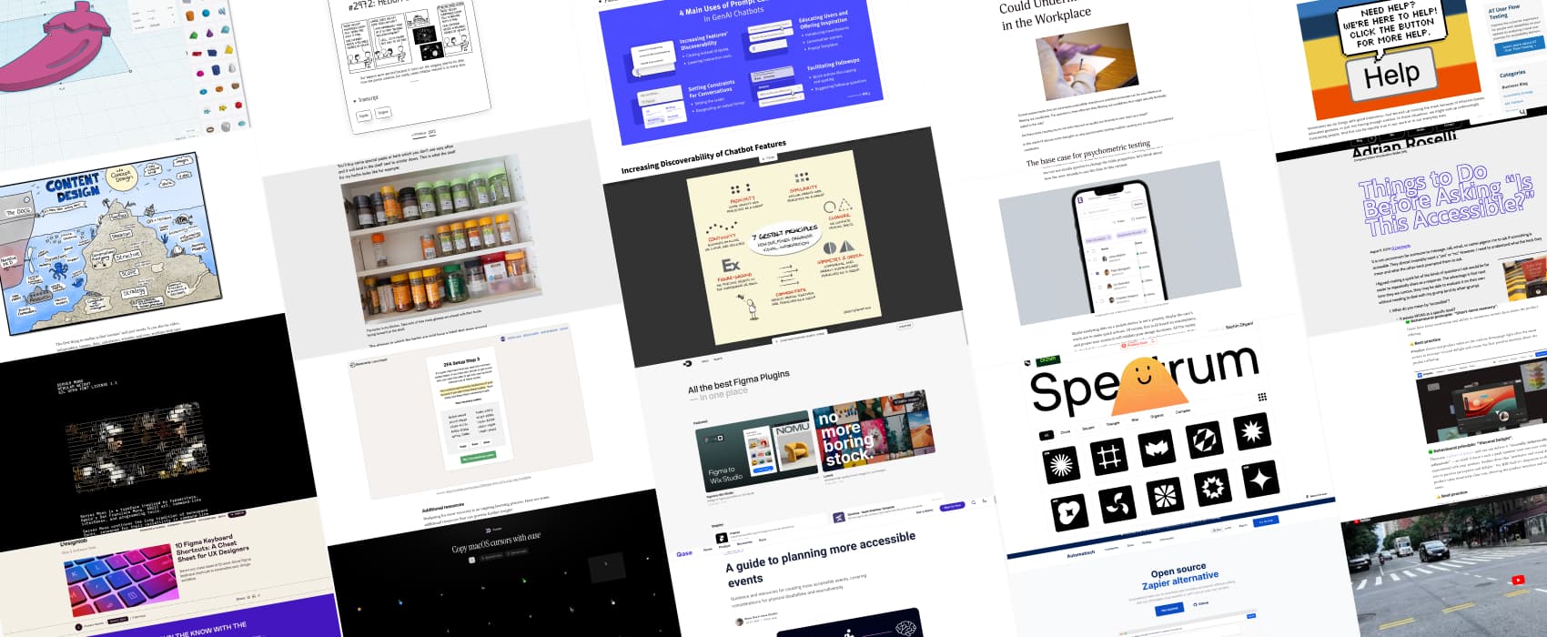
Most popular content this week
How to make tables fit on small screens (6min) by Litsa Babalis. Spoiler: you might not be able to make it fit. So, what to do? Focus on understanding what users need to do with the table, and adapt the component. Do they need to compare a lot of data? Then a horizontal scroll table might work best. Do they want to skim and have quick actions? Turning the table into a list component could help. Context is key. And, if you need more content about tables, I’m maintaining a big list on my blog, that includes content on responsive tables.
Interesting articles that caught my attention
Design and psychology
- Design ain’t a democracy (3min) tech companies are ineffective due to their democratic structures, where decision-making is slow and diluted by endless discussions. Having a decisive leader is crucial for great design and efficient product development.
- Designing for forgiveness: How to create error-tolerant interfaces (9min) when designing for error prevention, you want to avoid slips (accidental actions) and mistakes (flawed goals) with visual hierarchies, inline validation, and contextual guidance. But you can’t always prevent user mistakes, so having ways to recover gracefully is also important, for example clear feedback, autosaving progress, and providing undo options. By Tetiana Sydorenko
- Content Design below the surface (14min) by Linette Voller. a nice illustration to explain that content design goes beyond the surface (copy, error, messages, documentation, content accessibility reviews), all the way deep into strategy, information architecture, mental models, understanding users needs, and more. Content design is a big part of UX.
- Prompt Controls in GenAI Chatbots (17min) When following good practices, prompt controls can increase the discoverability of genAI chatbots’ features, offer inspiration, and minimize manual user input.
- 10 Behavioural Principles and Dark Patterns in User Onboarding you need to know (14min) Kate Syuma presents 6 steps in onboarding (Google search / Ads, arrival on the Website, sign up flow, first session, path to aha moment, habit-forming). For each, she explains some deceptive patterns you want to avoid, and what behavioral principle you can use instead to create a better. For example: avoid creating too much cognitive load on first session with too complex tasks. Instead, keep the number of choices low (hick’s law).
- Practical Design an interesting analysis on how on most herb packaging display the crucial information of expiration date on the back. Which means: you don’t see it when you have the jars aligned in the pantry. In contrast, Mujii puts expiration dates in the front, making them easier to spot. Also: wait, dried herbs expire? haaaa. Oups.
Accessibility and diversity
- Things to Do Before Asking “Is This Accessible?” (5min) Adrian Roselli put together a nice list of questions to help you understand what accessible even means, before you go ask an accessibility expert if something is accessible
- Good Intentions, Poor Context (12min) well-intentioned developers and designers overcomplicate accessibility by adding ARIA labels or verbose alternatives text where it’s not needed. This is often due to a lack of understanding of how a screen reader works. Doug Abrams’s advice: avoid assumptions, seek feedback from real users, and try to understand how screen readers work.
- How Psychometric Tests Could Undermine Diversity in the Workplace (6min) Psychometric tests, often sadly used in recruitment, might exclude neurodivergent individuals who process information differently from the norm the test was based on. Neurodivergent candidates may struggle with anxiety and executive function challenges during these tests. So, relying too much on such tests could lead to discrimination. (also personal note: don’t get me started on companies trying to get you into the MBTI test, giant red flag)
Curiosity cabinet: non-design/tech rabbit holes I enjoyed
Street Skater roasted by Speed Skater and then they complain about bikes… (more seriously, I’m having mini panic attacks every time he zigzags among taxis and cars)
Interesting frameworks and concepts
Gestalt principles in case you need to explain the Gestalt principles to someone, Sketchplanations created a really nice illustration.
Inspiration: fun experiments, beautiful art, and great ideas
- xkcd.fyi a more accessible version of xkcd that offers some transcript for the comic strip, a dark mode, and a link to an explanation in case you didn’t get the reference. Love it. (via Andy Bell’s newsletter)
- A twitter thread with 10 things that would be awesome if they were in Figma yup, I agree on most of them. Love the 7 pivot point position, it’s amazing in Illustrator, we need that in Figma too.
Useful tools & resources
- Figma Plugins a curate list of all the “best” Figma plugin, run by Benten Woodring, Chandler Roth, Evan Place, and Curtis Renkiewicz.
- Automatisch an open source alternative to zapier you can install on your own servers (or you can pay for their cloud solution)
- Spectrum if you need some free SVG shapes for your designs (circles, square, triangle, star, organic, complex)
- Floating UI A JavaScript library to position floating elements and create interactions for them. You can anchor elements to specific points and avoid collision. Perfect for tooltips for example.
- wasitai an online tool that tells you if an image was generated by an AI, with an API if you want to integrate this into your own products.
- Server Mono a typeface inspired by typewriters, Apple’s San Francisco Mono, ASCII art, command-line interfaces, and programming tools (free, SIL Open Font license)
- Cursor copy paste macOS cursors as SVG into your designs
- Thinkercad: a free web and iPad app for 3D design, electronics, and coding, created by Autodesk launched. It’s for education purpose primarily, but I’ve been having fun with the 3D module. There’s also a whole project section. I really like the 3D printed lamp that also uses their code block part.
- One Million Screenshots you can visually explore 1 million of the top homepages, find similar sites, see change over time.
Tutorials
- A guide to planning more accessible events: think about the venue, nearby hotel’s accessibility, making registration accessible, train your staff, share information with attendees ahead of time. Also check for the location (signalization, lighting, is there echo, do you have a transcript, is an ASL interpreter needed, etc.), help make presentation more accessible (use of color, contrasts,video have captions, no jarring noises in the presentation, etc.).
- 10 Figma Keyboard Shortcuts oh those are cool, the move from parent to child and vice versa is such a time saver! By Emilyann Gachko
Podcast
Episode 80: Starting a UXR Consultancy in a Low UXR Maturity Country: low research maturity, mostly finance and developer driven tech industry, businesses mostly using Facebook and none answering emails: wow, that sounds a LOT like Luxembourg (well, here they also love the phone). Nikki Anderson’s episode resonated a lot with me. It’s a challenge to make companies understand the value of UX when the whole country maturity is very low.
Latest news in the industry
Understanding the European Accessibility Act (EAA): Ensuring Compliance and Avoiding Penalties: a list of the penalties for non-compliance across different EU countries