Pixels of the Week – August 3, 2025
Don't trust the (design) process, the pentagon Pizza Index & a nice color tool.
Pixels of the Week is my weekly-ish curated newsletter for designers, UX folks, devs, and anyone building accessible, inclusive, usable (and let’s be honest, awesome) digital products. I share interesting articles, tools, inspiration, and resources I found during the week. This is the archive version. If you’d rather get it straight in your inbox (plus be notified when I publish other articles), subscribe to my newsletter.
Now: what I’m currently up to
It’s the summer, it’s raining in Luxembourg, what do you think I’m up to? Ramens, of course… Doing renovation in the flat, but also, waiting for some sun for the tomatoes to grow. Meh!
Most popular content this week
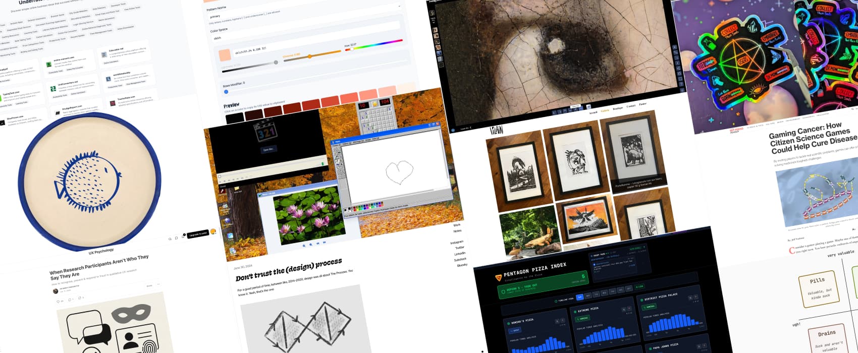
Don’t trust the (design) process (4min) Jenny Wen argues that designers became obsessed by the process, (personas, journey, flows), to the point where we forgot the actual project itself. I tend to agree here, I’ve seen consulting companies / agency sell whole abstract deliverables, following some design process by the book, and client go “hu, what is that?”. Can’t blame the client: they want a great product at the end but are not trained to understand a quadruple diamond process designer jargon. Jenny explains that, great work is sometimes messy, it’s not following a process by the book, instead, it’s having the flexibility to back track when necessary. I again fully agree here, but I would add that, people who tend to follow a process by the book are often juniors, who need a process, to start somewhere. Because they lack yet the experience (and the intuition that comes with it) to know when to ditch the process. So, I would still be kind, with juniors who put cute little diamonds in their portfolios: they were taught to do so. And, I’m looking forward to them, gaining the maturity they need, to ditch the rigid process.
Also, shameless plug, I myself got so tired of seeing design processes article, full of crap, that I ended up creating the only design process you should follow: the pentagram of user-centric (demonic) design. You can get the parodic sticker on my shop.
Interesting articles that caught my attention
When Research Participants Aren’t Who They Say They Are (10min) With more people faking eligibility to join paid UX studies, researchers need to stay alert to red flags like inconsistent answers, generic stories, or camera refusal. Use specific screener questions, onboarding calls, and identity checks. But don’t overcorrect and risk excluding valid but less confident participants. by Dr Maria Panagiotidi
The Product Triad: Design’s Role (12min) Designers are expected to make products not only desirable, but also viable and feasible. This can be achieved by collaborating across all 3 aspects of the product triad (desirable, viable, feasible), rather than trying to establish role based boundaries (engineer, product owner, etc.). Designers should shape the user experience, drive user research, align with business goals, and work with engineers to make sure ideas can actually be built.
Gaming Cancer: How Citizen Science Games Could Help Cure Disease (9min) Games could help fight diseases. Players were already involved in solving real science problems while playing, like designing better vaccines. These games teach biology, spark new ideas, and let anyone contribute, even without a science background. we need more games like EteRNA and Foldit. By: Jeff Yoshimi
Curiosity cabinet: non-design/tech rabbit holes I enjoyed
The Pentagon Pizza Index (PizzINT) tracks real-time pizza shop popularity around the Pentagon as an unconventional OSINT (Open source intelligence) indicator of military activity. Monitor the Pizza DEFCON level and discover when unusual activity might be brewing. I don’t know how legit this is, but, data nerd me loves it! The website also explains the history behind those theories, starting in 1970s.
Inspiration: fun experiments, beautiful art, and great ideas
Le Vilain is a French artist who creates amazing linocut prints of animals, dinosaurs and mythological creatures, but also fun beautiful wood carvings. Also, check the shop.
Amalfi Blowfish we all need cute, handcrafted, plates with blue little fishes in ours lives.
Girl with a Pearl Earring: a 108 billion pixels scan of Johannes Vermeer’s Girl with a Perl Earring painting, that lets you zoom to see super high level details, with a 3D view of certain parts. Quite amazing.
Microsoft Windows XP Professional welcome to Windows XP nostalgia, wants to play minesweeper in the browser??
Useful tools & resources
Able Player in case you need an accessible cross-browser HTML5 media player, with caption, transcript options, but also video descriptions and so much more. Also, it lets you embed YouTube videos which is quite nice. And, there’s a WordPress plugin for Able player as well.
Boring Websites online business ideas that succeed without hype or venture capital, organised by categories.
OKLChroma (pronounced “Oak-ul-kroh-muh.”) is a color palette generator that helps you build harmonious color scales based on the OKLCH color space. (you can also switch to other color spaces like lab or srgb)
Cool and Interesting Videos
How does tech enable me as deafblind? (35min vide) Torbjörn Svensson, Deafblind lecturer explains how tech helps his, on a daily basis, and all the many opportunities the digital world brought to him. Send this videos to colleagues, friends, to help them understand why, building accessible tools, services, products, is important for everyone.
Interesting frameworks and concepts
Priority Compass – focus your energy: a fun quadrant, to use in your personal ad professional life, to define how valuable things are, and how much you enjoy spending time on them. Does it spark joy??