Pixels of the Week – February 5, 2023
On Twitter, LinkedIn and Mastodon, I share curated articles I read, resources and tools about UX Design, User Research, UI and mobile design, HTML, CSS, the web industry, some process, some inspiration, etc. This is an archive of everything I shared this week. And some extra links that I decided to only share for the blog readers. Also, subscribe to the newsletter to get notified when those are published!
#Now – what I’m up to
I’m anticipating maybe migrating to Gutenberg (yurk). The previous format with # in front of themes is a mess with that editor. So, I’m testing a new format for those links. Reach out (Twitter, LinkedIn, Mastodon) if you have feedback on it.
I’m currently working some content on biases, and some workshops on user interviews are coming soon, normally in April this year! Yeahy. We will be using some of my interview resources, so, stay tuned.
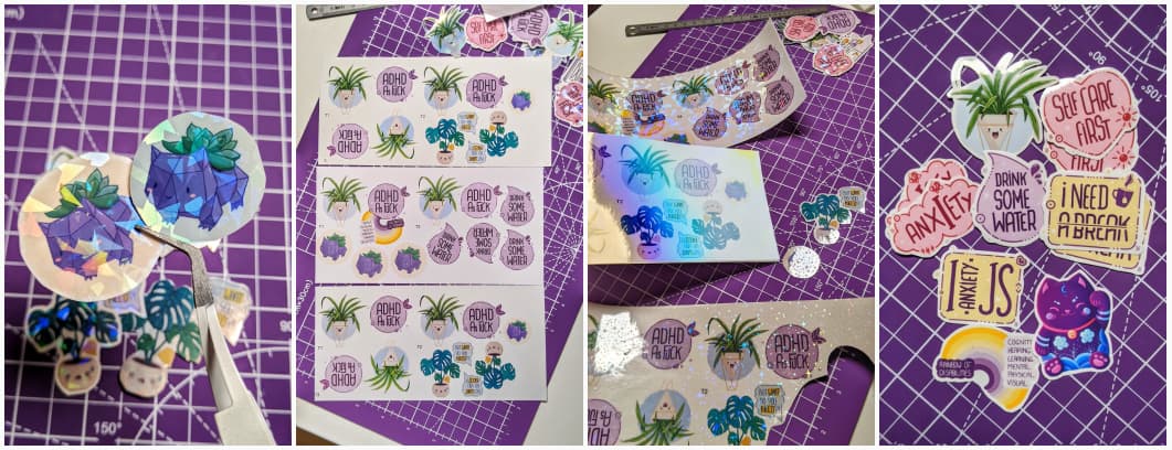
Craft: some sticker printing test
I’m trying to print holographic stickers. There is 2 ways to do so:
- you print on holographic paper (the paper has thin layer of printable vinyl)
- you print on white sticker paper and laminate with a holographic overlay.
I tested both, and made a little comparison video. I then went to ask people which one they prefer. The sample is small, but, so far, it’s 50/50 on the printing method. I also think it might depends on the color of the illustration. Personally, I think the 1st method method works better for darker illustration and the 2nd for lighter one. Then, I also tested different cold holographic lamination overlays!
This lead me to another rabbit whole: paper type and print settings. I noticed some of my stickers had different colors, for the same illustrations. I thought it was the paper. So, I started doing some printing tests on different types of papers and printing settings so see which ones would bring me the best result. I discovered the difference in color was linked to the setting, not the paper. Printing using “plain paper” setting (even though it’s glossy vinyl) brings out might bright colors, but we lose some contrast. A little bit as if the color were over exposed. Printing using the “matte paper” setting brings a deeper but slightly darker color. Glossy setting and photo setting bring deeper but even darker color.
So, I think I found one setting + paper combo that I like. It really brings all the nice colors of my illustrations to life. I also understood a little bit better how to modify the illustrations in Procreate to get colors printed the way I want them to be.
In the process, I did some research that lead me to learn more about inks, paper, light, screen display, color profiles on screen displays, etc. It’s quite nice to dig into something non UX related but still learn a lot on a specific topic.
TL;DNR the one you should not miss
This week’s awesome website
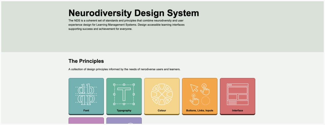
Neurodiversity Design System: a coherent set of standards and principles that combine neurodiversity and user experience design for for Learning Management Systems: font, typography, color, buttons, links, input, interface, communication, animations. Remember: those are for learning management systems. They might not apply everywhere and work for all interfaces. For example: the minimal principle in layout will conflict with the needs for a lot of complex data in enterprise software.
Interesting frameworks and concepts
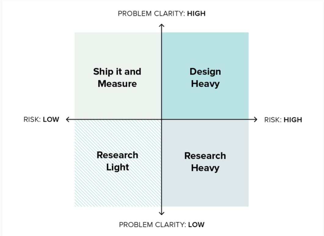
A matrix, by Jeanette Fuccella, to help you decide when to prioritize user research, depending on problem clarity and risk:
- high clarity + high risk = design heavy
- low clarity + high risk = heavy research
- low clarity + low risk = light research
- low risk and high clarity = skip and measure
Interesting articles
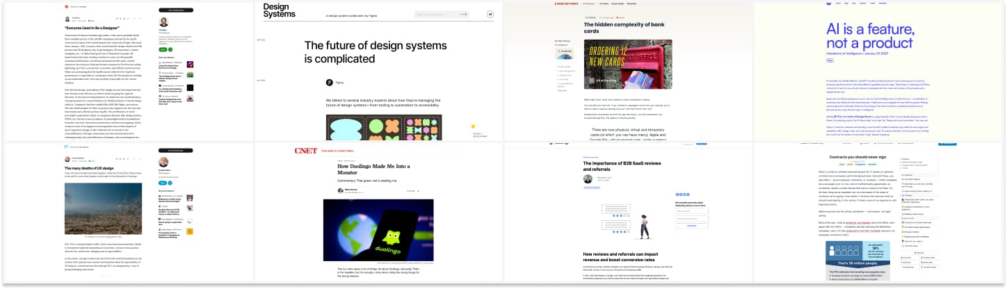
The current mess in our UX Industry
- Everyone Used to Be a Designer: “4 week & 3 week sprints became 2 week sprints, and we eventually settled on de facto 5-day design sprints. At this rate, design will soon become something done by an intern for half an hour during lunchtime every other Friday.” Sad, but true.
- The many deaths of UX design: 2023 is starting with lots of gloom and doom content about UX design, but, at least we start going beyond the “everything is alright in our industry” fluff and start talking about problems. Let’s now find how to make this better, or at least less broken?
Design systems, psychology , gamification and product design
- The future of design systems is complicated an interesting read on the need for more flexible design systems and how to go there
- How Duolingo Made Me Into a Monster, how the over gamification and manipulative patterns of duolingo can lead to very unhealthy behavior from users, who end up using the app just to stay in top ranks instead of actually learning a language
- The hidden complexity of bank cards: interesting case studies on bank cards. But I always wonder if people who write those have business knowledge: a lot of systems in banking are quite old, sadly, designers have to find a lot of workarounds to avoid friction, but sometimes, it’s impossible.
- Customer reviews is super important for B2C products, but don’t underestimated it for B2B and SaaS products as well. They impact revenues and conversion rate. Here are some tips to you get get reviews for your SaaS product too.
- Measuring DesignOps with the REACH Metrics Framework interesting framework to measure and improve your design ops initiatives
- How storytelling can supercharge your research findings, yeah, you want to avoid the death by powerpoint if you want people to check your research results, story telling and alternative formats can help a lot.
Other interesting reads
- “AI generation is a black box: you can have an expectation of what sort of output you’ll get, but you’re essentially throwing spaghetti at the wall until the algorithm produces something that you like.”, yeah, kind of a good definition of my current issue with such tools. AI is a feature, not a product
- Contracts you should never sign: there is a lot of abuse around contracts, here’s a lot of good tips on what to sign and what to not sign. Remember: contracts can (and should) be negotiated. The whole “everything belongs to the company” clause is a red flag I see often.
Inspiration, fun experiments and great ideas
Nice portfolios
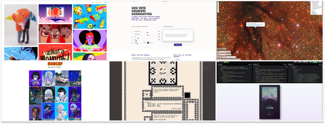
- Here’s the work of Pol and Nuel, 2 frelance illustrators in Spain. I love the vibrant colorful style!
- The beautiful work of RUDCEF, a digital artist based in Korea who draws a lot of portraits
Generators
- I am just having some fun with this 9-patch generator, it’s Friday so I hope you will have a little bit of fun too
- Why code when you can use CSS generators: Text Shadow, Glowing shadow, Box Shadow, Underline (new properties), Text glow.
Galaxy, time and beyond
- For my space lover friends, and anyone who wants to feel how small we are: a giant picture of the galaxy where you can zoom to check specific stars
- A super cool SVG and Vue “Time Comparison” demo by Sarah Drasner: choose a city and watch the little illustration adapt to day and night
- Some nostalgia of a skeuomorphic area, remember all the glossy docs, leather icons and realistic effects we used to build in Photoshop? Teenage Skeuomorphic Desktop Designs
Useful tools and resources that will make your life easy
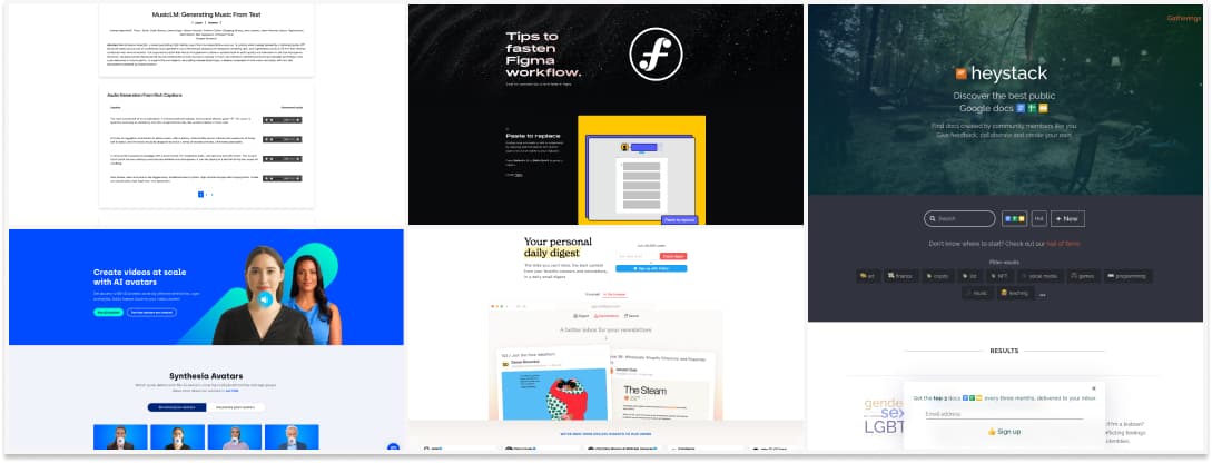
- Google is working on a text to music AI: MusicLM: Generating Music From Text. I listened to a couple of them, and my ears went “hu, something is not working in this”. Is there an “uncanny valley” for music? But, it’s the beginning. I’m curious about the possibilities. I love the idea of generating music based on The Persistence of Memory (Salvador Dalí) or Napoleon Crossing the Apls (Jacques-Louis David) paintings though. Uncanny, but, fun.
- Create AI Videos with 85+ Diverse and Realistic Avatars: okay, I’m actually impressed by this too, I could totally see it used for online training for example. Also, kudos on the diversity of avatars offered!
- A site dedicated to small Figma tips to save you time while designing: Awesome Figma Tips. So, what’s your favorite one? Any tips missing?
- Dailydigest: I’m testing some new tools to keep following the content creators I like, with less noise. Mailbrew looks like a nice idea, you can add sites, RSS, twitter accounts, reddit, podcasts and more
- 2000+ free icons you can use for your project. They come in SVG format and you can change the width of the stroke to get thinner or border icons
- Heystack: a tool to find public gdocs, gslide and gsheets
Videos
UX Strategy: Haaa, Jaime Levy talking about “digital transformation” here made my day. Very straight to the point talk
Tutorials
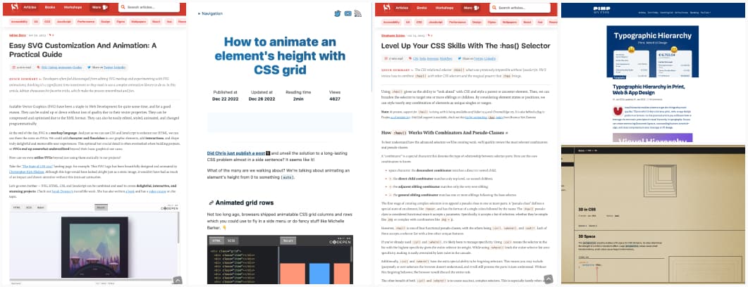
- Typography: A great introduction to Typographic Hierarchy in Print, Web & App Design
- Easy SVG Customization And Animation: A Practical Guide I love SVG, and SVG animations, so, this article makes me very happy!
- How to animate an element’s height with CSS grid oooh this is very nice and fun (but careful with accessibility)
- Level Up Your CSS Skills With The :has() Selector. I’m kind of expecting some lavalamp menus with that because of the adjacent demo.
- Interesting interactive tutorial to help you understand 3D CSS properties (perspective, translate, etc.)
News in the industry
- Amazon Begs Employees Not to Leak Corporate Secrets to ChatGPT, this should make people think twice before using it on real data. I’ve seen some people advocate for feeding it user data and asking it to summarize: good, be careful if you work in certain environments with corporate secrets
- You thought timezone were a mess when scheduling a meeting with other people on earth or developing a tool? Wait until we have people living on the moon and need to handle those as well (I love those kind of geeky challenges). What time is it on the Moon?