Pixels of the Week – January 22, 2024
Cognitive biases, UI "rules" & accessible component inspiration
My curated weekly-ish online newsletter, where I share interesting articles, tools, and resources I found during the week. You can expect content about UX, design, user research, accessibility & tech, but also some processes, some inspiration, sometimes books, and a couple of videos and podcasts. Also, don’t forget to, subscribe to the newsletter to get notified, you will get the weekly links directly in your mailbox, and be notified when I publish other articles.
Now: what I’m currently up to
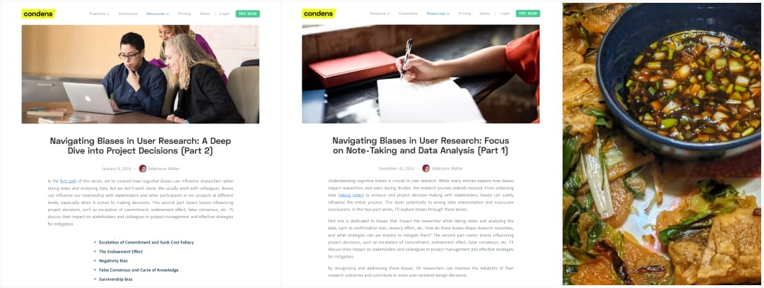
Condens published part 2, of my series of articles on how cognitive biases impact research: Navigating Biases in User Research: A Deep Dive into Project Decisions (Part 2). In this one, I discuss the impact of some specific biases on stakeholders and colleagues in project management interesting frameworks and concepts. I hope this will help you work better with your teams, and understand why sometimes, project decisions are made that look odd or strange from the outside. Also check part 1 on note-taking and data analysis biases: Navigating Biases in User Research: Focus on Note-Taking and Data Analysis (Part 1). Also, little reminder: new Newsletter subscribers get a small gift that is related to those biases!
If those articles were helpful, consider re-sharing my LinkedIn / Mastodon / Twitter post.
On a personal note, I’ve tried Pajeon, aka Korean pancakes and it’s very nice. I’ve share the recipe at the end of this article.
Interesting frameworks
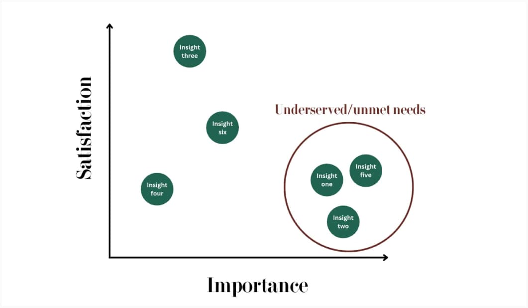
Prioritize Qualitative Research Insights with the Opportunity Gap Survey (19min) a method to prioritize findings, by running a survey to analyze the gap between how important each insight is and how satisfied people are with current solutions
Most popular content this week
58 rules for beautiful UI design (30min read). Interesting rules, and I really like that “ELEGANCE” acronym, but, I always try to think critically when anyone brings some “design rules”. For example, 14 “good design is as little design as possible”: while simplicity works for some B2C interfaces, oversimplification can lead to a lot of issues, especially in complex enterprise products, for expert users. Another example: rule 33. “Communicate Status with Semantic Colors”: while using red and green to communicate status can be a good idea, you should not use only color to convey information to build accessible interfaces. This might also contradict point 32, about cultural significance. Is red “bad” in all cultures? Maybe, you need to adapt those colors. Same for 53, introducing gamification might be nice, but does it work for all products? I’m not sure. So, check how this applies to your users and product.
So, while such rules are an interesting start, they are also not a magical one size fits all recipe you can always apply. Check them, stay critical. That’s what makes a good designer: being able to know when to apply and not apply a rule.
I don’t have comments on the blog, but you can participate in the conversation on LinkedIn / Twitter / Mastodon
Interesting articles that caught my attention
UX Design and Product Design
- Embracing Asynchronous Communication in UX Teams (9min) great tips to set up an environment with less meeting and more asynchronous communication. Honestly, this is for remote but I think this should also be done for hybrid and non-remote work too. (by Dr Maria Panagiotidi)
- Usability Testing of Inline Form Validation: 31% Don’t Have It, 4% Get It Wrong (15min) I’m surprise that only 4% get it wrong, I often have to deal with bad inline validation on US site, that won’t let me put my é in my name. So, yes, inline validation is important, but don’t validate names!
- What is a “Product Designer,” Now? (15min) long introduction to the 3 different types of product designers (physical, digital and project), needs and skills for each.
Accessibility
- 16 Lesser Known Accessibility Issues: interesting list of a couple of small things you can easily, for most of them, put in place to improve accessibility
- Money Talks! Formatting Currency in Web Content (10min) if you work in banking or finance and need to format currencies, TPGI tested 10 different formats with screen readers.
Game
Inside Apple’s Massive Push to Transform the Mac Into a Gaming Paradise (20min). Very interesting long read on how, with Apple silicon, Macs finally have the performance to compete with PCs. They got Baldur’s Gate in 2023, but, they need more AAA games, and to motivate game developers to come to their ecosystem.
Curiosity cabinet: non-design/tech rabbit holes I enjoyed
‘How do you reduce a national dish to a powder?’: the weird, secretive world of crisp flavours that was a fascinating read, I’m not surprised about all the secrecy around ingredients and recipes.
Inspiration: fun experiments, beautiful art, and great ideas
- drawing.garden a drawing garden, where cute plan emojis will bloom while you hover / click, and play a little music (not keyboard accessible). Hover multiple times the same element or click to change the emoji. (Via Cassidy Williams‘s very fun newsletter)
- Brand Identity Quizz Oh, you think you know branding? How many brands can you recognize in 30 seconds ? Okay, it might be a little biased, because even if you recognize it, you still need to find it in the list, which actually takes more time than to recognize it for some. There are hints, but, honestly, you won’t have time to. I got 9/15 on first attempt, how about you? (then it gets easier because it’s not randomized haha)
- What Did Hubble See on Your Birthday? Enter the month and date below to find out!
Useful tools & resources
3 places to look for accessible components inspiration:
- React Aria Components Adobe’s new React framework promises components with built-in top-tier accessibility, and internationalization out of the box. Examples are nice for designers to see what’s expected in terms of keyboard navigation. (I haven’t audited the code, but I’m also not an ARIA/react expert here, so if you have feedback on that, I’m curious as well).
- USWDS the U.S. Web design system has lots of components you can play with online, including some complex tables featuring some sorting with keyboard navigation. Don’t forget to check the accessibility section of each component
- Gov.uk Design system is also a nice source, for accessible components, with online demos to test keyboard navigation, screen reader and more. Also, don’t forget to check the Patterns page. They have guidance on how to ask users for things (name, email, etc.), how to help users with things (error prevention, cookies, etc), in an accessible and user-friendly way.
- For more resources to find inspiration articles on the topic of accessible components, don’t forget to check this part of my article on “Accessibility for Designers, where do I start?“
If this useful to you, you can reshare those on LinkedIn / Mastodon / Twitter
The other cool tools
- BlendingMe a cool little figma plugin to create some blended lines effect. You select 2 lines, hit run, and you get a very nice interpolation of the two. Retro synth wave fans, here we go!
- Key Combiner: a very handy repository, where you can find detailed collections of keyboard shortcuts for many apps and tools. For example: VSCode, Figma or Illustrator. I like how this can also be used as a source of “best practice” and inspiration, in case you are building a tool, and need to know what keys are commonly bound to specific actions. Following already in place patterns will make your app or site easier to learn for new users. None wants to re-learn how to duplicate an element for example.
- Svgl a place to find logos of different companies. You can search for 355 logos across different categories including design tools (Figma, Penpot, Axure), Social media (LinkedIn and all the others), browsers and more.
- Generate Awesome Stats an online tool go generate a nice banner, with a gradient background, to celebrate achievements on social media
Books
Fundamentals of Data Visualization, you can read a version of that book, for free online (that version is before final copy-editing and other quality control, but it’s still high quality)
Tutorials
- Designing better target sizes (40min) target size is important for accessibility, but also usability in general: you don’t want people to misclick or mistap. Ahmad Shadeed guides you through best practices in enhancing target size with CSS. Size is important, material for Android recommends 48×48 dp for mobile, WCAG 2.5.5 enhanced AAA recommends 44CSS pixels and WCAG 2.5.8 AA a minimum of 24by 24px, without overlapping content. Also, consider spacing and distance between the targets (Fitt’s law), aka, the closer they are from each other, the easier it is to miss tap, so try to have at least 8px between each, especially for smaller targets. Don’t forget that users need feedback when they hover, click, tap or focus the target. And you can use padding to enlarge the hit area, while keeping the target visually smaller. He also present lots of examples and solutions to common problems like the safe triangle target areas for dropdowns and how to expand the link in the title of a card. And explains how to communicate size to developers as a designer, and how to test.
- Grids and key shapes (12min) a great tutorial by Jerónimo García to help you design better icons that perfectly align to a beautiful grid, from building that grid, to defining the shapes, with practical examples.
- About subgrid and colored grid lines: another type of grids, this time, CSS grids. This is a very nice tutorial on how to build a website with modern CSS, with a cool layout, by Lene Saile
- Accounting for Internationalization with CSS and HTML: great tips to get your site ready
Latest news in the industry
Why Platformer is leaving Substack I’m happy to see some people react to the announcement that Substack won’t moderate nazi content. I’ve ended up removing the only article I wrote there and kind of semi nuked my profile. I can’t delete it completely, because I’m following some content creators who chose that platform and don’t have any personal blog. So, I’m feeling a little bit stuck on that side.
A cool quick Korean pancakes recipe
Maybe a little bit unusual, but I wanted to share with you a cool recipe I tried this week: Pajeon, aka, korean green onions pancakes (picture on mastodon). You can find it on Rhi’s instagram post, but I had to change some measurements to make it work, so I’ll put my updated version here for safe keeping.
The korean pancakes
What you need:
- 10 spring onions
- 120g of gluten free flour (I’m using a mix but you can make your own)
- 1 tbsp cornstarch
- 200ml water
- 1/2 tsp honey
So, chop the spring onions into sticks and set asside. Like all pancakes or cake recipes, mix the dry, then the wet. Mix the floor, cornstach. Then add the water and the honey. Cook a little bit the onions in a pan on medium heat. Add the batter on top of it. Flip it. Then cut in squares and dip in, the sauce
For the sauce
Trust me, the sauce if what brings it all together. Easy: mix is all together, and dip the pancakes in it
- 2 tbsp dark soy sauce (should work with regular non dark one)
- 1 tbsp rice vinegar
- 1 tbsp agave syrop or honey
- 1/ tsp sesame oil
- 1/2 tsp gochugaru (optional)
- 2 small finely chopped spring onion
Enjoy (and let me know if you want more recipes once in a while)