Pixels of the Week – July 9, 2023
Debriefing UX research, a glow in a dark yodelling pickle and a lot of accessibility resources
On Twitter, LinkedIn, and Mastodon, I share curated articles I read, resources and tools about UX Design, User Research, UI and mobile design, HTML, CSS, the web industry, some processes, some inspiration, etc. This is an archive of everything I shared this week. And some extra links that I decided to only share for the blog readers. Also, subscribe to the newsletter to get notified when those are published!
Now: what I’m currently up to
Smashing Training on “Accessibility for Designers”
I’m super happy to announce that I’m bringing my “Accessibility do Designer” training to the Smashing Conference Antwerpen. It’s going to be a full day (6 hours) workshop that I’ll run on October 12.
Article update, more training, cards, etc.
I’ve also been a very busy little fox.
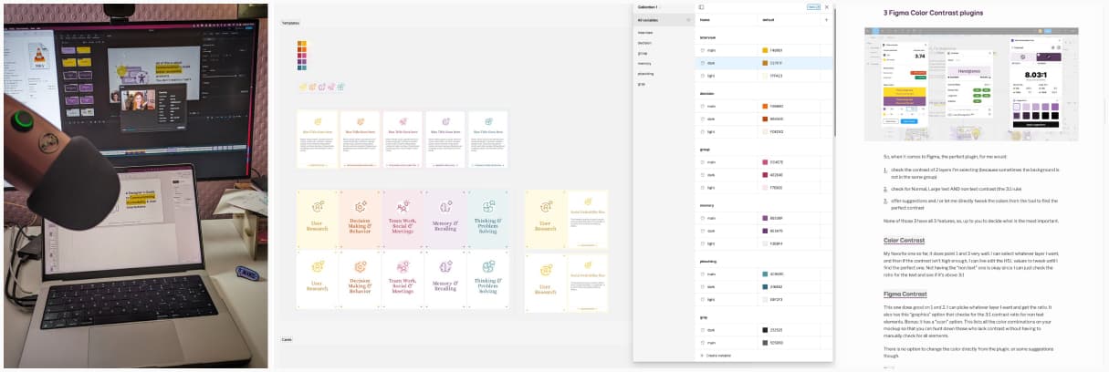
- I’ve updated my article on color accessibility tools to include a selection of 3 Figma plugins that could help you
- I’ve brought back my OBS setup to record a private talk (check the behind the scene picture on mastodon), and I’m starting to schedule some asynchronous online learning.
- I’m reworking our cognitive bias UX cards, new format, new colors, more cards, better descriptions. You can catch a glimps of the new design on LinkedIn. They will eventually be available again in my shop.
TL; DNR: the one you should not miss
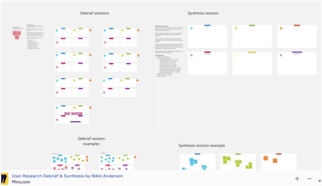
How to Debrief Your Research Team Post-Session some great tips to help with user research synthesis and a very helpful Miro template you can reuse
Interesting articles that caught my attention
UX research and career
- Gestalt Principles of Design – Continuity: more examples of Gestalt principles
- Stop asking UX researchers to defend their sample size, n = 3 reasons to trust your UXR and let them work in peace, haha. True, especially for quantitative research, we determine “sample size” by the principle of saturation.
- Shape Your Path with a UXR Career Framework career path in UX is sadly often a mess, people don’t know what to expect, how to evaluate us, how to help us grow. Nikki brings you a framework to help you and your teams identify different levels, areas of focus, collaboration and more
- AI-Powered Tools for UX Research: Issues and Limitations: the technology is promising, but there’s a lot of “market claims” that are just claims, and the tools don’t actually live up to their marketing brochure. So, for now, play with it, but also be cautious and double check everything.
- The Aura of Care. – Faster and Worse: “UX needs to make clear distinctions between commercial design work and design as a social good so the aura of care is not just an aura. Until that happens we’ll continue to see the worst companies hire the best people to help them make the worst things.” Damn, that hurts, but it’s also sadly true (and why I prefer working in enterprise UX those days)
AI, chatGPT, you know the gist
- AI is killing the old web, and the new web struggles to be born: generative AI models are changing the economy of the web, making it cheaper to generate lower-quality content. We’re just beginning to see the effects of these changes. The changes will be interesting to monitor for such.
- Inside the AI Factory: the humans that make tech seem human – The Verge “ChatGPT seems so human because it was trained by an AI that was mimicking humans who were rating an AI that was mimicking humans who were pretending to be a better version of an AI that was trained on human writing.”
Accessibility
- Become an accessibility champion by using simple mockup annotations. Interesting tips. If you need a couple of annotations kits you can check: A11y Annotation Kit (Figma), Accessibility bluelines (Figma), Jeremy Elder’s annotation kit (Sketch, Figma and XD) and of course my Accessibility Annotation Kit (Figma and Sketch, for now wink wink) that comes with a whole checklist.
- 4 Ways to Improve Mobile Accessibility: responsive web design, target sizes, relative units and consistent color contrast
- Accessible overlays aren’t accessible, your monthly reminder that overlay solutions won’t make your websites magically accessible (or protect you from lawsuits in the US).
- The beauty industry might actually be catching up on accessibility: “When it comes to makeup and different abilities, there has long been a misconception that you either create products for those that are ‘able-bodied’ or for some niche market with a specific disability and physical limitation,” Bryant says. “These are not mutually exclusive.” Yes, this, you don’t have to segment your market, build for all, build more inclusive from the start!
- Top Tips from a Web Accessibility Evaluator at WebAIM. Great pieces of advice to help you evaluate the accessibility of a website: evaluate piece by piece (header, main regions, footer), search for patterns, create your own checklist to help, etc.
Curiosity cabinet: non-design/tech rabbit holes I enjoyed
The Comic Natural History of the Human Race: a fun bestiary of drawings from 1851 where the author added satires of people’s heads on top of animal bodies
Inspiration: fun experiments, beautiful art, and great ideas
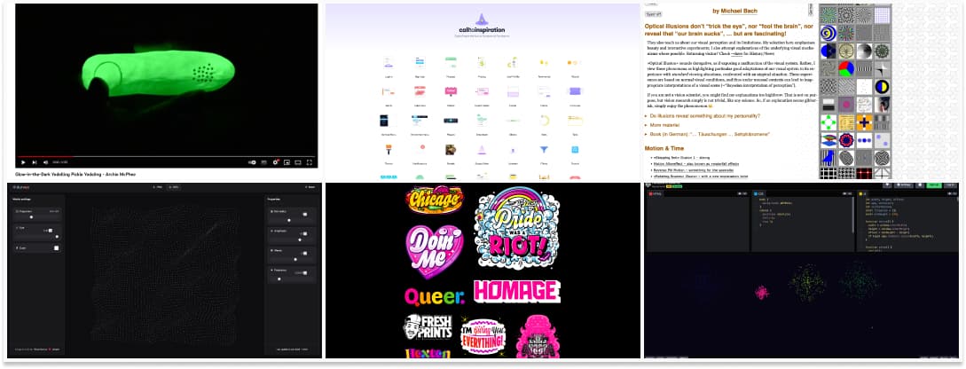
- Glow-in-the-Dark Yodelling Pickle Yodeling, I blame Myriam Jessier for that. And no, I won’t even explain.
- Durves – Design Pattern Tool: a fun pattern tool that builds a matrix of little dots, play with the parameters to get interest results
- CallToInspiration, a nice place to find UI inspiration for different components
- Kyle Letendre is a freelance Lettering Artist, Type Designer, and Illustrator in Portland, Oregon.
- 151 Visual Phenomena & Optical Illusions a repository of different optical illusions you can observe but also play with to better understand how they work
- Rainbow fireworks, a cute codepen with fireworks by Rachel Smith
Useful tools & resources
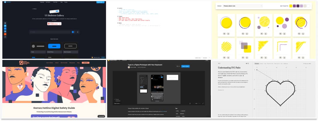
- UI Skeleton Gallery: if you are looking for inspiration for skeleton screens, I got you covered!
- Online Free Safety Guide: a nice guide to help you prevent potential online harassment. Start with these three steps: 1. create unique, complex passwords, 2. set up two-step verification, 3. remove potential doxxing information
- Styles to Variables Converter: a Figma plugin to convert all your style into variables so that you don’t need to do it manually
- Focus txt: a very simple ephemeral daily planner and note taking tool in the browser
- Type in a Figma Prototype with Your Keyboard: told you it would come: Levi recreated a fake mobile keyboard for your Figma prototyping needs. I love the technical challenge, but it’s a lot of efforts to mimic an HTML field. It would really be amazing if they could simply get “native” HTML form elements, like Axure does. I guess, technically, it’s complex since they generate canvas?
- Squiggles, scribbles, shapes and… other stuff: a library of over 70 custom-color elements ready to paste into your project.
- Understanding SVG Paths: a fun interactive playground to understand how SVGs are built, the math and coordinates behind it.
Cool and Interesting Videos
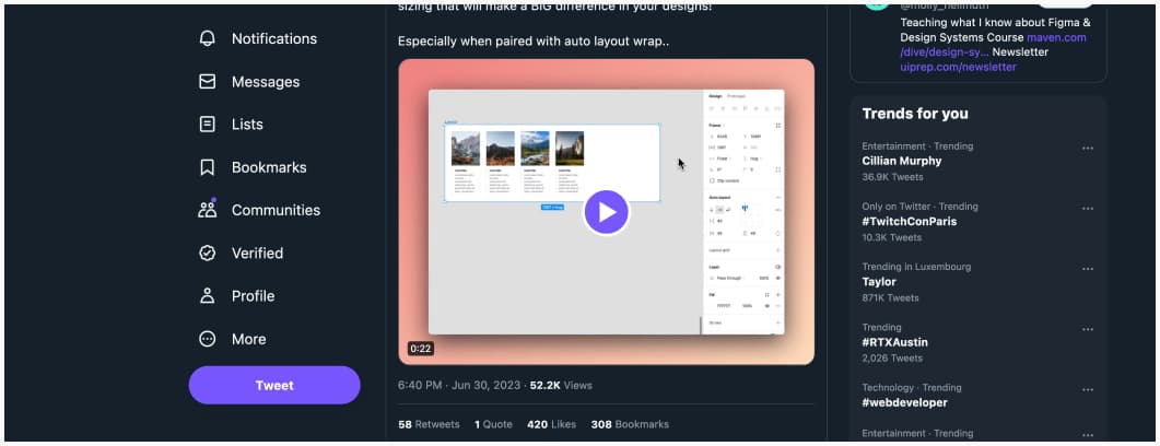
Twitter video thread on cool things you can do with min / max in Figma
Tutorials
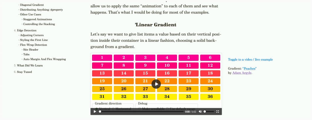
Position-Driven Styles: I like it when people just have fun with CSS and explore new techniques, this time, using scroll driven animations
Latest news in the industry
- WCAG 2.2, quick and simplified. The new version of the Web Content… some of the WCAG 2.2 guidelines around redundant entry and authentication are interesting when it comes to user experience for logging in, reinforcing the need to allow users to copy and paste passwords and use their password manager extension, among other things. You can check example of Accessible Authentication (Minimum) (Level AA) for more details. I wonder if there will be conflicts with security teams, though, what do you think?
- The Vatican Releases Its Own AI Ethics Handbook “Rather than sit around and wait for an AI apocalypse, Pope Francis and company partnered with Santa Clara University on guidelines tech companies can use today.” Yeah, let’s get the church involved in AI regulation, sure…
- Reddit, Twitter, Mastodon: where are we all supposed to go now same feeling here, I might mess the big “townhall”, but at some point, I think we might rebuild smaller communities?
