Pixels of the Week – June 16, 2024
A self-paced degree in UX research, avoiding portfolio mistakes & colorful hydrants
My curated weekly-ish online newsletter, where I share interesting articles, tools, and resources I found during the week. You can expect content about UX, design, user research, accessibility & tech, but also some processes, some inspiration, sometimes books, and a couple of videos and podcasts. Also, don’t forget to, subscribe to the newsletter to get notified, you will get the weekly links directly in your mailbox, and be notified when I publish other articles.
Now: what I’m currently up to

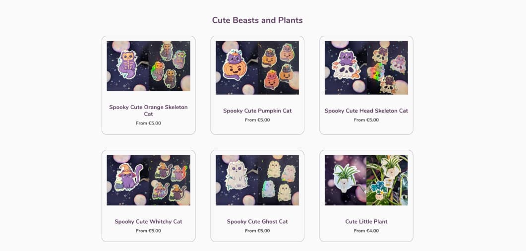
I’m happy to report I got, kind of better at cutting holographic stickers, so I printed the cute spooky cats on holographic and broken glass paper. Due to the different in paper and printer they appear lighter than the non holographic ones, but still cute. You can get them directly in the Cut Beasts and Plants collection.
I’m at UX London next week. I’ll bring cute stickers, if you are around come and say hi! Which also mean: no weekly links next week. See you in 2 weeks!
Most popular content this week
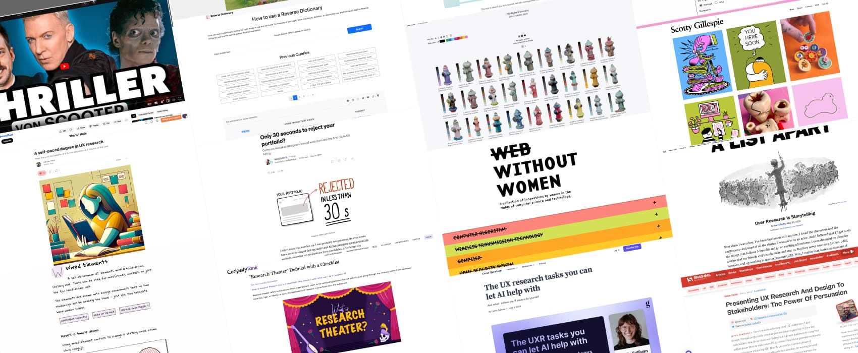
Only 30 seconds to reject your portfolio? Matej Latin reviewed many portfolio and listed common mistakes you want to avoid: show high quality images, avoid and grammar mistakes, avoid boring generic titles (try to get a hook to capture reader’s attention), focus on engaging story telling, but also explain the content of your case studies, and how you contributed to the project. It’s all about showing your communication skills!
Interesting articles that caught my attention
- The UX research tasks you can let AI help with (13min) Caitlin Sullivan tested a couple of AI tools that claim they can help UXers. Most struggles with transcription accuracy, especially if the language isn’t English. Which means that notes and summaries, can’t be accurate, either. She also don’t think replacing researcher by AI moderators will work (fully agree here). The human element in the research is what brings interesting data. There’s also the issue of biases in AI, that you then bring in your research. She suggests a partnership approach rather than full reliance on AI for UX research.
- Presenting UX Research And Design To Stakeholders: The Power Of Persuasion (35min) a long read with ideas to help you persuade your stakeholders, based on the Hovland-Yale model: Independent variables of Source, Message, and Audience. Use clear, credible, and engaging messages tailored to your audience’s interests and decision-making processes to secure their buy-in and collaboration.
- The Diverge-and-Converge Technique for UX Workshops (12min) there’s often a lot of in-group biases happening in workshops. To avoid this, you can alternate between solo (diverge) and group (converge) work. It also helps bring more creativity and part of the workshop can be done asynchronously.
- “Research Theater” Defined with a Checklist (8min) vague objectives, methodological weaknesses, limited transparency, conflicts of interest, and lack of expertise are signs you are in a research theater environment that prioritizes appearance over credibility.
- User Research Is Storytelling (15min) I really like this idea of framing user research into a story in 3 acts to help people understand what we do: setup, conflict, and resolution. The researcher has multiple roles: they’re the storyteller, the director, and the producer. The participants have a small role, but they are significant characters (in the research). And the stakeholders are the audience. This is brilliant.
Curiosity cabinet: non-design/tech rabbit holes I enjoyed
Triller (Michael Jackson song) in the Style of Scooter the video is in German but it’s about music so you still understand what’s going on. Start at 4min22 if you just want the song. I’m not gonna lie: I’m vibing friends.
Inspiration: fun experiments, beautiful art, and great ideas
- No Web Without Women: A collection of innovations by women in the fields of computer science and technology.
- Scotty Gillespie: beautiful illustrations and ceramics by Scotty, a Southwest of England illustrator.
- The Hydrant Directory: a collection of pictures of hydrant of different colors. Each has been processed into color palettes for free use by artists and designers. I don’t think it gets more designer geek than that, and I love this project. Which is your favorite one? I love this one: Kings County, Brooklyn, NY, USA.
Books
A self-paced degree in UX research Lawton Pybus put together a whole 2 years, 4 semesters curriculums to teach yourself UX research skills via books. It’s over $600, but you might be able to borrow some of those from public libraries for example. There’s also activities to help you, links to communities and more. Love the idea!
Useful tools & resources
- Reverse Dictionary, for when you know the definition but can’t find the word.
- Product design activity planner for Figma I like plannings, and I like cards. I usually use Miro to plan kanban like things, but, if you prefer to do this in Figma, Jess Eddy has created a useful product activity planner template.
- Wired Elements a collection common UI elements with hand-drawn sketchy look. That’s quite fun for wireframing for example. (via Jorge Arango’s newsletter)
Tutorials
Maybe Don’t Name That Landmark (4min) you don’t need to names (aria-labels) to most generic landmarks like header, banner, main, footer, etc.