Pixels of the Week – June 18, 2023
UX research vs customer conversation and some Japaneese hot food vending machines
On Twitter, LinkedIn, and Mastodon, I share curated articles I read, resources and tools about UX Design, User Research, UI and mobile design, HTML, CSS, the web industry, some processes, some inspiration, etc. This is an archive of everything I shared this week. And some extra links that I decided to only share for the blog readers. Also, subscribe to the newsletter to get notified when those are published!
Now: what I’m currently up to

I’m currently up to a lot of cool things that should happen in September, including more workshops and teaching remotely a online. This end of June is quite busy behind the scene! I also haven’t showed you my plants for a while, so, here you go, the Spider Plant is having some babies and the Stephania Erecta is back from her sleep with cute little leaves. Meanwhile, I’ve a thrips infestation on the Monsteras, who are now quarantined while being treated. Meh!
Interesting frameworks and concepts
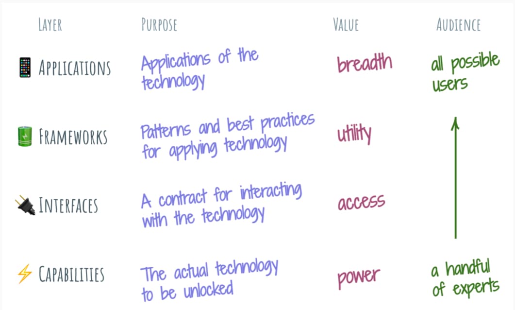
Four layers: every new technology tends to grow these four layers: Capabilities, Interfaces, Frameworks, and Applications. They stack on top of each other. Technologies who try to bypass one often become a mess. I loved this article, it brings so much insight on R&D vs final user adoption levels
TL; DNR: the one you should not miss
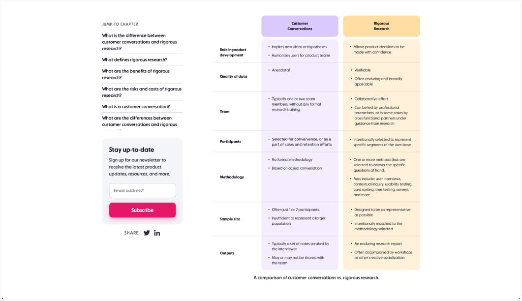
What separates rigorous research from customer conversations? The distinction between both is very important, because a lot of people will have conversation and try to convince it’s research, basing design decisions on biased data. What are the risks and costs of each mode of learning, plus learn when and how to use each one effectively.
Interesting articles that caught my attention
Mobile UX
- Bottom Sheets: Definition and UX Guidelines: use bottom sheets (especially for mobile apps) to present temporary contextual information, avoid stacking them on top of each other or using them to display too much content
Usability and UX design
- The problem with automatically focusing the first input and what to do instead: just don’t do it. Haha, shortest, straight to the point solution, yup, it’s a mess.
- Break down barriers through covert UX research: interesting tips to help you find creative ways to do research in a research hostile environment
- What I Wish I Knew Before Starting a Career in UX Design: interesting interview of a couple of UX designers in the industry, full of super insightful information for beginners!
- When It’s Worth Conducting Research with Non-Users: talking to people how are not using (yet?) your product can bring you a lot of valuable insights as well. They still need to be in your target audience, but, might not be using your product
- The 9 Rules of Design Research: embrace the uncertainty, and do user research!
- Negative-Space Typography “Which is better? (B) is better, every time.” Enterprise UX me already hears users complain about too much white space and needing to scroll moar on B. So, well, it depends, I guess?
- Avoiding pitfalls in reporting user behavior changes: changes in user behavior due to website or digital product redesigns and updates can be misleading if not analyzed properly. Analyzing them properly helps get a global understanding.
- How to Turn Good Design Direction into a Good System: interesting article on the design process, how creativity is 10% and the rest is discipline, structure and systems.
Ethics and AI
- The Elements of AI Ethics: Let’s talk about harm caused by humans implementing AI by Per Axbom
- Who should take responsibility for evil UX design and digital ethics? More content un Ethics and UX: The fine line between persuasion and manipulation: who will protect the user?
Accessibility
- Five accessibility bugs GitHub Copilot offers to create: damn, those AI suggestions are bad. At the same time, if the dataset is github projects, I’m not surprised. Another example of “AI reproducing the biases and issues found in its dataset”. Conclusion: don’t accept AI code suggestions until you understand them.
- No, ‘AI’ Will Not Fix Accessibility “Accessibility is about people. It is not a strictly technical problem to be solved with code. It is not the approximation of human-like ramblings produced by the complex algorithms generally branded as “AI”. ” This, yes!
- Accessible video game design a great introduction if you want to start making your games accessible and are not sure where to start.
- I Won’t Pretend That Disability Simulation Works: To me, it feels like the opposite of acceptance to have my entire identity as a person with a physical disability reduced to an isolated simulation experience. We must move away from equating empathy with acceptance
CSS
Reducing Complexity in Front End Development: interesting tips to help you think before you npm install and avoid too many dependencies and complexity
Curiosity cabinet: non-design/tech rabbit holes I enjoyed
How Japanese Hot Food Vending Machines Work a fun exploration of some old school Japanese vending machines maintained in a vending machine park, what they look from inside and how they work. I’m just impressed that you can get so many kinds of foods in vending machines.
Inspiration: fun experiments, beautiful art, and great ideas
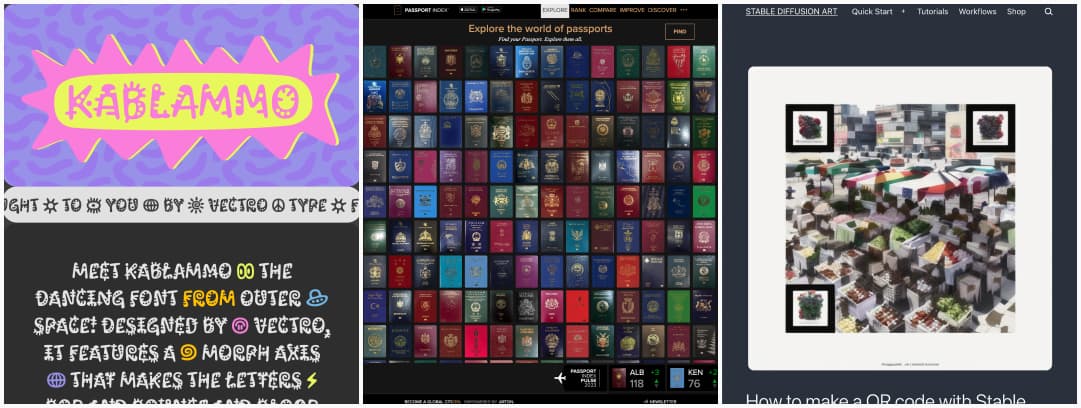
- Kablammo: a fun variable font, (maybe a little bit unreadable) where the letters can dance. I’m not sure if it’s a good idea to use it anywhere, but, the fact it exists brings me joy.
- Passport Index: an exploration of all the passports of the world, what they look like and their mobility score (where you can go without a visa)
- How to make a QR code with Stable Diffusion: this is impressive and opens up a lot of cool possibilities, impressive
Useful tools & resources
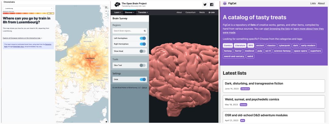
- Chronotrains: a map that shows where you can travel in 8h, departing from a specific European city
- Brain Survey a 3D tool to discover the human brain
- FigCat is a repository of lists of creative works, games, and other items, compiled by hand from various sources.
Cool and Interesting Videos
Driverless cars: Researcher disguises himself as car seat in study: when doing researcher, you need to be super creative for sure!
Tutorials
Rebuilding a comment component with modern CSS: very in dept tutorial on how to build a specific component using style queries, subgrids, CSS logical properties and a couple of other new cool CSS features


