Pixels of the Week – March 19 , 2023
As a user, I want rotating sandwiches, so that I can know if a fungus took over my brain!
On Twitter, LinkedIn, and Mastodon, I share curated articles I read, resources, and tools about UX Design, User Research, UI and mobile design, HTML, CSS, the web industry, some processes, some inspiration, etc. This is an archive of everything I shared this week. And some extra links that I decided to only share for the blog readers. Also, subscribe to the newsletter to get notified when those are published!
Now: what I’m currently up to
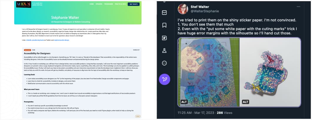
I’ll be running a workshop on Accessibility for designers, and how to make accessibility part of the design requirements and document it on May 24, in Lisbon as part of the UXLX conference (there will be a second session on Thursday too). Check my workshop description and grab a ticket if you are around.
On the craft side, I keep experimenting with sticker paper. The glitter one it not going well, you can check the epic fail on Twitter haha. The Silhouette can’t register the cutting marks, even when I try to cheat with some extra one printed on white paper. I will keep on trying to find a solution. To be honest, that paper is not working with color prints. BUT, I see potential if I ever do black (or dark purple) plain stickers. So, let’s see.
TL; DNR: the one you should not miss
As a user, I don’t want to.: “As a user, I want to click the button so that I can see the page” is the worst kind of user story you can write. It leads to bad product decisions. Instead, invert the user stories, to think bigger and solve actual user problems! Great read by Pavel Samsonov
Interesting frameworks and concepts
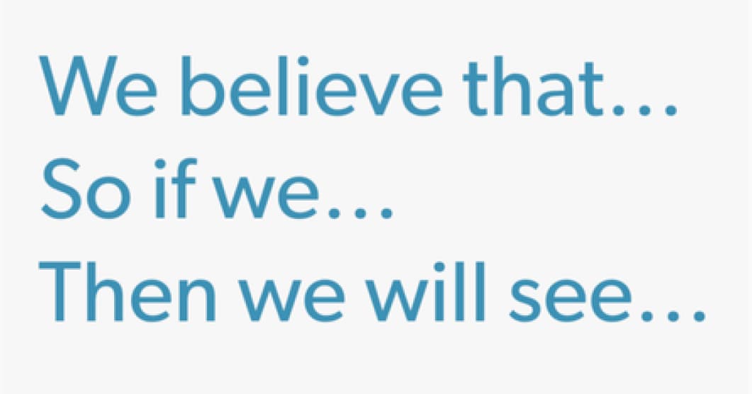
Using Hypothesis Driven Design to Improve your Digital Products and Services: ‘We believe that…’, ‘So if we…’, ‘Then we will see…’: an interesting framework to structure hypothesis for hypothesis-driven design. I like that part: “A Design Hypothesis is basically an assumption. Something that someone believes to be true. A Hypothesis helps you to prove or disprove the assumption. They are either proven or disproven using research and experiments.”
Interesting articles that caught my attention
User Research, UI design, and user stories
- Navigating New UI: How to Ease Users into Major Changes: 3 techniques to help users transition into a new Interface: progressive change, highlighting benefits, tutorials, and tour tips
- Rescreen participants to contextualize results: why would you re-ask some of the screener questions during the study to participants? To check experience & domain knowledge, to check familiarity with tools, to get usage context, to spot fakers,etc. I would also add, from personal experience: it helps to start the usability test or the interview with “easy” questions about the person and their habits and usage, to put them at ease from the start.
- How do you convince stakeholders of the importance of UX research? Show don’t tell, talk about money saved by investing in research, explain your methods, cite wrong past decisions made due to the lack of research, etc.
Some interesting content about UX career:
- Where do IC designers go once they peak? a sad truth: in our industry, after years of being an IC (individual contributor), if you want to have an impact, you have little other choice than to go into leadership roles. The lack of celebration of senior ICs’ work doesn’t help as well. Very good points
- UXR bootcamps & alternatives for learning the craft: keep in mind that Bootcamps are not the only option and they often only scratch the surface when you want to specialize in UX Research!
A few interesting things about accessibility
- UX for Good: digital sobriety, accessibility, inclusivity, ethics: interesting read on the convergence of different disciplines, from accessibility to inclusive design, ethics and sustainability
- The importance of adding accessibility design reviews to the design process. A list of things you can and should review: focus order, copy, colors, heading levels, aria states and attributes, alternate text, states, page titles, etc.
- 7 App accessibility best practices often overlooked: support orientation change, have buttons to validate inputs, provide multiple ways to navigate a page, the interface can be controlled by 1 finger, avoid gesture only to perform actions, support iOS dynamic font scale, avoid automatic page refreshes
- Five tips for focus groups with people who are blind or have low vision to help you make your user research more inclusive?
- The Web Needs a Native .visually-hidden interesting opinion and proposal for a display: visually-hidden in CSS that would indeed solve a lot of issues. And then, We Don’t Need .visually-hidden, an answer as to why we don’t need it. This is what I like about the tech community: people share different opinions, and points of view and we all grow together.
Curiosity cabinet: non-design/tech rabbit holes I enjoyed
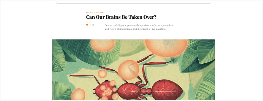
Can a Fungus Really Take Over Our Brains? In case you wonder if the mushrooms that can control your brain and turn you into a zombie (Last of Us) are real: yes, but, they can’t control humans. But, there are other non-fungi things that can influence human behavior and can bring mental health problems
Inspiration: fun experiments, beautiful art, and great ideas
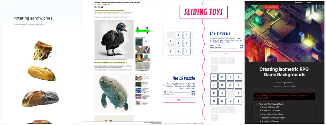
- Rotating Sandwiches: why would you need that? No idea. Is it awesome: for sure!
- midjourney envisions how centuries-long extinct creatures would look today: a really cute usage of midjourney
- Sliding toy: some fun sliding puzzles in the browser. I gave the 8 puzzle a try, and, let’s face it, I’m bad at this, like, 100 moves, for sure you beat me!
- Creating Isometric RPG Game Backgrounds: using Stable Diffusion techniques to create 2D game environments
Useful tools & resources that will save you time
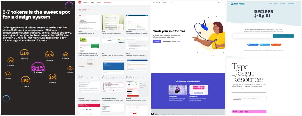
- The “How we document” annual report is out with some interesting findings on what people document in design systems and the benefits of such documentation. Use this next time people tell you documentation is a waste of time!
- Type Design Resources: a huge list of resources, communities, workshops, and software to help you if you want to start doing some type of design
- AI recipe generator: a fun idea to use ai generators to generate cooking recipes
- dumbpasswordrules.com: a website dedicated to examples of wacky, poorly designed password rules that sometimes make little sense
- Mic Check from Adobe: a cool tool if you need to check your microphone before a podcast or a remote talk. It will tell you if you need to get closer to the mic, reduce gain, etc.
Videos
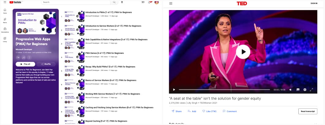
- Introduction to PWAs is a nice YouTube playlist of free videos to help beginners learn and build PWAs, created by Microsoft
- Lilly Singh: “A seat at the table” isn’t the solution for gender equity Women and girls are conditioned to believe success is “a seat at the table.” Lilly Singh thinks we need to build a better table, and walks us through, how to build that better table, in one of the best TED talks I watched in a while.
Tutorials
- A beginner’s guide to manual accessibility testing: test with screenreaders, test with keyboard, test the zoom of the page
- Some simple ways to make content look good: a few magic lines of CSS to bring some vertical rhythm to content, easy peasy!
