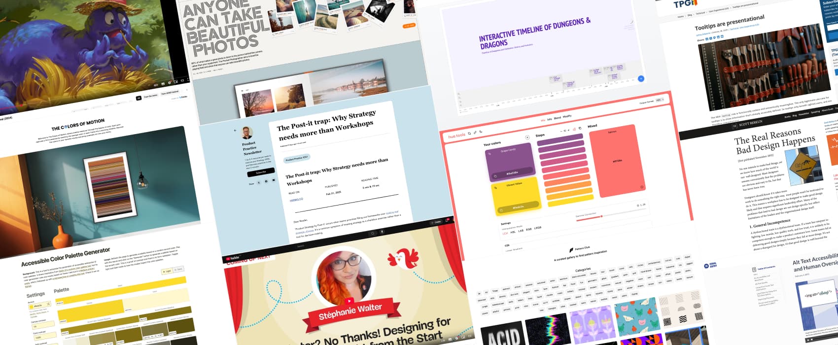
Pixels of the Week – March 2, 2025
A nice color tool, the reason behind bad design and a very strange bike
My curated weekly-ish online newsletter, where I share interesting articles, tools, and resources I found during the week. You can expect content about UX, design, user research, accessibility & tech, but also some processes, some inspiration, sometimes books, and a couple of videos and podcasts. Also, don’t forget to, subscribe to the newsletter to get notified, you will get the weekly links directly in your mailbox, and be notified when I publish other articles.
Now: what I’m currently up to
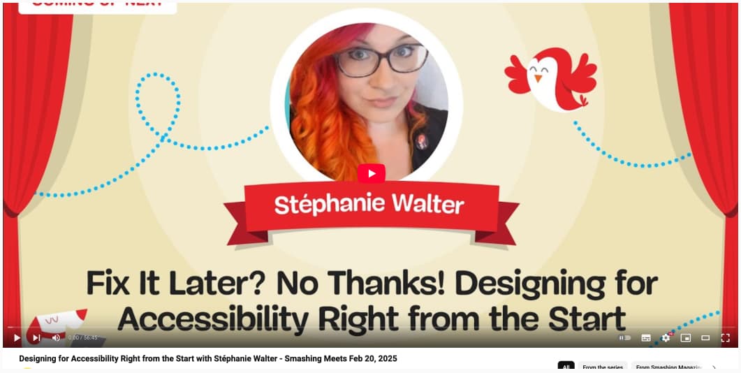
If you missed my Smashing Meets talk on accessibility, how can designers help fix it early in the mock-ups, it’s now available on YouTube: Designing for Accessibility Right from the Start with Stéphanie Walter. Also, don’t miss Sara L. Fossheim’s awesome talk on dataviz and accessibility:
Common Dataviz Accessibility Issues – Sarah L. Fossheim. And, you must watch Kardo Ayoub’s fun and light-hearted talk on how he discovered he had a brain issue, that caused him to lose half part of his eyesight, and what it changed in his designer life: Well, I Didn’t See That Coming! with Kardo Ayoub at Smashing Meets
Sun is back, so, it means more bike rides for me. Also, I need to start planning what I shall plant on the terrace this year and start growing the little seedlings. I’m thinking tomatoes, obviously. I loved the zucchinis big leaves last year, but then, they got attacked by a mushroom so it became depressing. I’m thinking about having cucumbers and eggplants instead.
Most popular content this week
Hue Color Tool a really nice color tool, with multiple options: mix, to build color scales with steps, info to get all information about a specific color in different spaces and values, and some combination options, blend to preview the result of 2 colors with different blend modes, and modify, to play with different settings of the same color. Made by Pascal Bürkle
Interesting articles that caught my attention
- The Real Reasons Bad Design Happens (22min) In short: bad design often happens because of poor leadership, weak team dynamics, or a lack of focus on user needs. Even with skilled designers, without clear goals, good communication, and user-centered thinking, products end up confusing and hard to use. I think we could create a nice bingo grid, or matrix, to self evaluate “why does my organization keep taking bad design decisions”, based on Scott Berkun’s article. (you can also read a shorter 10 reasons in substack)
- Generating image descriptions and alt-text with AI (22min) Dries Buytaert did a giant deep dive into testing multiple AIs for writing alternative text. The current conclusion is: it’s not perfect, you can’t fully trust them, and models needs to involve more, but, a combination of AI text and human review could do the job. For more on AI generated alt text, also check this video and transcript: Alt Text Accessibility: Balancing AI and Human Oversight (23min) on Equal Entry’s blog. Same conclusion: you can’t solely rely on AI (and it might have legal repercussions), but need some human check for accuracy and quality.
- AI Hallucinations: What Designers Need to Know (20min) Plausible but incorrect AI responses create design challenges and user distrust. To limit their impact, designers can implement features that transparently communicate uncertainty and encourage verification (contextual warning, presenting sources, etc.)
- Tooltips are presentational (6min) James Edwards has an interesting view on tooltips. He says they are presentational because they only give visual help to sighted users. They don’t offer useful or accessible info for non-visual users. The ARIA tooltip role doesn’t add real meaning or improve accessibility, so tooltips are just visual aids.
- Chat is a bad UI pattern for development tools (3min) Daniel De Laney argues that chat isn’t the right UI for coding tools, currently they are just fun toys for prototyping but nothin ready for real projects. Building real software needs precision and structure, not casual conversations: “We can’t. You don’t program by chatting. You program by writing documents.”
- The Post-it trap: Why Strategy needs more than Workshops (4min) Workshops are fun, but sometimes turn into UX theater. Filling out strategy templates with Post-its is not the same as making real strategic choices. A good product strategy helps teams say yes or no to opportunities based on evidence and data, not just how might we sticky notes and templates filled on a hunch.
- Human-Centered Design Through AI-Assisted Usability Testing: Reality Or Fiction? (22min) Can AI improve automated usability testing by dynamically asking follow-up questions based on participant responses? Technically, AI can dynamically generate follow-up questions, and refine participant responses. But, there are a lot of issues with redundancy, lack of contextual awareness that make this hard to automate fully to an AI, especially since participants get frustrated when the follow-ups are bad. It’s also hard to discover new issues, beyond the pre-defined questions (like you would do with moderated testing). So, the answer is: nope, not yet. You need to combine human and AI to get decent results and data. (by Dr. Eduard Kuric)
Inspiration: fun experiments, beautiful art, and great ideas
- Flitz Pedal-less Bicycle:it does have seat, gears or pedals, and you basically run a little bit then put your feet next to the back wheel. I’m honestly intrigued and would love to try this, just, for fun. You can check the “bike” out in action here on YouTube.
- The Colors of Motion prints that explore the mail colors of a film’s essence, by stacking the average color of each frame into a stunning timeline. I love the idea.
Books
The Pocket Photographer 99% of what makes a great photo is down to the person behind the camera rather than your equipment. So true. This book should help you take beautiful photos
Useful tools & resources
- Templates and Tools for UX Job Seekers a couple of templates you can copy, paste and modify for your UX job search, by NN/Group
- WikiTimeline I wanted an Interactive Timeline of Dungeons & Dragons. Due to a typo, and short attention, I ended up with the Timeline of Dungeons and Oubliettes: History and Evolution and now, I know the earliest use of “oubliette” in French was in 1370. Do what you must with this information, and have fun with that tool that lets you convert any Wikipedia article in an interactive timeline.
- Pattern Club a curated list of patterns, organised in different categories, for you inspiration.
- Accessible Color Palette Generator another interesting accessible palette generator tool! Enter a color, and it will generate specific palettes for canvas, accent non-content, accent content, etc. Usefull to generate different shades for a specific color.
Cool and Interesting Videos
Cabel Sasser, Panic – XOXO Festival (2024) an amazing (very emotional at the end) talk on legacy, the legacy of Wes Cook to be specific.