Pixels of the Week – October 29, 2023
Game accessibility, UX case studies & 3D printed salmon
On Twitter, LinkedIn, and Mastodon, I share curated articles I read, resources and tools about UX Design, User Research, UI and mobile design, HTML, CSS, the web industry, some processes, some inspiration, etc. This is an archive of everything I shared this week. And some extra links that I decided to only share for the blog readers. Also, subscribe to the newsletter to get notified when those are published!
Now: what I’m currently up to
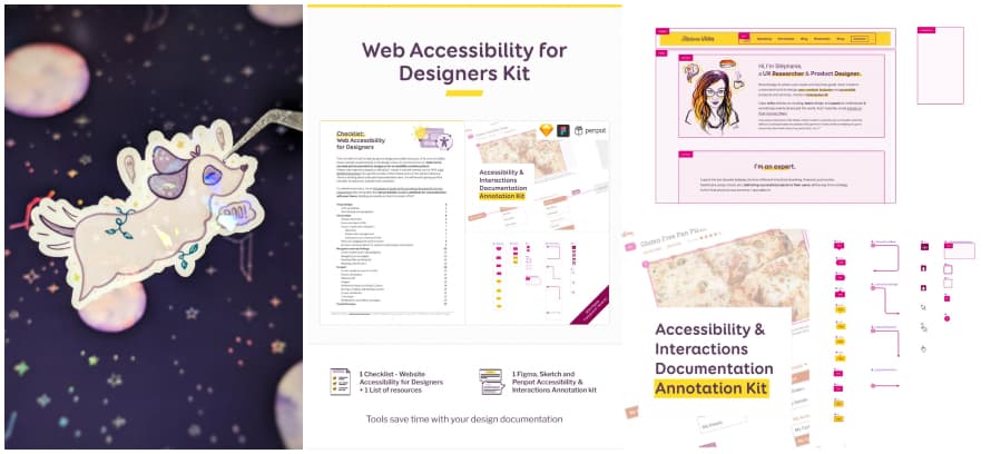
I’m putting the final touches to my “Accessibility for Designers” workshop. We will have 4 sessions, online, on November 6, 8, 13 and 15. There are still some tickets. (Also if you are a newsletter subscriber, use the link I’m sending you in the newsletter for a 10% discount). For the occasion, and because WCAG2.2 is out, I’ve also updated my accessibility for designer kit:
- the checklist now has the AA WCAG2.2 criteria
- new component to annotate mockup areas (landmarks for example)
- a list of resources
Get the checklist and annotation kit
I’ve revisited my “Momo the traveling dog” illustration, to create a Halloween momo stickers version. She is now dressed like a ghost.
TL; DNR: the one you should not miss
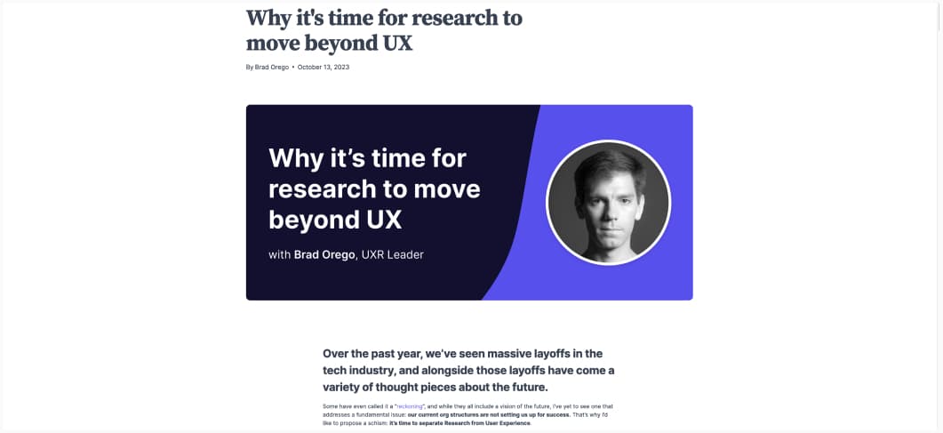
Why it’s time for research to move beyond UX (10min) a refreshing approach, different from the whole “UX designers don’t know how to prove their value”: our current org structures are not setting us up for success, and we need to change that. YES! By Brad Orego
Interesting articles that caught my attention
- Smashing Conf: Journey in Enterprise UX (5min) Luke Wroblewski wrote a very nice summary of my latest talk on enterprise UX. Also, it means I’m now part of his chatbot content, yeaahy. You can also check the slides. (I might eventually turn this into articles, but, well, time is not something I have at the moment)
- User research heuristic reviews (7min) Heuristic reviews are a practical, repeatable, technique to score, measure and prioritize which design aspects to improve, and why. They might not be flashy, but they sure can make an enormous difference in optimizing designs that captivate users with seamless interactions. by Michele Ronsen
- Accessibility Modes Should Be An Industry Standard (9min): “Games are meant to be played, and the more people they are accessible to, the better the industry is. Skill-based games are no exception to this, and skilled players should keep in mind that giving a game an easy mode doesn’t discredit the effort they’ve put in a normal or hard mode. For every player who enjoys a game, there’s another person who would enjoy it too—if they were only given the opportunity to play it.” This is so true.
- Personalization (7-9) “Personalization allows us to get more information into the funnel. Platforms that allow personalized signal erode anonymity. (…) We don’t crave connection. We crave authentic connection.”. This is very very true (and I will pretend I didn’t put way too much money in skins in LoL and spend way too much time personalizing my Tiny Tina and Diablo characters instead of playing the actual game)
- Create and present an impactful user research case study (30min) if you are looking for a job, Nikki Anderson-Stanier wrote an interesting article to help you improve your portfolio case studies
- Using Private Research Panels for Ongoing, Rapid Customer Feedback (18min) the advantages of using private research panels and how to build one, by Lauren Duquette
- Why the Internet Isn’t Fun Anymore (8min) The social-media Web as we knew it, a place where we consumed the posts of our fellow-humans and posted in return, appears to be over. Hard to disagree here.
- Testing ChatGPT-4 for ‘UX Audits’ (10min) With ChatGPT-4 an 80% false-positive error rate and a 20% accuracy rate in the suggestions, you don’t really want to use chatGPT4 for UX audits. (by Baymard Institute)
- The 4 Degrees of Anthropomorphism of Generative AI (11min) interesting study on how people address chatbots in a human way. I’m skeptical about the role play though, I think this is mostly due to being bombarded by “how to make good prompts” content, but hard to know for sure
Curiosity cabinet: non-design/tech rabbit holes I enjoyed
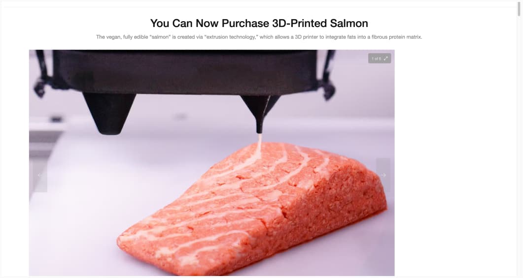
You Can Now Purchase 3D-Printed Salmon: okay, I’m very curious about 3D printing food, mostly because it sounds very startrekish to me.
Inspiration: fun experiments, beautiful art, and great ideas
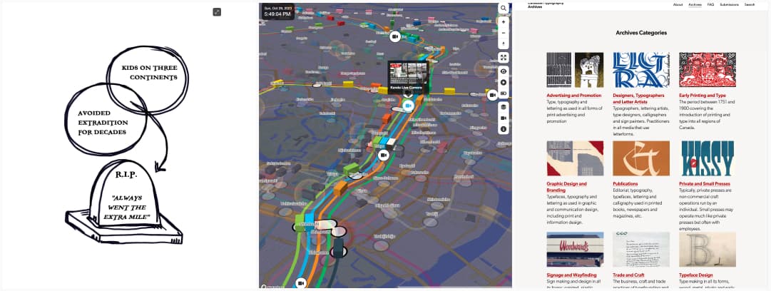
- When epitaphs are euphemisms it’s almost Halloween, those made me laugh, a lot
- Mini Tokyo 3D for my dataviz enthusiast friends: a mini map of Tokyo with real time position of public transportation (according to the public transport open data center), and access to a couple of live feeds
- Canadian Typography Archives: a nice place to find typography inspiration
Useful tools & resources
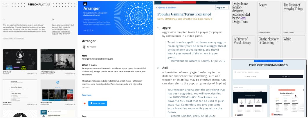
- Popular Gaming Terms Explained: nice list if you have gamers friends you don’t understand, but it’s missing MVP!
- PersonalSit.es: a repository of personal sites, for your inspiration.
- Design books for non-designers, a collection of books that can help become a better design
- SaaS Pricing Explorer: very niche, I know, but if you need inspiration for SaaS pricing (both page design and actual prices), that is a useful site.
- Arranger: a Figma plugin to arrange any number of objects in 10 different layout types, like radial (full circle or arc), along a custom vector path, pack an area with objects, and much more. Trust me, when you will need it, you will be happy this exists.
Tutorials
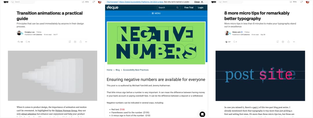
- Transition animations: a practical guide: good tips for great animations, in particular the spacial one. But, remember that too much animation can be distracting or make people sick, so, don’t overdo it, and respect user preferences to disable them.
- Ensuring negative numbers are available for everyone: interesting examples of how to communicate information with something else than color, for banking for instance, when you need to convey a number is negative, using a minus next to the number
- 8 more micro tips for remarkably better typography (10min) a great introduction to help you improve small areas of your site right away, by Matej Latin
Meetup & conference replay
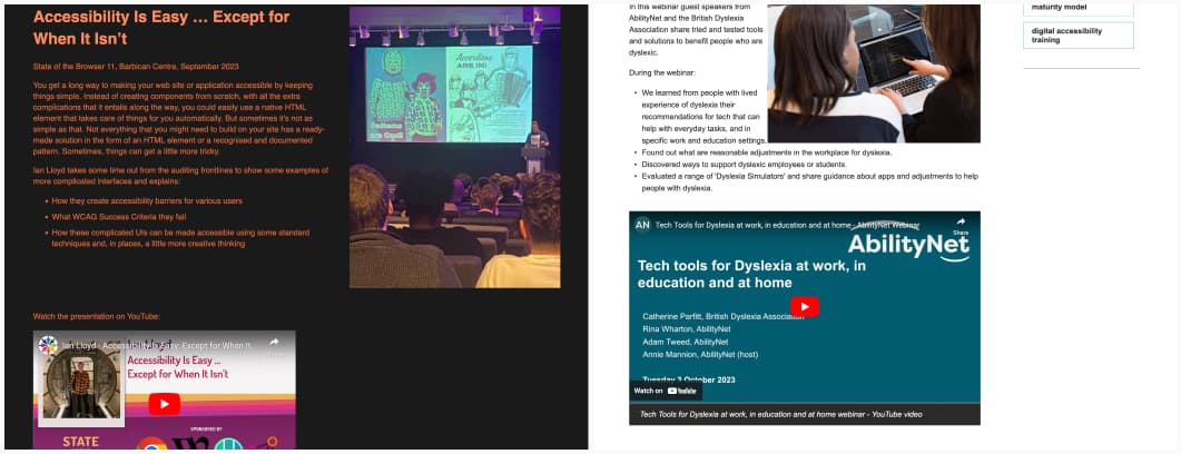
- Accessibility Is Easy … Except for When It Isn’t some interesting of complex patterns and how they can be made accessible using some standard techniques and, in places, a little more creative thinking
- Tech Tools for Dyslexia at work, in education and at home: great tips and list of tools to help you (or someone you know) with dyslexia, a review of dyslexia simulators (be careful those might be misleading) and a great panel to help you understand the different issues people with dyslexia might encounter on the web and in their workplace
Latest news in the industry
Web Push is almost usable with iOS 17: the “only available if you added it to home screen” is a big issue for me here, you can’t expect users to know about this without banners. So, that conclusion is on point: “with enough dedication and grit, you can get push notifications to show up on iOS devices, and it’s a little easier with iOS 17”.
Select element: now with horizontal rules: Chrome added the ability to have <hr> inside <select>, no Firefox support yet, but Safari is supported. I find this interesting for information architecture, in case you don’t need to name the group.

