Pixels of the Week – September 15, 2024
Accessible color combinations, Figma tips & UX research gamification
My curated weekly-ish online newsletter, where I share interesting articles, tools, and resources I found during the week. You can expect content about UX, design, user research, accessibility & tech, but also some processes, some inspiration, sometimes books, and a couple of videos and podcasts. Also, don’t forget to, subscribe to the newsletter to get notified, you will get the weekly links directly in your mailbox, and be notified when I publish other articles.
Now: what I’m currently up to
I’m taking a whole month off until October 13, without a computer. So: no weekly links, or newsletter. I’ve also closed all the DMs on most social platforms. Honestly, if you want to contact me for something, I’m not sure when you’ll get an answer, so, maybe wait until after October 13?
Most popular content this week
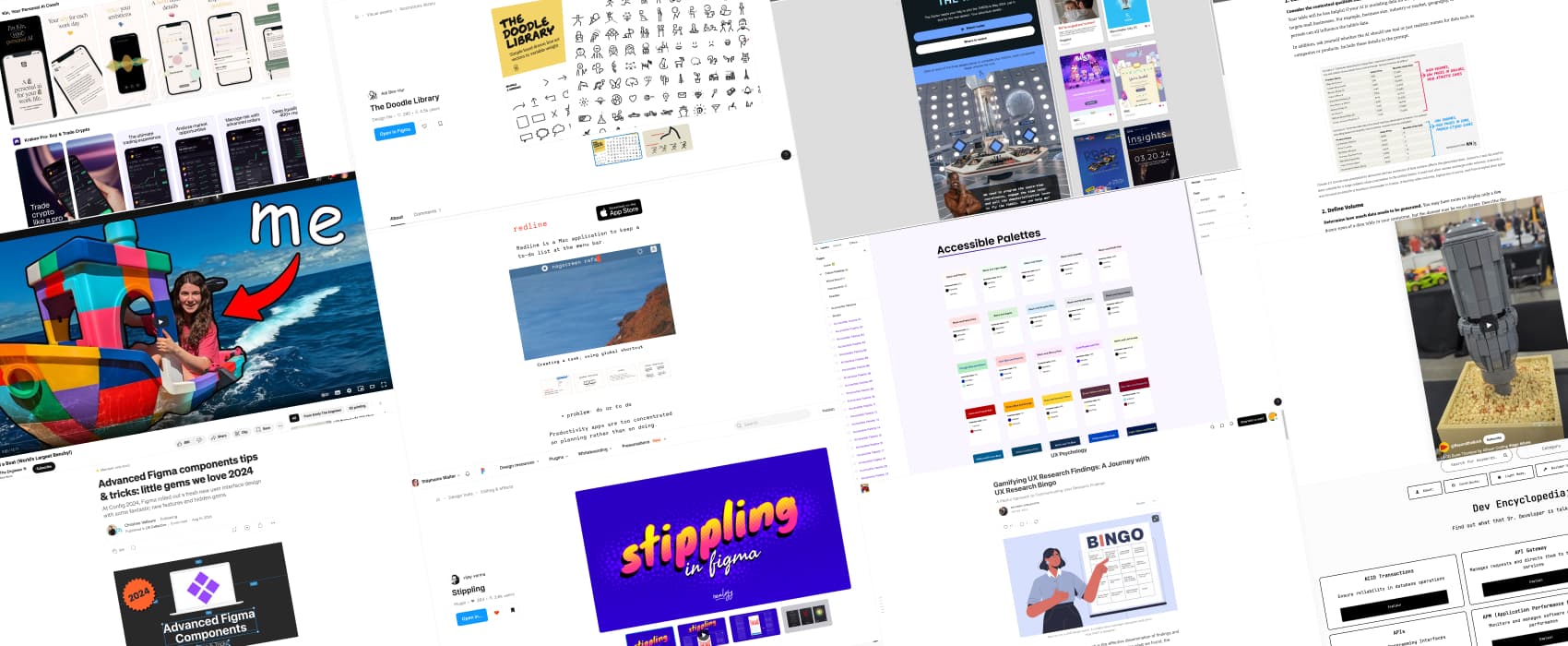
Accessible Colour Palettes 50+ ideas for accessible color combinations, in a nice Figma file by Furquan Ahmad. No more “Boohoo I can’t use pastel” and “Accessible color palettes are ugly”!
Interesting articles that caught my attention
- The Big Difference Between Digital Product And Web Design (12min) designing for a product that people use on a daily basis is a little bit different than a website they might visit once in a while. It requires understanding of user interactions in order to reduce friction and continuous improvement.
- Gamifying UX Research Findings: A Journey with UX Research Bingo (8min) I’ve a mixed feeling about this. On one hand, I find it fun and educational. On the other, I think it’s sad we need to gamify our findings in order for people to care about it, and I’m afraid it might bring us into more UX theater. What do you think? (Dr Maria Panagiotidi)
- 5 Steps to Prepare Your Next Talk (5min) by JD Schramm some nice tips to help you become a better public speaker, I love the “try to tell the audience what’s coming next before, or as you bring it up” because then you build some story telling.
- Leverage AI for Mock Tables and Charts When Testing Prototypes (19 min) an interesting usage of LLMs: ask it to generate realistic data for your usability testing sessions. This is very nice if you are in a case like me where you can’t put real data on mockups, because, security. Also, could be a nice way to force you to test “edge cases”, as in “what happens with super long names, super big data sets, etc”.
Curiosity cabinet: non-design/tech rabbit holes I enjoyed
I (Emily The Engineer) 3D Printed a Boat. I love when people do fun things, just, because they can!
Inspiration: fun experiments, beautiful art, and great ideas
- LEGO Dune Thumper video; because, why not?
- Email Design Inspiration by BBC for my Doctor Who fans, the BBC created an amazing interactive quiz email. That’s 100% the kind of emails I’m happy to get in my mailbox.
Useful tools & resources
- Scrnshts some inspiration for your native apps store screenshots and presentations, ordered in different categories (business, education, etc.)
- The Doodle Library: some cute hand drawn line art vectors in 3 weights and accent color in a Figma file
- Redline a Mac application to keep a to-do list of ONE item, in the menu bar. Could help a couple of neurospicy people who have issues tracking tasks?
- Stippling by vijay verma: a really cool Figma plugin to turn any image or frame into a stippling effect. You can then select the dots and change the colors
- Dev Encyclopedia: a centralized place to find definitions for commonly used technical terms, concepts, and even programming-language specific jargons. By Chenuli Jayasinghe
- OneLook Thesaurus and Reverse Dictionary: A powerful English thesaurus and brainstorming tool that lets you describe what you’re looking for in plain terms. It gives you hundreds of related words to choose from and lets you narrow down the list with several advanced features.
Tutorials
- Tools and Techniques to Create Accessible Accordion Components (14min) in case you need to create an accessible accordion, using aria-expanded and a couple of other aria goodness for such complex components. By Florian Schroiff
- Another Stab At Truncated Text (8min) different options to truncate text. by Geoff Graham
- Advanced Figma components tips & tricks: little gems we love 2024 (9min) more nice Figma tips with one of my favorite Figma instructor: Christine Vallaure. Scoping is going to be very interesting!