Tips to Create an Accessible and Contrasted Color Palette
Color contrast is something really important in Design. It will help users read your text and get a clear understanding of your content. Color contrast and color accessibility scares a lot of designers too. Some are afraid that color accessibility will limit the color palette they will be allowed to use and so their creativity. Some people think that color accessibility is “only for people with some sort of color blindness disease” so it does not concern their target audience. Let’s be clear from the start: color contrast will concern every one of you users. Everybody struggles at some point with issues linked to lack of contrast in interfaces and websites, color blind or not.
— Updated on March 3 2019 —
In this article, I will present you two tools and some quick tips to easily create an accessible color palette for your designs. I won’t lie to you: yes, you might not be able to use exactly all the colors you want. Or at least you will have to be careful with some of them. But that does not mean that you can’t get creative. After all, technical constraints are part of a designer’s job too.
Tools and resources to measure contrast.
To know if a color combination is accessible, we measure the contrast between the foreground color (usually the text but it could be icons) and the background color. If you want to understand how contrast is measured you might want to read Calculating Color Contrast. They are 4 levels of contrast: WCAG 2 AA Compliant for normal text and text above 18px and WCAG 2 AAA Compliant for normal text.
I will take a special interest in the first one: AA. Note that an AA accessibility grade can be mandatory sometimes when working with government sites for example.
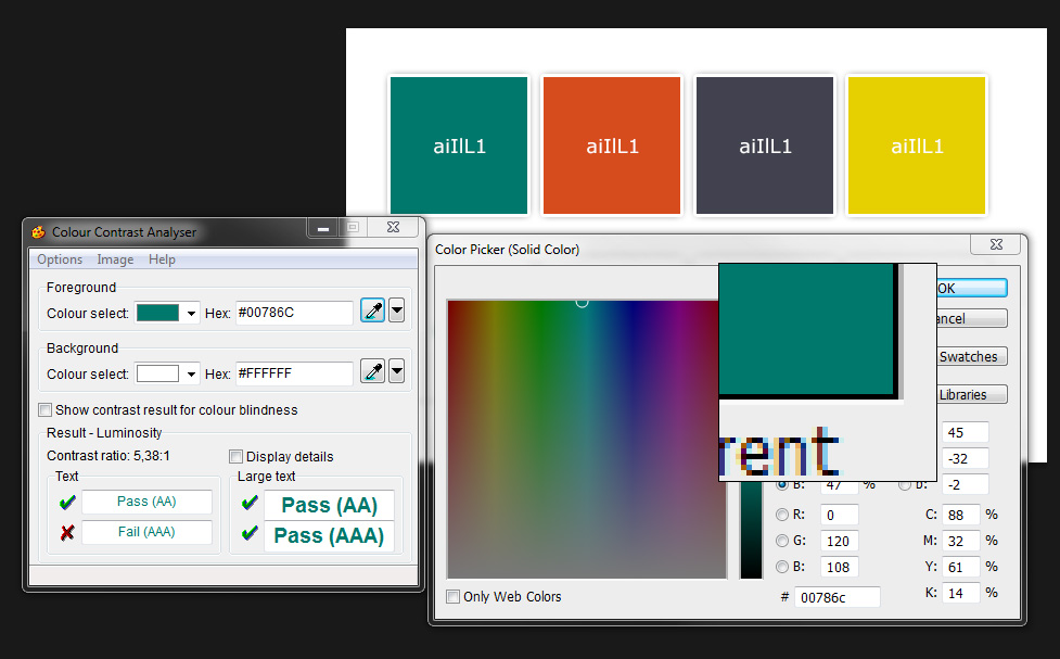
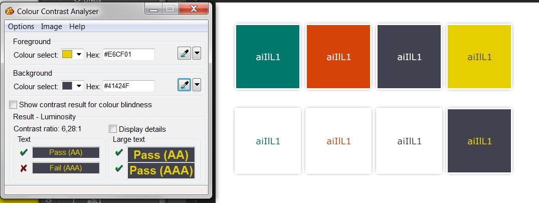
For the tests I’m using the “Color Contrast Analyser”. This tool which is available for Windows and Mac. The tool is a standalone application that you have to launch. It provides a color picker I can use anywhere on my screen to test the contrast between a foreground and background color. If you prefer online tools you can use this one or this one.
Using the CCA color picker to get the color directly from my Photoshop picker
Testing the palette
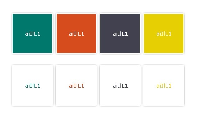
I chose a palette based on a vibrant orange and used a complementary green one. I added an anthracite color and a yellow one. I admit I chose orange and yellow for the sake of the exercise since those two can be tricky sometimes when it comes to contrast. Yet, you can still build an accessible website with yellow, like, let’s say, mine 😀
Read the Portfolio Redesign Article
To test the color palette, I first write some text on them. I like to test “aiIlL1” since those letters and number are pretty close in some fonts. This helps me to get a quick look at the font readability at the same time. As I said before, color contrast is measured between the foreground and background so I duplicate the scheme with the colors inverted.
This is what my 1st draft of the color scheme looks like:
Testing the green
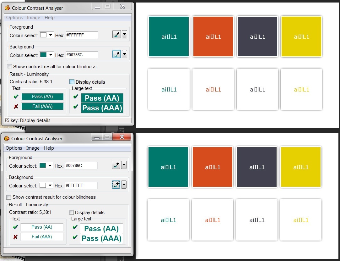
The first color is a dark green. To test it I launch the Colour Contrast Analyser software (I will call CCA for the rest of the article). I use the two color pickers to get the text color and the background one. The tool does contrast the testing.
CCA color picker can pick a color anywhere on the screen so you can use it in Photoshop, on the Photoshop color palette or even on a JPG final flattened file.
For this test, I’m interested in the AA values. Good news, my green passes the test so I can use it as is. Note that it failed the AAA test, but for most sites AA test is enough.
Testing the orange: when it starts to get tricky
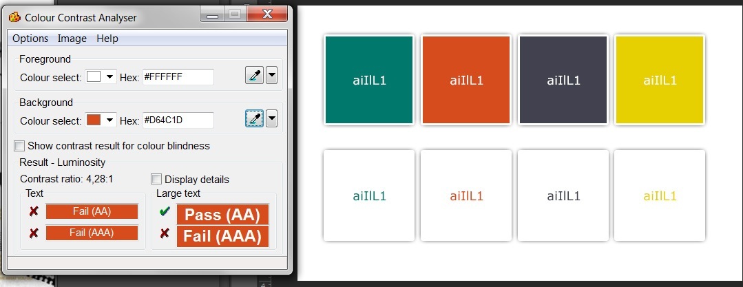
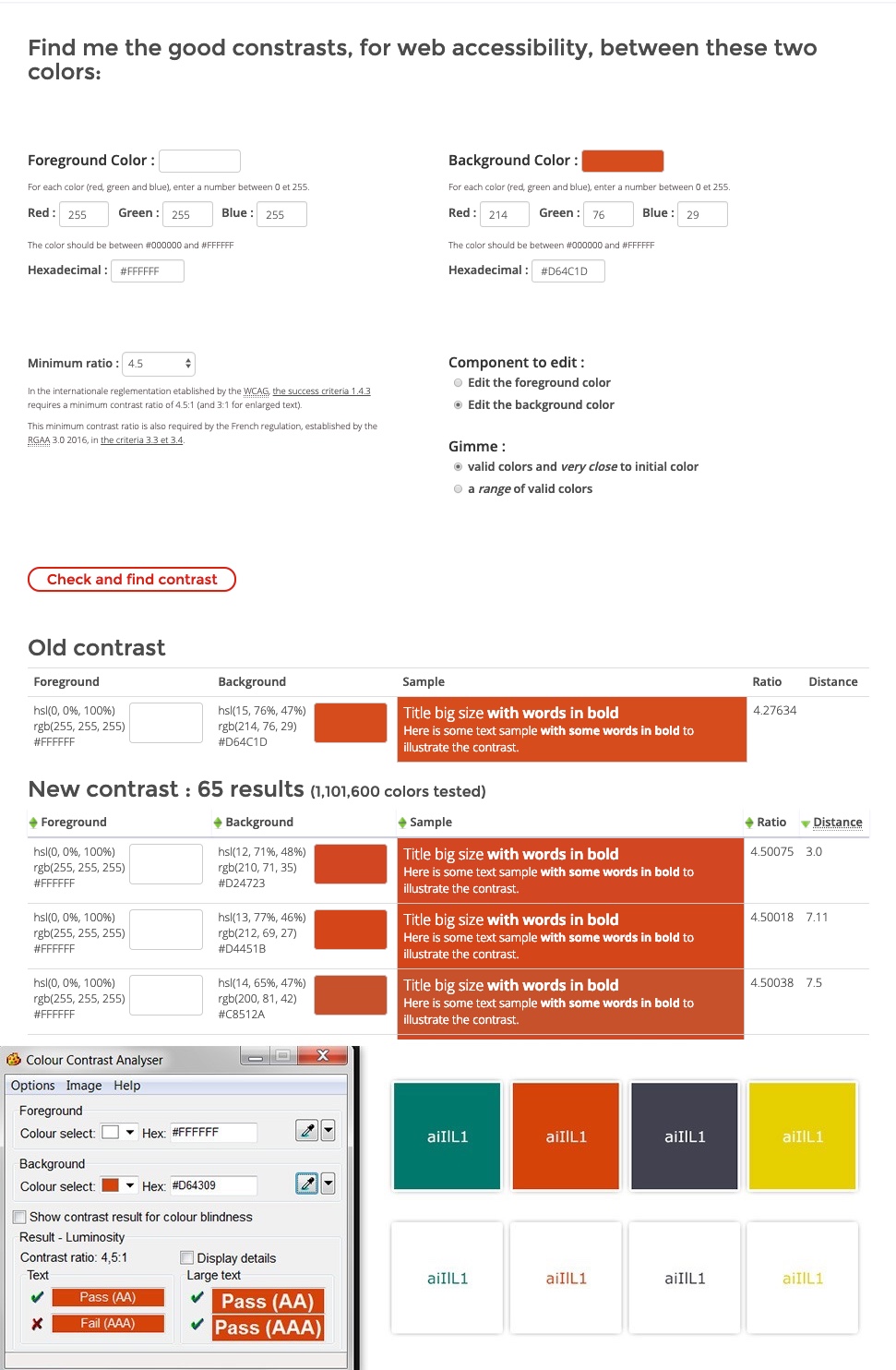
The second color I want to test is the orange. If I want to be able to write some white text on orange background (and vis versa), I have to make sure that the contrast between the orange and the white is high enough. Here is the test:
As you can see, this color would pass the AA test for large text, but not for normal ones. This means that if I want to write white text on orange (or orange text on a white background), the text has to be at least 18 points or 14 points and be in bold. Yes it’s strange, but the unit is actually the point so you’ll have to convert it in pixels for your tests.
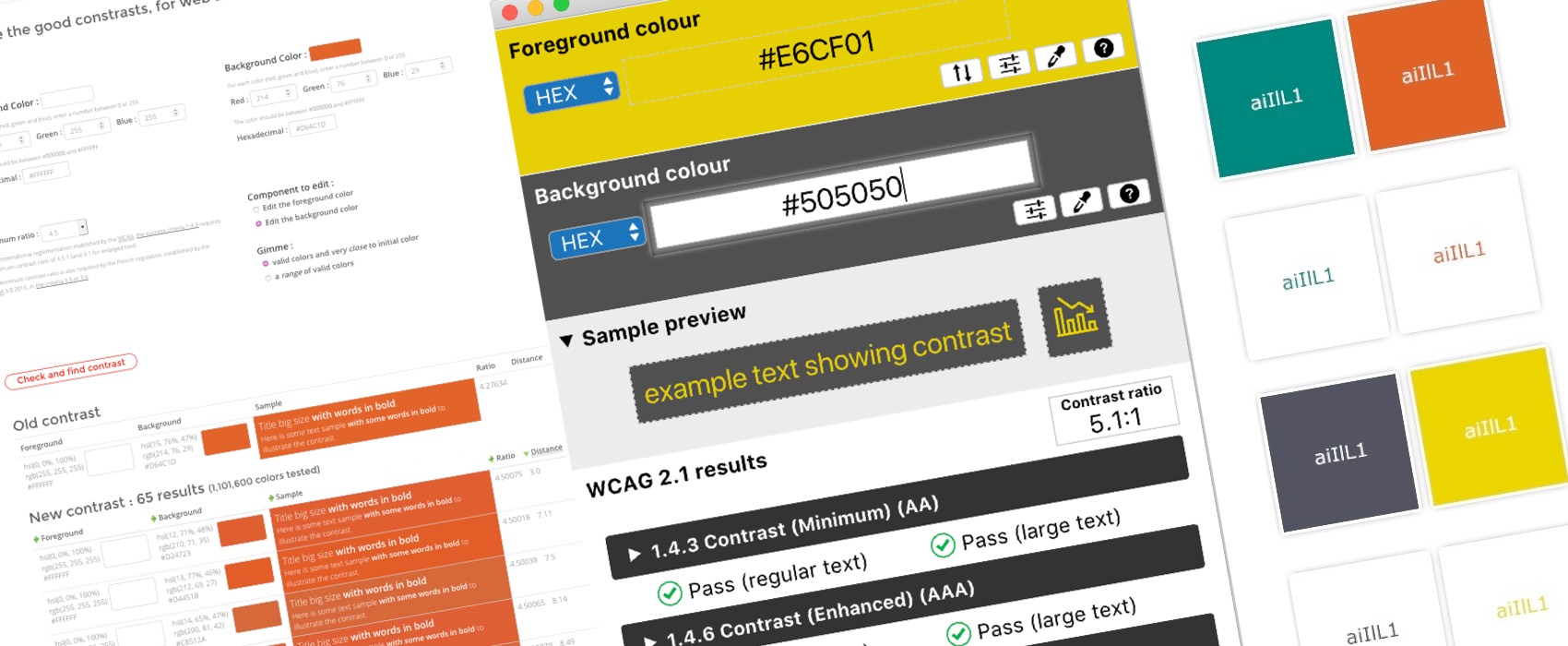
I want to use my orange for smaller texts as well so I will have to find a better color. Here is when I’m going to use my second tool: Tanaguru Contrast-Finder
Tanaguru Contrast-Finder to the rescue
Tanaguru Contrast-Finder is an online tool that will do two things:
- It can calculate if the contrast is high enough between two colors (so it does the same thing as CCA)
- It can propose color alternatives if my color does not pass the test.
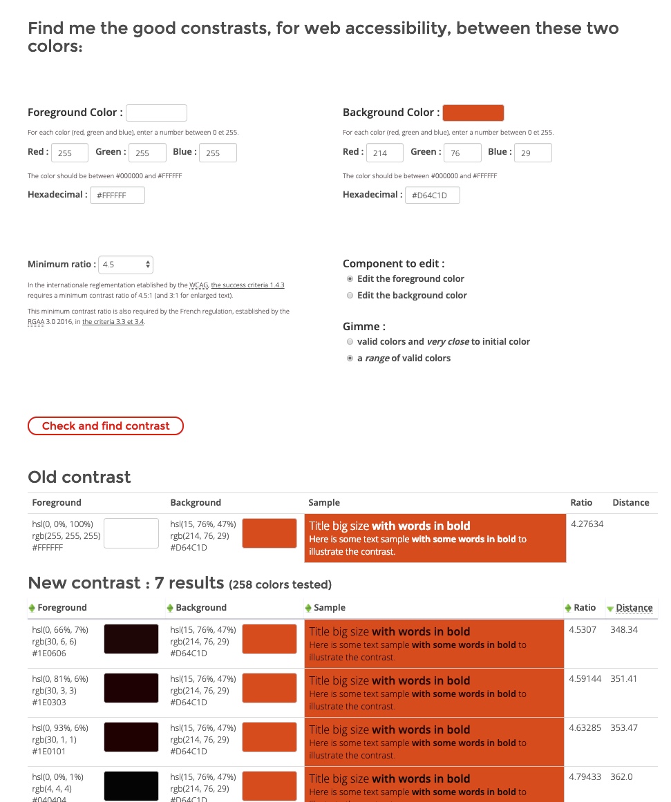
I give my colors to the tool. If I want to keep my current orange as a background color, I must use a dark brown/black the text. But I’m not super happy with the halloween look. Also I could not use the orange on a white background, I’m not super happy with that either.
Since I’d rather get light text than dark one, I have a second option: I can ask the tool to find me a better background orange color. To do so I change the dropdown “Component to edit” to “Edit the background color” and check the second radio “valid colors and much closed to initial color”. The tool now gives me some variation of my initial orange that have a high enough contrast. I choose the second one and you can see that this time, it passes the AA test.
The third dark color passes the test so I won’t have to tweak it, so let’s go straight to the last one, the yellow case.
To the yellow tricky part
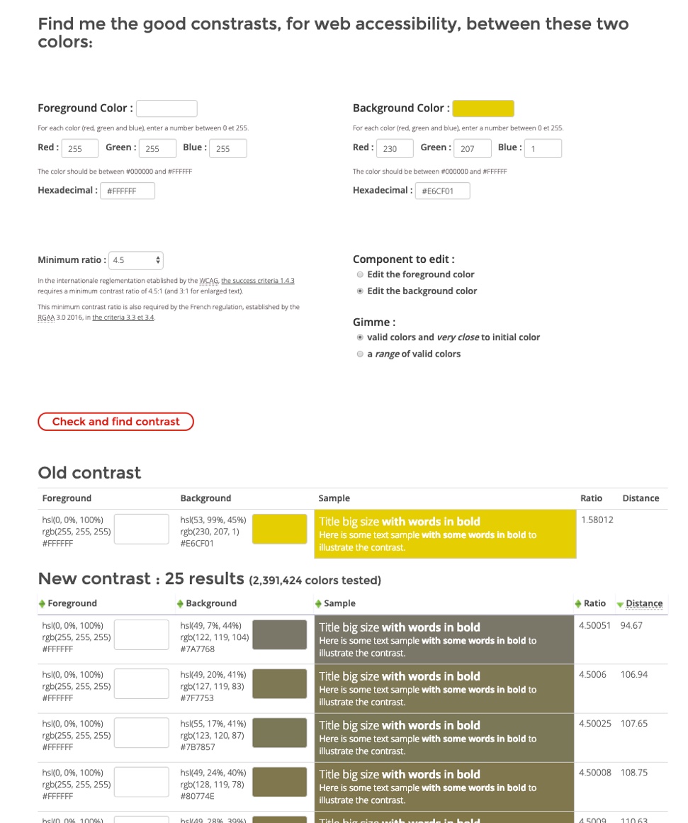
Yellow is a really tricky color when it comes to contrast. As you can see my current yellow color on a white background and white text on my yellow color fails all tests, even the large text one.
I could try again the “let’s find a yellow background close to the original one”. Unfortunately the closest thing I can get if I really want to use yellow with white is an awful brownish color.
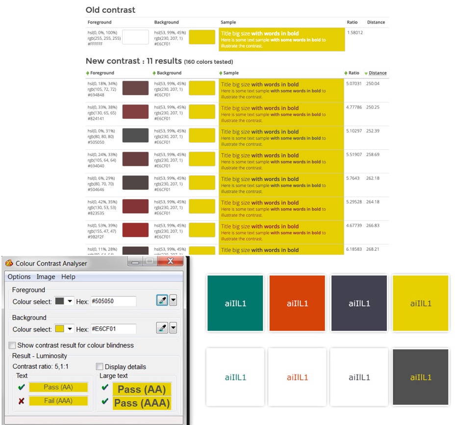
So if I want to keep this particular yellow color I will have to change the color of the text. The tool proposes me different shades of gray. So to use this yellow on a site with a high enough contrast I will have to:
- Use a dark text on the yellow background
- Use a dark background with the yellow text
This is what I get:
If I take a closer look, there’s something odd with the last color: it does not fit very well in the whole scheme. Even if the tool gave me an accessible dark gray, I’m still the designer so I can still tweak this little bit more to harmonize the colors.
My color scheme already had a dark variation of gray, why not use this one with the yellow as well? In this case, the gray I’ve used for the previous color passes the AA test. Hooray, I’ll be able to use it with my yellow.
This is my final color palette, with the yellow passing the AA test:
More tools to test colors
If you are looking for more tools to test contrast colors you can check my article: Color accessibility: tools and resources to help you design inclusive products
Conclusion
Building an accessible color palette is not as hard as it looks like, especially with the right tools. Also accessible color themes do not have to be ugly or kill your creativity. I had to do some little tweaking with the yellow color and I got an orange one pretty close to original one, but I’m not far away from my original color palette.
Of course it might not be this simple if you are working with a client that has already a strong brand identity with colors you won’t be able to chance. But educating clients is also part of the job, and making them aware of all this little details will help them launch a better website as well.
