Yellow, Purple, and the Myth of “Accessibility Limits Color Palettes”
Includes 6 palettes you can re-use and a full video tutorial
Recently, I was reminded of a statement, coming from a myth I hear from time to time:
“When you need to meet accessibility requirements, especially with certain color families, your options are very limited.”
This statement comes from a conference that unveiled a yellow and purple palette that looked eerily familiar (full details at the end). This combination has been the core of my visual identity for close to a decade. It’s a recognizable part of my brand in the design, tech and accessibility community. And, it took some expertise to ensure that every shade combination used meets WCAG contrast standards. I like a challenge!
So, let’s address the myth head-on. Accessibility does not limit your color palette choices. What feels limiting is often a lack of knowledge about WCAG color contrast criteria, how to build accessible color palettes in tools like Figma. And sometimes, a lack of creativity.
I like to make hard things seem easy and vulgarize them to ensure the industry moves forward. In this article I share six yellow and purple color palettes, I built for the occasion. And a full detailed tutorial (video included) to help you design your own accessible palettes with confidence. There’s also a FAQ for quick answers.
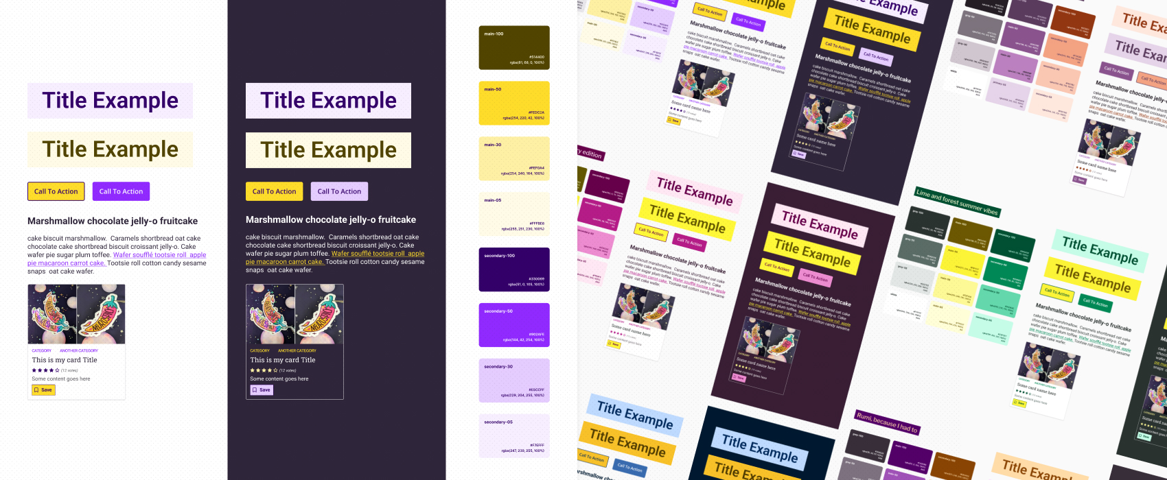
Six WCAG-Tested Yellow and Purple Accessible Color Palettes You Can Re-use
To demonstrate the range of possibilities, I created six WCAG-compliant accessible color palettes based on a yellow and purple color scheme. Each palette works in both light and dark mode, with combinations tested for accessible mockups.
Pairing my yellow and aubergine / lavendar purple in different ways
I’ve built 2 palettes that reuse one of my signature shades, but applied with different combinations. A proof that even familiar colors can still feel unique.
“Stephanie’s Yellow with a Vibrant Purple Twist”
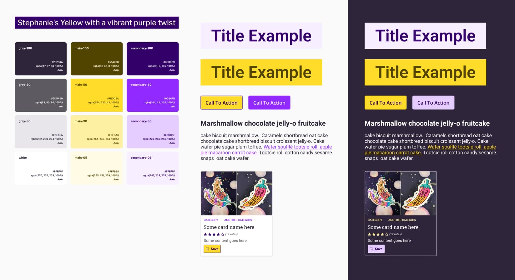
Colors include: #2F253A, #5D5A60, #E8E6EA, #FFFFFF, #514400, #FEDC2A, #FEF0A3, #FFFBE5, #330069, #902AFE, #E5CDFF, #F7EFFF.
My signature yellow paired with a more saturated blueish purple, adding energy while maintaining strong contrast. Suitable for bold, modern interfaces.
Stephanie’s Purple, but Make it Peachy
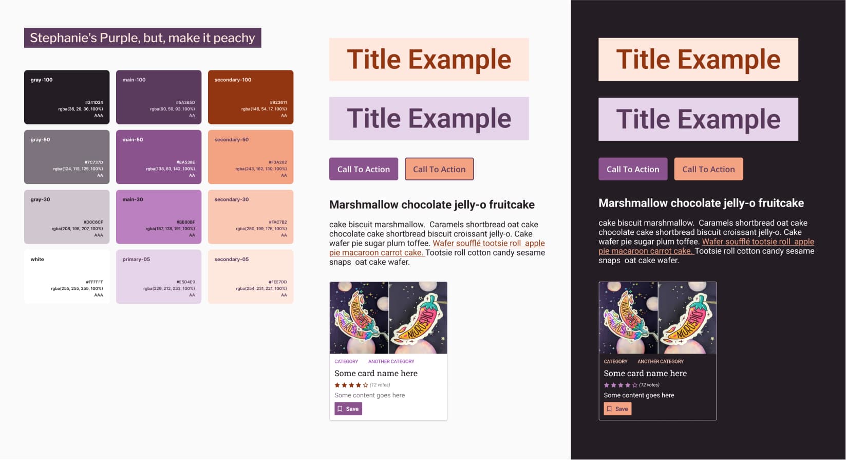
Colors include: #241D24, #7C737D, #D0C6CF, #FFFFFF, #5A3B5D, #8A538E, #BB80BF, #E5D4E9, #923611, #F3A282, #FAC7B2, #FEE7DD.
My aubergine and my lavender signature purples complemented with a warm peach tone for a softer, welcoming aesthetic that still meets accessibility standards. Get your daily dose of fruits and vegetables, people!
Pairing a brighter yellow, with strawberry pink / green
Here come the summer, fresh palettes, because honnestly, I designed those while it was 35 degree outside, and I needed something fresh. And, maybe a soda with tones of ice. Enjoy.
Soda Pop (Pink Strawberry Edition)
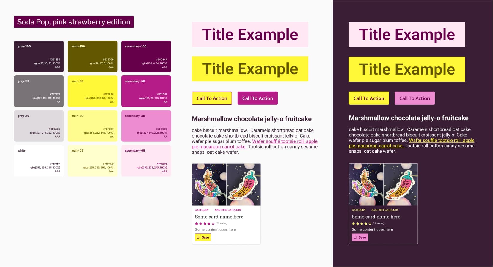
Colors include: #391E34, #797277, #DFDADE, #FFFFFF, #635700, #FFF838, #FEFC8F, #FFFFCD, #66004A, #B51C87, #EDBCD0, #FFE8F3.
Citrus yellow, paired with strawberry pink. Light and cheerful, ideal for brands seeking a friendly and approachable look, and some summer vibes. I think this would work amazingly well for selling sodas, but, also, colorfull clothes.
Lime and Forest Summer Vibes
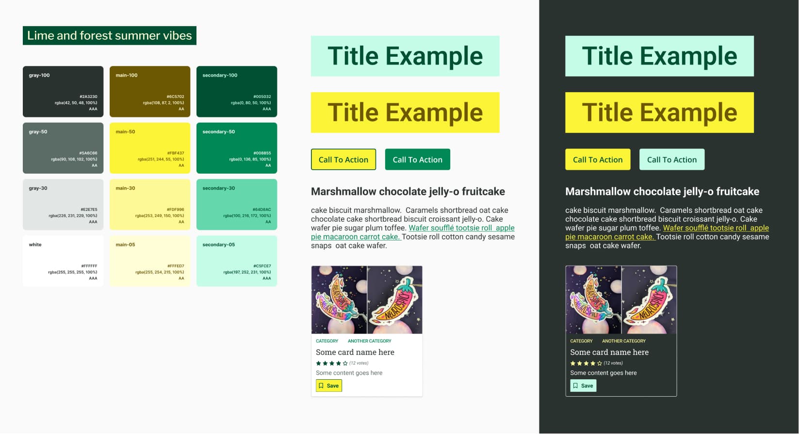
Colors include: #2A3230, #5A6C66, #E2E7E5, #FFFFFF, #6C5702, #FBF437, #FDF996, #FFFED7, #005032, #008855, #64DBAC, #C5FCE7.
Fresh lime yellow combined with rich forest green and cool supporting tones. Bright yet grounded, well-suited to nature or wellness-focused projects. Also, anything around sustainability.
Pairing yellow with KPop Demon Hunters inspired blue and magenta purple
Also, I might have gone overboard with the KPop Demon Hunters inspiration. I regret nothing. I’m going up up up!!
Derpy Tiger is Soo Cute
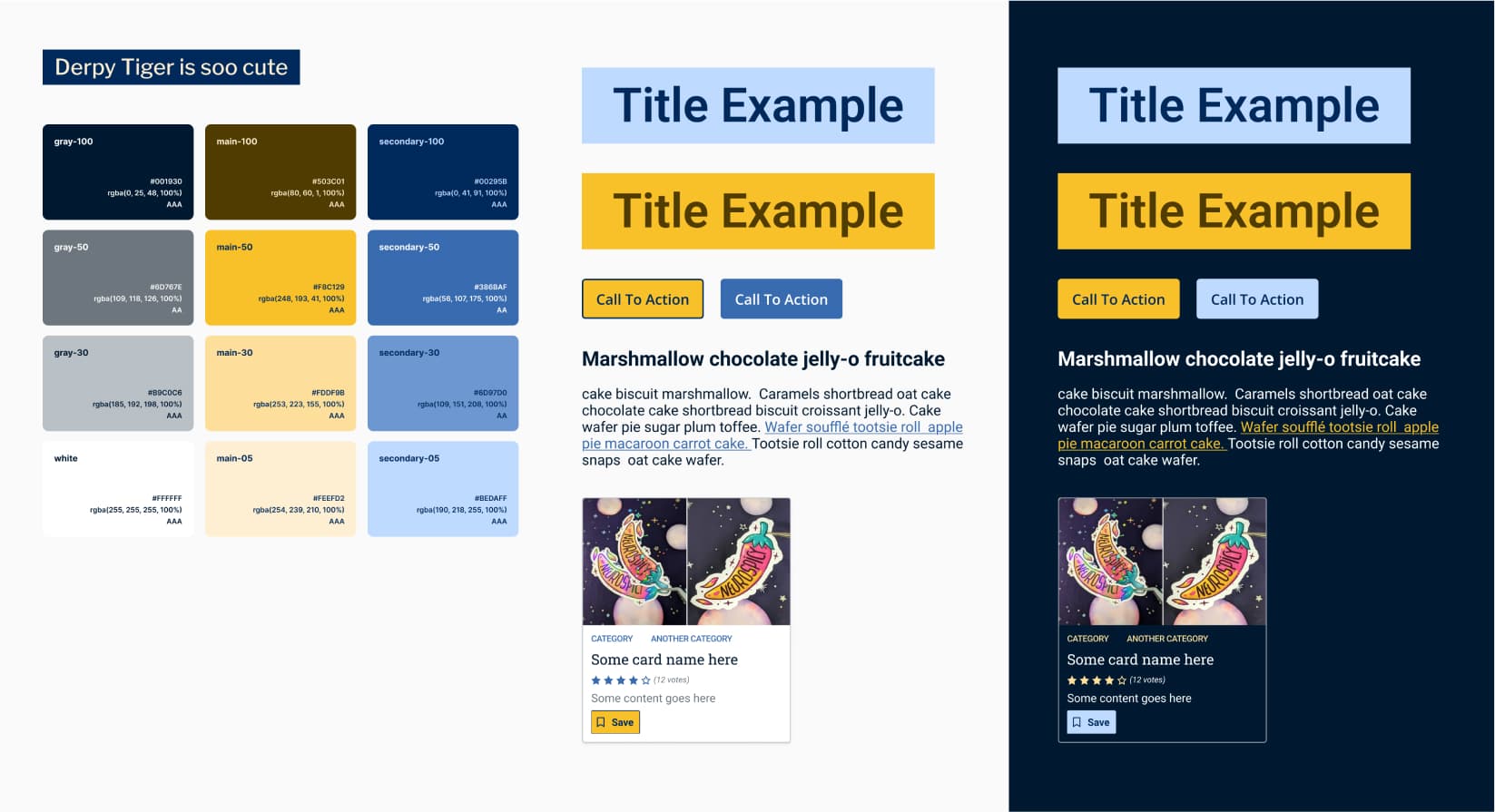
Colors include: #001930, #6D767E, #B9C0C6, #FFFFFF, #503C01, #F8C129, #FDDF9B, #FEEFD2, #00295B, #386BAF, #6D97D0, #BEDAFF.
Orange-leaning yellow with a playful purple inspired by the tiger character from KPop Demon Hunter. A fun, energetic palette with excellent readability. Is I ever draw Derpy tiger and magpie stickers, you know this will be my base!
Rumi, Because I Had To
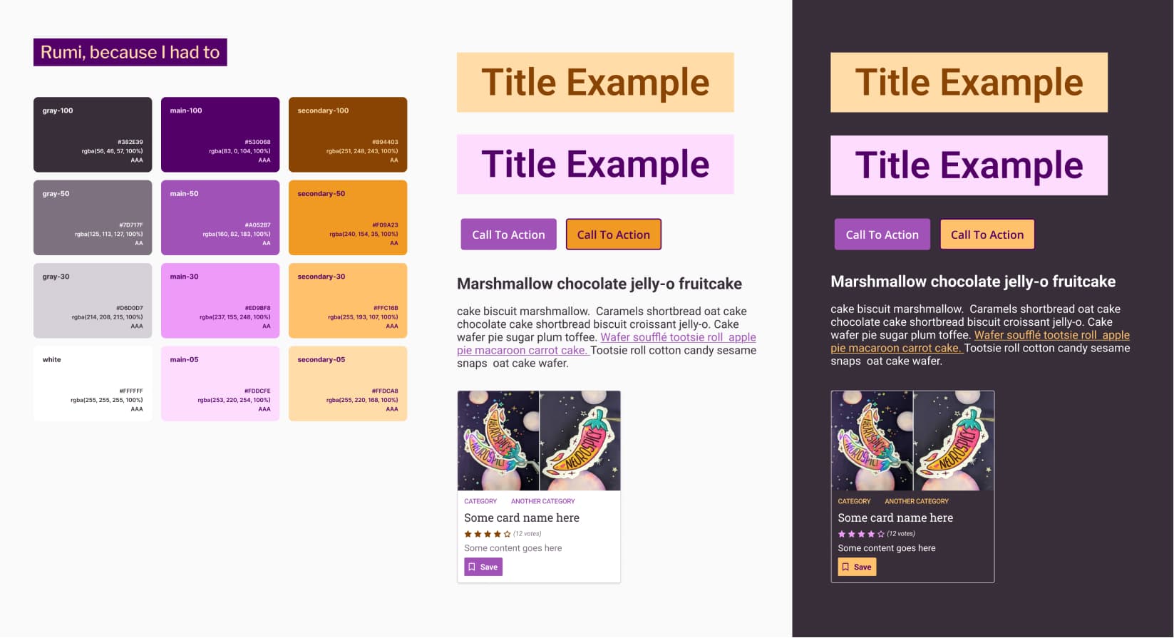
Colors include: #382E39, #7D717F, #D6D0D7, #FFFFFF, #530068, #A052B7, #ED9BF8, #FDDCEF, #894403, #F09A23, #FFC16B, #FFDCA8.
A magenta purple inspired by Rumi’s jacket and hair from KPop Demon Hunter, paired with vivid orang. A distinctive and stylish (just like her look) option that works across light and dark modes.
All usage examples include both light and dark mode, and every combination meets at least AA (sometimes AAA).
Get the free palettes from my shop!
Download all six yellow and purple accessible color palettes as a ready-to-use Figma file, in my UX template shop. Each palette includes WCAG-tested combinations, light and dark mode examples, and variables to speed up your design workflow.
Grab the 6 Color Palettes Figma File
How to Build an Accessible Color Palette in Figma
Wondering how to build accessible color palettes in Figma? Here’s a detailed tutorial on my process, including how I test WCAG color contrast and document combinations for real-world accessible mockups! This is adapted from my Accessibility for designers workshop. If you want the extended version for your team, I do remote and onsite sessions. Reach out!)
I’m going to use my “Stephanie’s Yellow with a vibrant purple twist” as an example here. But, feel free to adapt to your own needs! You can grab this one directly from my Figma Community file.
Video Tutorial
In case you prefer a video format, I’ve recorded a 19 minutes video tutorial.
Step 0: Learn about the WCAG color contrast accessibility criteria
Before we start, if you don’t know anything about color accessibility, please read Contrasts and accessibility: a few basics on color.
Short summary, you for text you need:
- 4.5:1 between text and background for text (strictly) smaller than 24px, or 19px bold
- 3:1 between text and background for text larger than (or equal to) 24px, or 19px bold
The contrast ratio rule also applies to non text elements: graphical objects and user interface components that need to be identified by the user must have a contrast ratio of at least 3:1 with adjacent colors.
And then, you will need your favorite contrast checker. If you don’t have any, I got you covered, pick one from Checking the contrast ratio in your mockups.
Step 1: Start with your 3 base colors
Choose the main color you want to build around. This could be your brand’s primary color. Since yellow won’t ever reach 3:1 on white, I already know I won’t use yellow text on white backgrounds. That’s fine: I can still pair it with darker colors.
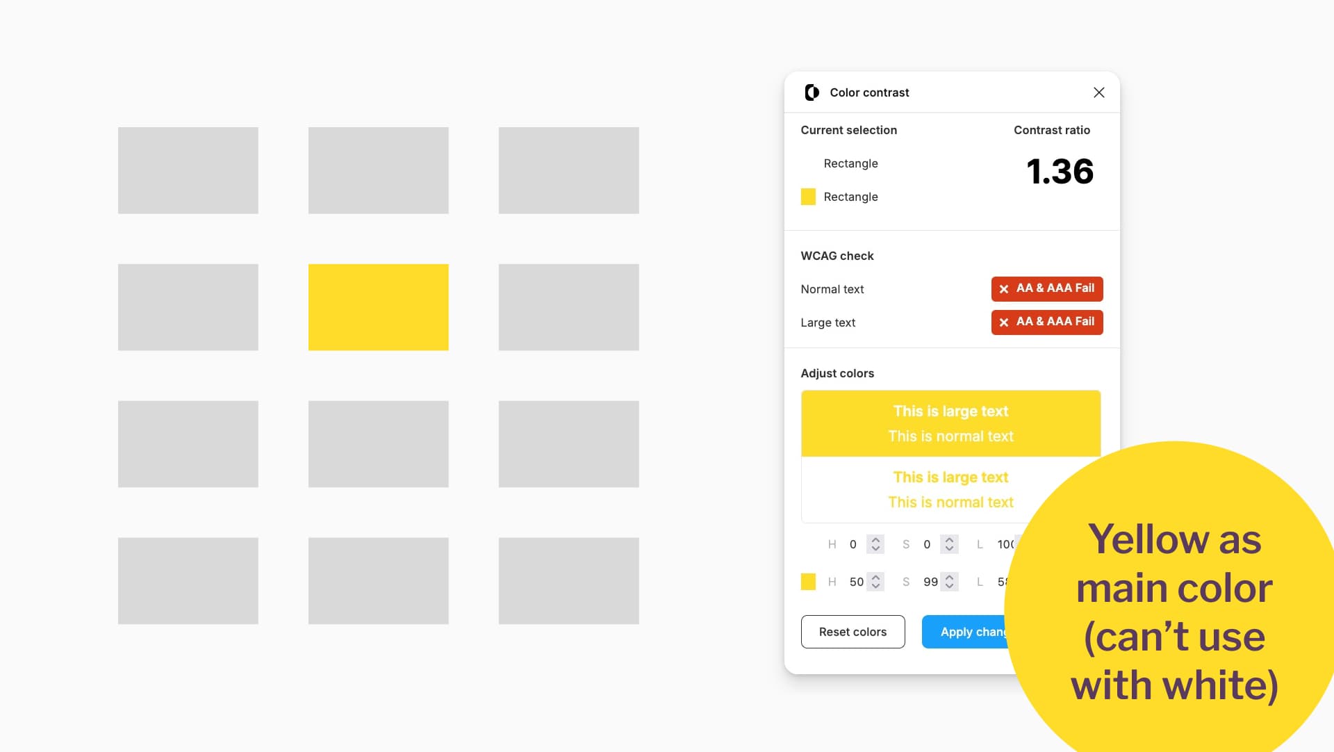
Yellow as main color (can’t use with white)
Next, pick your secondary color. I chose a vibrant purple with blue undertones. This works on white (5.31 contrast ratio), which makes it versatile for text and backgrounds. For example, for buttons.
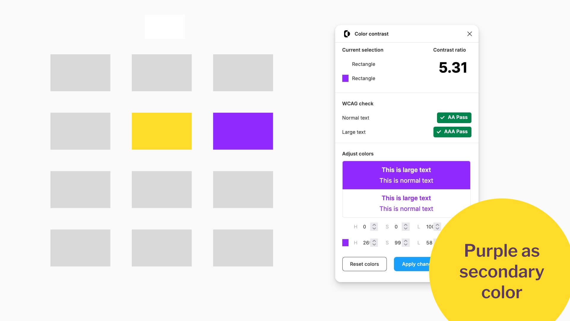
Purple as secondary color.
Finally, create a gray. Here’s my trick: desaturate your main or secondary color until you get a usable neutral gray with at least 4.5:1 against white. This ensures it’s safe to use as text color.
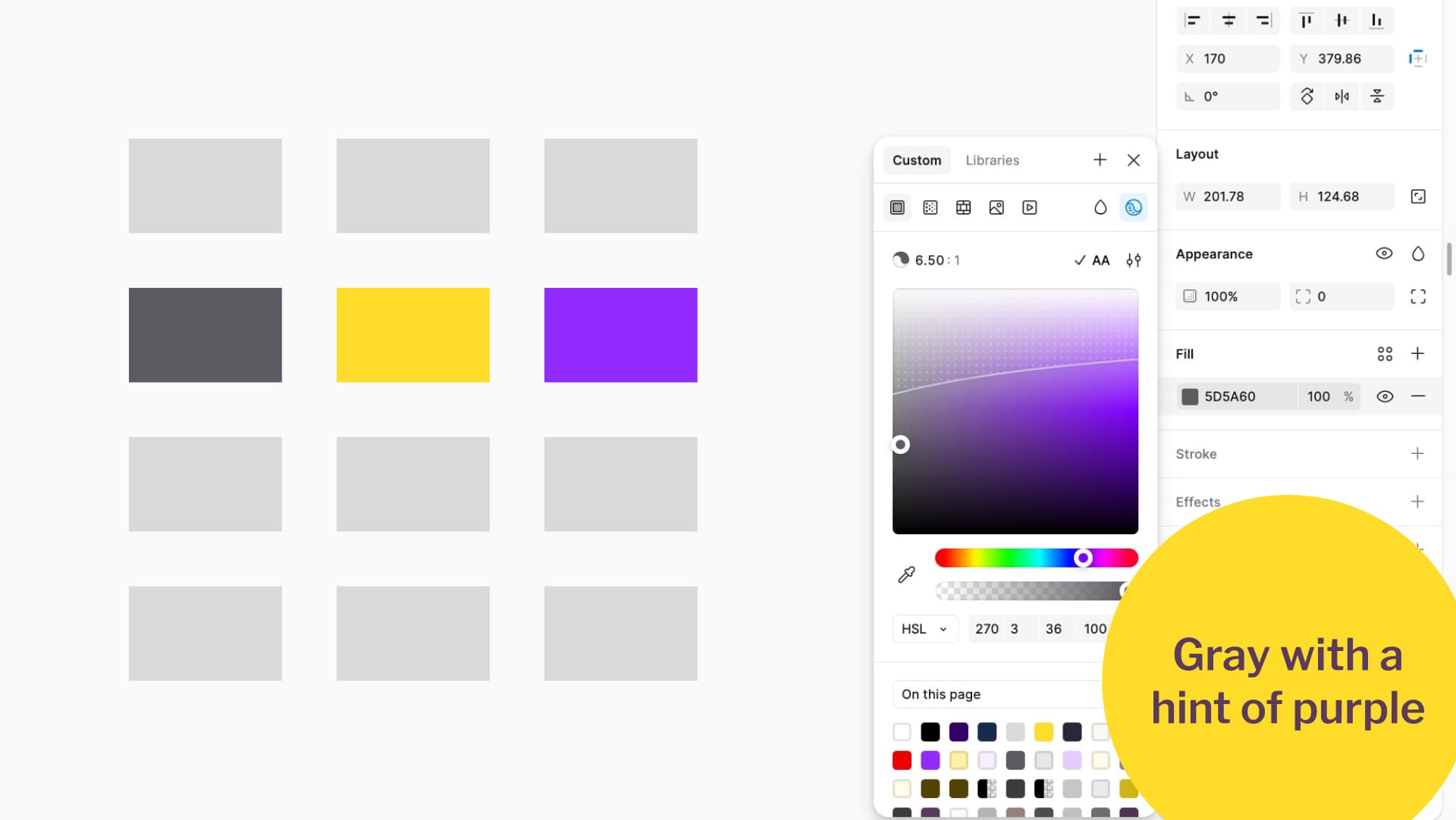
Gray with a hint of purple
Step 2: Create dark and lightest variants
Duplicate your base color and adjust its luminance to create darker and lightest variants. Here comes to tip that will make your life easier later: I always ensure my darkest and lightest versions get a 4.5:1 ratio when paired.
There are several ways to achieve this. Most of the time it involves manual tweaking, generating a color ramp and choosing from it, or a mix of both.
Tweaking the colors manually
To create darker and lighter shades, duplicate your base color. Open the color tool, switch to HSL, and adjust the L (lightness).
I duplicate my yellow and reduce the lightness to make it darker. Then I check the contrast between the dark yellow and my main yellow. I want at least a 4.5:1 ratio so that the two can be used together, especially since yellow cannot be used with white text.
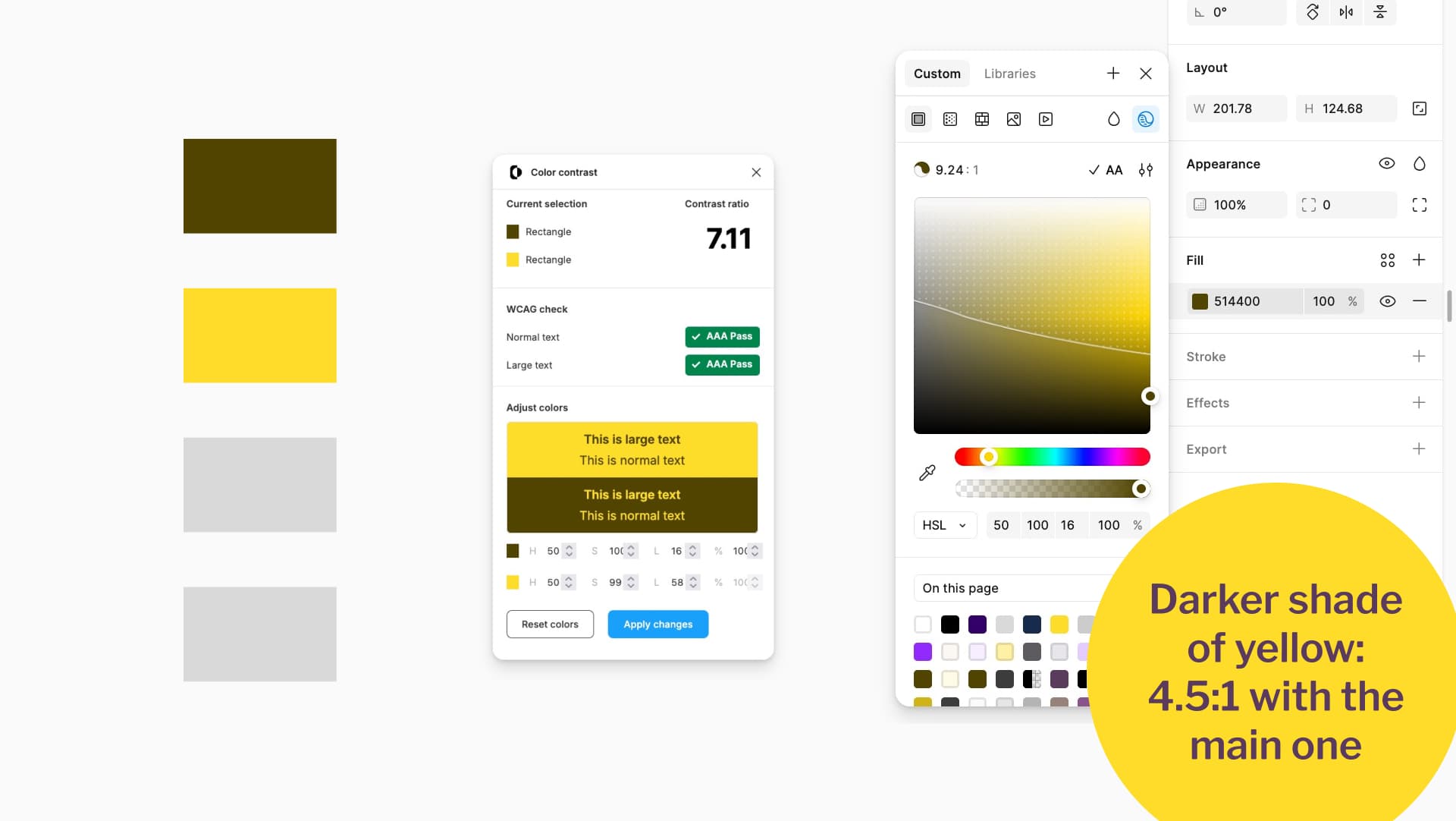
Darker shade of yellow: 4.5 to 1 with the main one.
I repeat the process to create the lightest version of my main color. I duplicate the yellow, increase the lightness until it is very pale, and then check that my dark yellow and my lightest yellow still reach a 4.5:1 ratio together.
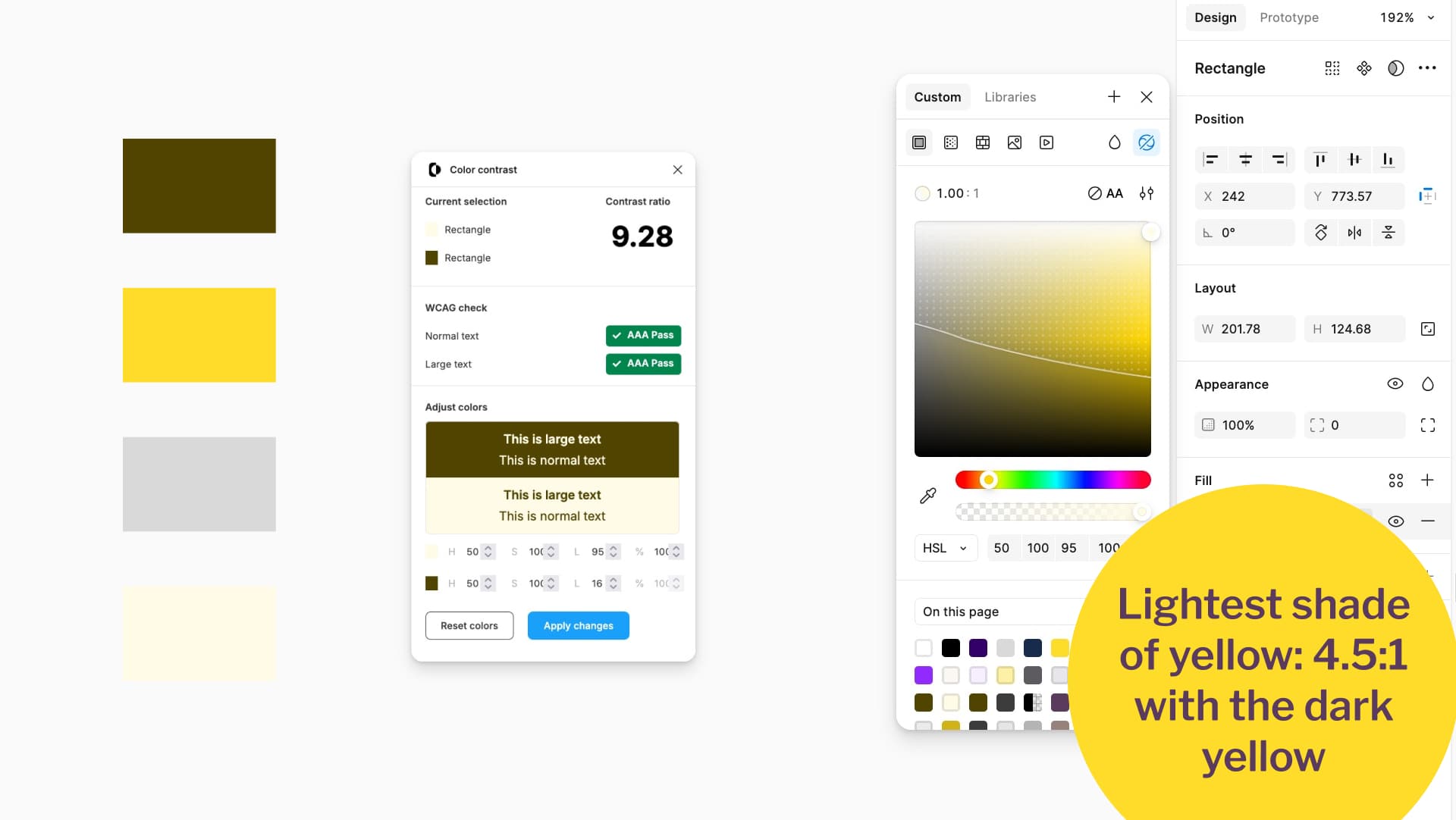
Lightest shade of yellow 4.5 to 1 with the dark yellow.
Figma color picker tips for foreground / background contrast
Figma includes a built-in contrast checker in the color picker. At the time of writing, it is in the top right corner of the color tool. Activate it and set it to Normal text AA.
Draw a square with your lightest color and another with your darkest. Place the lightest square on top of the darker one. Otherwise, Figma will calculate contrast against the frame background instead. I usually make a little sandwich of both colors, one stacked on top of the other. When you open the picker, it shows the contrast against the darker color, and you can tweak it.
Figma only lets you adjust the color in the foreground. To tweak the background, swap the order visually on the canvas (the layer order does not matter).

Figma Color Checker hack sandwich one color on top of the other.
If you are not using Figma, place your two colors in Color.review and adjust them manually until they pass.
Using a color ramp plugin to help you
If you prefer not to tweak manually, generate a full color ramp with many options for each base color, then pick from there. For example, you can use Figma Color Ramps, or the Color Ramp website to generate ramps outside Figma and import them. When I pick colors from the ramp, I always check the contrast between the lightest and darkest options. I want at least 4.5:1. I usually run them through Color Contrast and then tweak slightly if needed. For example, the lightest purple I generated was not quite light enough, so I adjusted it to match my lightest yellow.
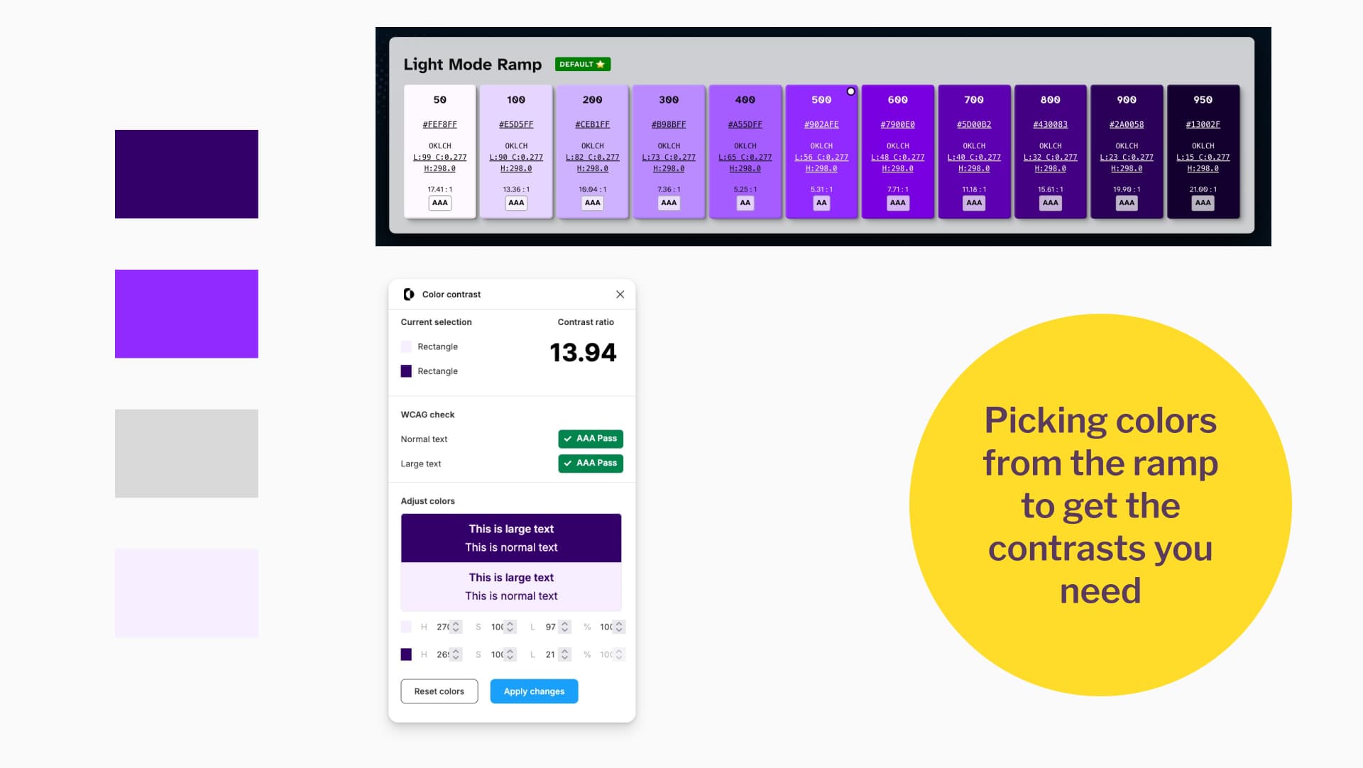
Picking colors from the ramp to get the contrasts you need.
Second pro tip: if your main color is very light (like my yellow), make sure the darker shade of either your main or secondary color has at least 4.5:1 contrast when paired with the main color. That way, you can safely use them together in buttons and other elements.
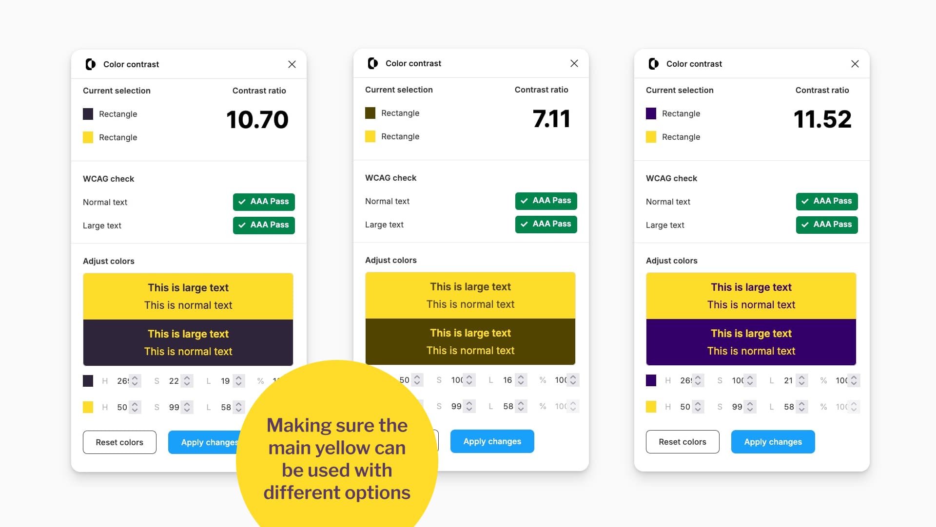
Making sure the main yellow can be used with different options
That is the process. Manually building accessible palettes is mostly a game of checking combinations and making small adjustments as you go. Rinse and repeat for all the colors in your palette. Did I just switch from cooking metaphors to laundry metaphors? Maybe.
For the gray, my “lightest” color is actually assigned to white, so the desaturated gray I created becomes my fourth color.
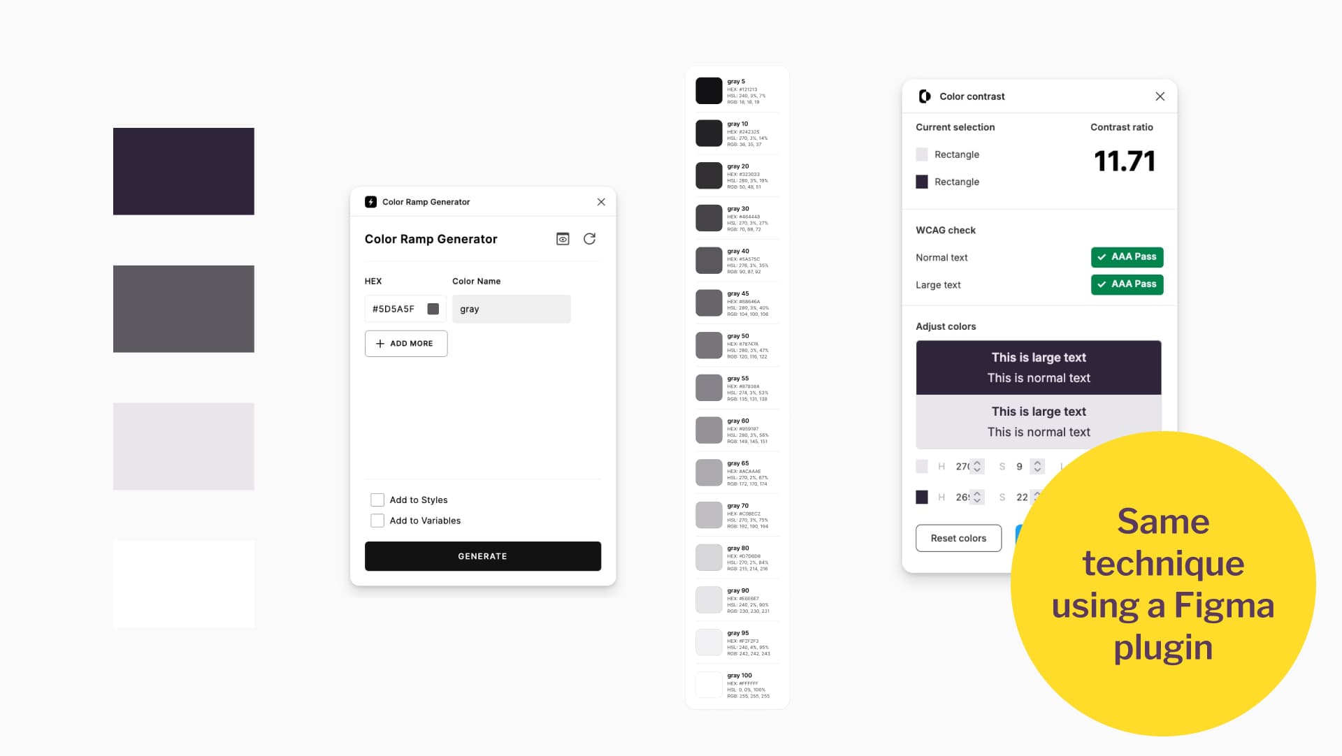
Same technique using a Figma plugin
Step 3: Create a 4th lighter shade (for future dark mode)
Duplicate your main color and make it lighter, but not as light as your lightest version.
Use the same trick as before: ensure this new shade reaches a 4.5:1 contrast ratio when paired with either the darkest version of your main or secondary color, or at least with the darkest gray. That way it can be combined safely in your designs.
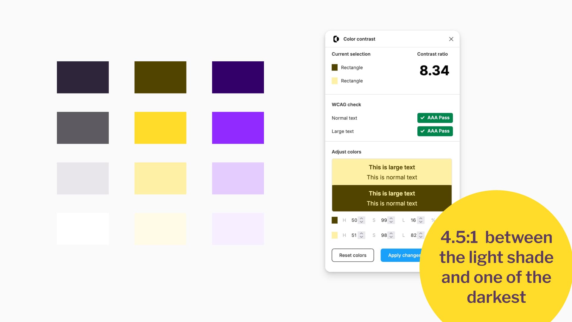
4.5:1 between the light shade and one of the darkest
You can do this with the manual tweaking method and the Figma sandwich trick, or you can pick a shade from the color ramp you already built.
Step 4: Turn the colors into variables
Once you are happy with your palette, convert the colors into variables in Figma. This makes it easier to adjust them later if needed. I use the plugin Color Variables Creator: I rename my rectangles with the variable names I want, then launch the plugin to generate the variables.
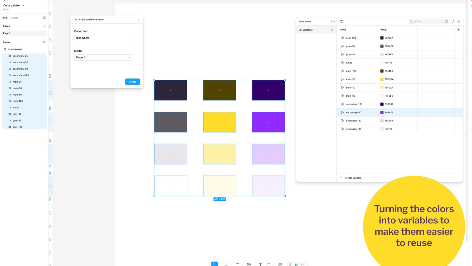
Turning the colors into variables to make them easier to reuse
My naming convention is:
- main-100 for the darkest
- main-50 for the main color
- main-30 for the lighter, in-between shade
- main-05 for the lightest
Choose whatever system works best for you, as long as it is consistent.
Building Mockups and Components with our New Accessible Color Palette
We have our nice palette. We checked that our combinations have enough contrast ratio. It’s now time to have fun, and build some components with our accessible yellow and purple color palette!
Designing a light mode
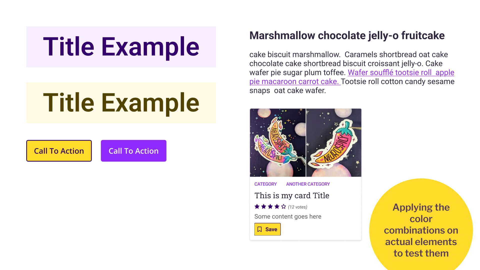
Applying the color combinations on actual elements to test them
Now it is time to apply your shades to actual components.
For example, for some title combination:
- Use main-100 (dark) text on a main-05 (lightest) background
- Use secondary-100 (dark) text on a secondary-05 (lightest) background
Then I can make a primary button:
- I’ll set my main-50 yellow as primary button background.
- I could go for main-100 dark yellow as text. But, in this specific case, the secondary-100 dark purple will also work with it. And, I prefer it visually, I think it brings more dynamism, so we will combine those two.
Then for the secondary button:
- Secondary-50 as background
- White, as text would work. But in this case, secondary-05 work too, and I like it better.
Text is going to be gray-100 mostly, and gray-50 for lighter texts. Links are getting the purple secondary-50 because the yellow won’t work on white background.
From there I experiment with the palette in a small card design:
- The call to action reuses the yellow and purple from the primary button
- Categories are links, so they also use secondary-50
- Rating stars are not clickable, so I use secondary-100 instead. Since stars communicate information, they must meet the 3:1 ratio requirement from WCAG 1.4.11.
Designing a dark mode
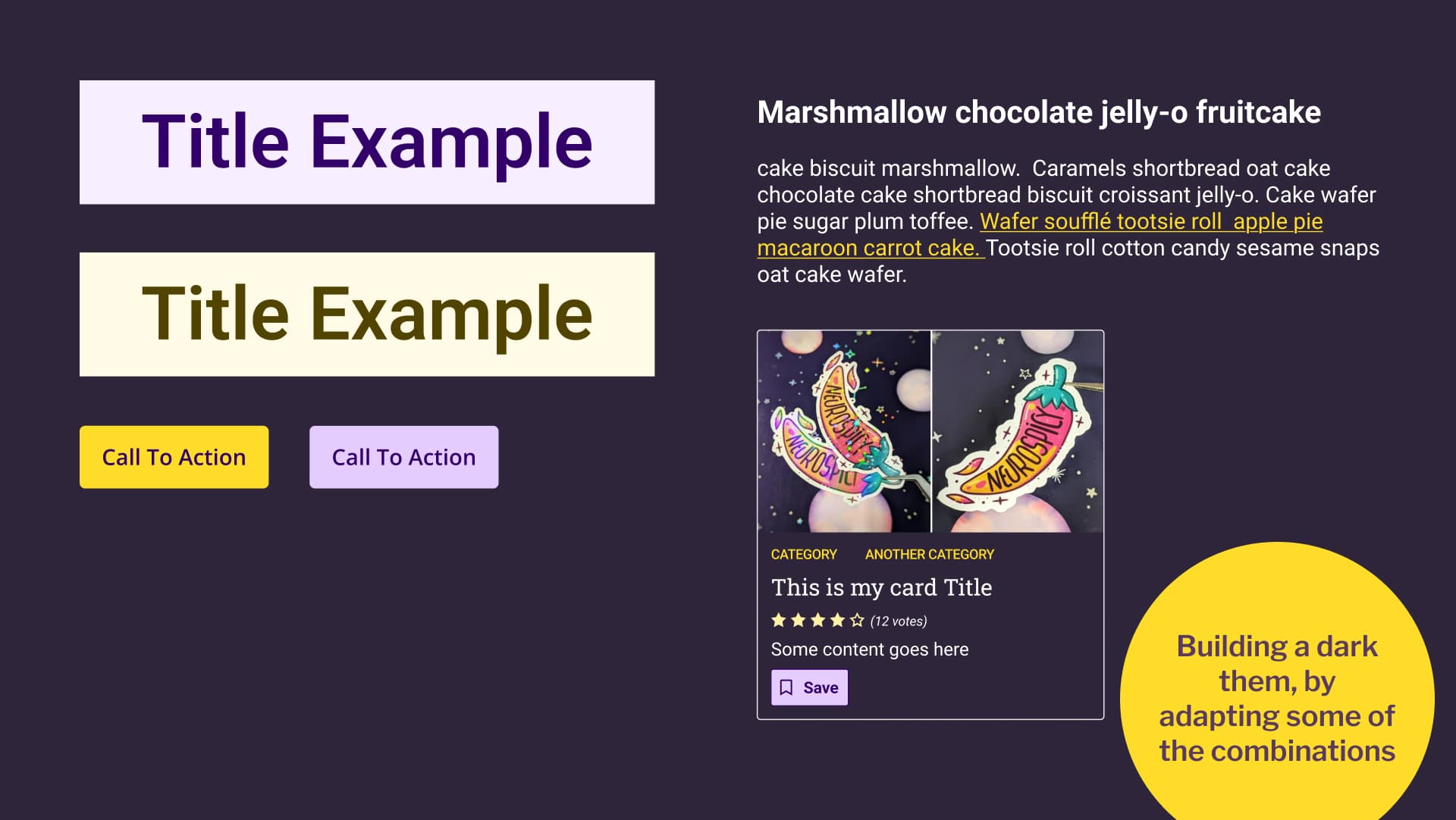
Building a dark them, by adapting some of the combinations
For dark mode, that fourth lighter shade becomes useful. Sometimes the -50 shade is too intense on dark backgrounds, so I use the -30 shade instead for call-to-action elements.
Because secondary-50 purple does not have enough contrast on black for text, I switch to main-50 yellow for links. This keeps everything legible and on-brand.
With these adjustments, the same palette works beautifully in both light and dark modes.
Documenting our accessible color combinations
Document your color decisions so other designers can follow the guidelines and avoid mistakes.
Color swatches with usage examples
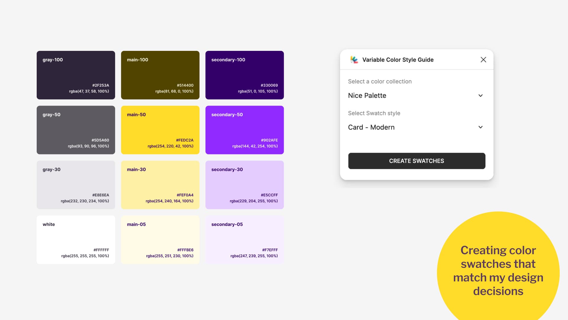
Creating color swatches that match my design decisions
I like to do this in two ways. First, I create color swatches. For that, I use the Variable Color Style Guide plugin. It automatically generates cute swatches from your color variables. By default, it applies light and dark text colors that are not part of your palette. I edit those defaults to match my actual combinations. For example, I set secondary-100 as the text color on top of my -50, -30, and -05 shades of yellow. I repeat this process for every pairing, matching them to the examples I created earlier.
Contrast ratio grid, for further usage
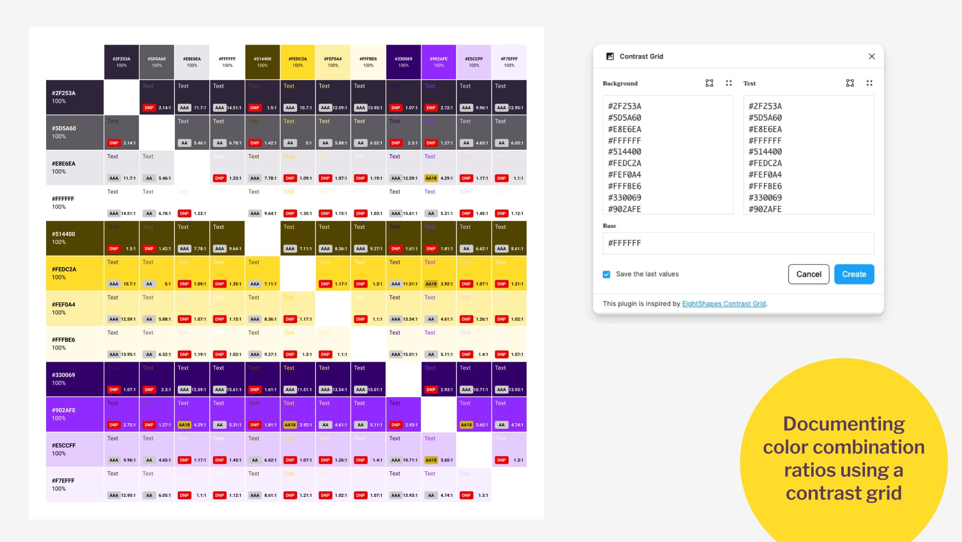
Documenting color combination ratios using a contrast grid
Second, I use Contrast Grid. This plugin creates a grid that shows which colors can be used together and which cannot. It builds a table with your colors as both row and column headers. At each intersection, it displays the contrast ratio. The grid makes it easy to see safe combinations and highlights “DNP” in red (Do Not Pass) when a pair fails accessibility checks.
That is all you need. You now have a complete yellow and purple palette, tested and documented, with examples ready for other designers to use on the project.
Final Thoughts
Next time someone telles you “yellow is not accessible”, send them this article. Colors aren’t “accessible” or “inaccessible” on their own: it’s all about how you combine them.
If you work in design, especially accessibility, you have both the opportunity and the responsibility to create palettes that are inclusive. Accessibility should not be seen as a limit on creativity. It is a design challenge that, with the right knowledge and process, can lead to better and more interesting results.
Yellow and purple, or any other tricky color combination, can absolutely work. The six palettes I shared are only a starting point. By following the process above, you can create something that is fully accessible and uniquely yours.
The full story of the similar color palette.
A LinkedIn follower, who prefers to remain anonymous but works in accessibility, sent me the conference website and explained. They asked if I was involved with the event, because the website’s color palette looked very similar to mine.
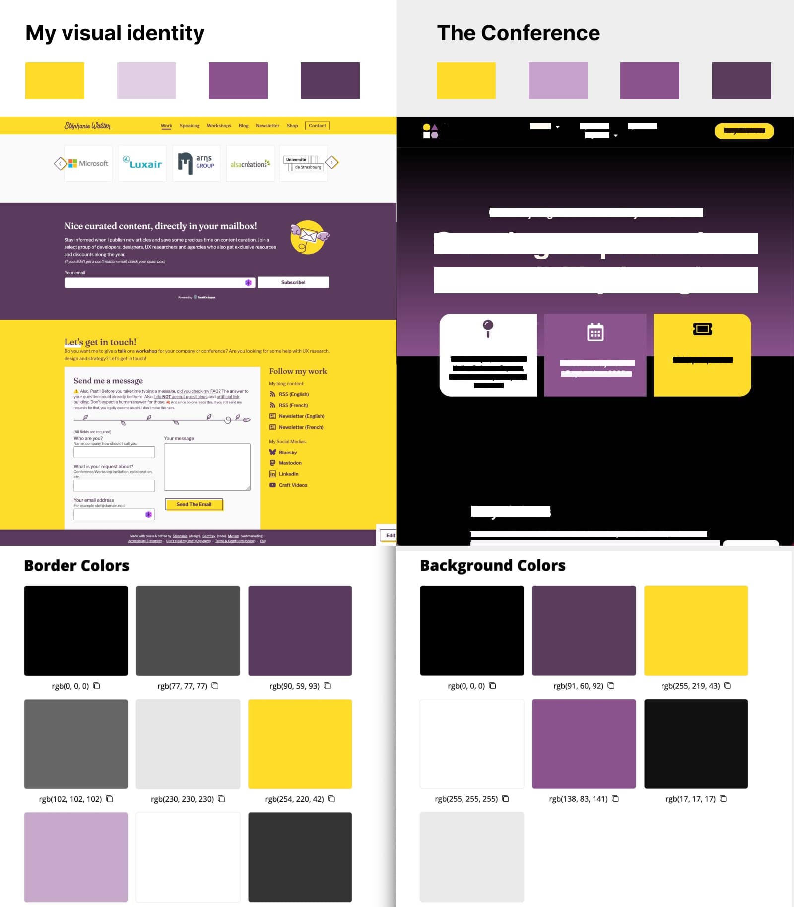
For the record: I am not and had never even heard of the conference. But I have to admit, the similarity was uncanny.
I reached out to the conference. They explained that accessibility palettes can feel limiting, and that yellow, black, white, and purple are often used in the field of accessibility. Fair enough, I guess? They also promised to tweak their colors a bit so that it’s less close to mine.
In the meantime, at least we now have six distinct yellow-and-purple palettes to explore, all tested and ready for prime time. So, I guess, something positive came out of this whole color adventure?
Need more help with accessibility? Get my checklist and toolkit for designers
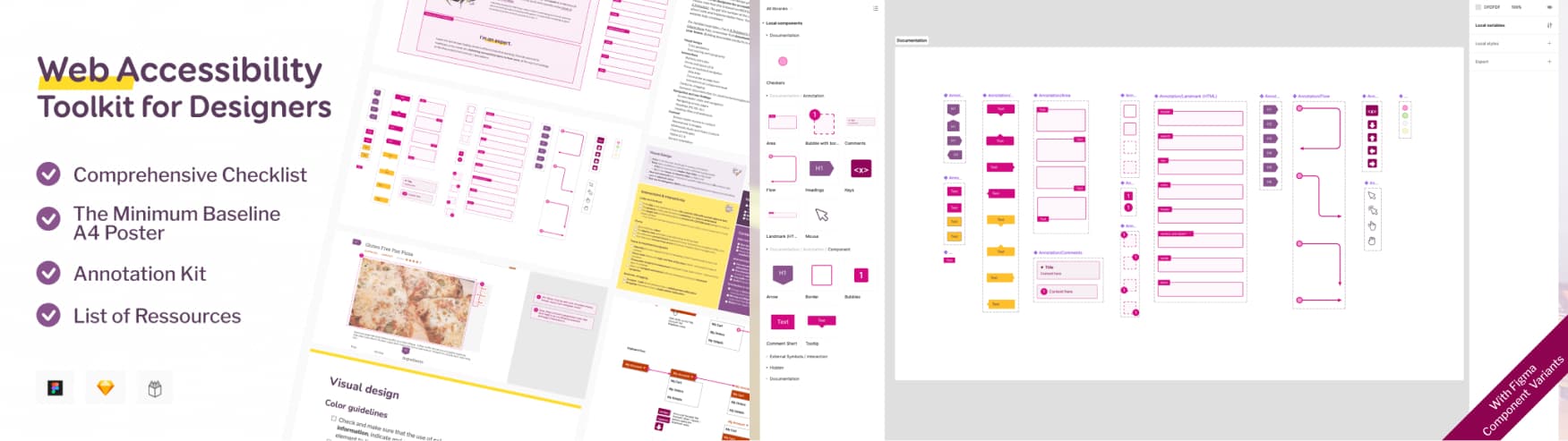
If you want to learn more about accessibility, I’ve built a full toolkit for designers. It contains
- A comprehensive checklist of what designers can put in place for accessibility
- A4 poster of the minimum baseline, that you can print for your office, to never forget about accessibility best practises
- A Figma, Penpot and Sketch accessibility annotation kit, for your mockups
- A giant list of resources and tools, to go beyond colors.
Get the Checklist and Annotation kit
FAQ
Is yellow accessible?
Yes. Yellow on its own is not “inaccessible.” Accessibility depends on contrast ratios between colors. While yellow text on white won’t pass WCAG, yellow can be paired with darker tones (purple, gray, green, etc.) to create vibrant, fully accessible palettes.
Are some colors inherently inaccessible?
No. There’s no such thing as “inaccessible colors.” Accessibility issues arise when colors are combined without sufficient contrast. With the right process, even “tricky” colors like yellow or light purple can be made into and accessible combination.
Does accessibility limit my color choices as a designer?
Not really. What feels limiting is often a lack of knowledge about WCAG contrast rules and accessible design practices. Accessibility is a creative challenge, not a restriction. With the right process, any color family can work.
Can I use the six yellow and purple palettes you created?
Yes. They’re available as a Figma file with variables and usage examples. Each palette is WCAG-tested and works in both light and dark mode. You can reuse or adapt them for your own projects. I would advice adapting them, so that, you don’t end up with the exact same color palette, as someones else reusing them.
What if I don’t use Figma, can I still follow your tutorial?
This whole tutorial is mostly about the process. If you don’t have Figma, you won’t have the plugins. But you can use the same result, using
- Colour Contrast Analyser, in any plateform to check your contrasts, or any contrast tools in Color accessibility: tools and resources to help you design inclusive products
- Color review for the tweaking
- Color Ramp website or any tools in my Dark and light color ramp/scale generator section
- The contrast grid website
Why are you using WCAG2.2 and not APCA?
Before you barge into my mailbox / social media comments demanding why I still use WCAG2.2 and not APCA, read this:
- Adrian Rosseli explained in January 2025 how APCA it’s not part of the WCAG3.
- WCAG 3 is not ready yet. And it won’t be for quite some time. By Eric Eggert.
So, for this tutorial, I’ll stick to the standard.
Where can I learn more about designing accessible mockups?
I run workshops on accessibility for designers where I teach how to integrate accessibility from the start: beyond color, covering interactions, documentation, and testing. You’ll also find my accessibility checklist and annotation kit useful for day-to-day design work.
And, if you need more content on the topic of yellow, I recommend you read:
- The “dark yellow problem” in design system color palettes
- Pantone 2021: Working on an Accessible Color Palette
- wrote a nice LinkedIn post, on how to use yellow as well.
- Color Theory & Palette – Resources and Tools
Is this article just an excuse to put the KPop Demon Hunters songs in people’s head?
Yes absolutely. It’s my contribution to strengthening the Honmoon to protect us all from evil inaccessible color demons! We’re going up up up!!