Pixels of the Week – April 16, 2023
Accessible colors in Material Design, AI dungeon and a Figma cheat sheet for devs
On Twitter, LinkedIn, and Mastodon, I share curated articles I read, resources and tools about UX Design, User Research, UI and mobile design, HTML, CSS, the web industry, some processes, some inspiration, etc. This is an archive of everything I shared this week. And some extra links that I decided to only share for the blog readers. Also, subscribe to the newsletter to get notified when those are published!
Now: what I’m currently up to
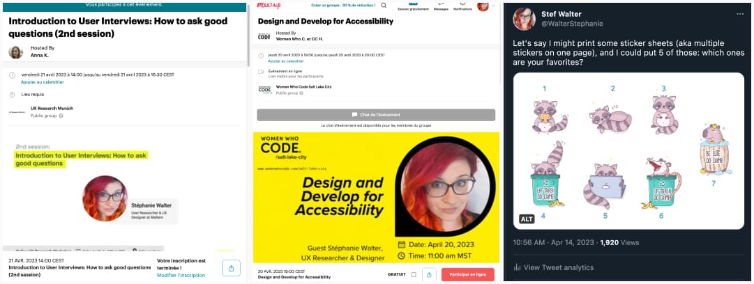
Next week is going to be super busy:
- Monday 17 and Friday 21: I’m doing a 2h workshop on user interviews, and we will use my interview cards to build better interview guides. There might still be some tickets for Friday.
- Thursday: I’m talking remotely about Accessibility documentation for designers Women Who C. et CC H., it’s free and you can register on meetup
On the craft side, I’m preparing a sticker sheet with a couple of the latest little cuties
TL; DNR: the one you should not miss
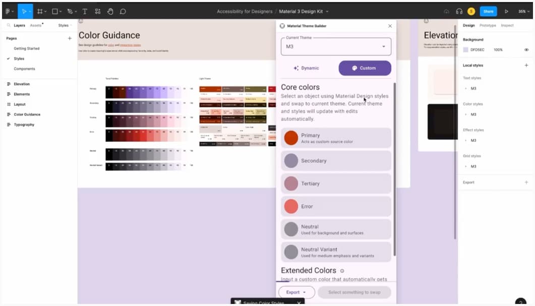
Material Design has awesome tools to help you build accessible palettes for native apps:
You then get fully customized components, with colors already calculated to have a sufficient contrast ratio.
Interesting articles that caught my attention
UX research, design and handoffs:
- Use your time wisely between conducting user research sessions: you won’t spend 100% of your time doing research, Michele gives you 16 ideas of what to do between sessions.
- Tips for early career UX researchers that are not taught in school: learn to explain your job to non-researchers, link UX to business values, prioritize foundation skills over tools, and network. I’m not convinced about the 1-page CV advice though, it really depends on the country and the amount of content you already have. If your 1page CV is crowded and hard to read, people might not even want to read it.
- Everybody Lies. Your Users Too: watch what people actually do (not just what they say they do), be critical about what they say they don’t, don’t believe when they predict future behaviors.
- 3 interesting articles on the idea of “no-handoff”:
- Ending design handoff: this is our fight that inspired The Best Handoff Is No Handoff: I like the approach of a more agile and collaborative way of working, back and forth, with developers and building the product together. For me, it doesn’t mean “no mockups and no documentation”, but being smart about it, having more communication with dev teams to avoid the “designer in an ivory tower designs something and sends it to devs who do what they can”.
- Why do they ignore my awesome design documentation? Avoid documenting in silos, involve the teams, measure success, communicate and collaborate, and choose the right tool with your team
- The Age of the App is Over: interesting thoughts on how users want to accomplish tasks, reach a goal, our apps are just small parts of a whole process. And the need to have a more centralized way to do that. This is about mobile apps, but I see the name needs in desktop apps (or web apps), especially in enterprise UX where the number of tools multiply every day and users are lost, needing to jump through a lot of tools and places accomplish one specific task.
Disability and accessibility reads
- 10 Ways Designers and Researchers Can Meaningfully Engage With Disabled People: involve them from the beginning, design against (ableism) instead of for or with disability, think about power dynamics, stop ignoring invisibilized disabilities, think about accessibility in terms of time and energy (not just space and matter), offer remote and asynchronous facilitation, be deliberate about how you categorize disability, reach to people who are often left out, make design process mutually beneficial, stop relying on traditional networking to reach out to disabled people
- What we’ve learned about designing for accessibility from our users: how slack involved screen reader users to test the interface and listened to their feedback to improve it
- Designing for colorblindness: “the most frustrating thing about these accessibility issues — they’re very much avoidable!”, how a colorblind person actually experiences the world
- The disabled villain: why sensitivity reading can’t kill off this ugly trope: for centuries, fictional narratives have used outer difference to telegraph inner monstrosity. As someone who uses a wheelchair, I’ve learned you can’t just edit out a few slurs or bad words to fix this – it’s often baked deep into the story
- NNg’s 10 Usability Heuristics and WCAG 2.1 guideline – good news: if you already follow Nielsen’s 10 heuristics for your design, you might already be compliant with a lot of WCAG 2.1 guidelines
More AI articles
- AI Chatbots Don’t Care About Your Social Norms: an analysis on how human conversations works, how we are hold accountable for lying, the lack of it in chatbots and why we shouldn’t anthropomorphize them
- AI and the American Smile: an interesting read on how AI misrepresents culture through a facial expression. Yet, biases, again, and again.
Curiosity cabinet: non-design/tech rabbit holes I enjoyed
Why Does Every Animal Look Like This? Why most animals have a dark top and lighter bottom, and the concept of counter shading
Inspiration: fun experiments, beautiful art, and great ideas
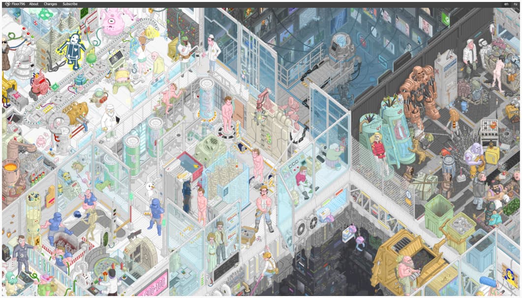
Floor796: Floor796: an ever-expanding animation scene showing the life of the 796th floor of the huge space station, full of pop culture reference. What an awesome eye candy. Don’t forget to click on the little characters to get some references (trigger warning: giant animation that might trigger motion sickness)
Useful tools & resources that will save you time
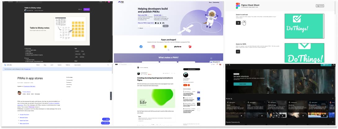
- Table to Sticky notes: a figjam plugin that lets you copy/paste tables from Excel to Figjam, then turn them into lists of sticky notes
- PWAs in app stores: did you know you could use PWABuilder to generate a package to share your PWA on Google play, Microsoft and Apple Store?
- Creating stunning liquid animation in Figma: for all my lava lamp effect fan friends (don’t judge us), you can use the blurry technique to achieve those fun effects in Figma too
- Figma Cheat Sheet: a very useful list of tips and shortcuts to help your dev team get the best out of the Figma inspect mode!
- AI Dungeon: a fun way to play and create AI generated Dungeon style adventures, scenarios, worlds, etc. Wait, will AI replace our Dungeon Masters?
Videos
- Artificial Intelligence: John Oliver made a nice video on artificial intelligence, including some issues with biases.
- The beautiful, hilarious surrealism of early text-to-video AIs: the fast and furious movie generated by AI is chef’s kiss, please Netflix, make that movie?
Tutorials
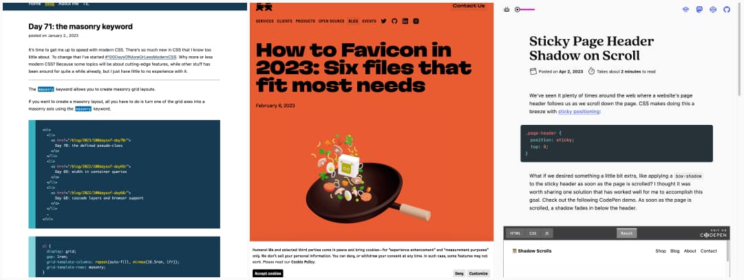
- Day 71: the masonry keyword – Remember when we used to need tones of JS to get masonry? Well, we won’t anymore, one line of CSS my friends: grid-template-rows: masonry; (only supported in Firefox but I have hope it’s coming)
- How to Favicon in 2023: Six files that fit most need: it’s 2023, time to update your favicon stack! (or just use realfavicongenerator.net)
- Sticky Page Header Shadow on Scroll: a fun effect that reveals a nice gradient when you scroll down the site


