Pixels of the Week – January 27, 2025
Better design tools for Accessibility, the UX of login codes & some Kirby fun
My curated weekly-ish online newsletter, where I share interesting articles, tools, and resources I found during the week. You can expect content about UX, design, user research, accessibility & tech, but also some processes, some inspiration, sometimes books, and a couple of videos and podcasts. Also, don’t forget to, subscribe to the newsletter to get notified, you will get the weekly links directly in your mailbox, and be notified when I publish other articles.
Now: what I’m currently up to
This week has been chaos, and I’ve honestly forgotten or underestimated how long it takes to record “short” videos for my Accessibility for Designers workshop class, but, it’s progressing. Yeahy! I’m still debating if the quality is “good enough” for a “video on demand course”, so I might end up asking for beta-testers. If you are interested in getting more information when it’s ready, please fill this form.
Also, it’s official, I’ll be the keynote speaker with the awesome Venessa Bennett at UXLibs 2025, in June in Liverpool! Get your tickets.
Most popular content this week
To Create More Accessible Outcomes, We Need Better Design Tools (12min) Nik Jeleniauskas explores some interesting ideas on how Figma could improve to help designers build more accessible products. This would include, for example: have properties for non-visual information built in the tool (semantic roles, accessible names, and behavior properties, etc.), adding accessibility simulation, extending the prototyping options to more real world behavior like focus, etc. He also created a prototype of how this could work in Figma.
Shameless plug: until Figma decides to add such things, you can do a lot with plugins and documentation, and, I got a whole talk and article on it: How to check and document design accessibility in your mockups, using Figma plugins and annotation kits.
Last but not least, Eric Bailey wrote Accessibility annotation kits only annotate, an excellent article on how annotation kits can be a useful tool for communicating intent about how an interface should be operated. But, they might also cause more harm when misused, where they fall short and how to overcome the limits.
Interesting articles that caught my attention
- Redefine Your Design Skills to Prepare for AI through automation, augmentation, AI will help us expand our capabilities as designers. This means, as designers we will need to be able to adopt more strategic thinking. But, don’t only rely on AI, scrutinize it outputs. Pablo Fernández Vallejo also predict that boundaries between team members will get more blurry and designers will need to learn to do data analysis, while devs might craft UIs. Let’s see, shall we?
- Stop Trying To Schedule A Call With Me (8min) a humorous tale of SaSS companies, harassing developers to get them to use their products, by Mathew Duggan. Yup, ring many bells, I got the same ones as a designer. Some UX tool company called me, on my client phone. I didn’t even know I have a phone number there. They called reception and convinced them to forward the call to me. Wow.
- What People with Disabilities Should Do as DEI Programs Begin to Disappear As companies scale back DEI programs, employees with disabilities can protect their rights and ensure workplace stability by documenting feedback, formalizing accommodations, and building external support networks. These changes are discouraging. But, don’t forget that the disability community is strong, and collective advocacy can help maintain progress toward inclusion and equity despite shifting organizational priorities.
- Prescriptive and Descriptive Information Architectures (8min) Jorge Arango introduces the idea that your architectures as on a continuum between fully prescriptive and fully descriptive. Most architectures are often closer to descriptive. A descriptive approach reflects users’ existing language and helps with clarity and usability. A prescriptive approach would use terminology based on organizational goals, but might sacrifice user’s familiarity.
- The UX of login codes (5min) Brad Frost expresses different frustrations users have with login codes, from text never coming, to impossibility to copying and pasting, etc. Balancing security and UX isn’t easy, but, let’s try to make this better, shall we? On a personal note, I would add “always offer a plan B, and C. I was in a situation where I changed my phone number, I tried to remember everywhere where this was used as 2-factor authentication, but missed one. A year after, I’m locked out of a product that used that phone number (forgot about it), with the only option of “call customer support” to help me. They could have implemented an option to retrieve it via email, or another way. But not, good old “call us”. Very frustrating.
Inspiration: fun experiments, beautiful art, and great ideas
- kirby vs. this blog post haaa, a fun little kirby eating the whole blog post. Careful, might trigger motin sickness.
- For my pixel art lover friends: 1 bit a day, a daily challenge that prompts you to create a monochrome drawing. And you can check what other people drew with that prompt.
Useful tools & resources
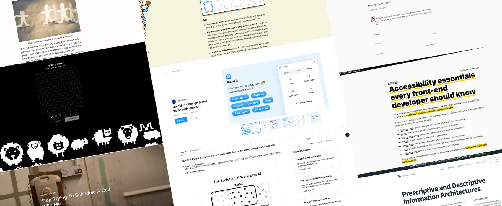
QuickFill is a Figma plugin that gives you fake lorem, text and image content for your mockups. I usually prefer to design with content, as close as possible in size and structure to the real one. But, it’s not always possible.
Tutorials & guides
- Comprehensive Accessibility Checklist for Web Projects (9min) an introduction to the basics you can put in place to make your website accessible. Be careful with dyslexic fonts though, not every dyslexic person is able to read those, so, let the users chose.
- Accessibility essentials every front-end developer should know (14min) for more technical accessibility, a tutorial on the basics for developers, from semantic HTML to modals, forms and beyond, by Martijn Hols