Pixels of the Week – July 17, 2022
Every day, I share on Twitter and LinkedIn a list of curated articles I read, resources and tools about UX Design, User Research, UI and mobile design, HTML, CSS, the web industry, some process, some inspiration, etc. This is an archive of everything I shared this week.
#Now – what I’m up to
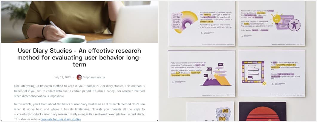 This week, I wrote about “User Diary Studies – An effective research method for evaluating user behavior long-term” on the condens blog. Bonus: there is a little template at the end to help you with your own studies! I also had a few A6 illustrations printed ^^
I updated my homepage with a new “Enterprise UX” bloc and had a lot of fun with the responsive version. Also, I forgot to tell you, there is now an easter egg on my homepage. If you find me, send me a fun tweet to let me know you did (but don’t reveal it).
Last be not least, I see more and more of those redesigns that are pixel eye candy. I wrote a little thread about it on Twitter:
When you see one of those “UX redesign” case study to “make it better” I want you to have some critical thinking. Ask yourselves “did that person think about / try to take into account the actual usage of this, the business and technical constraints that might exist
For example
- Wikipedia redesign: did this take into account that a lot of Wikipedia is edition and not just displaying content?
- Airplane ticket: did it take into account that those need to be printed on super old machines and the information on them is highly standardized?
- Amber/natural disaster alert: did it take into account that those are also displayed on old feature phones and all sort of phones that might not have fancy capabilities?
Design without taking into account the constraints behind a tool or a system is fun, nut not realistic
TL;DNR the one you should not miss
#Inclusive Design
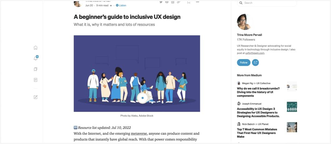
A beginner’s guide to inclusive UX design, what it is, why it matters and lots of resources by Trina Moore Pervall. I really love how she explains the difference between accessibility and inclusive design as well.
Interesting article
#Accessibility
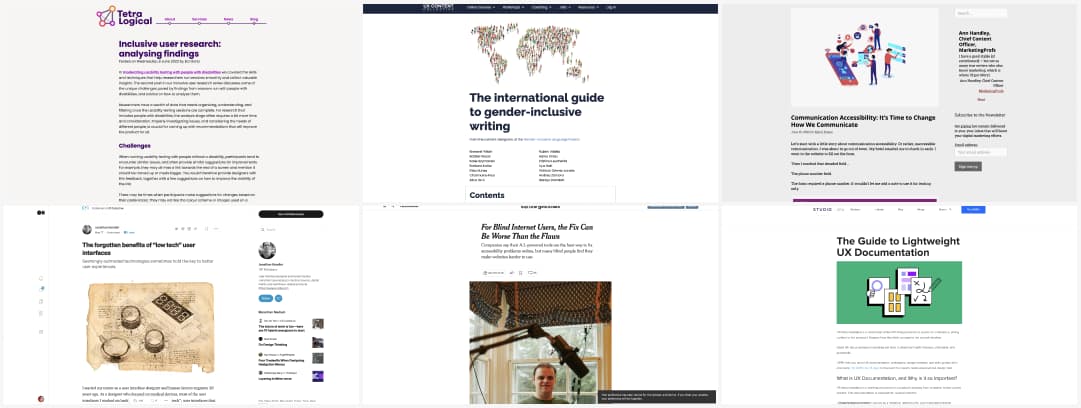
- Inclusive user research: analyzing findings: great feedback on how to analyse usability testing sessions with disabled people
- A little help understanding the WCAG SC 1.4.4 Resize Text & 1.4.10 Reflow success criteria
- “That’s not accessible!” and other statements about accessibility. Interesting idea to see accessibility as a spectrum to make it again about how people can or cannot use a website. People first mindset
- Criticism of overlays has made mainstream media! For Blind Internet Users, the Fix Can Be Worse Than the Flaws – The New York Times
- Communication Accessibility: It’s Time to Change How We Communicate. Accessibility should not be a work-around or a hack. This articles describes many frustrating situations where that deaf person had communication issues and how they solved those and gives examples of built in good communication alternatives
#UX Documentation
The Guide to Lightweight UX Documentation. An interesting guide to help you decide what and how to document your UX work. The main rule, like often with documentation, is to understand the target and document accordingly
#UX Research
Obtaining Consent for User Research – Better designs should never come at the cost of another person’s well being. Informed consent is a fundamental part of an ethical research program, which respects participants and protects them from harm.
#CallToAction
The “Would you like to? / I would like to” test, and interesting test to evaluate buttons in your interface
#Inclusive Language
The international guide to gender inclusive writing
#Low Tech
The forgotten benefits of “low tech” user interfaces. An interesting read on the many benefits of low tech interfaces. Sometimes, it might start as a constraint, but not having a fancy touch screen for a product doesn’t stop your from bringing a good experience for users
#Psychology
What is the Endowment Effect, why do people over estimate the price of a house they are currently living in and how this one is used to persuade you to buy more
#CSS
“Masonry? In CSS?!” that would indeed be awesome
#Strategy
Interesting thoughts by John Cutler: Why Most Strategies Lack Clarity
Inspiration, fun experiments and great ideas
 #Fun Demo
What’s a better way to read privacy policy than with a fun mouse elevator and a little music. I just love when people do fun silly things with technology.
#Maker #Fun
Ha, this is amazing (and proof that cats will do whatever they wanna do): I Built a GIANT Cat Food Marble Run!
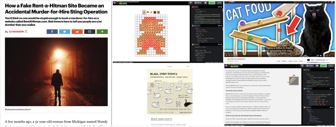
#Fake Site
This is all sorts of levels of strange, creepy, and, wow. “I wanted to make this Web site so glaringly obvious to the normal user that this is a parody…(…) Yet people have gone to the Web site and solicited to have other people murdered.” How a Fake Rent-a-Hitman Site Became an Accidental Murder-for-Hire Sting Operation
#Biases
The black swan event: “One single observation can invalidate a general statement derived from millennia of confirmatory sightings of millions of white swans. All you need is one single black bird.”
#Fun
A mario created in checkbox accent colors. why? Because we can and it is awesome. By shshaw
Useful tools and resources that will make your life easy
 #Sounds
“Like Spotify, but for natural soundscapes” is a nice tagline for a tool that lets you explore the world through a map of different sounds in the nature
#Illustrations
Illustrations has now a figma plugin, this is really nice
Tutorial
#CSS #DarkMode
Nice read, and I 100% agree, not everyone enjoys dark mode, let the user chose: The Complete Guide to the Dark Mode Toggle
#Accessibility
“Are you sure that’s a number input?” Haa one of my big pet peeves is when people use input type number on credit cards. You don’t want to increment that number, right? Then you need inputmode=numeric instead!
#JS #API
“Stop The Screen Going To Sleep With JavaScript“. I could totally see that on a cooking site (with a toggle maybe), that’s a cool little API right there
Conferences and Workshops
#Accessibility
This week, I also attended Alexa Heinrich’s workshop on social media use and accessibility, so many interesting tips. The slides are here. I also really like her 3 arguments to convince people to make sites accessible:
- Compassion: it is the right thing to do
- Marketing: because you will reach a wider audience
- Fear: because if you don’t, you might get a sued (in the US)
Videos
#Maps
Awesome 7 minutes videos on how old maps where created
#Strategy
Interesting video on the difference between a plan and a strategy