Pixels of the Week – March 17, 2024
The work beyond the work, RAS syndrome & how to interrupt people
My curated weekly-ish online newsletter, where I share interesting articles, tools, and resources I found during the week. You can expect content about UX, design, user research, accessibility & tech, but also some processes, some inspiration, sometimes books, and a couple of videos and podcasts. Also, don’t forget to, subscribe to the newsletter to get notified, you will get the weekly links directly in your mailbox, and be notified when I publish other articles.
Now: what I’m currently up to
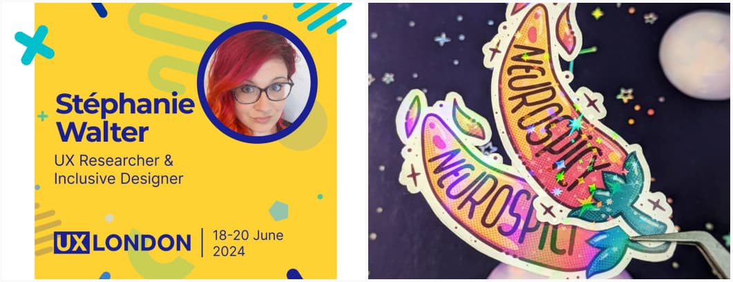
I’ll be running a workshop at UX London on 18 and 20 June. The workshop doesn’t have the schedule announced yet, but, it will be an information architecture workshop, to help you plan and build more reusable components and pages. You can get different tickets that give you access to different days.
On the craft side, I’m back to making stickers, are you ready to spice up your world? I’m bringing Neurospicy mayhem with some brand new stickers. This is a collab with Myriam Jessier. For now, I’ve only run a first print test and need some adjustments. Also, I finally got to use the halftone brushes I’ve been hoarding. They are available as pre-order in my shop. I’m also checking for other format, maybe A5 print (riso, lino, who knows?). Check them on TwitterX, Mastodon, LinkedIn, Bsky, or enjoy the video with the Spice Girls song on Instagram.
Interesting frameworks and concepts
RAS Syndrome: what does a PIN Number and a PDF Format have in common? They both suffer from RAS Syndrome, also known as Redundant Acronym Syndrome. It’s when an acronym is followed by a word that is also part of the acronym, and there’s quite a couple of them.
Most popular content this week
The work is never just “the work” (12min) the actual “work” you have to do, is just a very small part of a whole invisible set of a project. There’s the world around the work, to get the work, before the work, between the work, beyond the work, outside the work, etc. It makes it hard sometimes to estimate it all. Dave Stewart has an interesting framework to help you estimate it more accurately. Continue the conversation on LinkedIn, TwitterX and Mastodon
Interesting articles that caught my attention
Design and UX research
- 90% of designers are unhirable? (13min) The title is a little bit too sensational for my taste, but the article is interesting. Matej Latin explains that most design portfolios show the perfect cookie-cutter linear process, the perfect project, following the same recipe. This doesn’t reflect real life messiness and won’t help you stand out. He suggests to instead, focus on telling a genuine story, include the messy details, show how you solved something and tell an actual story, using the STAR framework (situation, task, action, result)
- How personal should personalization be? (7min) what are the limits of AI personalization, what is creepy and what is not. At the core of the ideas: be transparent and ask consent!
- 7 Insights for Navigating B2B Design (10min) Enterprise UX designers, unite! Pat presents 7 Insights for Navigating B2B Design, that I honestly wish I had at least heard of, before starting working for enterprise and B2B products.
- Bold visual styles are hard to use (5min) Having a bold visual style (expressive aesthetics, eye-catching imagery, saturated colors, high contrast) sounds cool, but it might be harder to pull it off than you think. Anthony Hobday list a couple of them: it’s hard to direct user’s attention when there are too many bold elements, coherence is harder with bold elements, if bold elements don’t work with consistency, try subtle ones, bold visual styles make people uncomfortable
- UX, Stop Believing The Gaslighters (8min) Debbie Levitt urges UX practitioners to be careful when they see the whole “UX researchers are not strategic enough, and failed to deliver real business value”. This is often gaslight and we need to challenge those narratives and stop perpetuating such harmful beliefs within the UX community.
- AI and Design Systems (14min) from writing component code to translating components into other frameworks, writing unit tests or documentation, Brad Frost has ideas on how AI can help you with your design system
Accessibility
- A Web Designer’s Accessibility Advocacy Toolkit (22min) Yichan Wang wrote an amazing guide to help you advocate for accessibility. She covers how to show your expertise as an advocate and help clients understand why it’s important, how to align with client goals, what are accessibility benefits, and how to define accessibility in the project scope. She offers some answers to a couple of the most common questions we get, that can help us address clients’ concerns around the topic. Finally, she explains how to leverage user research and manage incremental changes to push accessibility in the long term.
- What is Inclusive Design, and How Does it Relate to Accessibility? – Part 1 and Best Practices for Inclusive Design – Part 2 (10min each): 2 interesting articles to help you understand how inclusive design and accessibility are connected, and what you can do to design inclusive digital content that provides the best experience for people with disabilities (and other groups too).
- Difference between the accessibility page and the accessibility statement (5min) quick summary of the difference, why you need both with a clear example.
The other interesting articles
- The quiet, pervasive devaluation of frontend (18min) Josh Collinsworth noticed a trend: CSS and HTML are often dismissed as real language, in a whole industry where we prioritize speed and “good enough” over quality and accessibility. Front-end became kind of a haste people want to get rid of quickly. It’s perceived as less significant than other engineering roles, often with a good dose of gender biases. I sadly noticed that too. And I’m not sure what anyone can do about it.
- How to interrupt (and be interrupted) respectfully in the workplace (11min) I’m always in a situation where I feel bad about interrupting people, so I love Wes Kao’s “interrupt politely” strategies. Asking upfront, “is it okay if I interrupt if you share stuff I already know” sounds like a good plan. Also, I like the idea of raising a hand, at least, it’s quite clear. Wes also gives interesting advice on how to handle interruption and still stay in control, how to frame and sell your listener on why they should let you continue.
Curiosity cabinet: non-design/tech rabbit holes I enjoyed
Dry Brining Calculator I wasn’t aware the you could dry brine meat, so I’m discovering the concept and this nice calculator to help me do so. I mostly eat chicken, I’ll give it a try.
Inspiration: fun experiments, beautiful art, and great ideas
- Gif Cities Search (warning, page full of moving GIFs) If nostalgia from 1999’s hits you, internet archive has a Geo Cities GIFs search engine. You can now find again all the under construction GIFs your heart desires.
- Backrooms UI OMG this retro style interface is such a treat. Don’t forget to switch off the lights!
Books & Guides
People + AI Guidebook Google created and maintained a guidebook to help you design better AI experiments. I think I’ve seen this in 2019, but it’s since been updated a lot.
Useful tools & resources
Bring all the gradients
- NEAT: a free tool that generates beautiful gradient animations for your website. It requires you install a NPM package, and you can customize colors, wave type and more.
- Gradientor If you trust serendipity, you can try out this random gradient generator that also lets you copy/paste the CSS.
Other tools
- 404s a gallery with 404 pages inspiration
- Hex Colors a collection of different color tools, all in one single place. Do you need a CSS gradient generator, a material palette editor, or just some ideas for a color palette?
- One Page Product Strategy Ross Stanley put together in a GoogleSlide a one page product strategy template you can re-use. This is a tool to guide you as you build and maintain a clear and aligned strategy for your product, service, or company.
Cool and Interesting Videos
AI Generated Videos Just Changed Forever: interesting review of Sora, and how we went from the uncanny Will Smith eating spaghetti video to something quite plausible (as long as you don’t have hands)
Tutorials
The Ultimate Ideal Bestest Base Font Size That Everyone Is Keeping a Secret, Especially Chet (2min) haha, Adrian you little troll. Still, don’t set a default font-size on the body, let the users chose it in their own browser. Worst case: font-size:100%
Latest news in the industry
Figma Select Matching Layers and Multi Edit (YouTube Video)t: a new Figma feature you didn’t know you needed, but, trust me, you do (especially when migrating design systems or ideating)