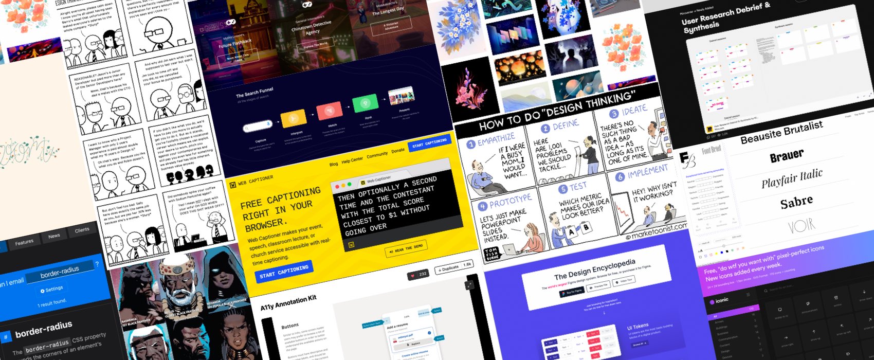
Pixels of the Week – May 16, 2021
Every day, I share on Twitter and LinkedIn a list of curated articles I read, resources and tools about UX Design, User Research, UI and mobile design, HTML, CSS, the web industry, some process, some inspiration, etc. This is an archive of everything I shared this week.
#Now – what I’m up to
Well, I’m the most unlucky person on earth. Who else gets punctures her tire with a piece of glass only 10 minutes after getting it back from maintenance? You’d be surprised how complicated it’s to find a fat tire inner tube for 20″x3″. This lead me to an awesome online community of custom bikes lovers and builders where I’ve been geeking out for a few hours. I also got my hands on some old book archives and I love those. Last but not least, I finally took some time to upgrade my gulp build (TLDNR I changed computer and got a few issues with different node versions), which means that you can expect some design changes on the blog in the next couple of weeks.
TL;DNR the one you should not miss
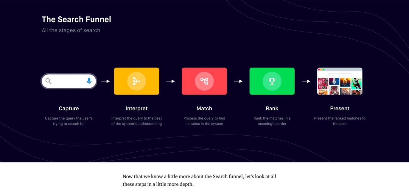
#Search
“Designing search for your product” I like how @shashanksahayy here splits the search in 5 phases (capture, interpret, match, rank and present) and explains in a lot of details how to design a search for your product. Great read!
Interesting article
#Technologies
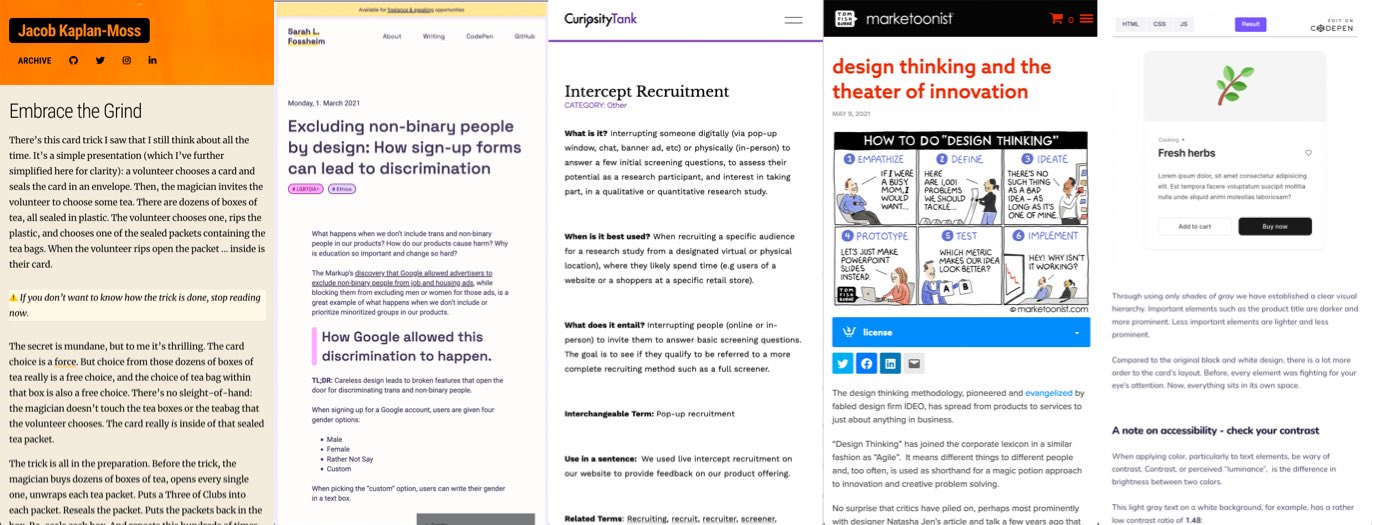
I love that article and I think this also applies to design: sometimes, programming (design) feels like magic: you chant some arcane incantation and a fleet of robots do your bidding. But sometimes, magic is mundane. If you’re willing to embrace the grind you’ll look like a magician.
#Inclusion
“Excluding non-binary people by design: How sign-up forms can lead to discrimination” by @liatrisbian
#UXResearch
You know how sometimes you know a tool or a method but have no idea how it’s called? That’s me and “Intercept Recruitment“, I knew the practice, used it even, but did not really know it was called that in English ^^
#PWA
Ho, this is going to be a nice feature for desktop PWAs, the ability to customize the window control overlay, the demo is a search bar, but I could see a Spotify like PWA with some controls for next/prev track, etc.
#DesignThinking
“Design Thinking and the Theater of Innovation” sadly accurate cartoon in many cases by @tomfishburne
#Color #UI
A Beginner’s Guide to Applying Color in UI Design, a good introduction to the different types of colors that you will need in UIs by @georgedoescode
#RSS
If like me you are still using RSS (you should, I have whole article with cool UX people to follow), this is going to be useful: RSS feed for youtube channels and GitHub project
#FoodblogsUX
Tech, SEO, food and a murder joke in the same article ^^ In case you were wondering why food blogs all follow the same pattern we all hate, well, blame the ad revenue model and Google that mostly dictates this structure.
Inspiration, fun experiments and great ideas
#Inspiration #Illustrations
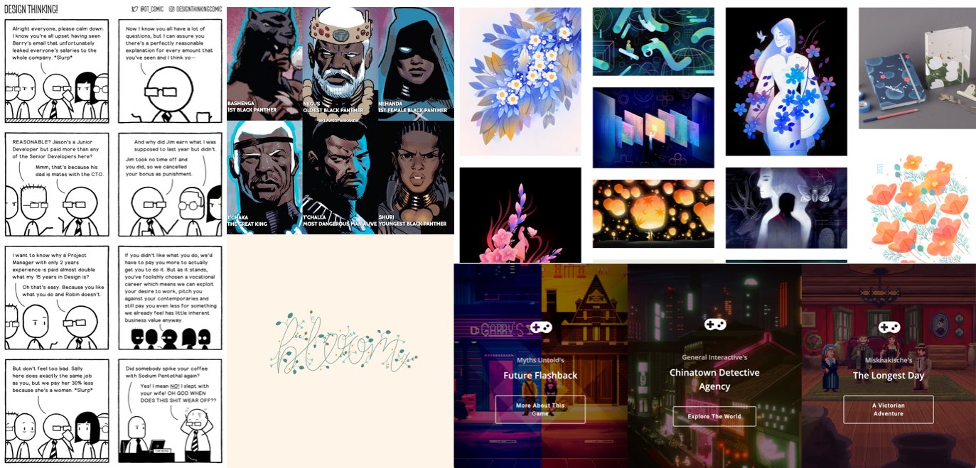
I love Maggie Chiang‘s illustrations, the colors and the way she works with grain is awesome
#Comic
This week’s comic stroke a nerve, it’s about salaries
#Pixelart #Inspiration
Today I wanted to present you the awesome pixel art work of Ricardo Juchem (@ricardojuchem)
#GSAP
Beautiful “Bloom” animation with SVG and GSAP by @shunyadezain
#Illustration
Some Wakanda history illustration by @Jspence
News in the industry
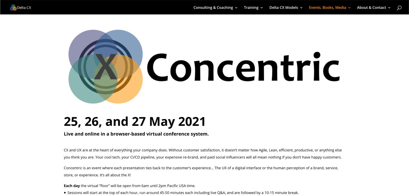
#Conference #CX
Concentric, a 3 days free remote conference on 25, 26, and 27 May 2021, created by Delta CX, with an awesome line up of speakers
Tutorials
#CSS
“Getting started with CSS Custom Properties“, a nice beginner’s guide, clear, easy to understand with plenty of examples, by @piccalilli_
Useful tools and resources that will make your life easy
#Email #Support
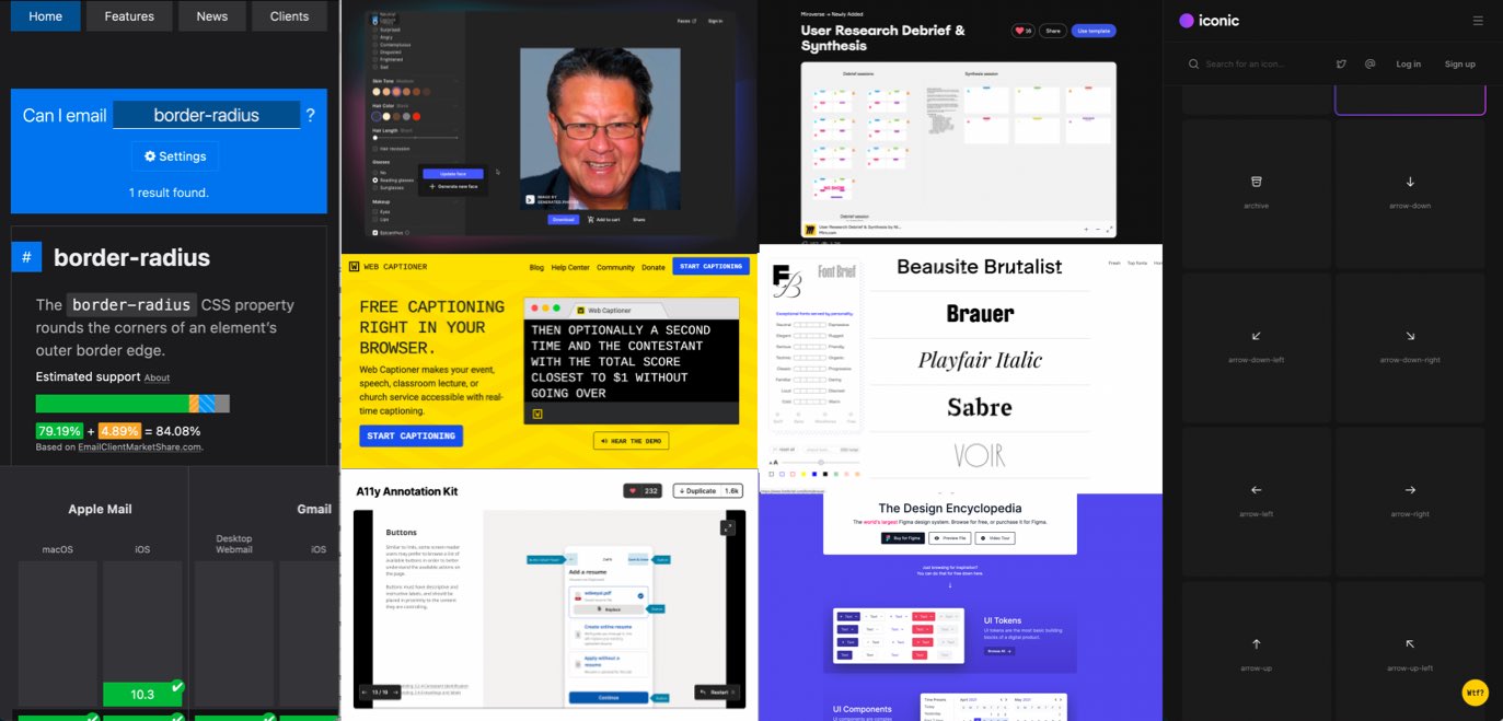
This is nice: Can I Email, the equivalent of Can I Use, but for email clients to know which HTML, CSS feature is supported in which email client 🙂
#Accessibility
I’m intrigued by this Figma board to document accessibility. I already document a lot of things in my designs for accessibility but I wonder: – will FE devs not complain that the designer is now intruding in their job (happened to a friend of mine, React devs really did NOT like it). Will those guidelines not be sometimes far away from the actual code used for the component (maybe unless you document those with the dev team directly in figma?) – this also means designers need a super high level of “code accessibility” knowledge for the aria part. A lot of designers struggle with the basics of contrast, so, ARIA is quite next level, especially when you enter into interactive components. I still really like the idea of documenting all of that, just wondering if it will actually be used.
#Accessibility
This is a really nice free tool that offers live captioning in the browser, but also has a lot of integrations with other video conference tools: webcaptioner
#Face #avatar
Face generator: I am still debating if this is awesome, fascinating, creepy, or all of them, but here we go, a face generator that let’s you create a unique person in a few clicks
#Icons
Another collection of “free do what you want with” icons for your projects
#UserResearch
Nikki Anderson created this useful little “User Research Debrief & Synthesis” miro board you can use for you own projects
#Font
This tool offers you different fonts based on their personality, a nice way to pick a font it you don’t know a lot about typography
#Tools
This is a nice Chrome and Firefox extension if you want to de-clutter your twitter
#DesignSystem
This is a cool cool example of what a collection of design tokens, patterns and more documentation could look like
#CSS
You know when sometimes a few years after you started working on a project, you wish you took other decisions and want a time machine? So does the CSS working group for some CSS properties ^^