Accessibility
All my content about accessibility, from color contrast tools to how to document accessibility for designers and some illustrations to help promote accessibility.
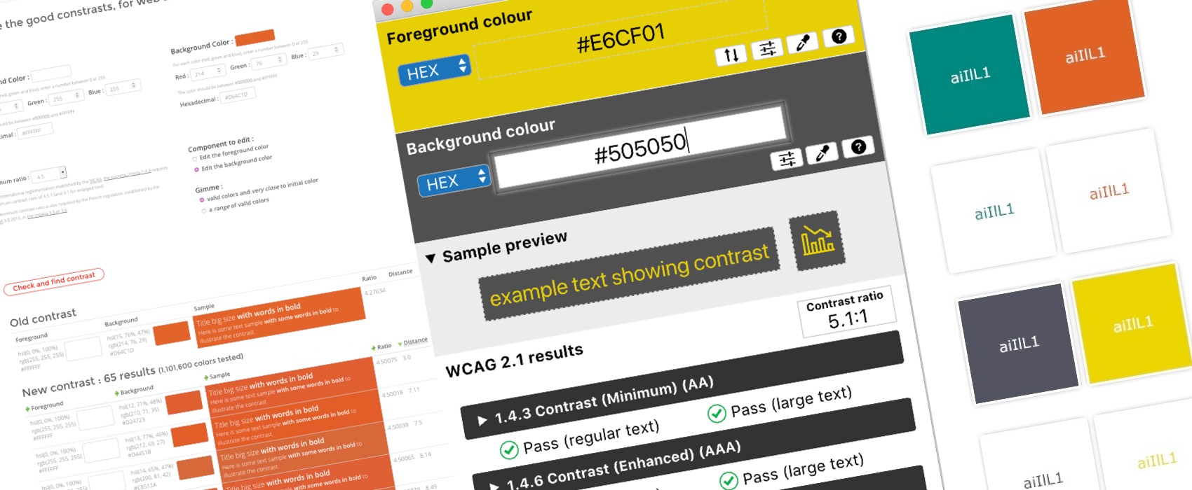
Tips to Create an Accessible and Contrasted Color Palette
Color contrast is something really important in Design. It will help users read your text and get a clear understanding of your content. Color contrast and color accessibility scares a lot of designers too. Some are afraid that color accessibility will limit the color palette they will be allowed to use and so their creativity. Some people think that color accessibility is “only for people with some sort of color blindness disease” so it does not concern their target audience. …