How to make your blog images stand out & reflect your identity
This article is a bit tricky, yet is going to be super useful to anyone with a blog. Or anyone using images in their communication, conference slides, etc. It will help you if you ever find yourself facing stuff like this: “Ugh, I am so tired of seeing the same boring stock photos on every blog…but then…every visual I pick is also the same exact type of thing that I am tired of seeing. Maybe, if I take this and just move on pixel to the left, people won’t be able to tell I stole the design, branding, visual style?”. Yes, we can tell.
From photos, to illustrations, mosaics and abstract patterns: how could you make your blog headers, images and other visual content part of your brand identity? Here’s some real world advice from an experienced designer on how to be your best visual self online, with actual examples.
Rethinking the classic “let’s use a stock photo”
Let’s start with the basics. You could use images, as in “a stock photos” to illustrate your articles. I’m talking about the “blog header image” here. But this also applies if you want images inside the article. Usually as decoration or “breathing” areas.
Almost all the blogs (mine included) use that technique. You can use:
- use photos on the topic of the article: simple, efficient
- mix the image(s) with some text overlay something like Webdesigner Trends.
You can create those overlays in design tools. If you do so and have text in your images, don’t forget about alternative attributes on the image if the title is not in the HTML elsewhere. Because, accessibility. You can also achieve the overlays with pure CSS. There’s nice techniques in this article “How to effectively use transparent backgrounds in graphic design” if you want to start playing with image overlays and transparency. Again, be careful about accessibility though!! You need your text to have enough contrast ratio to read it on top of images.

Some places to find nice images
Finding the right image is always tricky. How And at some point, everyone ends up with the same boring stock photos. So here are a few place to find nice images, that hopefully go beyond what you see everywhere.
- Let’s start with the classic: unsplash.com. One thing I like about unsplash is the unporn series: a nice place to find pictures if you need to write about nsfw topics (like sexual health).
- Another idea if you can’t find images linked to your theme or topic, is to go full abstract. Repeating patterns and geometric images work nicely, and there’s a lot on unsplash
- Nappy.co provides, I quote, “beautiful photos of Black and Brown people”, for free.
- Diversity in skin tones and on the gender spectrum is important, but so is diversity in different body types, abled and not. Disabled And Here is a disability-led stock image and interview series celebrating disabled Black, Indigenous, people of color (BIPOC).
- If, like me, you are tired of always seeing the same type of people (cis gender conforming people) in images on blog posts, give The Gender Spectrum Collection: Stock Photos Beyond the Binary a try.
- Life is messy, unfiltered. Polished stock photos are nice, yet, soooo boring. If you are tired of boring perfection, this is Stocksy.com’s promise: Stock Photos and Footage with no filler
- Now, if you want to bring it next level and have specific needs, icon8 has this tool called Moose and it lets you create your own scenes. Need a giant dog in the living room with a guy eating salad? Yup, they got you covered
- Also, this list of free stock photo images for commercial use is a nice recap.
Spicing up boring stock photos
Okay you might say “yes but if everyone is using images, how might I spice things up and make those unique”.
There’s a few things you could do:
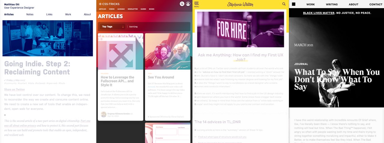
- Have some colored overlay on top of your images just like Matthias does here. Bonus if it matches your brand identity. You can see this in action on “How can I find my first ux job” and “80+ UX blogs (with RSS feed) to follow”. I am in both using a stock photo, and applied a purple filter.
- This trick also works with gradients. CSS Tricks mixes a lot of different image techniques. But every image has this orange purple blue gradient on top of them to give them some consistency and make it look nice on the homepage
- You could also decide you want them all to be black and white like Henry Desroches’s website
- Or you could do like my friend Myriam: she once decided she would give a talk with only pink images. And it was awesome and it worked. The images had little to nothing to do with the talk. But, it worked. Because, there was consistency and a theme.
Some tools to spice up your photos
Image editing can be annoying so here are some tools to help:
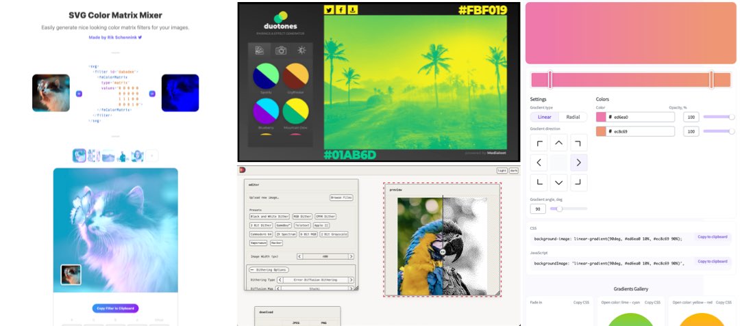
- Dither images could be your thing, there’s plenty of styles to explorer with this tool
- Bring back duotones images back to something trendy, I dare you
- With SVG color Matrix Mixer you can generator some SVG color matrix filters on top of images. This way, you don’t need design tools to color images but can apply those on your websites.
- SVG Gradient Map Filter: another tool to build some duotone on top of an image using SVG
- If you are into gradients you could try this or this and add them in CSS with some blend modes on top of your images. This means you don’t need to edit every single image, let the browser do the job.
I do most of my editing in Sketch (Photoshop if I really want something fancy) so I don’t have that many online tools. Feel free to reach out by email or twitter if you have some nice gems to share here.
Bringing in some characters and illustrations
Illustrations are super trendy. For real. They have been for a while now. They offer more flexibility than stock photos because your imagination is the limit. And you can go super abstract.
Here are some cool examples if you are looking for “how do people use illustrations” inspiration:
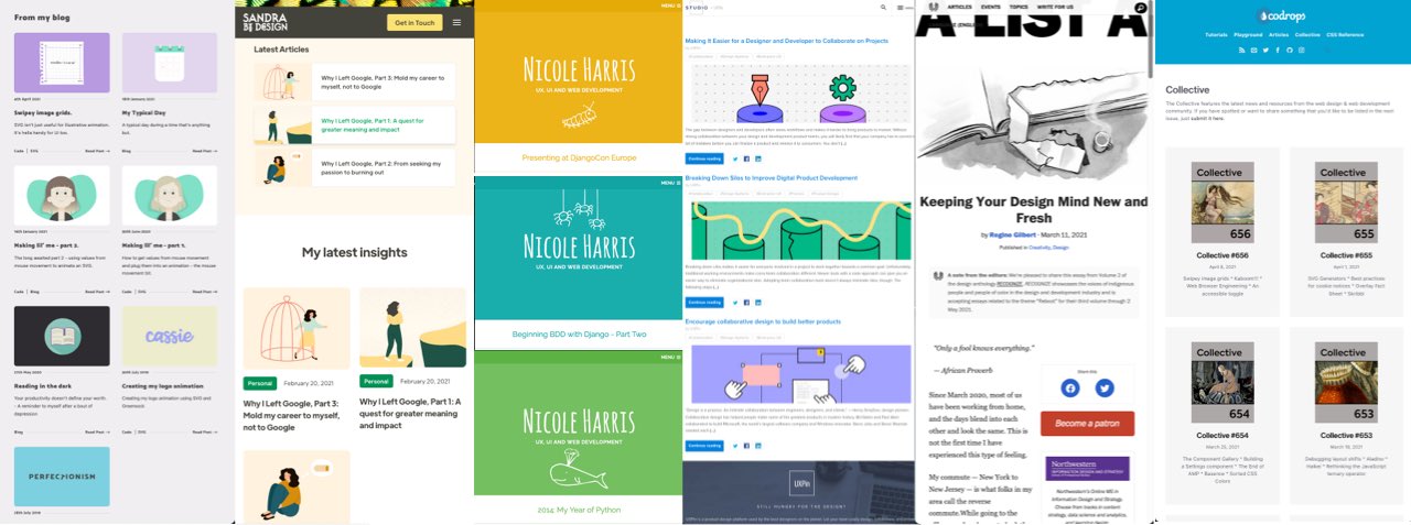
- Viget is a good example of simplicity for the usage of illustrations. Each article header is one rounded illustration with a nice colorful background that depends on the category.
- Each article on Cassie Evan’s blog is represented by a nice little illustration
- Sandra Camacho’s insights use cute branded illustrations in the preview and on the article
- A List Apart brings illustration to the next level, each article has a custom banner illustration. It has been this way for years now and I love it.
- I also love the drawing style of the illustrations on Sketchplanations
- The blog of UX Pin has some simple illustrations, most of the time geometric ones but it works quite well
- Nicole Harris’s articles headers are all a color, a white illustration, some text, that’s it. And it works nicely
- Maggie Appleton uses awesome hand drawn illustrations as images to introduce her essays
- Another trick with images is to have images (or illustrations) on a specific theme, like Codrops Collective does.
And the list goes on and on.
Getting the most out of illustrations for your blog
Here’s a few illustrations tips to bring more consistency to your blog and brand:
- SVG for illustrations is awesome. You can embed SVG illustrations directly on websites and it would be lighter than PNGs. The annoying part is that some CMSs like WordPress won’t let you do so by default (but there’s tricks). But if you have a custom blog, it’s worth a shot. You can also embed JavaScript so you animate those. And you can mix vector and JPG/PNG images in SVG just like Khan Academy homepage. SVG is also an open door to awesome interactive infographics.
- Illustration authors usually have a specific “style” (or a few styles). If you need multiple illustrations, try to use illustrations from the same “pack”. This will again help bring consistency. My trick: check the profile of the authors on the different platforms and cherry pick the illustrations that go well together.
- Illustrations usually come in vector format like SVG, AI (for illustrator) or more versatil EPS. You can open those with vector tools (like Inkscape which is free, but also vectr.com in the browser or even figma). You can change the colors of the illustrations to have them match your brand identity. Some of the galleries in the next section even come with built in tools to recolor those).
- If you want something specific, hire a professional illustrator (reach out in email if you need some names). Usually illustrators take commission and can create you a set of different illustrations on some themes you can reuse
Of course you don’t have to go one style or another. Mixing strategies based on different content types works nicely. For example uxmag.com has a mix of sometimes illustrations. So does Think Company, but if you look at their illustrations, you’ll see consistency in the styles.

Recolor Icons and Illustrations in Illustrator
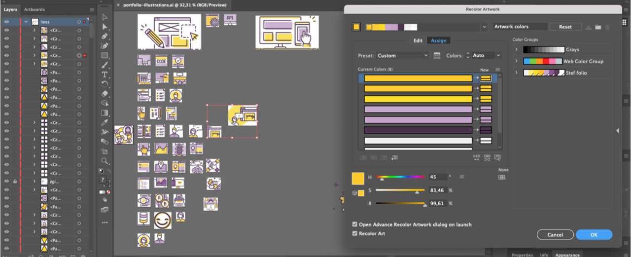
So, let’s talk about my secret weapon for illustrations. I told you in the introduction, I’m giving you all the secrets so that you can steal like an artist (also yes, check that book). For all my personal projects for example I use the streamline icons and illustrations. Here’s my pro tip: I use Illustrator’s “recolor artwork” tool to quickly recolor them. I can also try out different options and have them match my yellow and purple brand identity. Here’s a video to teach you how to. Another Illustrator tip: if you want to manually replace colors, you could use select > same > color and fill to select everything that has the same color.
Cool places to find cool illustrations
- Stubborn.fun is a character generator that also lets you create scenes
- Blush.design is a figma and sketch plugin to create storytelling illustrations
- Weareskribbl.com is a collection of free hand drawn illustrations in a “black and white line style”
- Drawkit.io is a collection of nice illustrations updated weekly
- getillustrations.com is another nice place to find free and non free illustrations
- Undraw.co became one of the big classics when it comes to free minimal illustrations
- Freeillustrations.xyz offers a lot of illustrations kits in different styles
- icon8 also has nice illustrations. Bonus point, you can recolor those in their tool directly. Worth a try.
- Blackillustrations.com are beautiful illustrations of Black people for your next digital project
- Mixkit.co has a lot of free resources (videos, sound) and has a section dedicated to “free stock art”.
- Biodiversity Heritage Library’s albums offer images from old books, plants and animals that I love so much. I admit it’s a specific style. But it can work.
- Another really specific style of images can be found on oldbookillustrations.com. I am not sure if this goes under illustrations or images, it’s definitely a really specific style, but I kind of like it. You could have a whole series on animals, people, etc. The cool part: since it’s mostly black and white you can have a lot of fun with filters and recoloring those. This awesome essay on newsletter uses that style, and it works!
How to “find” the right images and concepts.
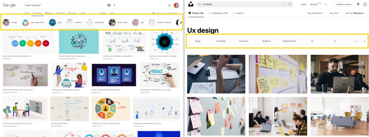
Time for another secret trick: when I am looking for images (or illustrations) to illustrate a concept, I start with a Google image search. This gives me a first “trend” of what other humans expect to “see” around this topic. Another thing I love with the Google image search results is the suggestions. This helps me understand taxonomies and what humans, again, expect around this concept. This is how my SEO friend Myriam explains it:
“ Google tries here to make some human/machine translation of a concept into distinct entities, aka, build taxonomies, like, hashtags”.
And this is gold to help you find images. A lot of “image search engines” like unsplash do this trick as well and help you expand your search.
I also like to take a look at what kind of images come up in The Noun Project. Again, the idea is to understand human mental models to illustrate concepts. Last but no least, you could take a look at “Same Energy”, a visual search engine.
Mandatory copyright and license warning
TLDNR: check the image/illustration license. If there’s no license, don’t re-use unless you asked for permission.
I can’t write an article about images and illustrations without a warning about copyright. I’m honestly quite tired of the design community, but also of other communities giving zero toughs about copyright. So let me put this here: just because someone put an image or an illustration on a blog, it doesn’t mean you can reuse it. Especially on commercial content. And yes, I’m pointing at you, agencies who use content from my blog without my permission. I see you 🙂
So, before using ANY image, photo, illustration: check the copyright rules. And, follow those. By default, if there’s no mention or copyright, the image belongs to the blog owner (unless they themselves stole it from somewhere). So, by default, unless it’s written otherwise, you can’t use an image from someone else.
The good news is that today, there’s a lot of content under creative common licenses and open licenses. You can use most of that content, even for commercial use (unless the license says otherwise). But you usually still need to credit the author somewhere.
Mosaic, grids and collages of images and photos
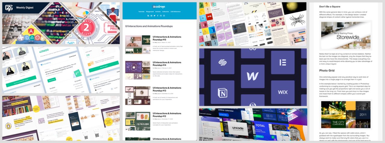
I’m not going to pretend otherwise: mozaic and collages might be THE technic I use the most for my blog images. Mosaics work really nicely if, like me, you publish posts that are resources or lists of content on different topics. I did (and still do) a lot of tests and explore with the format a lot. Here are a few examples from my own experiments over the last, like, 10 years of blogging. I told you that today, I’m showing you all the tricks in my book 😉
- 5 years ago I used to have only 2 images in the collages
- Then, about 3 or 4 years ago, I started to use more vertical images in the collage, since a lot of websites are now optimized for responsive web design. I also use this technique when I have a few nice portrait images.
- For the last 6 months, I have been sharing more and more “inspiration” resources. So the vertical mosaic doesn’t always fit. I started adding some portrait and landscape images to the mix.
- Did someone say colorful collage mosaic. Here I explored with even more images, since it’s book covers, and ordered them by color.
- To have something more dynamic, I’m also testing a -12deg angle on the mosaics (why 12deg? Because I like it like that). It started with my conference transcripts where I use mosaics of the slides. But I’m also exploring this format for the weekly links now. I like it because it works with my design and breaks the straight horizontal lines a little bit.
I’m not sure there’s generators or tools for collages. I do them in Sketch. But still, there’s a few tips and places you could use for inspiration:
- You could explore with zero gutter collages (like mine). Or explore some styles with more spacing and gutter like Frontend Weekly does. If you go for gutters, which is, the most annoying thing to do, you need to make sure you have proper and consistent spacing everywhere. This is why I find this annoying to do. My trick here: cut the images if needed.
- Angle mosaics are trendy, also it works with gutters.
- You could also use some grids of logos like here.
- And here are even more angled mosaics.
- Like images, you can bring consistency by applying a whole color overlay if you want. Or have them all black and white. Codrops is, again, an awesome example of this. Each of their roundups has a color filter which brings consistency to the whole mosaic.
- Have grid, then, break the grid and explore with diagonals and outside the box things. This is an old article from 2011 I still like on the topic of multiple image layout
- Find inspiration outside of the web: architecture and print design, magazine layouts are a good start here for that kind of ideas.
Abstract art and backgrounds + some text.
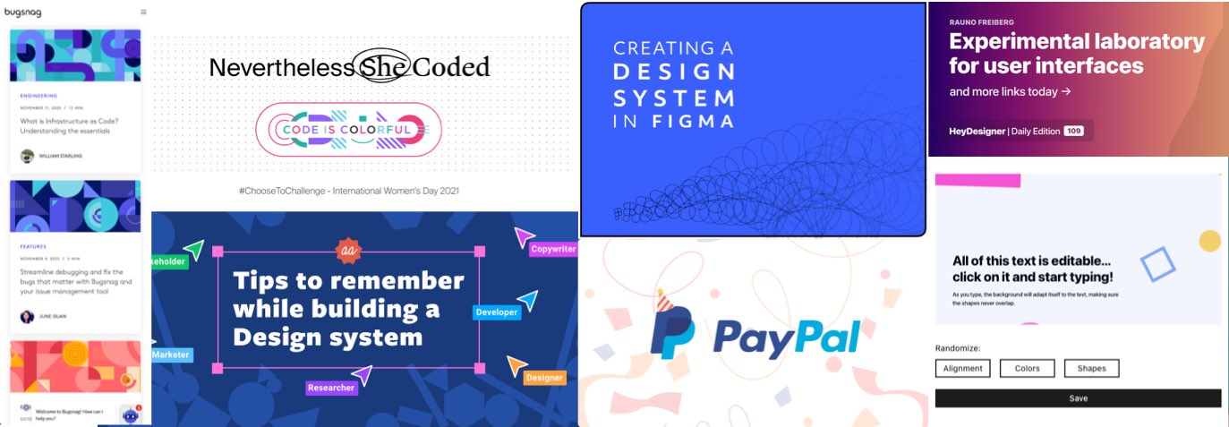
It’s sometimes hard and long to find images, photos and illustrations. So, going abstract could also be an easy road to go. There’s a lot of generators in the next sections. Going abstract background + some simple text offers a LOT of possibilities while still keeping consistency around all your articles and posts and your brand. Just hit refresh on George’s generator here to know what I mean. Endless possibilities with little investment. Perfect if you don’t want to spend too much time but still want something nice.
For your inspiration, here’s a few examples of that abstract pattern trend.
- This article on UX Planet uses some geometric background and just some text. Easy, effective.
- Here you have an example of just some background repeating pattern and some text as well.
- Big blue background, abstracted “f” geometric forms, here we go
- Here’s an example of a background and just a logo, that does the trick, simple, efficient.
- bugsnag.com uses those geometric shapes in their blog headers, it’s beautiful, abstract and it works nicely

Abstract SVG and patterns generators
There’s plenty of places to find some nice abstract patterns. Most of them generate SVG, because it’s THE format that is perfect for that.
- Haikei.app is an webapp with 15 abstract SVG generators
- Tabbied.com is a random geometric doodle shapes generator
- What about some springles or colored shapes? Check the rest out on bgjar.com
- I like glitchart.io, it can be used to create awesome things
- You can find some awesome repeating patterns on heropatterns.com, pattern.monster
- More polygon patterns in here. Yep, I love polygon patterns, sue me!
- If you are looking for some cool polygon background and more: coolbackgrounds.io
- Generate a pattern from a SVG you upload on this site and use it as background for text or other articles headings
- And another really cool pattern generator here
- Generate patterns from different SVG icons with patternico.com
- If you want a gif of “moving” backgrounds (I don’t think it’s a good idea since it might be annoying though) you could use Loading.io
- This Sketch plugin generates confettis using patterns you created
No image, nice layout, beautiful typography, awesome colors
Last but not least, you could also simply not have any header image. Or any decoration images except for when they help explain something. Those kinds of blogs usually rely on a nice layout, elegant typography, and a great use of colors, gradients, borders. Note that you still might need an image when sharing on social media though.
Here are a few examples I like:
- Tatiana Mac has a colorful blog, typography choices are awesome, no image needed.
- Hugo Kitty Giraudel makes a nice use of gradient, again, no image needed
- Sarah L. Fossheim has brings some awesome colors and borders
- Gift Egwuenu has that awesome pink gradient border and the nicest title font face
- Stephanie Stimac has those really nice purple links list
- Ethan Marcotte’s blog is another beautiful of awesome typography, delicious subtle backgrounds, nothing more is needed here.
- Josh Comeau is also a nice example here if you are looking for simple effective typography
- Another great one, but I’m biased because I love those Gs is Andy Bell’s Piccalil.li
So, that’s it. I hope I gave you nice ideas for different visual content and images for you blog posts, but also conference talks. Shoot me an email if you have more ideas or tools to share. Also big thanks to Myriam for helping me with that article 🙂
