The UX Research and Design Blog
My practical expert insights and curated content (resources, tools, etc.) on UX research, inclusive design, enterprise UX, accessibility, and more, to help you growth as a designer.
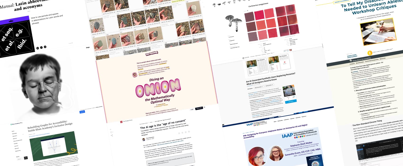
Pixels of the Week – August 31, 2025
👉🏻 Curated weekly UX Research, Design & Tech resources: enterprise UX and accessibility, the age of no AI consent, design for neurodivergent users, accessible graphs, synthetic users vs real personas, optimal onion dicing, aging face experiment, mushroom color atlas, nice rocks, ChatGPT for neurodivergent users, dark mode toggles.
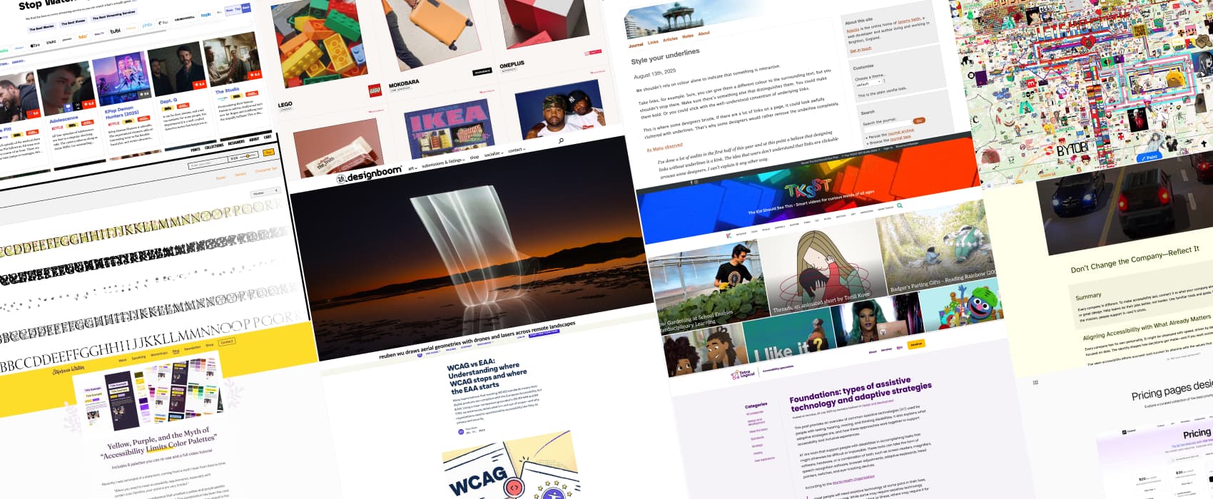
Pixels of the Week – August 24, 2025
👉🏻 Curated weekly UX Research, Design & Tech resources: accessible yellow and purple palettes, WCAG vs EAA, embedding accessibility in company culture, agentic web and blind shopping, assistive technologies beyond screen readers, accessible link styling, curated brand archives, fun color fonts, pricing page inspiration, one-time secret links, world painting canvas.
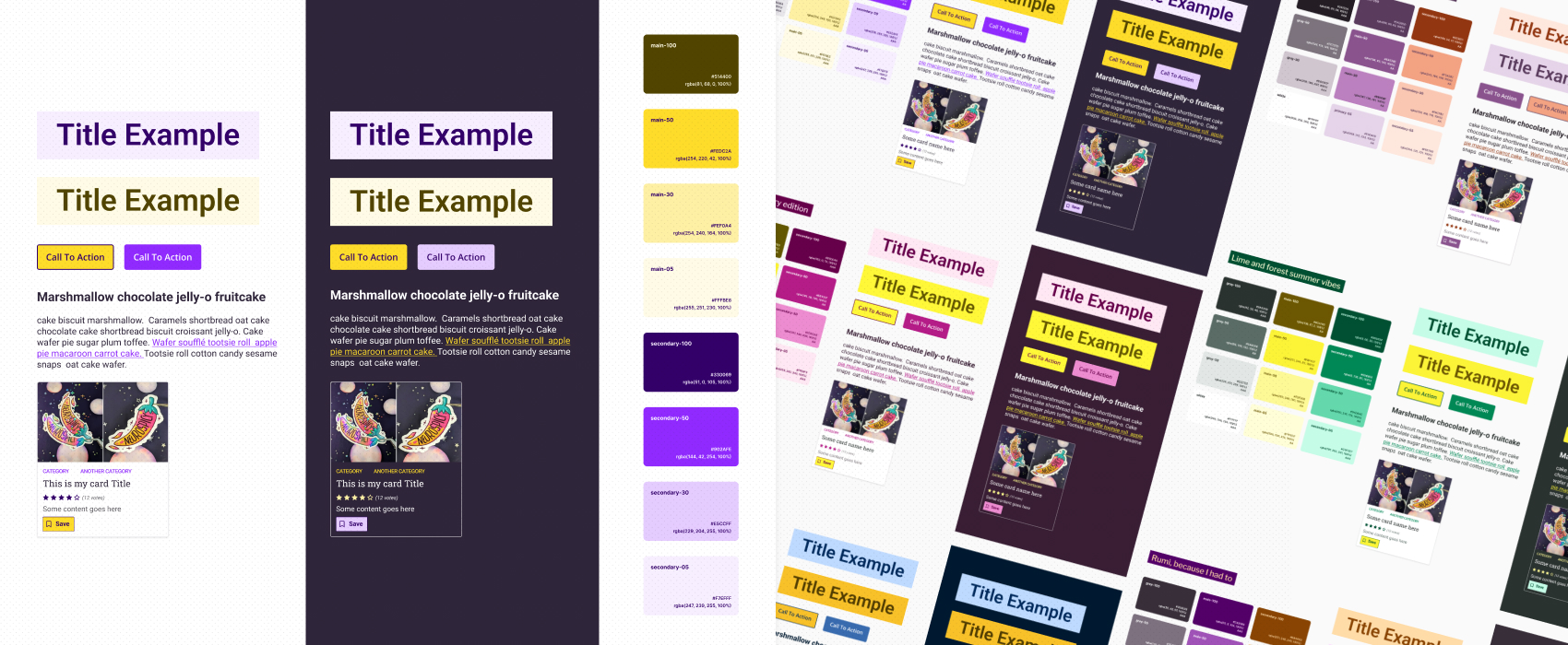
Yellow, Purple, and the Myth of “Accessibility Limits Color Palettes”
Accessibility does not limit your palette choices. What feels limiting is often a lack of knowledge or creativity. To prove it, I created six distinct WCAG-tested yellow and purple palettes. In this detailed tutorial, I share exactly how I built them. So you can create accessible, original palettes too!
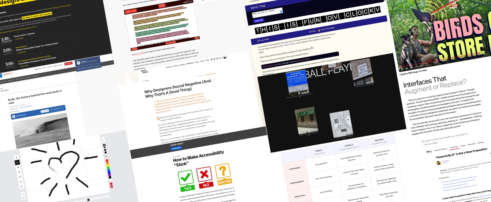
Pixels of the Week – August 10, 2025
👉🏻 Curated weekly UX Research, Design & Tech resources: why designers sound negative, how to make accessibility stick with “yes, but”, “powered by AI” is not a value proposition, interfaces that augment or replace, history of the word dude, NYC’s urban textscape, old split flap board typography, a fun animation tool, HEART framework to measure UX, rainbow selection in CSS, inclusive design 24 conference.
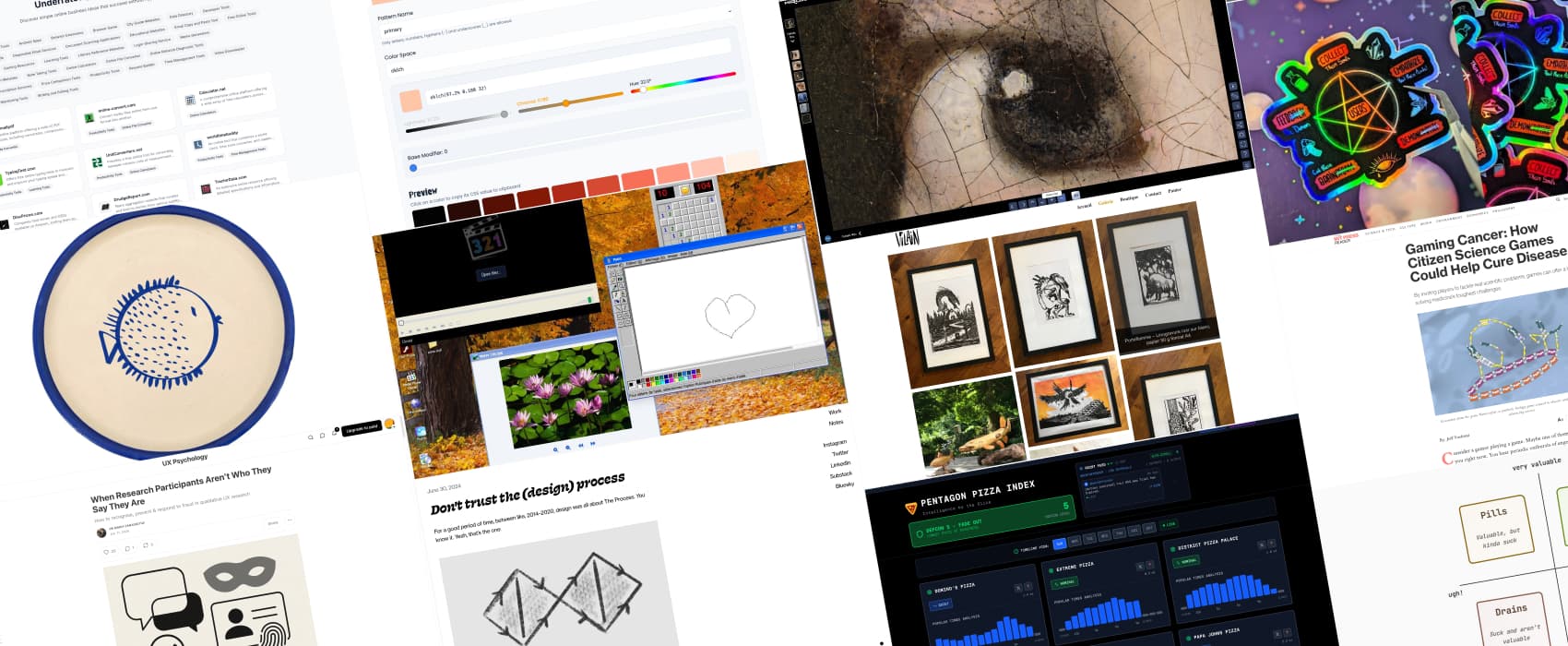
Pixels of the Week – August 3, 2025
👉🏻 Curated weekly UX Research, Design & Tech resources: don’t trust the (design) process, dealing with lying research participants, the product triad, gaming cancer, pentagon pizza index, linocut inspiration, cute plates, explore the girl with a pearl earring painting at high zoom level, Windows XP in the browser, accessible video player, OKLChroma color scale builder, using tech as a deafblind person, priority compass, etc.
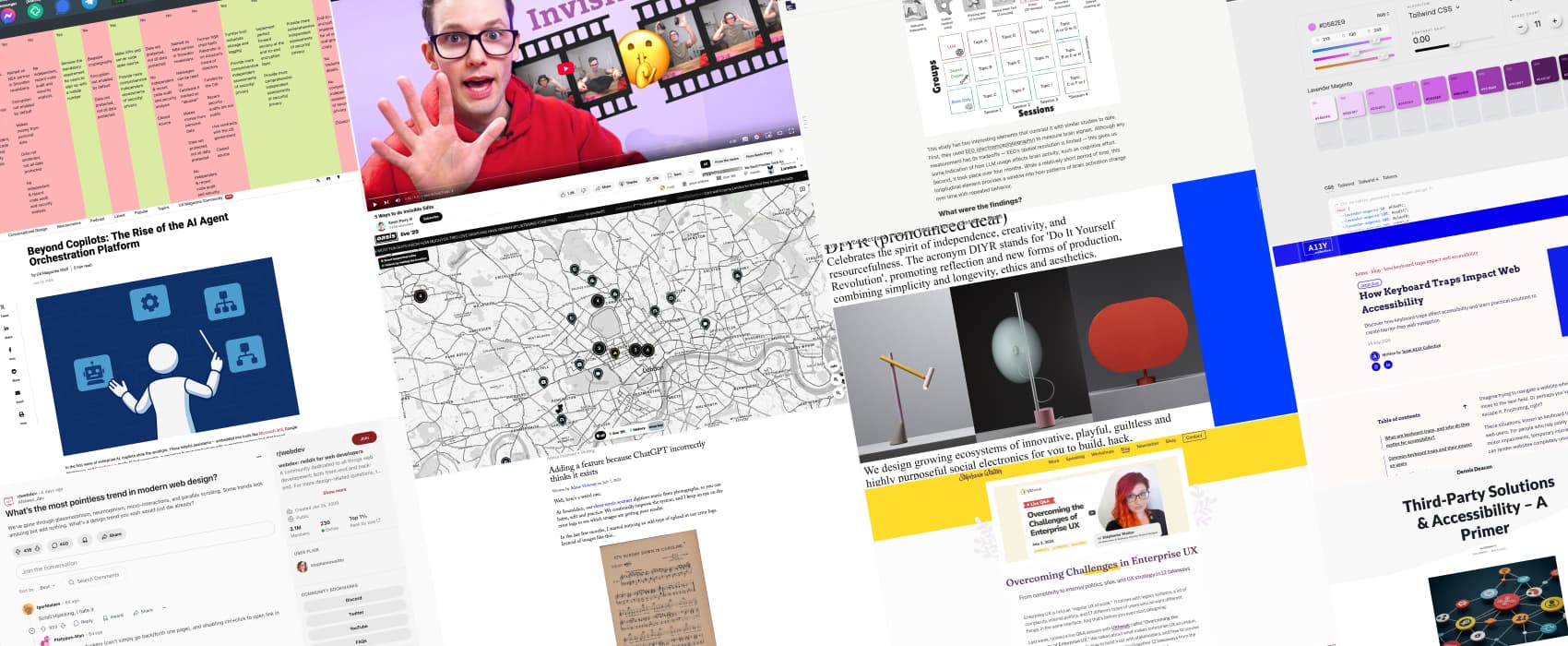
Pixels of the Week – July 27, 2025
👉🏻 Curated weekly UX Research, Design & Tech resources: enterprise UX challenges, annoying pointless webdesign trends, third-party accessibility, accessible videos, using AI in UX research the right way, AI agent orchestration, ChatGPT hallucinating product features, focus indicators, keyboard traps, DIY 3D printable objects, secure messaging apps, color generator, social media assets cheat sheet, gloomy Japanese playgrounds at night, oasis live map, hiding video edits, etc.

Overcoming Challenges in Enterprise UX
Enterprise UX comes with legacy tools, tricky politics, complex data, and way too many user roles. My live Q&A breaks down how to overcome challenges in such environment. I’ve summarized 12 takeaways from the session that you can use right away.
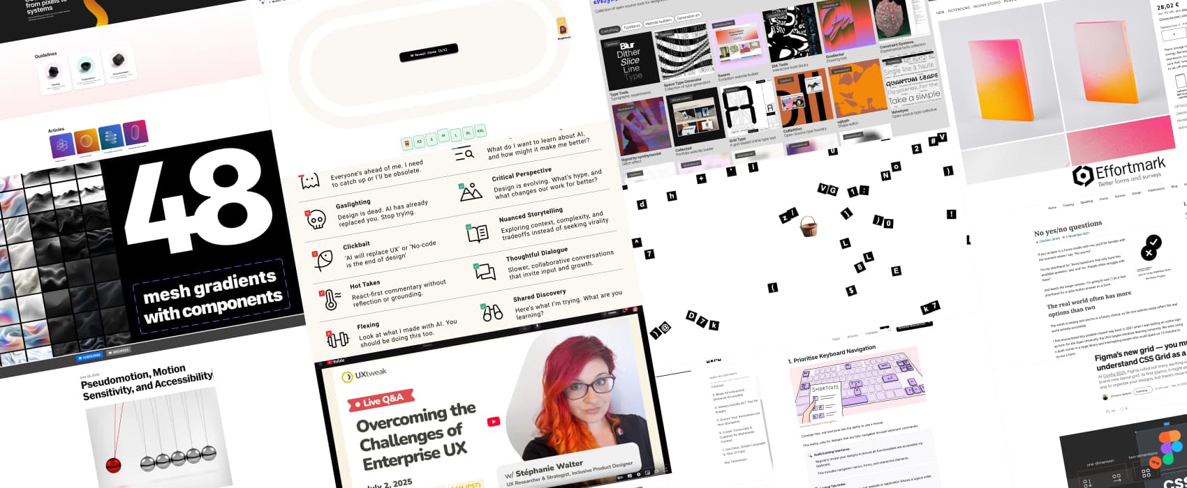
Pixels of the Week – July 6, 2025
👉🏻 Curated weekly UX Research, Design & Tech resources: enterprise UX Q&A, motion sensitivity, and accessibility, the broken rhetoric of AI, no yes/no questions, 7 principles for inclusive UX, figma’s new grid system, design good practices, a fun password generator, free poker planning tool, open source tools for designers, 48 mesh gradients, etc.
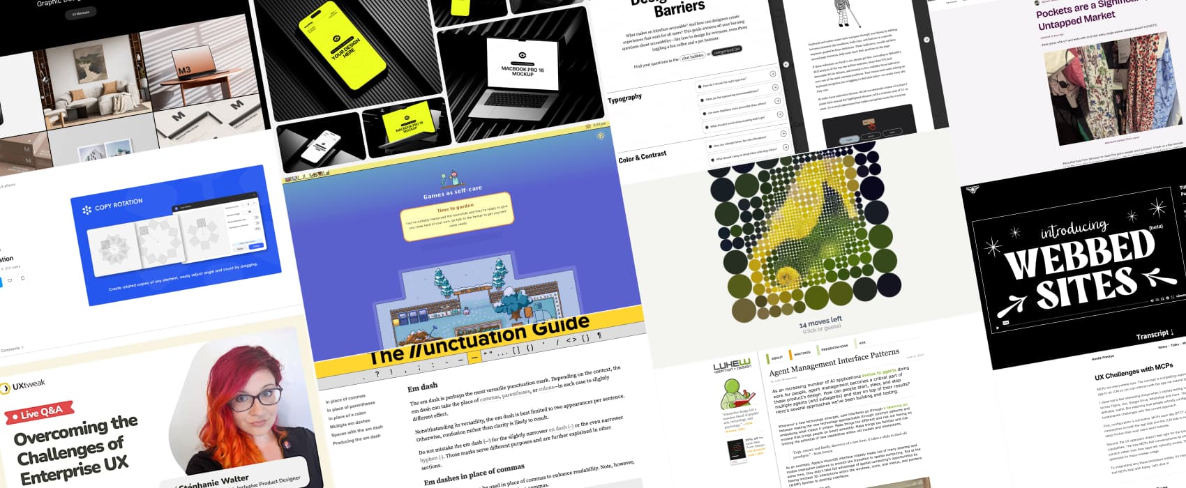
Pixels of the Week – June 29, 2025
👉🏻 Curated weekly UX Research, Design & Tech resources: design beyond barriers guide, the market for pockets and search UX, UX challenges with MCPs, agent management interface patterns, a fun daily game, a Figma copy rotation plugin, a punctuation guide, a study on cozy game, fake product mockups, and a satirical video on site generators.
Pixels of the Week – June 22, 2025
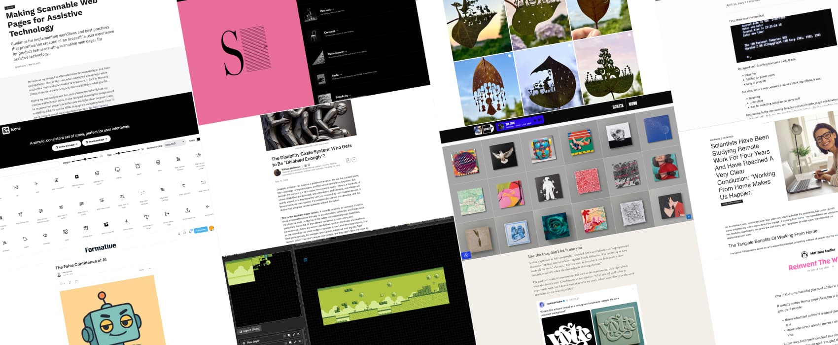
👉🏻 Curated weekly UX Research, Design & Tech resources: the disability caste system, working from home makes us happier, post-chat UI, reinvent the wheel, a designer’s guide to engaging with AI, the false confidence of AI, beautiful covers, leaf art, a game level editor, design concepts, free icons, making scannable web pages for assistive technology, the role of captions and transcripts in accessibility, EAA compliance, etc.