My Talks & Workshops
Text transcripts, slides, and videos from my UX talks and workshops at conferences worldwide. Topics include accessibility, UX research, enterprise design, information architecture, and mobile UX, among other things.
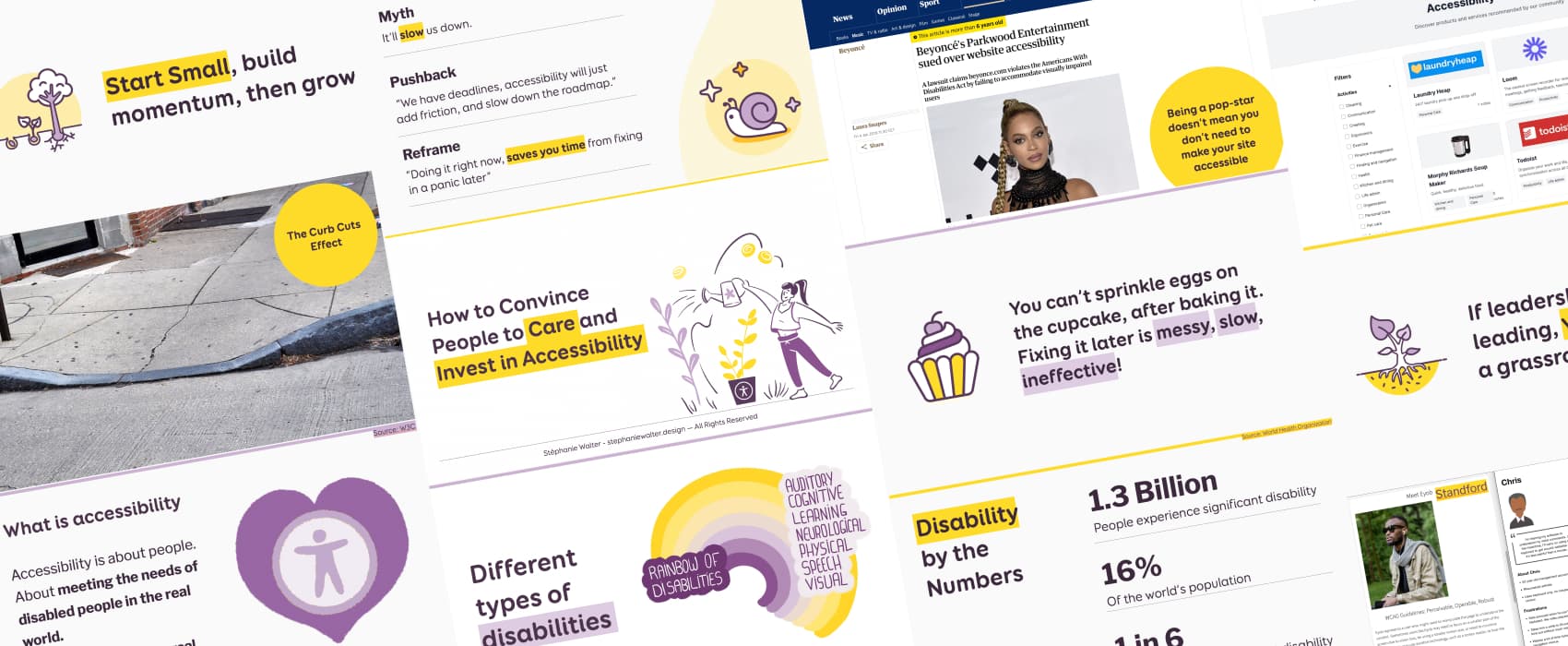
How to Convince People to Care and Invest in Accessibility
Tired of being ignored when you bring up accessibility? Here is your guide to making people care, whether you’re in charge or not. Learn how to connect accessibility to business goals, avoid common pushback, and take small actions that lead to real change. Because accessibility isn’t optional, it’s a universal right. And, it’s essential.
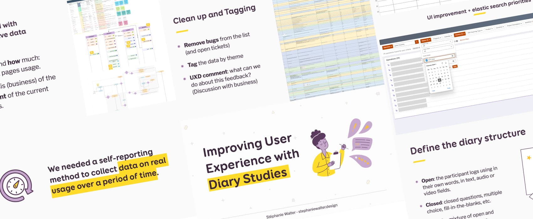
Improving User Experience with Diary Studies
How we used diary studies to evaluate how users interacted with the product over time, on a large-scale redesign project. This helped us improve the product a lot before final launch. I share my process step by step—from setting up the study to analyzing the results—and shared key takeaways.
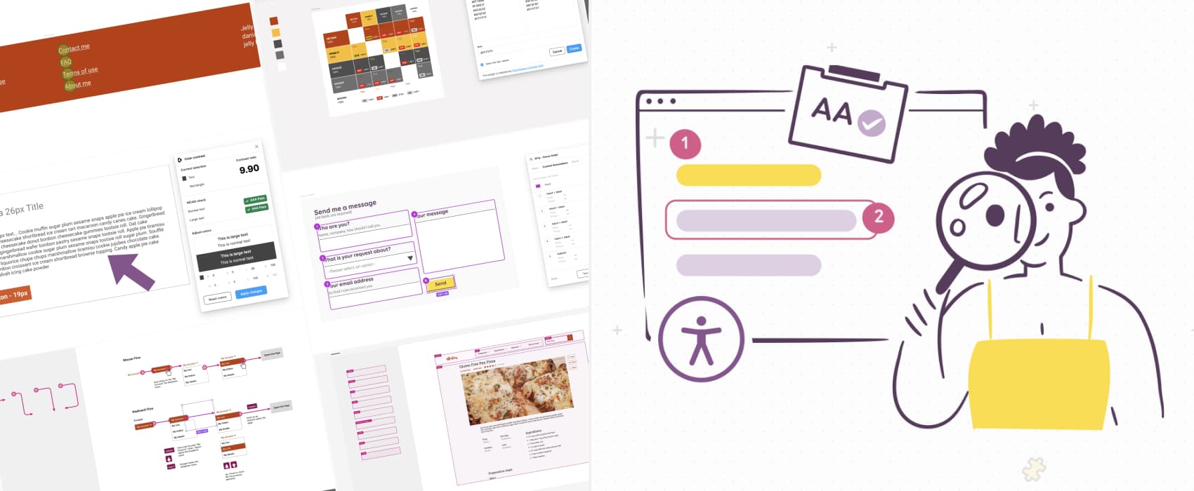
How to check and document design accessibility in your mockups
A lot of accessibility issues can be already foreseen and prevented in the design phase. From color usage to contrast ratios, text resizing, complex interactions, keyboard navigation and more: save time documenting accessibility in Figma mockups with practical tips and a list of selected tools, plugins, and templates.
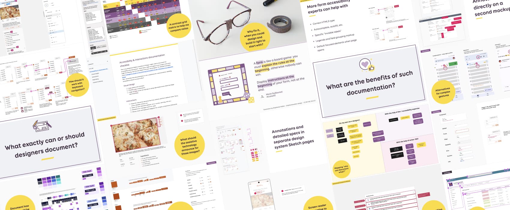
A Designer’s Guide to Documenting Accessibility & User Interactions
Accessibility is unfortunately still an afterthought on many projects. User interaction and accessibility requirements are poorly documented, at best. Or forgotten, when handing over designs to developer teams. And fixing it later costs a LOT more than building it right to begin with. Why, what and how designers can document different aspects of accessibility and user interactions requirements, to build better more inclusive products.
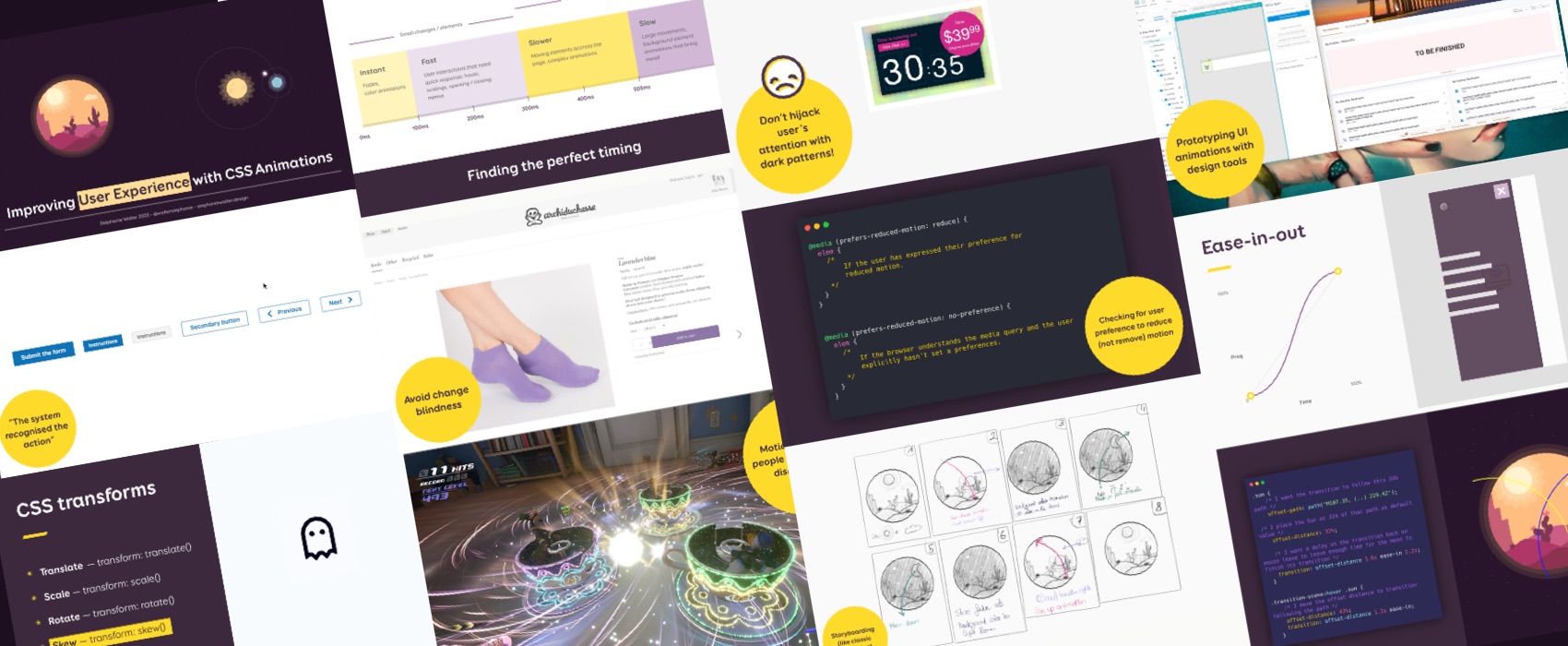
Enhancing User Experience With CSS Animations
With CSS and JS progress, implementing animations on websites has never been easier. But how do we make sure that our CSS animations and transitions will be meaningful to our users? That they will not be just some annoying “in-your-face” eye candy? That they will not trigger motion sickness and cause accessibility issues to some?
You will find here a transcript with CSS codepen and video examples and LOT of resources to dig further in specific topics. I also published the PDF version of the slides at the end of the article.
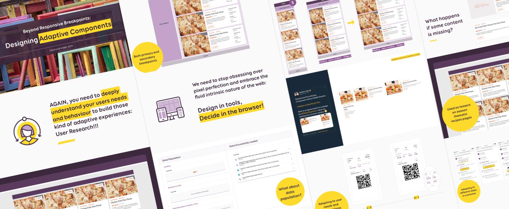
Designing beyond the pixel-perfect idealistic case
How to design systems of components that go beyond responsive adaptation to different screen/viewport size and can also be used in different layout and container contexts? How to make sure that my components work beyond the perfect “happy path perfect situation”: what happens with super long text, missing images/content for example? And how about adapting components to user needs across specific points in their journey and build truly adaptive systems?
There is an app, NO, a web API for that – conference talk
Last week, I was invited to speak about mobile capabilities and PWAs by the Facebook Developer Circle: Akure. I talked about unleashing the capabilities of mobile browsers and new APIs to create a truly mobile optimized experience that goes beyond responsive grid and layout adaptation. In this article you will find the slides of the talk, a link to the replay but also links to the demos I show during the talk and some resources and articles to help you bring your mobile experience to the next level.
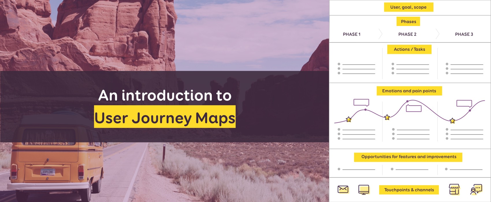
An Introduction to User Journey Map + free User Journey Map Templates
I’ve spent last Saturday mentoring and coaching some startups at a WIDE (women in digital empowerment) event. The whole day was about helping them build a more user centered product and come up with a paper prototype of some of the features so that they can test it later. In this context, I gave them a small introduction to User Journey Maps, a tool that helps designers get a visual representation of the whole experience users have with a product or a service. This article is a transcript of this introduction. I will guide you step by step on how to build a user journey map for your product or service. At the end of the article you will find the slides but also two templates to help your build user journey maps for your own projects.
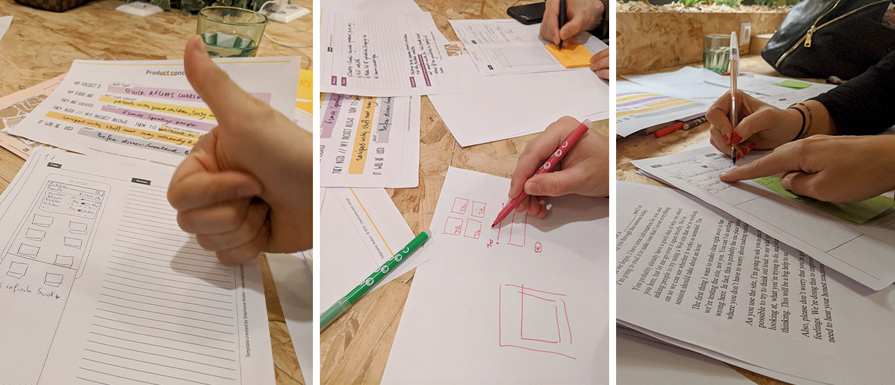
User Experience – Starter Crash Course for Startups
I facilitated a workshop on: “User eXperience – starter crash course for Startups”. The audience was a nice mix between students and entrepreneurs with a project/ website. The goal was to help them discover how to build a product with a user centric approach and why startup people should focus on users needs and talk to their potential users as soon as possible.
In this article, you will find the slides of the workshop.
Investing in User Centric Design is a Good Business Decision
I’m honoured to be the opening keynote speaker of the LOIC’s Innovation dating event dedicated to User Experience – User Interface in Luxembourg.
In this keynote, I explain to companies and organisations why “Investing in User Centric Design is a Good Business Decision”.
The slides of the keynote are available in this article.