Search Results for " accessibility "
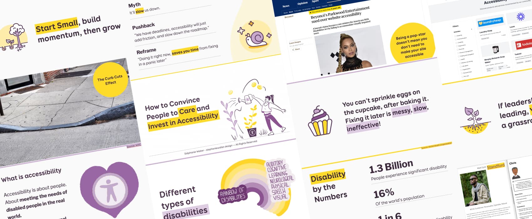
How to Convince People to Care and Invest in Accessibility
Tired of being ignored when you bring up accessibility? Here is your guide to making people care, whether you’re in charge or not. Learn how to connect accessibility to business goals, avoid common pushback, and take small actions that lead to real change. Because accessibility isn’t optional, it’s a universal right. And, it’s essential.
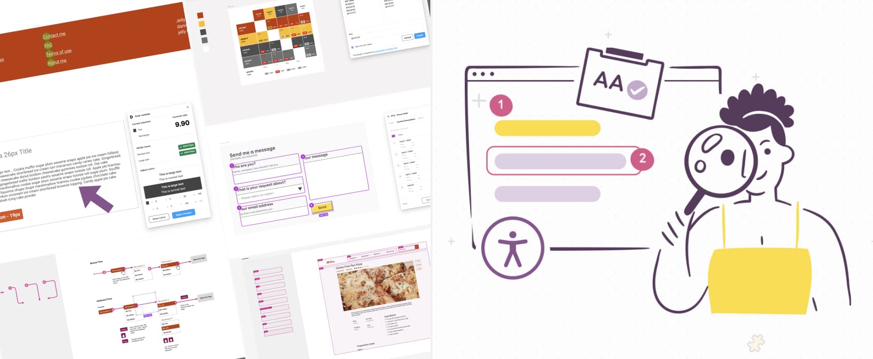
How to check and document design accessibility in your mockups
A lot of accessibility issues can be already foreseen and prevented in the design phase. From color usage to contrast ratios, text resizing, complex interactions, keyboard navigation and more: save time documenting accessibility in Figma mockups with practical tips and a list of selected tools, plugins, and templates.
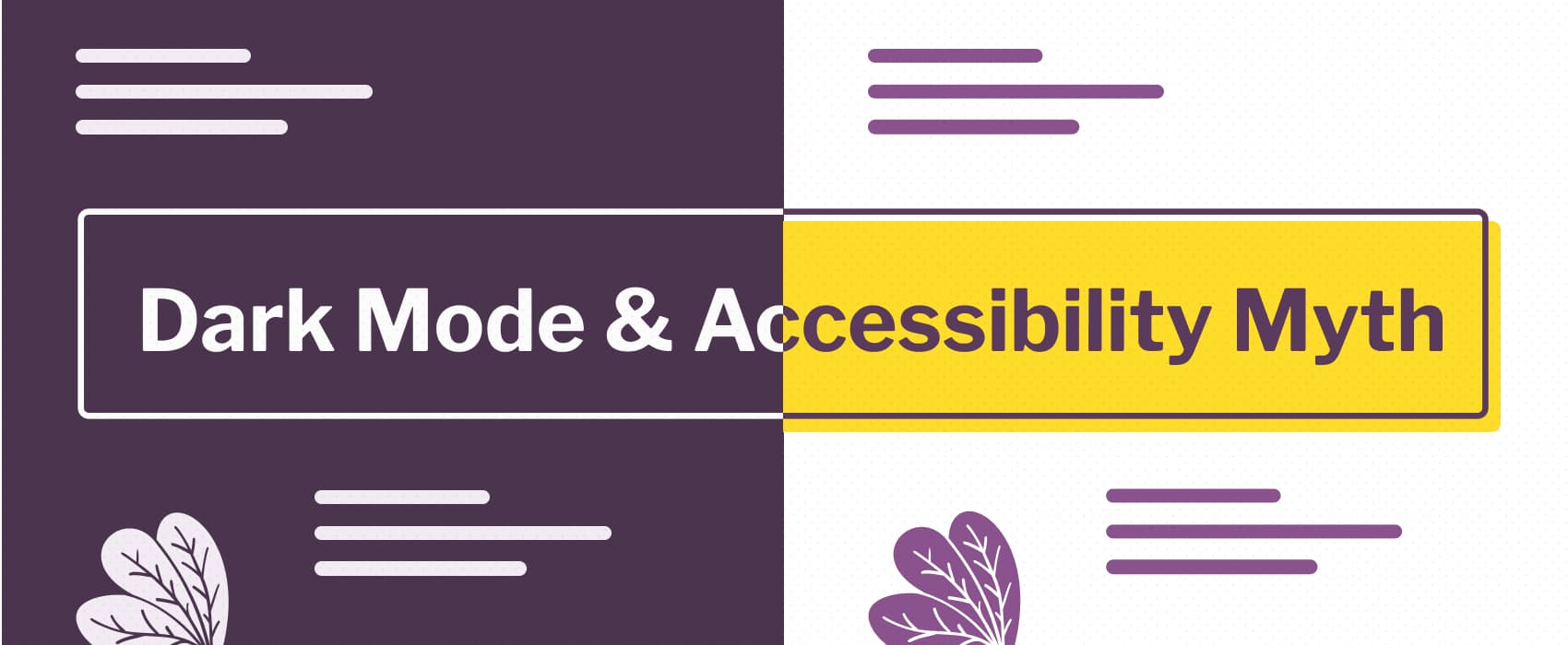
Dark mode & accessibility myth
While dark mode can enhance readability for some users, it can make things worse for others (like users with astigmatism, dyslexia, keyboard users). Consider offering both modes and let user chose. And if you build a dark theme, make it accessible too.
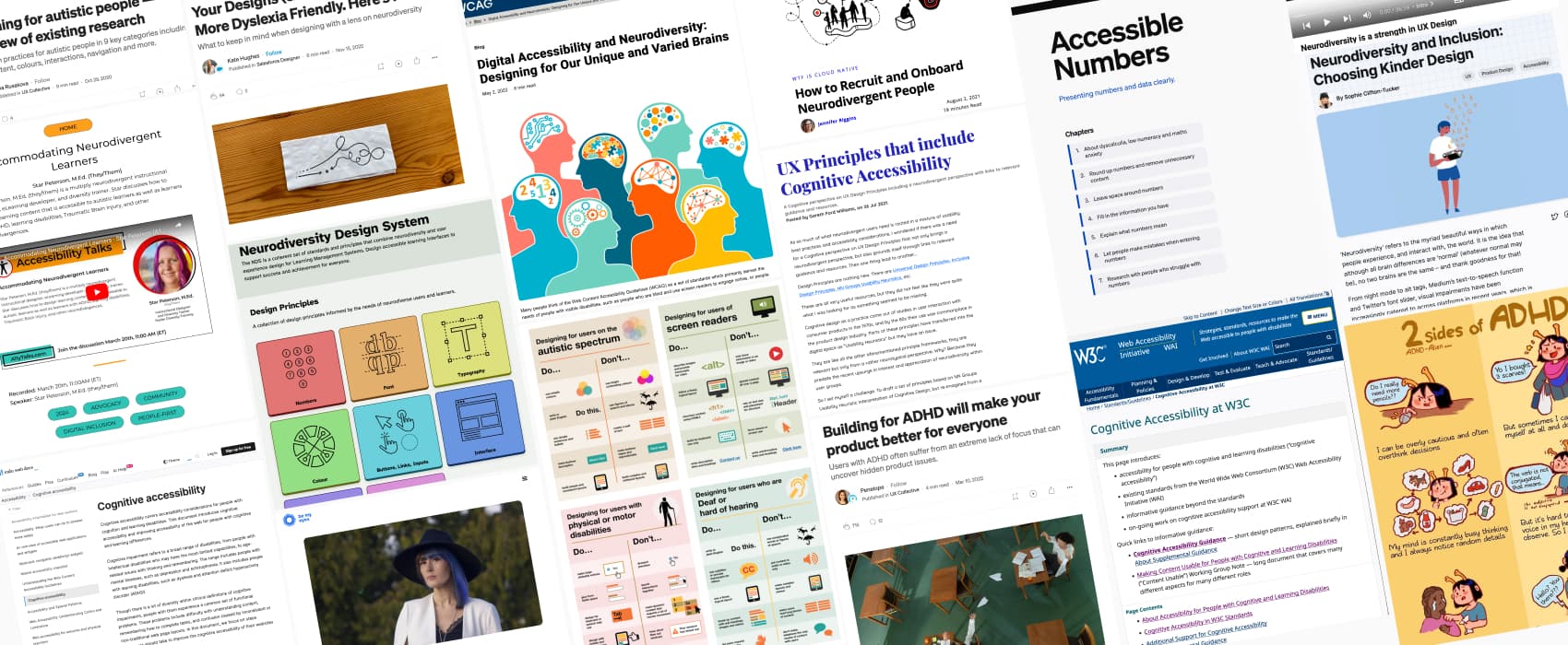
Neurodiversity and UX: Essential Resources for Cognitive Accessibility
A list of curated resources to help you design for neurodiversity, from WCAG guidelines to real-world expertise and practical tips for various cognitive disabilities, including Dyslexia, Dyscalculia, Autism and ADHD
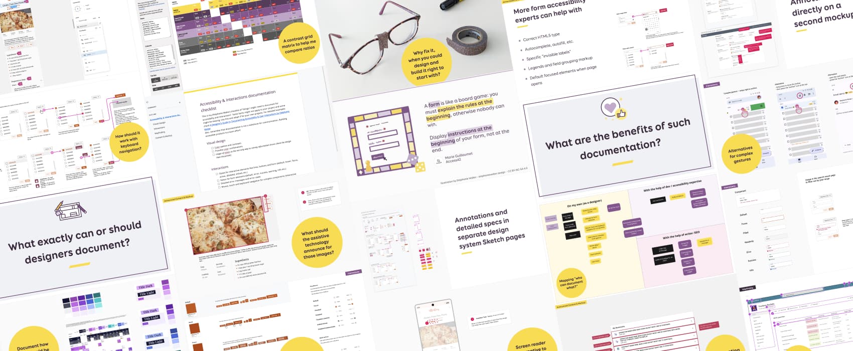
A Designer’s Guide to Documenting Accessibility & User Interactions
Accessibility is unfortunately still an afterthought on many projects. User interaction and accessibility requirements are poorly documented, at best. Or forgotten, when handing over designs to developer teams. And fixing it later costs a LOT more than building it right to begin with. Why, what and how designers can document different aspects of accessibility and user interactions requirements, to build better more inclusive products.

Designing for Accessibility: Creating Inclusive and User-Centric Products
Accessibility experts Léonie Watson and Rakesh Paladugula offer pragmatic advice on how to help accessibility become an integral part of design. From keyboard navigation, to the use of colors, ARIA, design documentation and more, they covered what designers need to be aware about to build more inclusive products.
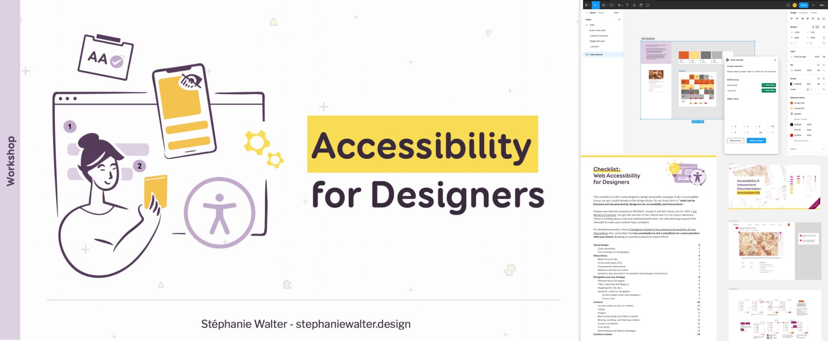
Accessibility for Designers Workshop
Accessibility is often overlooked in the initial stages of product design, mistakenly relegated as an issue to be “fixed” later. It’s also still assumed as solely a developer’s responsibility. However, effective accessibility is the collective responsibility of the entire team, including designers. Many accessibility problems can be anticipated and already eliminated during the design phase. As a designers, you have the power to influence product roadmaps by advocating for accessibility, accessibility features, making a significant impact! Workshop Dates for 2025 …
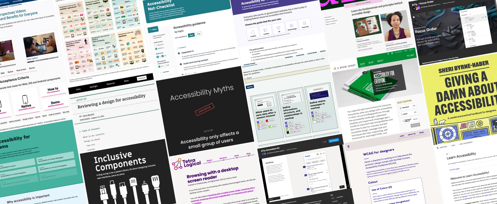
Accessibility for designer: where do I start?
When talking about accessibility, especially to designers, I’m often asked “where should I start if I am interested in the topic and want to learn more?”. So, here we are: I put together (and will update) this list of resources, articles, blog posts, and checklists to help you, designers, get started on your “building more accessible products” journey.
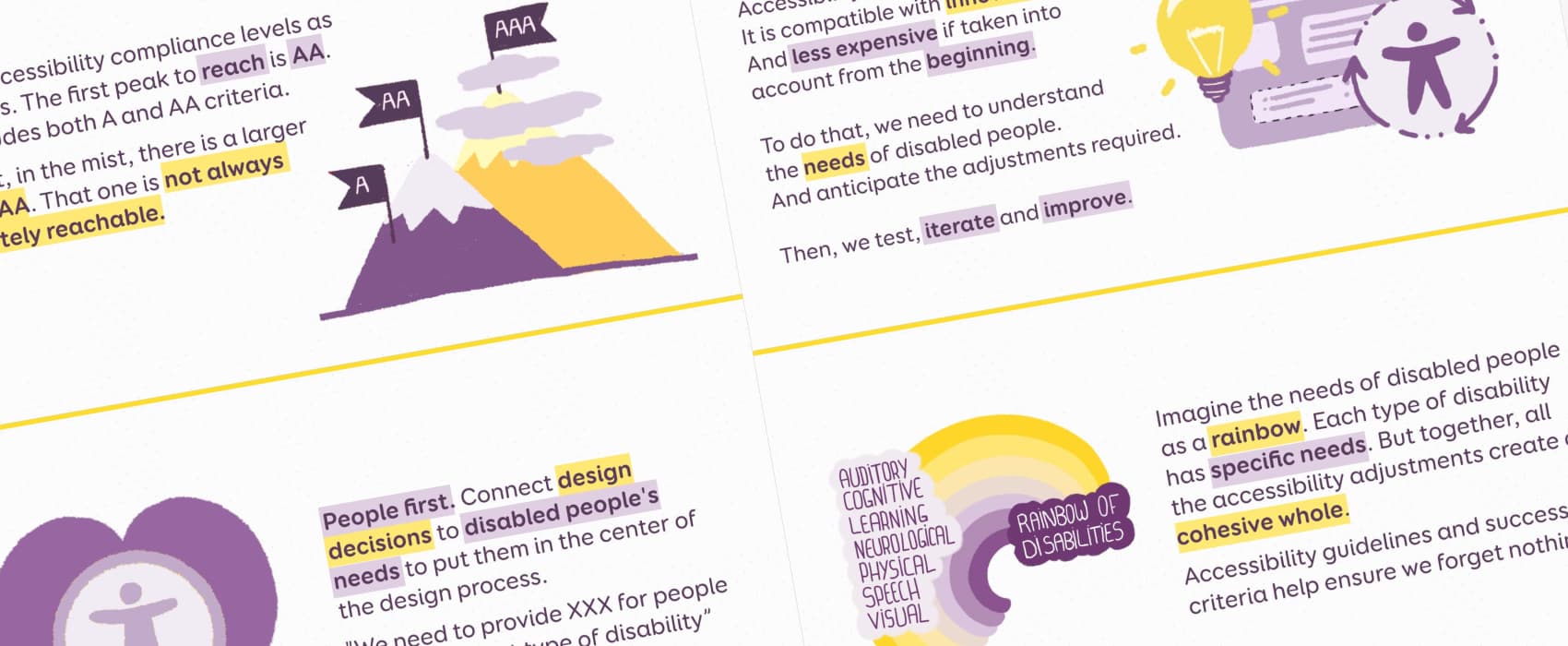
5 illustrated metaphors to explain and advocate for accessibility.
For educational purpose, I illustrated 5 quotes from my last week training on accessibility. Those are about understanding disabled people’s needs, reaching compliance levels, connecting design decisions and needs, giving the rules of the forms and the compatibility between design accessibility and innovation.
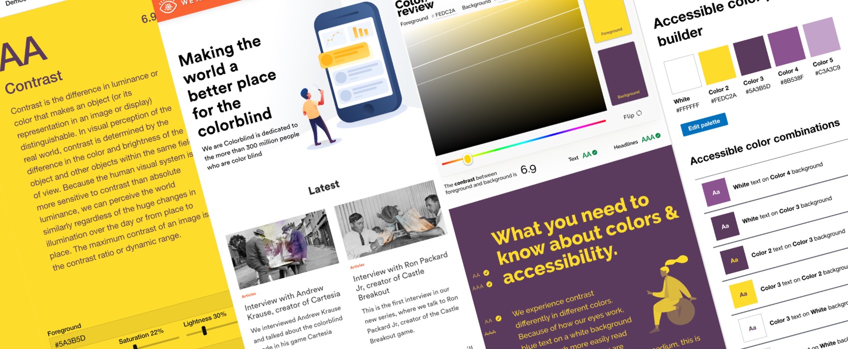
Color accessibility: tools and resources to help you design inclusive products
I wrote a quick tweet about teaching the basics of accessibility and colors to design students that go quite some attention. It brought up some interesting discussions. So I thought I would share with you all the resources, tips and tools I regularly use to build and check the color accessibility of my products in one place. Enjoy.